
A Comprehensive Look at the Chartology of Gold
 share
share
 share
share
 share
share
 share
share
 share
share
Tonight I want to take an unbiased look at gold from every angle I can find. There are some clear cut chart patterns that have been formed since the beginning of this secular bull market that began at a low price of 255. I’ve said it before and I’ll say it again, this bull market in gold will be studied by future analyst as we have studied the great bear market from the 30′s. From a chartists perspective this bull market has produced one beautiful chart pattern after another starting with the bear market low at 255. Keep in mind every impulse leg up is followed by a serious correction and that pertains to our current situation. Even though I’m very bullish longer term we are in one of those consolidation patterns that began last fall from the bull market top at 1920. The consolidation pattern that has been forming since last years high is still not revealing itself yet. There are several possibilities we’ll take a look at that may give us a road map to follow as our current consolidation pattern matures.
First, lets look at a daily chart for gold that is showing only a part the bigger consolidation pattern. The reason this pattern is only part of the bigger chart pattern is because it has formed below the bull market top at 1920. I’ve not seen any chartists out there that is showing this beautiful rectangle that has been forming since gold crashed off of it’s 1920 high to the first reaction low at 1535, red #1 on chart below. I’ve labeled the reversal points with red numbers that show a completed rectangle pattern. With the touch at point #5 the rectangle was completed.
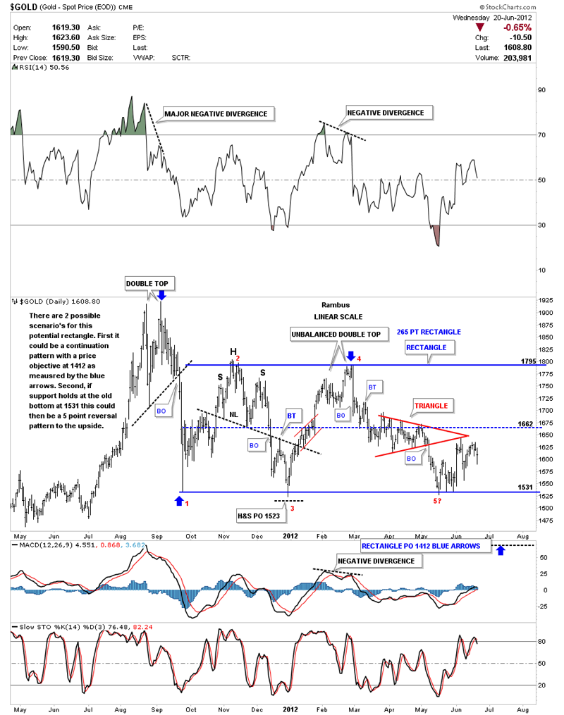
There are two possibilities for this rectangle on the chart above. The first scenario would be that the rectangle will end up being a consolidation pattern to the downside. If that is the case the price objective would be around the 1400 area as measured by the blue arrows. The other scenario could be that this is a 5 point rectangle reversal pattern that would end up being the bottom for this corrective move off the 1920 high. Whenever I see a rectangle pattern I always put on a mid point trendline, dashed blue horizontal rail, that often times will act as resistance before the rectangle finally breaks down to new lows. So how gold does at the mid rail will give us some important clues going forward.
Next lets look at a two year daily chart that shows what I think maybe forming and that is a large bull flag. In any valid consolidation pattern you need at least an even number of reversal points, such as 4,6,8 or more. As I’ve shown you on the first chart above the rectangle has four completed reversal points completing the pattern. On the chart below, the pattern I’m focusing in on, is the potential bull flag in black. To complete the bull flag we need to have at least one more low put in somewhere below the blue rectangle. Again, if the blue rectangle is a consolidation pattern to the downside that will give us a place to look for a low in which to connect the bottom rail for the 4th reversal point.
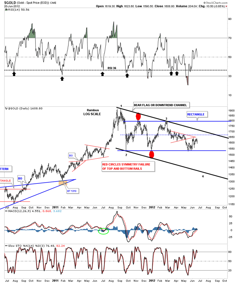
There is a possible clue, on the chart above, that the next low may come in on the bottom black rail of the bull flag. Symmetry plays an important role when I look at chart patterns. The red circles shows a gap above and below the rectangle that has created the angle for the top rail of the bull flag. I’ve shown to our subscribers how these types of patterns can morph into the true pattern once the symmetry from the top, red circle, is placed below the bottom rail, red circle. What I mean by this is, if you were to draw the initial trend line across the first to tops of the bull flag the angle of your top trendline would be much steeper than the present one. You also would have had a false breakout of the original downtrend rail, top red circle.

Symmetry says to put the bottom red circle at the bottom of the blue rectangle. As you can see on the chart above this is giving us an almost perfect parallel bull flag or downtrend channel. Now if the bottom rail of the rectangle gives way then I believe the bottom rail of the possible bull flag will come into play.
The next chart is a weekly look at the uptrend channel that formed off the 2008 crash lows. This chart shows why I think we have another leg down before we hit the correction lows. Note the beautiful uptrend channel off the 2008 lows and how the bottom rail held support during that big advance. About 7 weeks ago that bottom rail was broken to the downside and has reversed it’s role from support to now resistance. You can see gold has been bumping up against the bottom rail for at least 4 weeks now without penetrating it. This is classic TA. If the potential bull flag is going to be the correct consolidation pattern, you can see we need at least one more low to create the 4th reversal point.
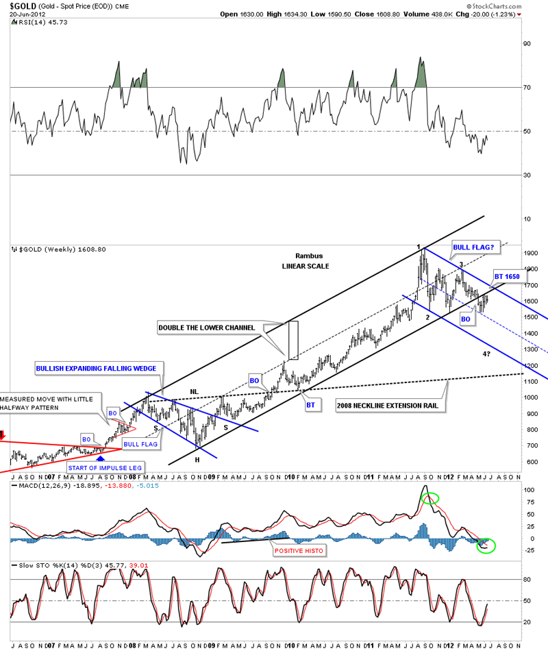
There is one more important feature to look at on the chart above. Notice the uptrend channel that formed below the dashed mid rail. It was very clean and tight. When gold went nearly vertical in it’s move to 1920 it doubled the lower channel, exactly. This was a good clue that gold was probably burning itself out and would need to have a good correction. And as you can see that is exactly what has happened.
The next chart is the same weekly look that shows all the smaller consolidation patterns that formed from the 2008 crash low to the 2011 top at 1920, in red. When you hear me talk of reversal points in a consolidation pattern take note of all the smaller red consolidation patterns. You will see at least four reversal points in each pattern starting at the top of each pattern.
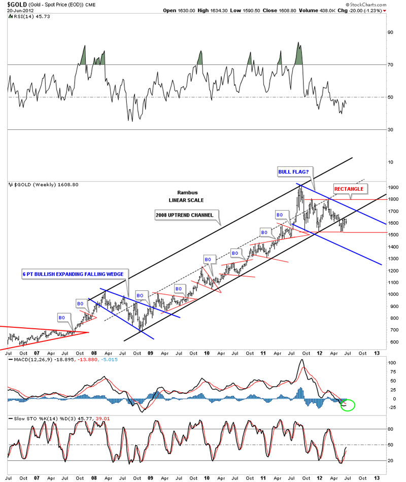
One more important takeaway from the chart above is the two blue patterns. The 6 point bullish falling expanding wedge that was built as part of the 2008 consolidation area and our current but still incomplete bull flag that looks like it will be a bookend for the big rally off the 2008 lows. When our current bull flag is completed it will most likely be a halfway pattern as measured off the 2008 low. I won’t get into that right here but it is a strong possibility.
This next chart is a monthly look that shows the entire bull market to date. This is my interpretation of all the most important chart patterns that have formed over the last 12 years or so. Note how the red and blue patterns alternate. By just simply visualizing this uptrend channel you can see how the red consolidation patterns have formed roughly halfway between the blue patterns. The real question now is will our latest consolidation pattern, the possible bull flag, tag the bottom rail of the major uptrend channel similar to the 2008, 6 point bullish expanding falling wedge?

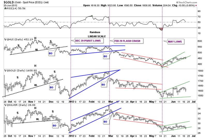
Next lets look at some other charts to see where we are in this correction over the last year or so. This next chart is a 3 way combo chart that shows the HUI, gold and silver. I call this chart my short term history chart because it has some important turning points that some of you may recall. The purple dashed vertical lines represents those turning points made since the first of the year. You may recall the December bottom that so many analysis were calling the bottom for the precious metals complex. As you can see it was a bottom but not the bottom. Its labeled December 29th pivot lows. The next important reversal point came when we had the flash crash. How many recall that day made on Feb. 29th. I remember well all the talk of market manipulation that was being bantered about. The last reversal point on the chart below is the May low that many analysis are calling the low for the PM complex. It is possible that the May low could be The Low, but if the HUI and silver which are strongly testing their bottom rails, give way the precious metals complex could have another leg down. Note how gold is holding well above it’s lower trendline.
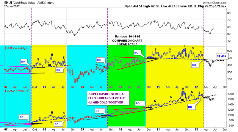
Next lets look at another combo chart with the HUI on top and gold on the bottom. This chart shows you how the HUI and gold generally breakout of similar patterns at the same time. Even though gold has been much stronger than the HUI they generally form a very similar consolidation pattern. The yellow area shows the 2008 H&S top on the HUI and gold and our current H&S patterns. You can see the HUI is doing a critical backtest to the neckline at 465 as we speak.
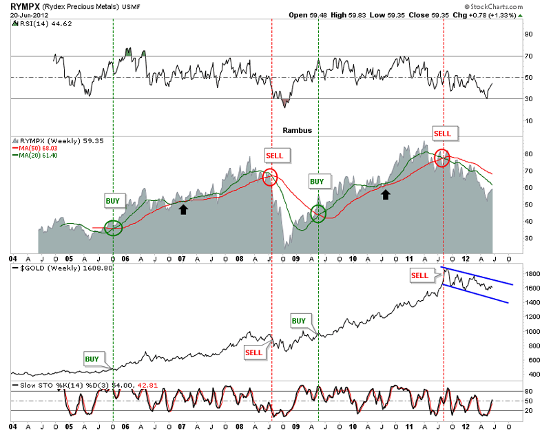
The next chart is the Rydex precious metals stock. It doesn’t give many buy and sell signals. The latest signal was a sell signal that was made when gold hit it’s all time high at 1920. When the 20 week crosses over the 50 week ma is when you get your buy and sell signals.
I need to wrap this essay up as its getting a little long but there is one more chart that I would like to show you. Several years ago the Aden sisters showed a chart that described the 8 and 11 years time cycles. It basically shows an eight year low followed by an elven year high. They took these 2 cycles all the way back to the 1960′s. Below is my interpretation of their work. I have to say its pretty impressive in calling important tops and bottoms. You may need to study this chart to get the full affect of its meaning. Right now the most important feature on the chart below is the February 2012 high that has followed the 2001 eight year low. 2001 plus 11 years equals a top in 2012. So far it looks like the cycles are still in play.

So there you have it a look at gold from the Rambus perspective. Everything seems to be pointing to a larger correction than most are looking for. At the very least we need to see gold trade above it’s 300 dma before we can start to get excited about a move higher. Whatever direction gold wants to move we have a road map that will let us know if its in a bullish or bearish mode….All the best…Rambus
To Subscribe to Rambus Chartology and see Rambus' 10 Favorite PM Stocks and a World of Charts and Projections including the Chartology Forum where Rambus answers your Questions and even Charts your Favorite PM Stocks by Request, go to : www.rambus1.com
share
share
share
share
share
 Rambus Chartology is Primarily a Goldbug TA Site following the precious metals markets. Chartology is the Unique Blend of Technical Chart Pattern Identification and Market Psychology, Developed by Rambus During the Tech Mania of the late 1990s. His Early Training came the old fashioned way...Reading Edwards and McGee's Bible of Technical Analysis and spending years with a sharp pencil graph paper and ruler refining his skills and accuracy. Visit the Rambus Chartology website at http://rambus1.com/.
More from Gold-Eagle