
The Dow vs The Precious Metals: Where’s The Beef? Where’s The Bull?
 share
share
 share
share
 share
share
 share
share
 share
share
Before we look at some precious metals stocks, I would like to show you a couple of charts which will help explain why I didn’t participate in this last rally in the precious metals stocks that started in December of last year. It’s not that I didn’t want to, it’s just the evidence shows that the $INDU, which I’m going to use as a proxy for the rest of the stock markets, is in a true bull market vs the precious metals stocks. As I have often said, ” you always want to trade in a bull market vs a bear market because it will save you from a bad trade if you enter it at the wrong time. If you enter into a long trade in a bear market it will be unforgiving and can take you to the cleaners before you know what hit you.”
If you were trading the precious metals sector from the 1980 high to the 2000 low it was a tough game to win and be successful at, as the trend was down to sideways with a few brief counter trend rallies which would get everyone excited only to be disappointed a little later down the road. On the other hand if you were trading the $INDU during that same period of time, you enjoyed one of the greatest bull markets of all time. So knowing which way to trade, either a bull market or bear market is a BIG DEAL IMHO.
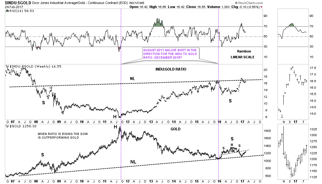
Below is a ratio chart which compares the $INDU:$GOLD going back to 1980 and clearly shows you how the $INDU outperformed gold going into the 2000 top. Back then the PM complex was way off my radar screen and my main focus was on the big cap tech stocks. I remember reading a few gold stock analysis which kept harping on how over valued the stock market was and the gold stocks were the only place to be. They eventually were proven right after being wrong for many years, but the damage to the PM investors was done.
Now let’s look at the 2000 high and the big H&S top that finally reversed this ratio in favor of the precious metals sector. For the next 11 years the place to be invested was the precious metals complex until they topped in 2011 which is the same time this ratio chart bottomed. I still hear people talking about how this ratio has to go down to 1:1 before the bull market is over for the PM complex. That was the case in several instances in the past, such as the 1980 high in the ratio when gold hit 850 and the INDU was trading at the 850 area as well. Keep in mind, the only rule in the markets is there are no rules. As you can see the ratio hit a low of 5.5 in 2011 which I believe will be the low for quite a while.
As it took a very large H&S top to reverse this ratio to the downside in 2000 it’s taking an equally large inverse H&S bottom to reverse this ratio back up. The price action has been testing the neckline for almost one year now telling us the neckline is hot and to be respected.

Below is a combo chart which has the $INDU:GOLD ratio on top and gold on the bottom. This 10 year weekly bar chart brings into focus the inverse H&S bottom on the ratio chart and a possible H&S top we looked at a several months ago in a Weekend Report that I labeled the potential gold H&S top, just for entertainment purposes. Note how the rally out of the December 2016 low started at the 10 year neckline which again tells us that neckline is hot and to be respected. The bottom line is that neither of these potential massive H&S patterns have actually broken out above their respective necklines yet. Until they do we still don’t have confirmation, but if they do this combo ratio chart is strongly suggesting the stock markets are going to outperform the precious metals complex for an extended period of time because of the size of these potential H&S patterns.
Precious Metals:
I would now like to show you some individual precious metals stocks to see if they’re giving us any clues on what to expect from this sector going forward. You may remember the many H&S tops I was showing you on most of the PM stock indexes late last year with the August 2016 high being the head. Many of the H&S tops were negated when the price action rallied back above those necklines, which one has to respect. As you would see at my site some of those H&S tops are still relevant on many of the precious metals stocks.
I have always said that I like trading the precious metals stocks because the universe is so small that you become familiar with the individual stocks that make up the indexes. When you see some of the leaders building out a top or a bottom you know the rest won’t be far behind. So with that said let’s look at some daily charts for many of the bigger cap PM stocks and see what they may be telling us in regards to their H&S tops or possible topping patterns.
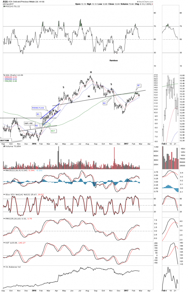
Here is Large Cap ASA which has been a leader in this move from the 2016 lows. It shows you a very nice H&S top with the backtest taking place 3 months after the breakout
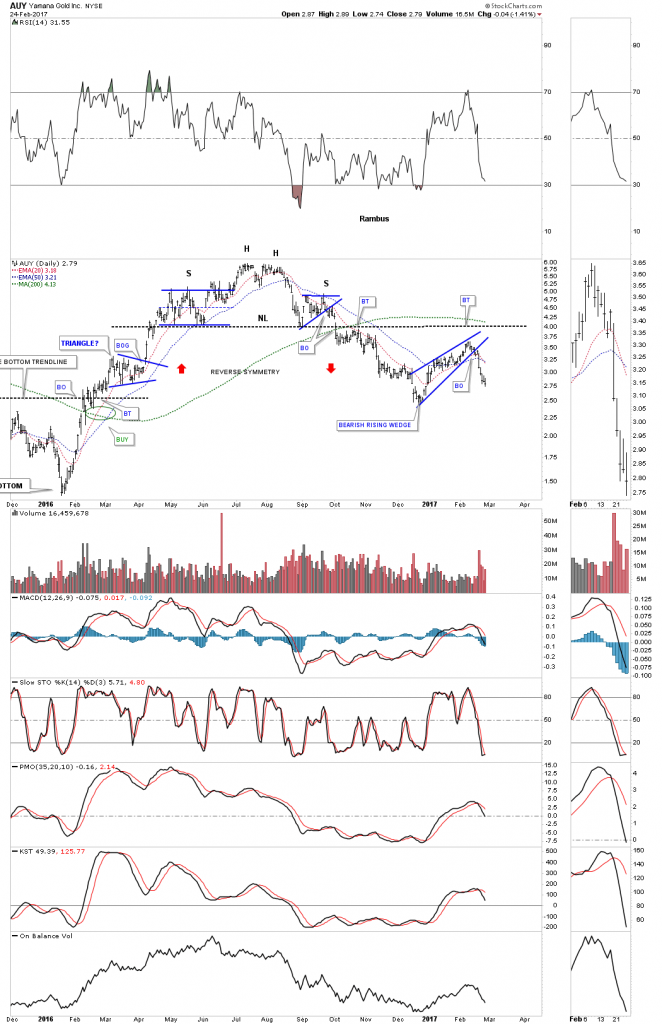
AUY was one of the leaders back in the early days of the bull market, but has fallen on hard times. It built out a H&S top with a nice clean backtest before dropping lower. Two weeks ago it broke below the bottom rail of the blue bearish rising wedge signaling more weakness ahead.
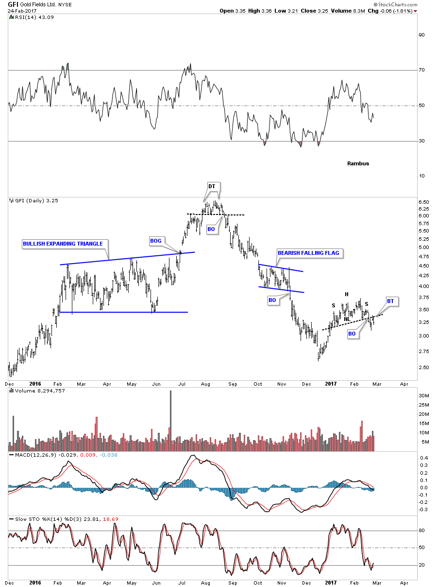
During the initial rally phase out of the December 2015 low the South African stocks were the leaders to the upside. Below is a daily chart for GFI which topped out in August of last year and has declined strongly. After a short counter trend rally out of the December 2016 low it has now broken out of a H&S top to the downside.
To be fair I have dozens of Other PM Charts Posted at https://rambus1.com/
some of which are not this dire but many of which are.
With all the completed and partially completed H&S tops, I can’t in good conscience recommend buying these stocks. I know it goes against the main theme of the PM investors, but the charts are suggesting this is a time to exercise some caution. For the record I’ve been trading the PM stocks exclusively since the spring of 2002, both long and short. This is the first rally phase, out of the December 2016 low, that I decided not to participate as I see better returns for the longer term in the stock markets.
In Summary: Where’s The Bull?
Below is the 75 year chart for the INDU that I have to respect regardless of all the reasons why this bull market has to end, or is going to crash at any moment. Remember big consolidation patterns lead to big moves and if the 13 year Jaws of Life pattern has any relevance this next impulse leg up is just getting started. It is what it is until it isn’t

Now let’s be clear, at Rambus Chartology we are not trading the Dow per se .
We have been accumulating many different Stock Market Sector Leveraged ETFs which have been identified by the charts as being the leaders during this impulse move.
This could all change in a heartbeat, but for now I have to go with what the Chartology is suggesting.
All the best trading in whichever market you choose.
share
share
share
share
share
 Rambus Chartology is Primarily a Goldbug TA Site following the precious metals markets. Chartology is the Unique Blend of Technical Chart Pattern Identification and Market Psychology, Developed by Rambus During the Tech Mania of the late 1990s. His Early Training came the old fashioned way...Reading Edwards and McGee's Bible of Technical Analysis and spending years with a sharp pencil graph paper and ruler refining his skills and accuracy. Visit the Rambus Chartology website at http://rambus1.com/.
More from Gold-Eagle