
Gold Market Update
 share
share
 share
share
 share
share
 share
share
 share
share
Although the longer-term bullish case for gold could scarcely be stronger, over the short to medium-term the picture continues weak, with it looking vulnerable to breaking down into another downleg to the $1000 area and perhaps lower. In the last update you may recall that there was some optimism expressed that it might perk up on the dollar topping out, but such has not proved to be the case – instead it has performed miserably and now looks set to drop more steeply to new lows.
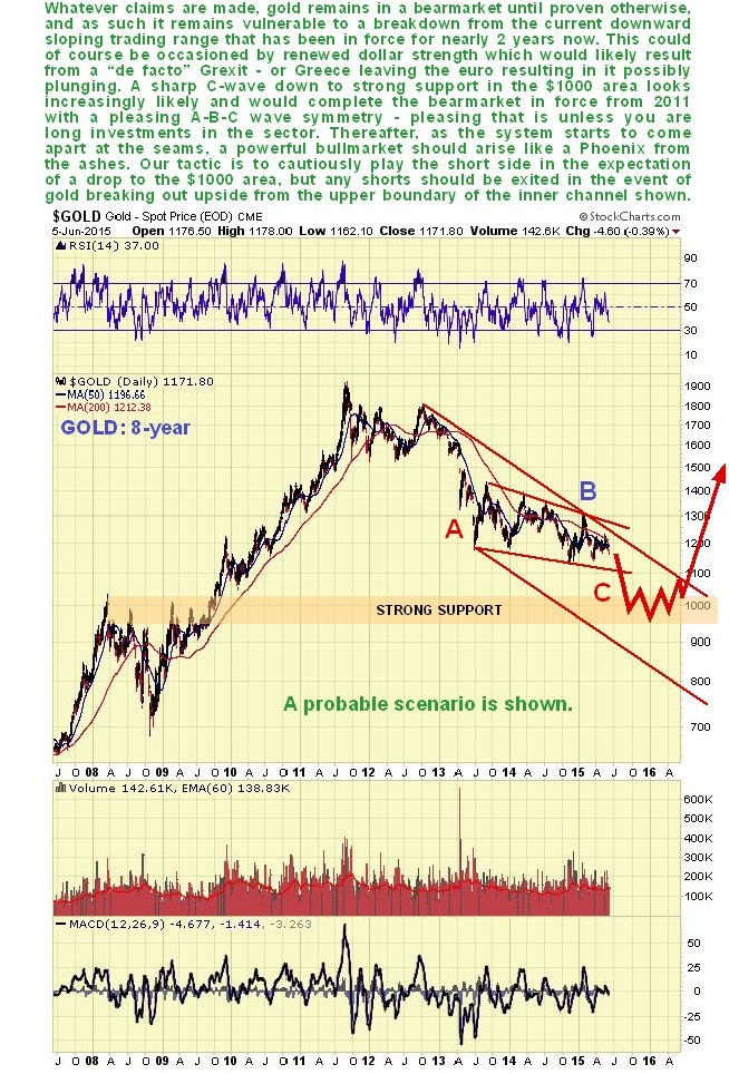
On its 8-year chart we can see that gold remains in the grip of the bear market in force from its bull market highs of 2011. The breakdown from the top area during the earlier part of 2013 lead to a severe decline, which has been followed by a downsloping trading range that has been going on for 2 years now. Its recent poor performance suggests that it is going to break down from this range and gravitate towards the strong support in the $1000 area and perhaps lower towards the lower boundary of the major downtrend channel, which move should end the bear market. Such a move would result in it completing a satisfying 3-wave A-B-C correction to the entire bull market to date, although it understood that it will not be satisfying to existing gold bulls. In expectation of such a move we are short the sector. It will take an upside breakout from both of the downtrends shown on this chart, preferably on good volume, to abort this scenario.
Apart from showing the latter part of gold’s 2-year down-sloping trading range, the 6-month chart is not of much use, although it does reveal that gold is coming under pressure from its bearishly aligned moving averages, and could drop quite sharply from here, as it is not at all oversold on its MACD indicator.

Gold’s latest COT is in middling ground, and if anything somewhat bearish. In itself it provides us with little guidance one way or the other. Silver’s latest COT on the other hand is decidedly bearish, and we take our cue from that.

The Gold Hedgers chart, a form of COT chart over a longer timeframe, is likewise neutral…

Chart courtesy of www.sentimentrader.com
The following two charts are a warning not to get too negative, and suggest that gold’s expected downleg may not take it lower than the $1000 area. They also warn us to be on the lookout for signs of a reversal at any time going forward. The 1st is the Gold Optix or optimism chart, which shows optimism towards gold is at a low level, and although this is precondition for an important reversal, in itself it won’t prevent further losses over the short to medium-term…
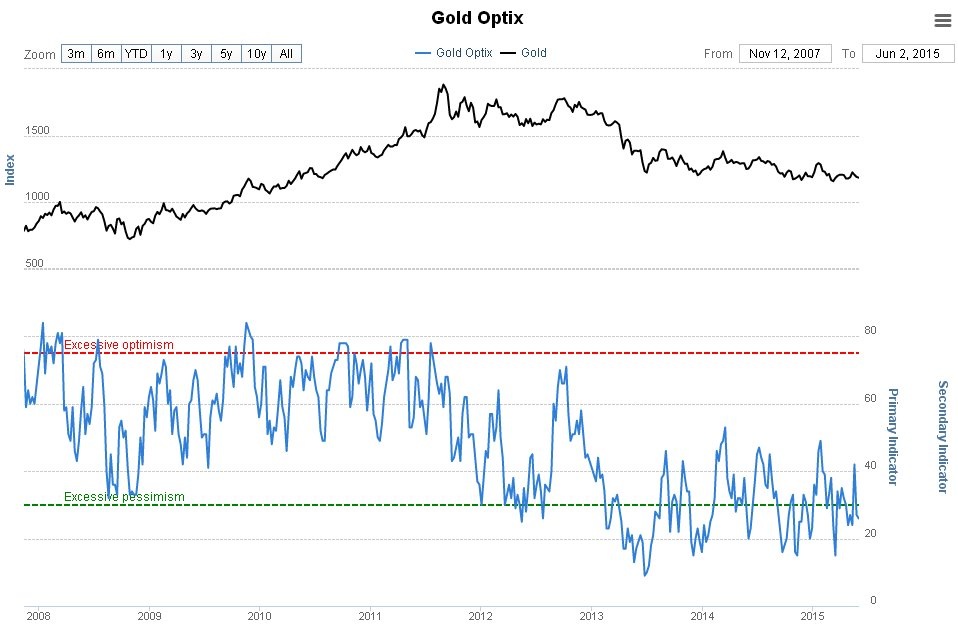
Chart courtesy of www.sentimentrader.com
The other chart showing excessive bearishness is that for Rydex Precious Metals Assets. Again, this doesn’t mean there won’t be further losses, but it does suggest that that a bottom and reversal is not too far out.
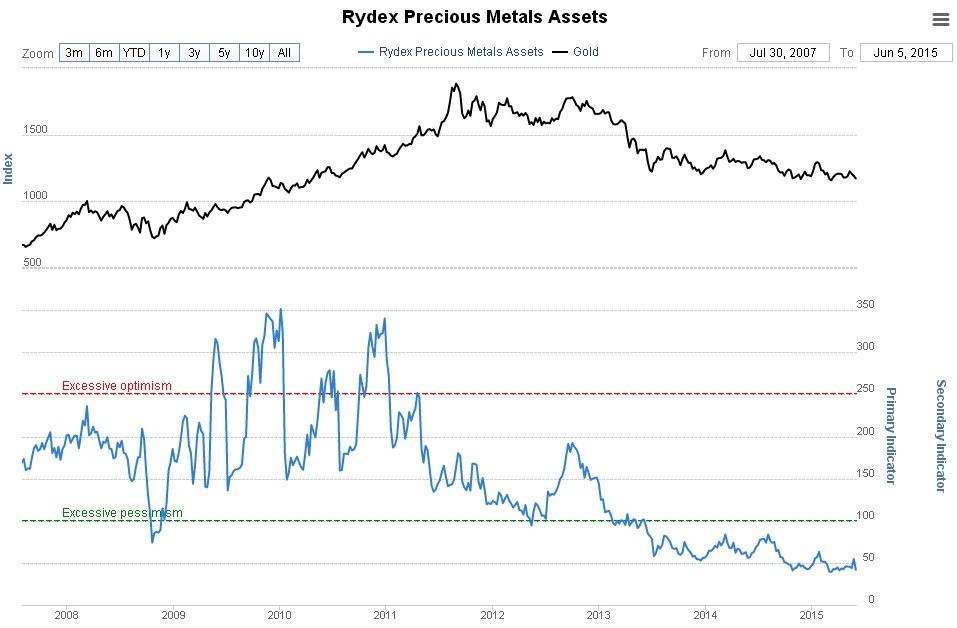
Chart courtesy of www.sentimentrader.com
Turning to the all-important dollar we see on its 5-year chart that it has broken down from its earlier powerful parabolic uptrend and is now floundering around and presumed to be marking out an intermediate top area. Whilst it remains above its rising 200-day moving average, however, there is the possibility that it could make new highs, which might be occasioned by the euro plunging as a result of Greece effectively adopting another medium of exchange, which is a risk at this point. This is a potential reason for gold and silver dropping to new lows. One possibility is that a Head-and-Shoulders top forms in the dollar, with the Left Shoulder now completed and the Head yet to form.

The 6-month chart for the dollar index shows how it bounced from oversold as expected after approaching its rising 200-day moving average. It now looks set to form a trading range between the support and resistance shown, with some chance that it will rise above the resistance to mark out the Head of a Head-and-Shoulders top as mentioned above. A break below the support would lead to a more severe decline, although it looks to be too early for such a move to occur

Conclusion: gold looks set to break down from its 2-year downsloping trading range soon into a downleg that takes it to the strong support level in the $1000 area, with some risk of its dropping further to the lower boundary of its downtrend channel shown on its 8-year chart. To abort this scenario it needs to break out upside from both the channels shown on the chart preferably on good volume, which would be a buy signal. The expected downleg should complete gold’s “bea rmarket within a larger order bull market”, and thereafter it is expected to reverse into an uptrend that promises to dwarf that of the late 70’s.
********
Courtesy of http://www.clivemaund.com/
share
share
share
share
share

Clive P. Maund’s interest in markets started when, as an aimless youth searching for direction in his mid-20’s, he inherited some money. Unfortunately it was not enough to live a utopian lifestyle as a playboy or retire very young. Therefore on the advice of his brother, he bought a load of British Petroleum stock, which promptly went up 20% in the space of a few weeks. Clive sold them at the top…which really fired his imagination. The prospect of being able to buy securities and sell them later at a higher price, and make money for doing little or no work was most attractive – and so the quest began, especially as he had been further stoked up by watching from the sidelines with a mixture of fascination and envy as fortunes were made in the roaring gold and silver bull market of the late 70’s.
Clive furthered his education in Technical Analysis or charting by ordering various good books from the US and by applying what he learned at work on an everyday basis. He also obtained the UK Society of Technical Analysts’ Diploma.
The years following 2005 saw the boom phase of the Gold and Silver bull market, until they peaked in late 2011. While there is ongoing debate about whether that was the final high, it is not believed to be because of the continuing global debasement of fiat currency. The bear market since 2011 is viewed as being very similar to the 2-year reaction in the mid-70’s, which was preceded by a powerful advance and was followed by a gigantic parabolic price ramp. Moreover, Precious Metals should come back into their own when the various asset bubbles elsewhere burst, which looks set to happen anytime soon.
Visit Clive at his website: CliveMaund.com
More from Gold-Eagle