
Gold Market Update
 share
share
 share
share
 share
share
 share
share
 share
share
There is now such an overwhelming array of technical evidence that the Precious Metals sector is forming a major bottom, that by the end of reading this update you will, or should unless you are stupid, understand why we now have no choice but to turn strongly and unequivocally bullish on the sector. Up until now we have had some reservations, but these have been swept away by the latest truly extraordinary data.
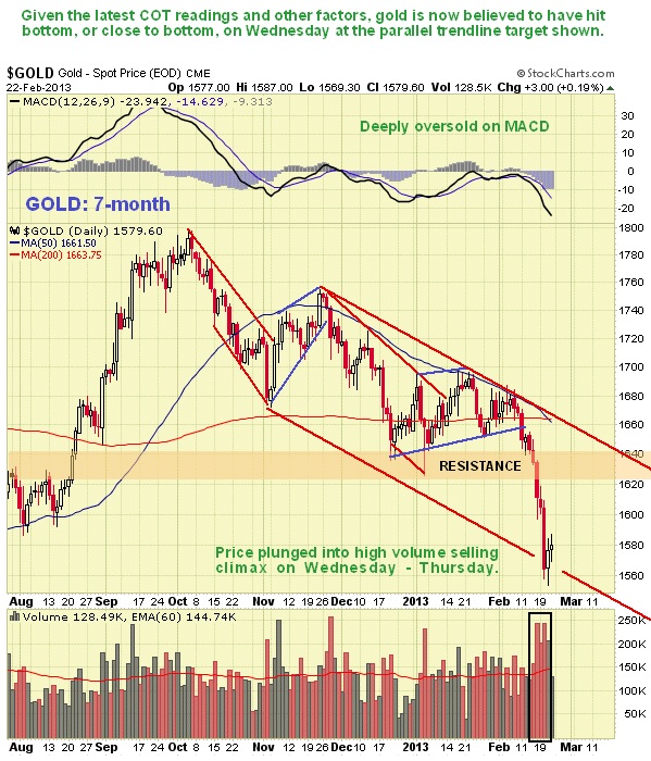
You may recall that in the last update posted on the 10th we called for a drop. As you won’t need reminding, we got it. On its 7-month chart we can see that gold sliced straight through support at its early January bull hammer low and then dropped steeply into last Wednesday – Thursday, where a high volume selling climax occurred at a parallel trendline target. Gold is now quite deeply oversold, with many oscillators at extreme readings. This 7-month chart cannot provide the big picture of what is going on, only recent detail, so let’s now move on to the longer-term charts.
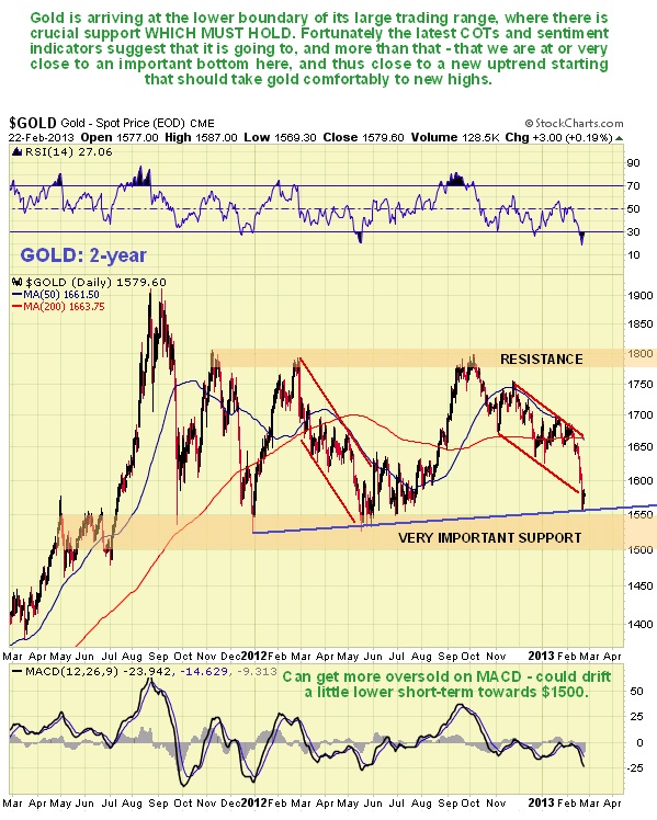
The 2-year chart for gold is very useful as it enables us to examine the large trading range that has formed from the August – September 2011 highs in detail. After the initial drop from those highs we can see that gold settled into a horizontal trading range between clearly defined support and resistance at its upper and lower boundaries. Since the boundaries of this trading range have been tested on several occasions in both directions, resulting in significant reversals, they are clearly are great technical importance, and a breakout from this range will thus be an important technical event that can be expected to lead to a major move. For a variety of compelling reasons which we will soon come to, gold is expected to reverse to the upside from its current position near the lower boundary of the trading range and go on to break out upside from it. Here we should note that although a powerful new uptrend is expected to develop soon from here, we should not be surprised to see some backing and filling over the short to medium-term above the support, that may involve gold dropping a little further to about $1530. This is hardly surprising given that many sector participants are shell-shocked after the latest drop, so that some are in the frame of mind where they will sell for what they can get. Failure of the support at $1500 is viewed as highly unlikely given the current technical readings – if it happened it would have dire implications for just about everything, as it would imply that another 2008 style deflationary implosion was on the horizon, and it is considered unlikely that the money pumpers will permit that, although one day they may no longer have any choice in the matter. Now let’s look at the really big picture on gold’s long-term chart.
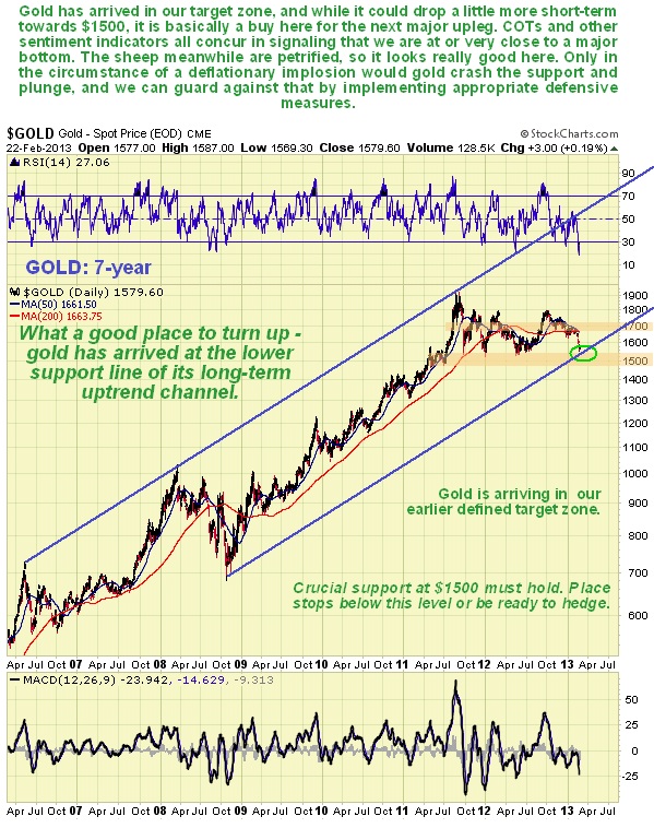
On the 7-year chart we can see that after its latest drop gold has arrived not just at, or close to, the lower boundary of its recent large trading range, but also at a parallel trendline target. It is now in the zone that we had earlier defined as being an excellent point to buy ahead of the start of the next major uptrend. This is an excellent point for it to turn up to start the breakout drive marking the birth of the next major uptrend, and as we will now see, all the technical indications are that it is about to do just that.
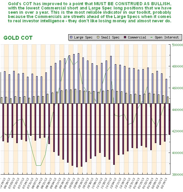
The latest COT chart for gold is at its most bullish for over a year, and this chart, which is up to date as of last Tuesday’s close, does not even factor in Wednesday’s big drop, so readings now can be assumed to be even more favorable. This is by far the most reliable indicator in our tool bag – whenever we have gone against it we have lived to regret it - and it was partly the then still bearish silver COT which enabled us to predict the latest plunge in both gold and silver before it started. After this drop Commercial short and Large Spec long positions (for Commercial read Smart and for Large Spec read dumb) have fallen dramatically and this COT chart is now viewed as strongly bullish for gold.
Now we move on to look at a range of sentiment indicators which provide a raft of evidence that gold is either at or very close to a major bottom. We start with the Hulbert Gold Sentiment Index, which shows that sentiment is at rock bottom, there is only room for it to drop a whisker more. This indicator shows that everybody and all their friends and relatives are bearish on gold, which means that there is almost nobody left to turn bearish on the friendless metal. So guess what happens to the price when people start changing their minds? – that’s it – you’ve got it!

Chart courtesy of www.sentimentrader.com
The gold public opinion index is at even more extreme low levels, being at its lowest reading by a country mile since at least the end of 2008. This demonstrates that the sheep are all up at one end of the field, the bearish end – and we all know what happens to them.
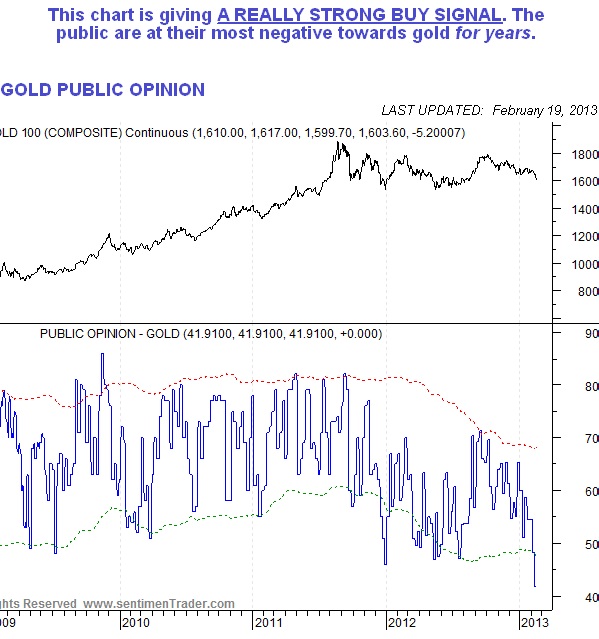
Chart courtesy of www.sentimentrader.com
The Rydex have reduced their Precious Metal holdings to a very low level, as we can see on the following chart, which also shows that they are dumb as a door stopper when it comes to timing Precious Metals purchases. We can therefore take their low interest at this time to be another positive indication.

Chart courtesy of www.sentimentrader.com
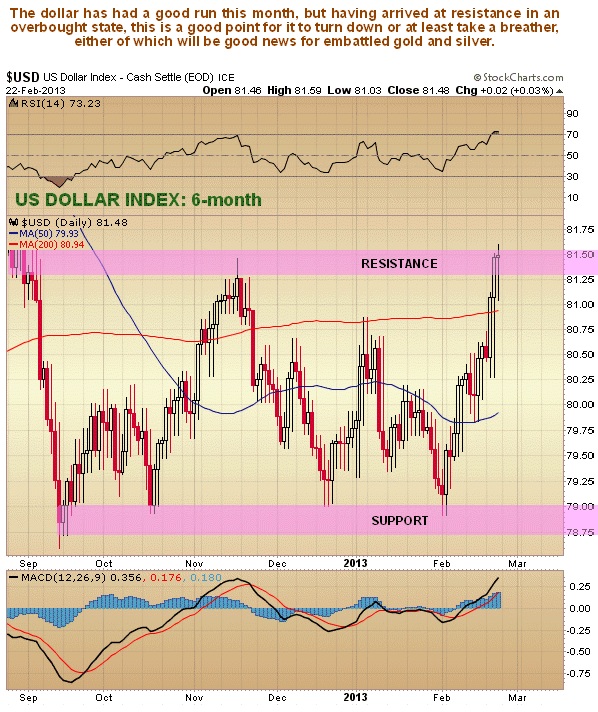
How does the all-important dollar fit into the picture at this time? Let's take a look. You may recall that we were positive on the dollar in the last update, despite the large completing Head-and-Shoulders top evident on its chart, because of the then bullish dollar COTs. As we can see on the 6-month chart for the dollar index below, it has enjoyed a significant rally this month, but has now arrived at a zone of strong resistance in an overbought state.
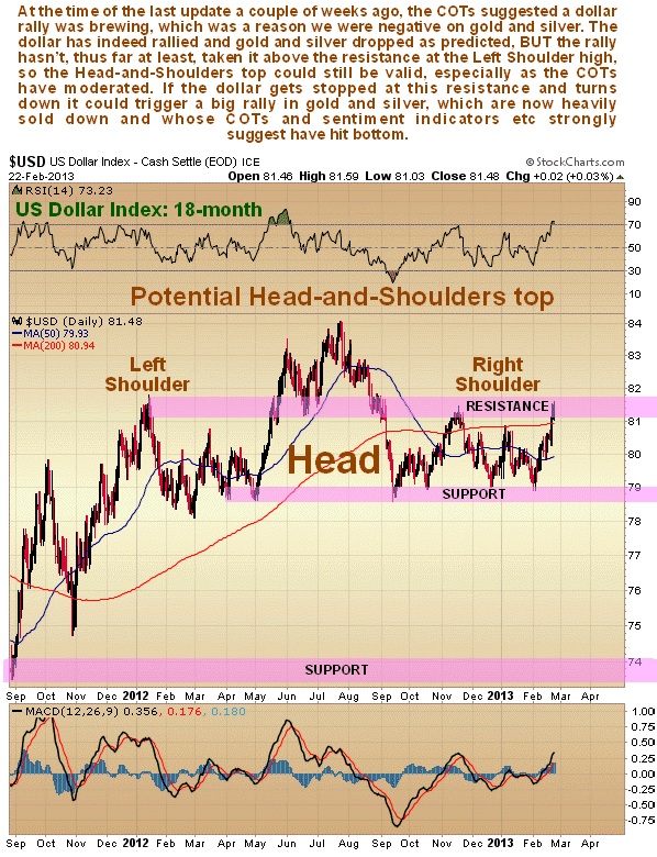
However, on its longer-term 18-month chart the dollar still looks like it is completing a Head-and-Shoulders top, and this is made more likely by the fact that the dollar COTs, which were distinctly bullish, are now moderating, opening up downside potential again. All the data set out above for gold certainly suggests that the likelihood is high that the dollar will now turn tail and drop hard.
Alright, so if the outlook for gold is now so rosy, what about gold and silver stocks? Precious Metals stocks have taken a terrible beating over the past 17 months, and must be about the most unloved sector on the market, which is very strange given that gold really hasn’t fallen all that much. Just how unloved stocks are relative to bullion can be seen on the 20-year chart for the XAU large Precious Metal stock index over gold shown below. On this chart we can see that this ratio has sunk almost to its lowest ever level, on a par with the 2008 panic trough – and after that a big rally in stocks ensued, as we can see on the sub-chart for the XAU index at the bottom of this chart. The key point to grasp when looking at this chart is that when investors are pessimistic towards the PM sector they favor bullion over stocks, because they believe it to be safer, which of course it is, and the ratio sinks, but when their pessimism is driven to extremes it is also a very bullish sign for the sector, as there comes a point when the tide turns and a new cyclical uptrend emerges. Quite clearly from looking at this chart, there couldn’t be a much better time for the pendulum to swing in favor of stocks, and that of course implies the birth of a new sector uptrend.

Just how bearish are investors towards gold stocks? – extremely bearish, and the following chart of the Gold Miners Bullish % Index makes this abundantly clear. It shows that with only 6.6% of investors bullishly disposed towards gold stocks, there is almost no-one left to turn bearish. When this happens, you are at or very close to a bottom. Could it go lower? – well, it dropped to zero at its lowest in late 2008, but that would only happen again if we see a deflationary implosion, and all the indications for gold that we have looked at above are bullish, so that either the implosion isn’t going to happen, or this time, if it does, gold and silver are going to going contra-cyclical and go up anyway.

There is one final crucial piece that we have to fit into our puzzle, and that is to reconcile the inconsistency of the apparent Head-and-Shoulders top that appears to be completing in gold stocks indices. Observation of this formation has made us bearish, but too bearish, on PM stocks in the recent past. A breakdown from a Head-and-Shoulders top and further plunge by Precious Metals stocks in the near future does not fit with the strongly bullish indications for gold that we have reviewed in this update today. So what we are going to do now is to take a second look at this apparent H&S top but this time using the proxy Market Vectors Gold Miners (GDX) on which we can study the volume pattern. For a true Head-and-Shoulders top should be accompanied by heavy volume as the index rises up towards the Left Shoulder high of the pattern, somewhat lighter volume as it rises up towards the high point of the Head of the pattern, and light volume as it rises up towards the Right Shoulder high.

On the 6-year chart for the Market Vectors Gold Miners above we can see that while volume was high on the rise into the Left shoulder of the Head-and-Shoulders top, and it was much lighter on the rise into the Head, it was high again on the rise into the Right Shoulder of the pattern, which is why the Accum-Distrib line shown on the chart rose to new highs. This is not consistent with a true Head-and-Shoulders top, where volume should be light on the rise into the Right Shoulder. It is therefore reasonable to conclude that the pattern is a phoney, which is consistent with the strongly bullish indications for gold at this time. While it is true that the latest high volume plunge has driven the Accum-Distrib line sharply lower, this looks like a final capitulative selloff.
So, in conclusion, while it certainly takes a lot of courage to buy gold and silver and especially Precious Metals stocks here, especially if you have been beaten up in the recent past, according to everything we have reviewed here, that is precisely what you should be doing.
Silver Market Update
Clive Maund
Even though the technical indications for silver are not as strongly bullish as those for gold, they are now sufficiently positive that silver is likely to take off higher before much longer, encouraged by the strength that we should soon see reappear in gold. Of course, it will probably take some weeks for sentiment to recover sufficiently to drive a significant rally after the latest sharp drop, so we may see some backing and filling before a sustainable uptrend can get going, but that is normal.
We predicted another downleg in silver in the last update, which was posted on the 10th, due to the still bearish COTs at that time and the way that silver was topping out beneath a zone of resistance. The downleg started the next day and has proven to be quite severe, as we can see on our 7-month chart below. The decline did not pause at the support at the early January bull hammer, but continued lower to another support level and the trendline target shown. The bounce on Thursday and Friday occurred because silver has become critically oversold on its RSI, but it looks weak, and so we could see some more minor downside short-term before the current downleg has completely run its course. Nevertheless, we are believed to be close to an important bottom here.

On its 3-year chart we can see that silver has dropped back close to the lower boundary of its recent trading range. While we may see a little further downside short-term towards the strong support at the bottom of the trading range, it is now viewed as entering buying territory, however, this support is clearly defined and of great importance as it has turned the price back up to start significant rallies on 3 occasions over the past 17 months, so it must hold – if the price breaks below it, it would likely trigger a plunge as lines of stops would be triggered.
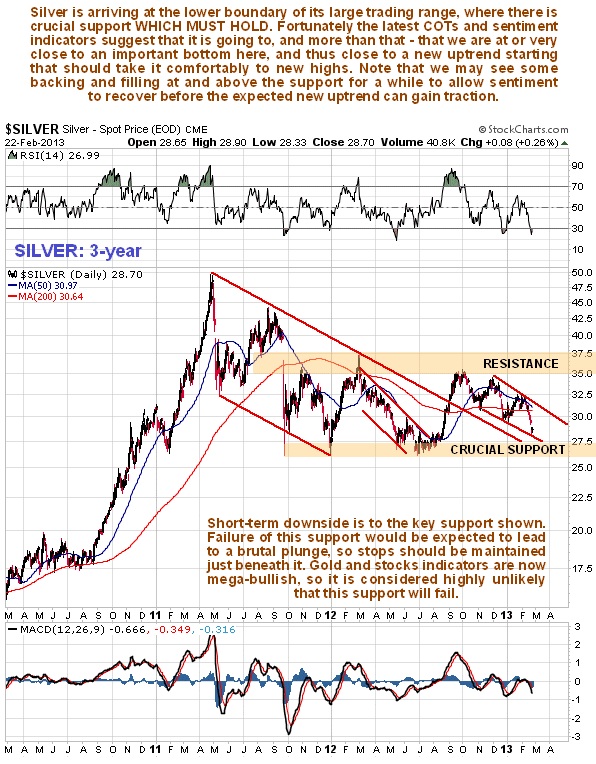
Another bullish point to note is that after breaking out of its downtrend back last August – September, silver has not dropped back into it, but has instead drifted back down in a reaction, riding the support above the upper trendline. The current position of the price not far above this trendline and also just above the critical support towards $26.50 suggests that it is now at a very good point for a major new uptrend to start.
The long-term 7-year chart is encouraging as it shows that all of the action from the April – May 2011 highs looks like nothing more than a reaction within an ongoing major uptrend that should re-assert itself before much longer, although as we can see the lower channel has not yet caught up with the price – but it may not have to, given the now super positive outlook for gold.

So it is good to see that we now have at last a significant improvement in silver’s COT structure on its latest chart, which, since it is only up to date as of last Tuesday, does not take into account the sharp drop in silver’s price that occurred on Wednesday, and so these figures can be presumed to be better still now. However, it must be said that there is considerable room for improvement, and we may see it in the weeks ahead if silver backs and fills for a while above the support before the expected new uptrend begins. That said, it is considered prudent not to wait for that to happen before taking positions, because downside now looks very limited and gold’s COT (and other indicators) is already very bullish indeed, meaning that it could take off higher with little delay now.

The public were still too bullish on silver just a few weeks ago, which is a big reason why it plunged, but as we can see on the latest public opinion chart, they have now curbed their enthusiasm , which is a good thing. Public opinion is now back at the more acceptable levels from which a strong uptrend can get started.

Chart courtesy of www.sentimentrader.com
In conclusion, although silver may back and fill short-term, and possibly drop back a little more towards its key support level at and above $26.50, it is now viewed as being back in buying territory ahead of the powerful uptrend that is expected to develop before much longer that should take it comfortably to new highs.
Clive Maund, Diploma Technical Analysis
25 February 2013
share
share
share
share
share

Clive P. Maund’s interest in markets started when, as an aimless youth searching for direction in his mid-20’s, he inherited some money. Unfortunately it was not enough to live a utopian lifestyle as a playboy or retire very young. Therefore on the advice of his brother, he bought a load of British Petroleum stock, which promptly went up 20% in the space of a few weeks. Clive sold them at the top…which really fired his imagination. The prospect of being able to buy securities and sell them later at a higher price, and make money for doing little or no work was most attractive – and so the quest began, especially as he had been further stoked up by watching from the sidelines with a mixture of fascination and envy as fortunes were made in the roaring gold and silver bull market of the late 70’s.
Clive furthered his education in Technical Analysis or charting by ordering various good books from the US and by applying what he learned at work on an everyday basis. He also obtained the UK Society of Technical Analysts’ Diploma.
The years following 2005 saw the boom phase of the Gold and Silver bull market, until they peaked in late 2011. While there is ongoing debate about whether that was the final high, it is not believed to be because of the continuing global debasement of fiat currency. The bear market since 2011 is viewed as being very similar to the 2-year reaction in the mid-70’s, which was preceded by a powerful advance and was followed by a gigantic parabolic price ramp. Moreover, Precious Metals should come back into their own when the various asset bubbles elsewhere burst, which looks set to happen anytime soon.
Visit Clive at his website: CliveMaund.com
More from Gold-Eagle