
A Growing Mania In The Stock Market? I Think Not.
 share
share
 share
share
 share
share
 share
share
 share
share
The Dow Jones continues rising like a bat out of hell. Of the past 72 NYSE trading sessions, the Dow Jones broke above to a new all-time high in 29 of them. That’s a new all-time high in 40.2% of the daily closings since November 9th. If this continues I’ll have to do some research to see if we’re making history here. Did the Dow do something similar during the Roaring 20s bull market?
Maybe during that market mania from a century ago the Dow did something similar, and then maybe not. And the last four years of the 1920s was a market mania – a deep and broad based, unflinching blind faith that a bull market couldn’t end. Exactly like the last few years of the NASDAQ High-Tech mania of the late 1990s. Is that what today’s stock market has become – a mania? Excuse me, but that’s a pill too large for this old goat to swallow.
The mystery to me is where is all this money coming from? Is the public coming back into the market again? This is exactly the type of market action that’s sure to draw the suckers into it as the smart money exits by selling into strength.
However, it’s hard imagining this could happen without some market intervention from the FOMC, as seen during the three QEs highlighted below.

But when I look at the monthly changes in the Federal Reserve’s holding of US Treasury debt below, since its QE3 terminated in December 2014 (Red Circle), they haven’t monetized a sufficient volume of the US Treasury Market to affect the stock market as they did in their three bouts of QE. Of course, believing that depends on whether or not we can still believe the statistics published by the Federal Reserve for public consumption.
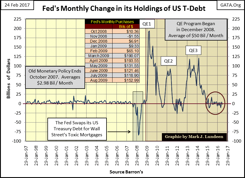
Maybe with the election of President Trump, the FOMC has decided they can no longer be truthful with the public reporting of their activities. If so, the Fed wouldn’t be the only government bureaucracy going renegade with the election of Donald Trump.
The NSA has leaked official phone conversations between Trump and world leaders to the Washington Post, whose new owner Jeff Bezos of Amazon.com received a $600 million dollar contract with the CIA. Nothing suspicious there!
http://www.hangthebankers.com/washington-post-owner-receives-600-million-cia/
The State Department is still supporting ISIS in Syria to over throw Bashar Assad, as well as instigating conflict with Russia. And the EPA hasn’t stopped its war on carbon dioxide emissions, all in opposition to stated policy of the Trump administration.
Well, Trump was inaugurated only a month ago, and Washington is a big swamp. It may be a year or so before we see the full effects of his pumping sludge from our nation’s capital. But we are seeing criminal activities in these oppositions to his policies. Trump needs to have his Justice Department investigate these activities, and where possible he needs to prosecute those breaking the law or his presidency will be ruined. But these things when processed by the bureaucracy take time, so I’m not expecting much will be made public in the coming weeks on these issues.
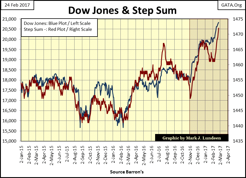
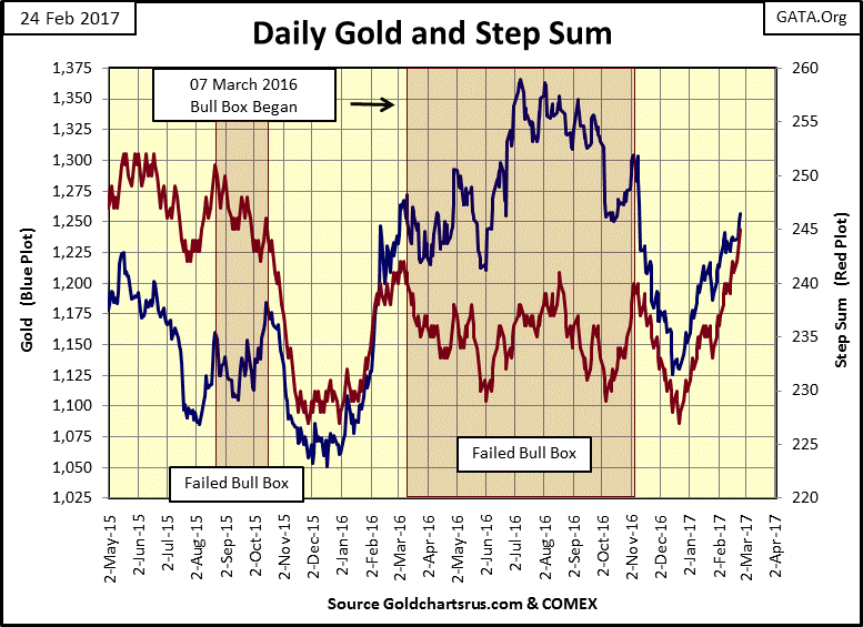
Below is a step sum chart for the Dow Jones going back two years. In the highlighted area we see the two month bull box that was closed last week, where the step sum went down with no effect on the Dow Jones itself. The advance in the step sum since February 8th has been accomplished entirely by daily closings that are new all-time highs. That’s something we don’t see every day.
Okay, the Dow Jones has all the appearance of a stock market mania, so why do I believe at the end of February 2017 the stock market itself isn’t in a mania?
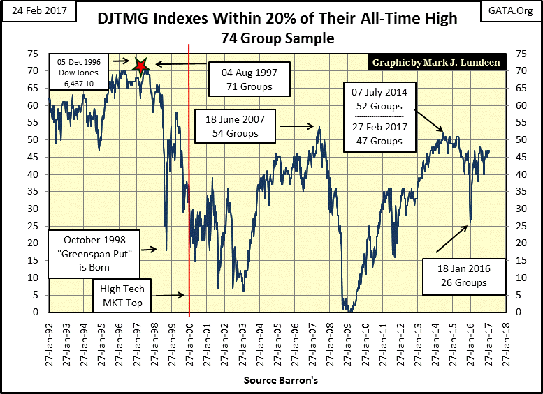
Let’s examine the Dow Jones Total Market Groups’ (DJTMG) top 20 in the chart below. At the end of this week (Barron’s 27 Feb 2017 issue) the top 20 had still only 47 groups out of 74 within 20% of their last all-time high, and it’s been around that level since last July.
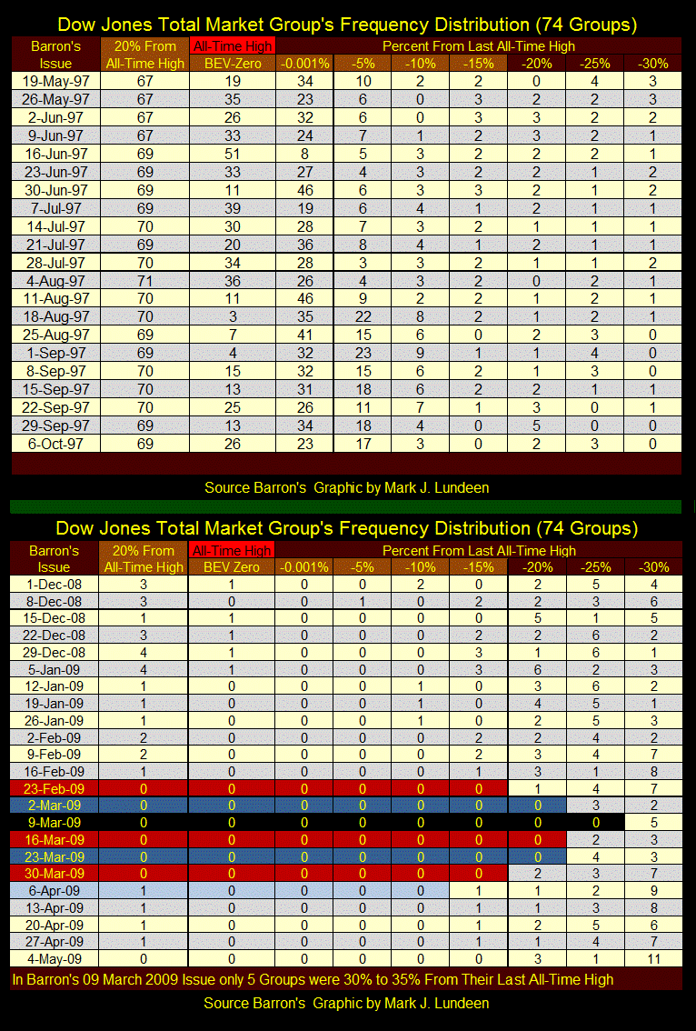
Do you want to see a market mania? Look at Barron’s 04 Aug 1997 issue, where 71 of 74 DJTMG groups were within 20% of their last all-time highs. And it wasn’t just that one issue of Barron’s from twenty years ago. If you look at the plot below, the DJTMG’s top 20 was in the high 60s from 1995 to 1997 – three years. Our current market hasn’t seen the top 20 break into the 50s since 2015.
Let’s take a quick look at the frequency distribution table that derives the top 20 plot above. From last week to this, after a week with nothing but new all-time highs for the Dow Jones, we see in the table how the top 20 remains stuck at 47. I highlighted with a red box the only change from last week; two groups migrated up from the -5% to the -0.001 column.
The only action seen this week in the DJTMG was in the 17 groups that for the second week in a row made a new all-time high in the BEV Zero column. If they hadn’t, the -0.001% column would have picked up these groups had they failed to do so. Everything else, the other 57 groups not making new all-time highs are pretty much staying put.
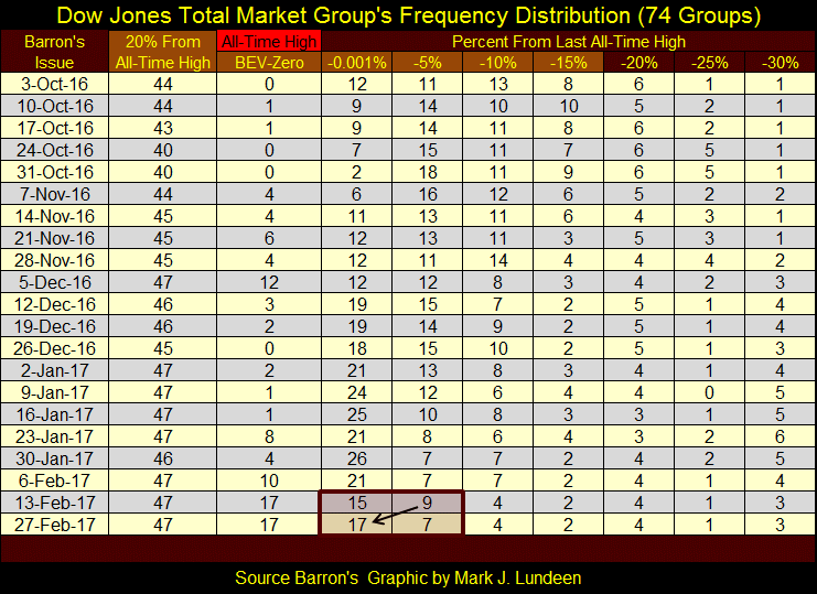
Here’s the DJTMG’s Frequency Distribution tables for the peak mania era of 1997, and at the March 2009 bottom; when the top 20 plot seen in the chart above hit 71 and zero.
Last Friday, I had some doubts whether gold would continue rising without first seeing a bit of a correction. Today, my doubts of last week proved groundless as gold closed over $1,250.
This chart is a comfort to me. During the period labeled “Failed Bull Box” that spanned most of last year, the trends in the price of gold and its step sum were disjointed. For bulls that’s usually good in a bull box. However, beginning in early November this bull box failed as the price of gold followed its step sum down to lower levels.
But note that since early November, gold’s price and step sum trends have been tightly correlated. Within days of each other, they both reversed smartly upwards last December, and have continued going up together since then.
Next target: $1,300!
In the step sum and 15 count table below, both gold and the Dow Jones are seeing a preponderance of daily advances. Both have seen their step sums advance by 10 since January 20th. Those net 10 daily advances took the price of gold up 4%, and the Dow Jones up 5% in the past twenty-five trading days.
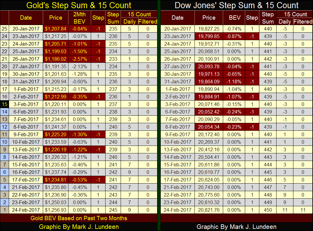
The remarkable feature above is seeing the Dow Jones’ 15 count rise from -5 to +11 in the past 25 trading days. Gold’s 15 count could also go to 11 next week if every day is an advancing day. Note the odd coloring highlighting days 1-15 on the table above. Those are the 15 days in the count. Gold has to get past that down day seen on February 9th with nothing but advancing days all the way to next Friday to do it, which I don’t believe is likely.
But for a market series to generate a (+/-) double digit in a 15 count is hard, as we see in the chart below. The chart itself plots the Dow Jones only from January 1900, but the table at the top goes back to the beginning of the Dow Jones Average itself in 1885. I’d like to plot the data in its entirety, but MS Excel has problems with charting data containing dates from the 19th century.
Anyway, since 16 February 1885, there have been 36,217 NYSE trading sessions. The table lists the number of daily market closes with the Dow Jones’ 15 count at +13 down to -13. In 132 years, the Dow Jones has never seen a 15. Note that the 0.00, or days where the Dow Jones’ 15 count were in single digits numbers at 35,902. So it’s accurate saying double digit 15 counts are extreme market events, an extreme event the Dow Jones has seen six times in the past year: a 15 count of +11. This is why the current bar in the chart has such a thick appearance.
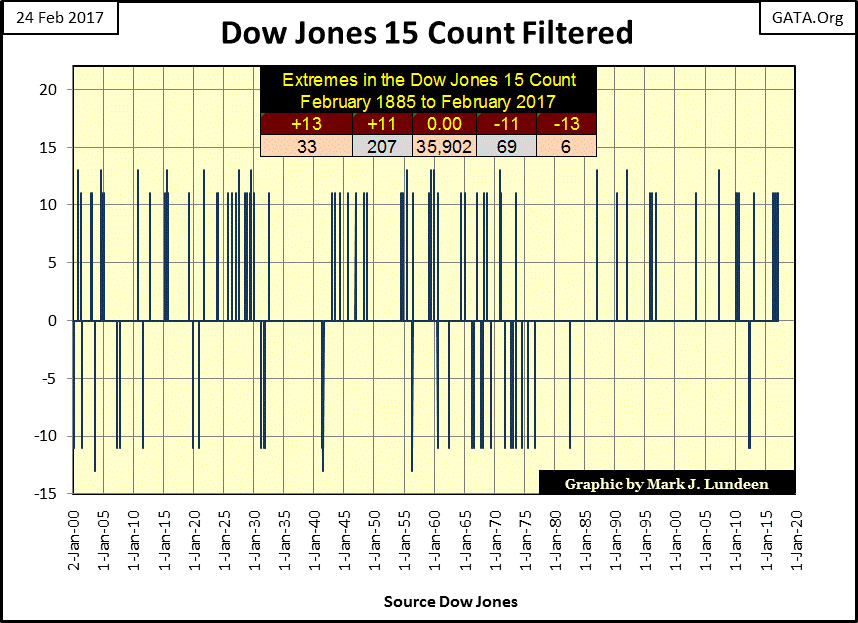
Two more observations to make on the chart above. The 15 count made a -11 in August 1982. This was just days before the official start of the bull market of 1982-2000. The Dow Jones 15 count wasn’t to see another -11 until May of 2012 – three decades later. That’s a big gap in the history seen above, a history that actually goes back to 1885.
Also, the frequency with which the Dow Jones’ 15 count made positive double digit counts was greatly reduced from August 1982 to March of last year, though we’ve seen six of them since. I haven’t counted them, but just looking at the chart above, one can see the paucity of (+/-) double-digit 15 counts since 1982.
I believe we are seeing yet another of those finger prints left behind by the “policy makers” as they “stimulated the economy” and managed stock market valuations for the past four decades.
I haven’t published any of the following economic charts for about a year, so let’s see what’s changed.
First is Consumer Confidence (CC) by the Conference Board. Going back to 1993, we see how CC in 2017 (113.7) is still far from its highs during the peak of the NASDAQ mania days (144.7). Consumer confidence is a contrary market indicator, where high positive consumer confidence isn’t necessarily good news for investors in the stock market. In fact it’s actually bad. Consumer confidence in early 2017 is now high enough to be a concern for market watchers.
Look at the table on the chart; CC peaked in January 2000 just as the high-tech bubble began deflating. Consumer confidence then deflated with the NASDAQ for the next few years, declining to 62.5 in the April 2003.
Consumer confidence’s next peak was in August 2007, just as the structural problems in the sub-prime mortgage could no longer be denied by members of the main stream financial media and the FOMC. The Dow Jones peaked two months later in October 2007. The collapse in CC during the credit crisis was horrific, bottoming at 25 in March 2009, precisely when Dr. Bernanke began “injecting” trillions of dollars of QE into the banking system.
The recovery in CC in the years following March 2009 matched the gains seen in the stock market. This shouldn’t be surprising. Since 1993 consumer confidence has obviously become a metric of the “policy makers” success or failure to maintain the stock market’s inflated market values.

So was January 2017 with CC finding itself above its highs of August 2007, flashing a market top? I can’t say as I don’t know; but I’m thinking it. However, if the “policy makers” continue having success in inflating stock market valuations to even higher levels, we can expect CC to continue climbing.
But I will say this; this is not the time to begin thinking of buying stocks. Rather, investors should be looking for reasons, any reason to sell their positions in the stock market’s current strength, and then go away with their money until consumer confidence, and stock and bond market values are far below where they are now. It might take the best part of a decade to fully deflate current stock market valuations.
Housing permits are at near post-credit crisis highs, but far from past highs in the housing market. One could interpret that to mean that the housing market currently is not at risk of deflation, as it’s not inflated in the first place. But I don’t believe that’s accurate.
My living memory spans the time period seen below. From personal recollection of the economic history, what we are seeing with the advances and declines in the plot of housing permits are what were once called by economists; the business cycle. The business cycle was the economy’s response to the increases and decreases in interest rates by the FOMC. Easy money policy stimulated home construction / tight money policy retarded home construction.
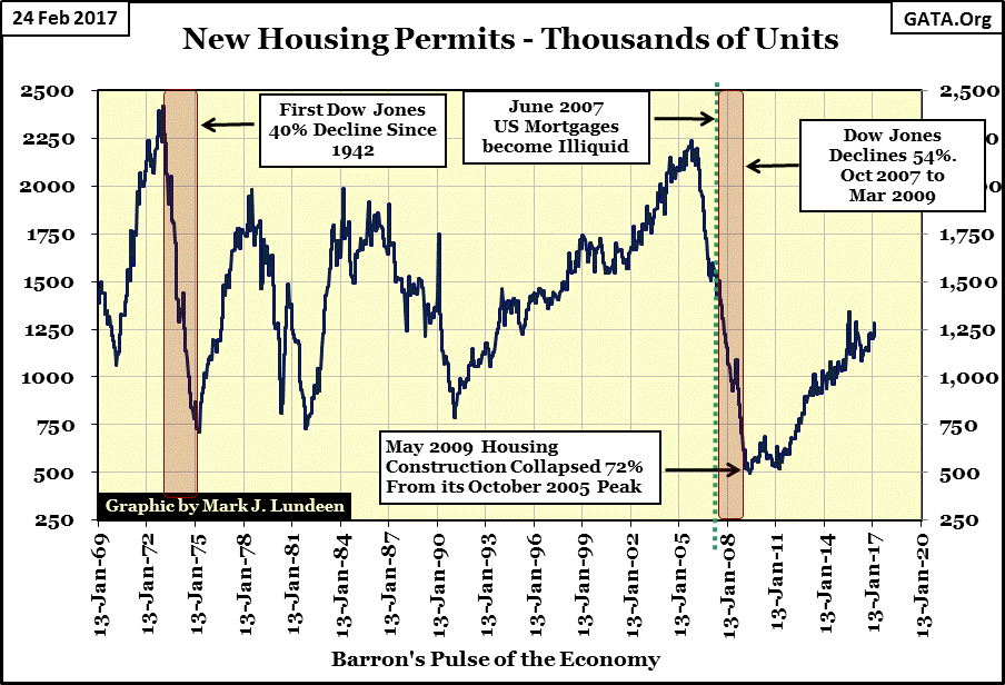
And so it appears from 1969 to 1991, when from its cyclical lows seen in February 1991, housing permits began an uninterrupted fourteen year period of growth that didn’t peak until October 2005. This period of market history stands out like a sore thumb; so what changed? For one thing Alan Greenspan was the Chairman of the Federal Reserve from 1987-2006, and “Easy Al” made inflating bubbles in the financial markets; stock, bond and real estate very fashionable with our “policy making” elite.
Greenspan’s timing for retirement was perfect. He vacated his position as chair of the Fed in March 2006, a year before cracks began to be seen in the sub-prime mortgage bubble he was responsible for.
Below is a plot of mortgage rates from 1964 to present. What were mortgage rates before 1964? I remember my father telling me the 20-year mortgage he took out for our home in the early 1950s had a rate of only 3%. But I can’t find mortgage rate data going back that far.
Mortgage rates peaked in October 1981, and bottomed thirty-one years later in October 2012. The impact this decline in rates had on real estate valuations can be seen in the table located on the chart.
Looking at what a $1,000 a month payment would afford in the mortgage market, we see that in October 1981 with rates at 18.53%, a “homeowner” could purchase a $64,500 mortgage, or house as real estate industry would have it. After thirty-one years, and a decline of 16.1% in mortgage rates, a “homeowner” could afford a $255,500 house on a $1,000 a month service. In fact, after thirty-one years, and a 16.1% decline in mortgage rates, it could be the same house purchased for $64,500 in 1981.

The 2.43% seen in October 2012 above increasingly appears to have been a bottom in mortgage rates. If the 3% mortgage rate regime of the early 1950s couldn’t survive the monetary inflation of the following decades, our current low rates won’t be able to either. Here are two quotes from the dusty old pages of Barron’s my readers may find interesting.
“November 15, 1951 reached a new low of 53 cents in terms of 1935-1939 dollar value. In extended comment on the shrinkage of the dollar, the National City Bank’s December Letter says: “From the standpoint of the creditor—the buyer of Savings bonds, the pensioner, the insurance beneficiary, the school teacher with lagging pay—the experience during and since World War II has been disheartening. Inflation is a concealed type of tax and these are the people who took the brunt of it.” In line with the repeated views of Professor Sumner H. Slichter, the City Bank adds: “People reconciled to a dollar of wasting value look around for real estate or other equity investments as a hedge against price inflation and dollar shrinkage.” -- Barron’s Editorial, 31 Dec 1951
Today, if there is one thing everyone can agree on is that the 1970s was a decade of rising consumer prices. But one really can’t understand the BIG PICTURE in inflation unless one understands that before the consumer price inflation of the 1970s, came the “monetary policies” of the 1940s-60s, as Barron’s documented above in 1951.
That plus the housing market has been dominated by America’s politicians for many decades. Again, from Barron’s here is an editorial comment on the Housing Act of 1954.
“The Housing Act of 1954 will turn out to be one of the worst pieces of inflationary legislation ever placed on the statute-books. For the first time, non- veterans will be able to buy a $10,000 house with a down payment of $500, the Federal Housing Administration insuring a 30-year mortgage of $9,500 on such a house. This is a triumph of the Nation’s Home Builder’s Association and a defeat of commonsense. Unfortunately, there is no reason to hope that mortgage money lenders will resist the practical consequences of this legislative monstrosity. Throughout the’ first half of’ 1954, most of them have been eager to make VA mortgage loans to home-buyers at no down payment at all.”
- Barron’s The World at Work, 05 July 1954, Page 7
So long ago, on a planet far away, “consumers” once needed only $500 for a down payment on a $10,000 house that looked remarkably similar to a $250,000 home on Earth today.
If someone were to do their research, they’d find that as with the rising mortgage rates from the early 1950s to 1981, so too the sub-prime mortgage crisis of the early 21st century, as both share a common cause – the US Congress’ insistence in interfering in the financial markets for political gain. But we’re not going to hear that from the main-stream financial media as they are either too lazy to do their research, or don’t want to rock the boat by doing right for the consumers of their reporting.
And exactly what might that be? To point out that 20th & 21st century history shows that whom Washington chooses to assist, be they homeowners or students attending college; they ultimately destroy by legislating low interest rate, government subsidized loans.
It’s only a matter of time before mortgage rates begin their inevitable advance to double digits, exactly as they did from the 1950s to 1981. When will this happen? With mortgage rates in the chart above seeing their bottom at 2.43% in October 2012, it may be happening now. Mortgage rates just haven’t crossed above their threshold of panic yet. But that threshold is lurking somewhere above the current high of 4.35% seen in September 2013, and we will cross above it in the years to come.
But with the typical mortgage sold with a 30 year term, most homeowners will see the equity in their homes come crashing down long before they make their final monthly payment decades from now.
For single family homeowners who can afford their monthly payments, fixed by their mortgage contract, this may actually be a blessing as monthly rent payments rise with the coming increases in consumer price inflation. But for real estate speculators using the mortgage market to leverage their position, the coming increases in mortgage rates will prove fatal.
The sad fact of life in the early 21st century is that there is just too much debt being serviced by too little income. That’s true for government servicing its debts with their tax revenues, corporations with their earnings, or consumers with their personal income as seen in the chart below.
Since 1993, consumer debt (Red Plot) has increased by a factor of 5.19, as personal income servicing this debt (Blue Plot) has increased by only a factor of 2.96. This is not good, especially should interest rates begin to increase, which one day they will.
Keep in mind that it is these same “consumers” (the “policy makers’ human resource”), that must also bear the burden of government’s taxes and who provide the demand for goods and services that corporations generate their earnings. Bankrupting America’s middle class will have consequences spread far and wide.
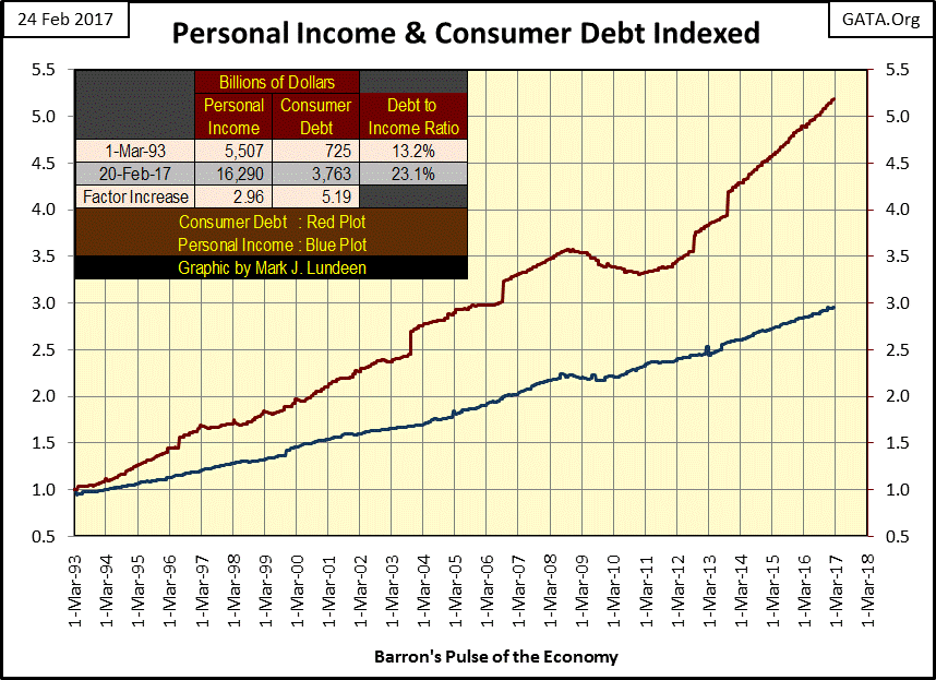
How much longer can this continue? I don’t see how it’s lasted this long! But with many in the baby boomer generation extinguishing their debt either by passing on to the next world, or by personal bankruptcy, I can guarantee you these trends in consumer debt and personal income won’t continue on for another twenty-four years.
Largely unreported in the FAKE mainstream news, internet service providers such as Google and Facebook are attempting to run the new generation news providers, such as BREITBART and INFOWARS, off the internet by denying them access to streams of income from advertising, or the outright refusal of access to the internet of their reporting.
This outrage of the First Amendment is pure sour grapes from the Democratic party, whose operatives in these giant corporations blame the “alt right” news organizations for the victory of Donald Trump over Hillary Clinton. They intend not to let this happen again.
Well I hope it does, so I urge all my readers to give BREITBART and INFOWARS a chance, and for a couple of days visit them to see what they have to offer you in news. You may be enjoyably surprised by what you see, because it ain’t CNN!
As I don’t use Facebook myself in publishing my articles, but websites by members of the pro-gold internet media; I urge them (and everyone) to support BREITBART and INFOWARS to any extent they can during this, their time of trouble. Because after these evil people take care of the above mentioned internet sources of daily news, the “policy makers” will soon be coming for any internet content provider that dares to publish market commentary such as I send them weekly.
Mark J. Lundeen
[email protected]
share
share
share
share
share
More from Gold-Eagle