
HUI Goldbugs Index…Some Perfect Chartology
 share
share
 share
share
 share
share
 share
share
 share
share
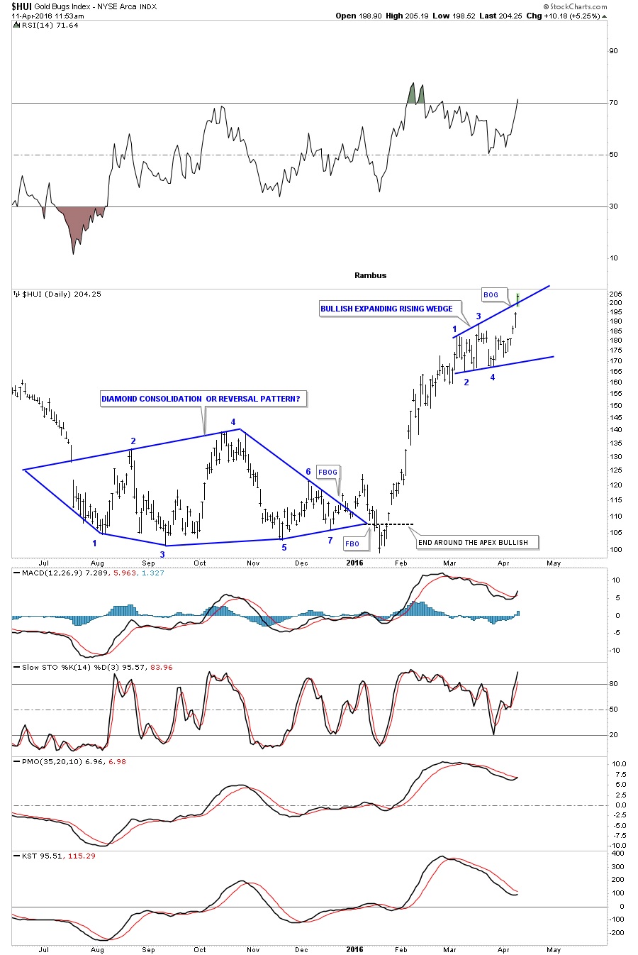
Below is a daily chart for the HUI which shows one of the original patterns that formed what turned out to be a Diamond Reversal pattern to the upside. There are at least several more reversal patterns that formed at this most important low. As you can see the Diamond had seven reversal point making it a reversal pattern to the upside. The breakout was accompanied by a gap and then a backtest to the top rail. Everything looked good to go at that point then after just four days of rallying the HUI quickly reversed direction and traded below the apex of the blue triangle which is not what I wanted to see as that usually is a bearish setup in this case. After trading just four days below the apex the price action reversed hard again to the upside negating the end around the apex move. That was a shakeout before the breakout or bear trap. Again as we’ve discussed in the past when you get a false breakout in one direction you’ll generally see a big move in the opposite direction. That false breakout of the blue Diamond was the bears’ last hope to push the HUI lower…but they quickly ran out of gas and the bulls then took control which initiating the short covering rally.
Since the initial high during the first week of March, the HUI has been consolidating that first impulse move up forming a bullish expanding rising wedge which broke out this morning with a breakout gap.
This second daily chart for the HUI shows a clean five point expanding triangle reversal pattern. The breakout was a little sloppy but the backtest held nicely on the last touch. It’s always nice to see some type of consolidation pattern form on top of an important trendline which is generally a bullish setup in this case. The moving averages had a nice cross back in February with the 20 and 50-day ema’s crossing above the 200-day simple moving average.

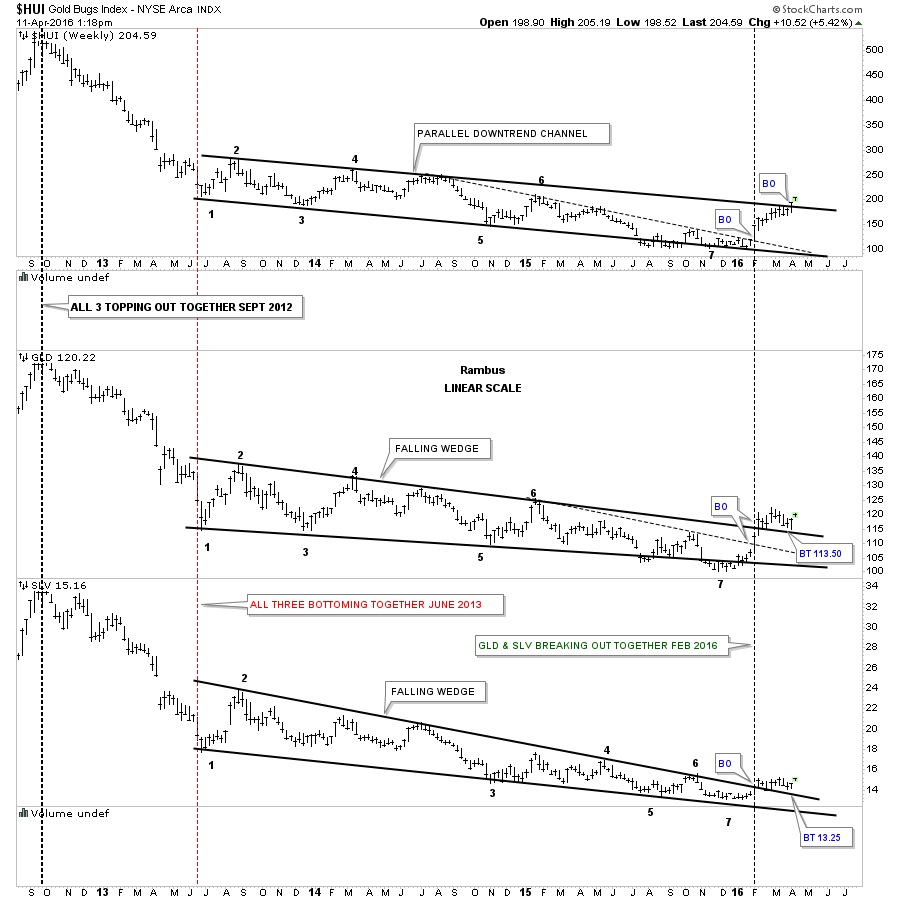
This next chart is a weekly combo chart which has the HUI on top, gld in the middle and slv on the bottom. We’ve been following this chart for a very long time which shows the massive 3 1/2 year consolidation patterns that each one has formed. Both GLD and SLV broke above their top rails several months ago already while the HUI is just now breaking out above its massive seven point bullish downtrend channel. It’s charts like this one that helps us confirm the bull market is still alive and well. If we see the price action become very weak and start trading below the top rails of their respective 3 1/2 year trading ranges then we’ll know there is trouble but as long as the price action keeps confirming the bull market it is what it is.
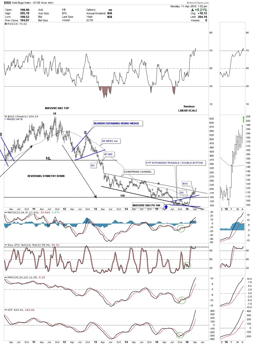
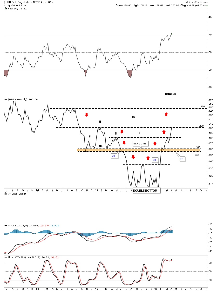
Below is a weekly chart which shows the massive H&S top and the bear market that ensued once the neckline was broken to the downside back in 2013. At the bottom of the chart, you can see the blue 5 point expanding triangle that formed which was the reversal pattern to end the bear market for the HUI. I put a red circle around the breakout and backtesting process of both the expanding triangle and the top rail of the downtrend channel. It’s very subtle but you can see the price action broke above the top rail of the downtrend channel first and then backtested it. The HUI then rallied above the top rail of the expanding triangle and then backtested it before moving higher. They’re inconsequential to most folks but for me these little clues all add up to paint a picture that one can make a game plan to follow and as long as the game plan is working stick with it and don’t try to outsmart yourself by looking at every trendline thinking it’s the most important line on the chart. In a bull market, the surprise will be to the upside as today’s price action is showing.
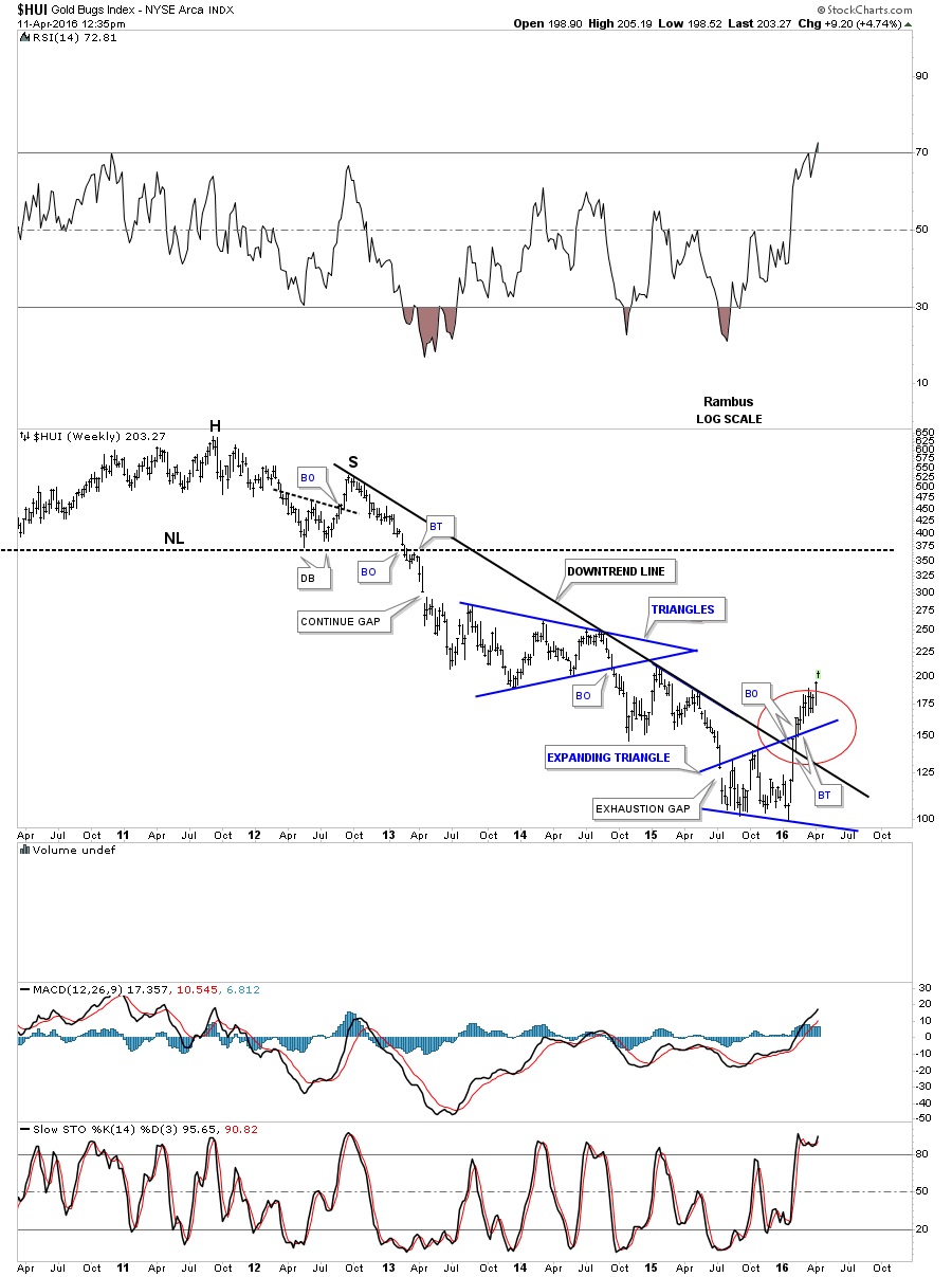
This next weekly chart for the HUI shows a good example of how this bull is unfolding from a Chartology perspective by doing all the right things. This is the ping pong chart we’ve been following which shows the expanding triangle forming on the bottom rail of the 3 1/2 downtrend channel. The breakout above the blue expanding triangle also coincided with a breakout above the 2008 crash low which was a very important low which had been violated to the downside last summer. Trading back above that crash low was a big deal. It’s interesting that this morning the HUI had a gap opening which is right at the top rail of the 3 1/2 year downtrend channel. It won’t surprise me in the least if we see a backtest on the top rail of the downtrend channel before it’s all said and done which would add more confirmation especially if it holds support. There are no rules tho that say we have to see a backtest either.
This last chart for the HUI is a weekly line chart that shows there have only been two weeks since the January 2016 low was put in place, where the HUI fell. This kind of price action makes it hard for the bulls to take a position if they missed the bottom and it makes it hard for the bears who are looking for some weakness to reduce their short positions. Confounding both the bulls and bears alike is what makes this move so special. Everyone can’t get in at the bottom and everyone can’t get out at the top.
share
share
share
share
share
 Rambus Chartology is Primarily a Goldbug TA Site following the precious metals markets. Chartology is the Unique Blend of Technical Chart Pattern Identification and Market Psychology, Developed by Rambus During the Tech Mania of the late 1990s. His Early Training came the old fashioned way...Reading Edwards and McGee's Bible of Technical Analysis and spending years with a sharp pencil graph paper and ruler refining his skills and accuracy. Visit the Rambus Chartology website at http://rambus1.com/.