
Market “Stability” As Seen By The Dow Jones
 share
share
 share
share
 share
share
 share
share
 share
share
If you’re willing to ignore the behind the scenes shenanigans in the stock market; central-bank market stabilizations, management driving their companies deep into debt to fund share repurchase programs, and dubious earnings numbers, then Wall Street is doing just fine. But to some degree the gains seen in the stock and bond markets are a result of losses taken by savers who (due to low interest rates) have been forced out of banks deposits into investment vehicles with significantly higher market risk. This is by design.
In a world where money comes from central banks, local banks don’t need depositors’ savings. What central banks need to maintain the appearance of solvency in the banking system is for grandma’s money to flow into the financial markets. But no matter how much money the aged and infirm, (including Janet Yellen) send to Wall Street, no bull market can advance forever. So this is a perfect time to examine where the stock market stands from a historical stand point.
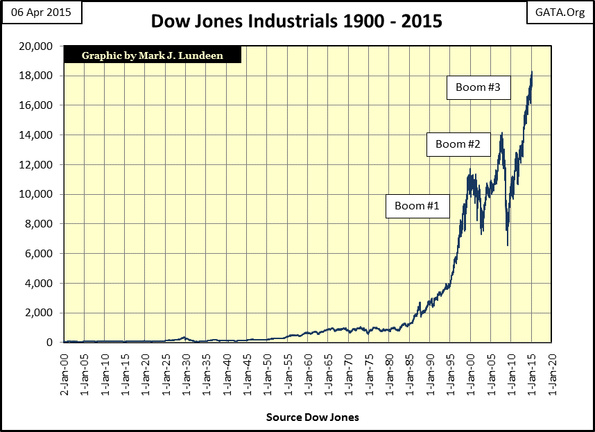
Below we see a dollar plot of the Dow Jones from January 1900 to April 2015. Where’s the Roaring 1920s’ bull market and depressing 1930s’ bear markets? Occasionally someone writes in suggesting that I plot this data on a logarithmic scale for a better view of the last hundred and fifteen years of Dow Jones movements. I could, but plotting the Dow in dollars better illustrates the Federal Reserves’ exponential inflation of its valuation. The Roaring 1920s’ bull market saw the Dow Jones peaked out at an astounding (at the time) 381 points on 03 September 1929. Today a 381 point daily move in the Dow Jones has no more significance in the chart below than does the entire Great Depression crash.
The stock market gains since the credit-crisis bottom of March 2009 are actually quite frightening. The bust following our current boom (the third boom of an inflationary cycle which began around 1990) could easily drop below the lows of six years ago when it pops.
How far could the Dow Jones decline during its next bear market? Using the Dow’s dividends one could make a case for 1,000 on the Dow Jones: a 95% market crash, larger than the market decline the Dow suffered in July 1932. Currently the Dow Jones is paying $405 a year in dividend cash payouts. A 75% reduction in current cash payouts (similar to the decline in dividends the Dow saw from 1929 to 1933) would take us to the $100 line in the table below. With the current Dow Jones yield of 2.29%, this alone would take the Dow Jones down to just above 5000, some 1500 points below its March 2009 bottom. But historically, all significant Dow Jones market declines have also seen its dividend yield rise. In July 1932 the Dow Jones was yielding over 10%, and a 10% yield with $100 in cash payout prices the Dow Jones at exactly 1000.
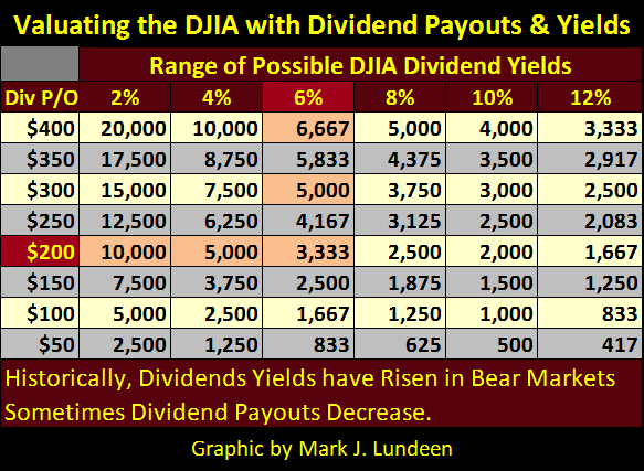
How likely is this? I don’t know of any school of economic thought that doesn’t place the responsibility for the Roaring 1920s’ boom, and the blame for the 1930s’ bust on the Federal Reserve’s first two decades of “monetary policy.” Honest economists admit a connection between the high-tech & mortgage bubbles subsequent busts with Alan Greenspan’s “monetary policy.” Choosing to believe that this current monetary insanity will not have deflationary consequences of biblical proportions is unreasonable (as suggested by the Dow Jones dividend table above). But market bulls never want to discuss dividends. The big question they keep asking themselves is “when will the Dow Jones rise above 20,000?”
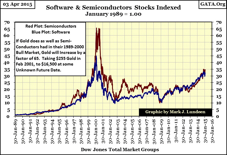
In March 2009, with all the lingering problems of the mortgage bust still burdening the global banking system, I expected gold to reach $16,000 before the Dow Jones ever did. My reasoning was that from 1989 through 2000, semiconductor stocks, the hot investment of the late 1990s, increased by a factor of 65 due to Alan Greenspan’s “monetary policy” (Red Plot below). Since the time of the Roman Empire, gold has always become THE hot investment during the credit liquidations which always follow credit booms. The tiny gold and even smaller silver market should have seen gains as great as the huge semiconductor industry. Taking gold from its February 2001 low ($255), a gain of sixty-five times would have gold price at $16,500.
However following the mortgage bust there was no cycle of credit liquidation. Instead the Federal Reserve and other central banks “monetized” worthless mortgages by paying full face value for them with inflation in order to save their precious banking system. If we haven’t yet seen gold rise to $16,000, it’s only because central banks have managed to prevent the financial system from purging itself of trillions of dollars of dubious credit assets.
Since December 2008 American “monetary policy” has gone berserk. The Federal Reserve’s balance sheet has expanded by a factor of five over the past seven years monetizing non-performing loans and US Treasury bonds.

Multiply $16,500 (gold’s performance had it equaled the semiconductors stocks from 1989-2000) by a factor of five (the increase in the Fed’s balance sheet since 2008) and the gold content of a 1913 $20 gold piece could be $82,500 in today’s inflated paper dollars. But predicting future gold prices based on past performance of unrelated market events isn’t reasonable; or is it?
Look at it this way: inflation created by central banks flows where their banking system directs it for instance to loans for real estate or to fund corporate stock buybacks using corporate bonds. But after these newly created dollars, yens or euros execute their initial purchases for their creators (the central banks), they now are the property of economic entities (like you and me and companies other than banks) who worked hard for these arbitrarily inflated units of currency.
People always want to do better this year than last. However, private individuals and financial entities outside the protective umbrella of the central banking system understand very well that there is no one to bail us out when we fail. As most of the money created in the past by central banks (like the Federal Reserve in chart above) is already in the hands of people outside the banking system, a market panic could easily overwhelm the best efforts of the “policy makers” to “stabilize” the stock and bond markets. It’s important to understand that central bankers aren’t God, but little people sitting behind desks a few sizes too big for them.
As long as the financial markets continue to advance, central banks can maintain the appearance of “market stability.” However we live in a world wallowing in unserviceable debt, created by these same central banks. There is an unknown threshold level in the stock market, (and yield in the bond market) where people like you and I will decide to exit Wall Street taking what’s left of our money. But then what? Some of that money will flow into gold, silver and precious metals mining shares.
"The prudent sees danger and hides himself, but the simple go on and suffer for it."
Proverbs 27:12 (ESV),
As the gold and silver markets are minuscule compared to the capital that would be exiting the stock and bond markets, the metals gains would be multiples of the losses seen in the financial markets and couldn’t go unnoticed by any investor, even those formerly antagonistic to the idea of investing in precious metals. And even those who had been invested in precious metals ETF’s such as GLD and SLV, or other precious metals derivatives might be in for a rude surprise as their ETF’s cease to track the actual price of bullion, and descend toward their actual value, likely zero. Like the high tech stocks of the late 1990s, a mania could easily develop in gold and silver where the higher their prices increased, the more willing people would be to pay higher prices for them as other financial markets deflate.
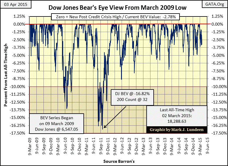
Looking at the stock market, how large a decline in the Dow Jones would it take to cause a panic away from Wall Street and into the precious metals? No one knows, but if you want to get a clear picture of the declines in the Dow Jones, it’s best to look at the Dow like Mr Bear does; with the Bear’s Eye View (BEV). Below is a BEV plot of the Dow Jones daily closing prices from February 1885 to April 2015.
A BEV plot negates the effects of one hundred and two years of inflation from the Dow Jones’ valuation by converting each new all-time high into a Zero percent. All daily closings not new all-time highs are converted into a negative percentage from their last all-time high. This is Mr Bear’s view of the market where each new all-time high is a big-fat zero, as all Mr Bear cares about is how large a percentage he can claw back from the bulls at any point in time. In the current battle royale between the “policy makers” and Mr Bear, the “policy makers” are having their way with the market. But trust me on this; Mr Bear isn’t going away.
As you can see below Mr Bear’s view of the Dow Jones is a history of market declines. However since its March 2009 bottom the Dow Jones has only advanced, but that will soon change simply because market also go down, as the Dow has many times since 1885. Looking at the Dow’s BEV plot below, it appears to me that its current advance is becoming very stale.
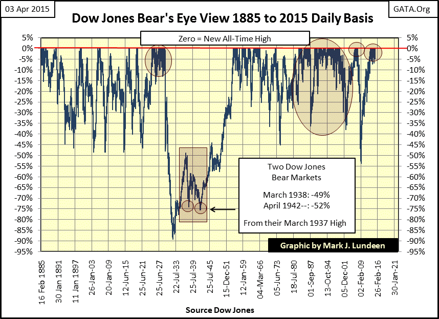
One has to keep in mind that the Dow Jones is comprised of only thirty large blue-chip stocks trading in New York; but since 1885 it’s been an excellent barometer of the general market. Currently central banks are inflating a bubble in the global bond and currency markets. What’s happening with the Dow Jones is merely incidental to current “monetary policy.” With the Dow currently around 18,000, I don’t believe that it’s reflecting the actual free-market value of the thirty Dow Jones stocks themselves, so what good is following the Dow Jones?
I see the recent gains in the Dow (since March 2009) as an indication of the success the central banks have had forcing their inflation to flow toward critical markets to maintain prescribed valuations. When this “policy” begins to falter, we’ll be able to detect it by noting when the Dow Jones once again begins to see what I call 2% days, days where the Dow Jones closes more than 2% up or down from the previous day’s closing price.
Here is a chart plotting every daily move of +/- 2% or greater since January 1900. In the chart they appear to be regular market events, but that’s not exactly true. Of the 31,264 trading sessions at the NYSE since January 1900, only 1,795 of them have seen a Dow Jones move of 2% or more from a previous day’s closing price. Following World War Two up until 1973, it could sometimes be years between 2% days.
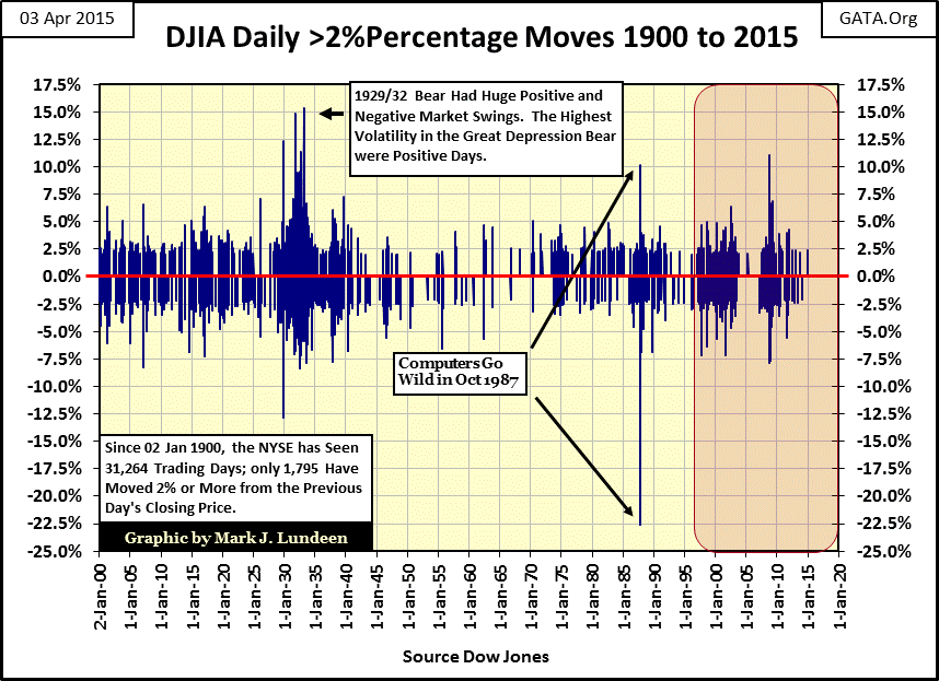
Curiously, the largest positive daily moves in the Dow Jones have been during the worst market declines. Think of this as Mr Bear making sure even bears shorting the market during the Great Depression crash and mortgage crisis got their share of grief.
The next plot is what I call the Dow Jones’ 200-Day Count, or the number of 2% days in a running 200 day sample, a more utilitarian view of the data seen in the chart above.

It’s easy spotting the big bear markets; bear markets see lots of Dow Jones 2% days, with one exception: the April 1942, 52% bear market decline which bottomed with a 200-day count of only six. After the devastating market crashes of 1929-32 and 1937-38, few people cared if the Dow Jones crashed again in 1942. Isn’t that what the stock market did, crash every few years? Anyway in April 1942 the United States was occupied with a world war and few people, including reporters noticed the 52% decline in the Dow Jones. But in retrospect it was the safest and most profitable entry point into the stock market since January 1900.
To better illustrate the effects of a rising 200-day count on the Dow Jones, and the stock market in general, I’ve prepared the table below. The number 1 & 2 bear markets (A & F in the table) saw the most, but ever since January 1900, anytime the Dow Jones sees more than a few 2% days in its 200 day count, the potential for significant market declines are at the door.

Next is a chart for the Dow Jones (Red Plot / Right Scale) and its 200 day count (Blue Plot / Left Scale) from 1990 to present. Keep in mind that the 200 day count is similar to a 200 day moving average in that its peaks lags as much as several months behind the index itself.
Below we see market volatility (the 200 count) decline in the early 1990s in the wake of the leveraged buyout boom / bust of the late 1980s. As the high-tech bubble began to inflate in 1992 the stock market would see no more than two 2% days in the 200 count until late summer of 1996. A year later the count had increased to nineteen for no apparent reason. However remember that this was at a time when Greenspan himself was concerned about “irrational exuberance” in the stock market. In late summer of 1998 Wall Street was in crisis when the Long Term Capital Management hedge fund went bust, sending the Dow Jones 200 day count up to twenty six. The 200 day count would oscillate between 10 and 28 until the high-tech crash ultimately bottomed with the count peaking at 49.
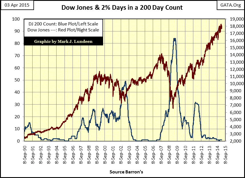
After the count peaked in 2003, it quickly collapsed as Alan Greenspan imposed “market stability” - again - by inflating yet another bubble in the sub-prime mortgage market. From April 2004 to July 2007 the 200 count never rose above one during the hot housing market, and was usually at zero throughout these three years. However, problems in the mortgage market began increasing to the point where the new Fed Chairman had to deny them in May 2007.
"We do not expect significant spillovers from the subprime market to the rest of the economy or to the financial system." -- Fed Chairman Ben Bernanke, May 17, 2007
In July 2007 the Dow Jones’ 200 day count began an ascent that would not terminate until it had increased to 84 Dow Jones 2% days in late winter 2009. During this rise in the 200 count, the global banking system came very close to collapsing under the weight of abandoned mortgages in their reserves. After “market stability” was once again restored by inflating the latest bubble in the global bond and currency markets, the Dow’s 200 count declined as the crisis ended.
The last spike in the Dow Jones’ 200 count happened in autumn of 2011, when it increased to thirty two as the Dow Jones declined by only 16.82%. This 16% decline in 2011 developed more 2% days (in a 200 day count) than did the horrific crash of 1907 (thirty 2% days on a 48% Dow Jones decline). Market historians credit the crash of 1907 with motivating Wall Street insiders to lobby Congress for the creation of the Federal Reserve in 1913. Why the 2011 decline developed so many Dow Jones 2% days can’t be explained; but I suspect market insiders were keeping their eyes on the exits (and Doctor Bernanke) for fear the market might crash once again. It’s also interesting to note that at this time gold saw its last all-time high ($1,888). Since then the “policy makers” have been supporting the stock market and suppressing gold and silver prices – for good reason.
Since autumn of 2011 the Dow Jones has increased 7,633 points without a single correction larger than 8.75%; meanwhile its 200 count has declined to one. The stock market has been “stabilized”, but when we examine the Dow Jones’ daily volatility 200 Day Moving Average below there’s reason to believe the best of that “stability” is now behind us.
As noted in the chart, every major market decline since 1900 can be identified when the plot increased above the 1% line, except for the April 1942 Dow Jones 52% market crash (triangle). Currently the 200 Day M/A is just a tad above the 0.50% line, but in December it was below it. Are we seeing the beginning of a new cycle of rising volatility; and declining market prices? Like me, you’ll have to wait to see what happens.
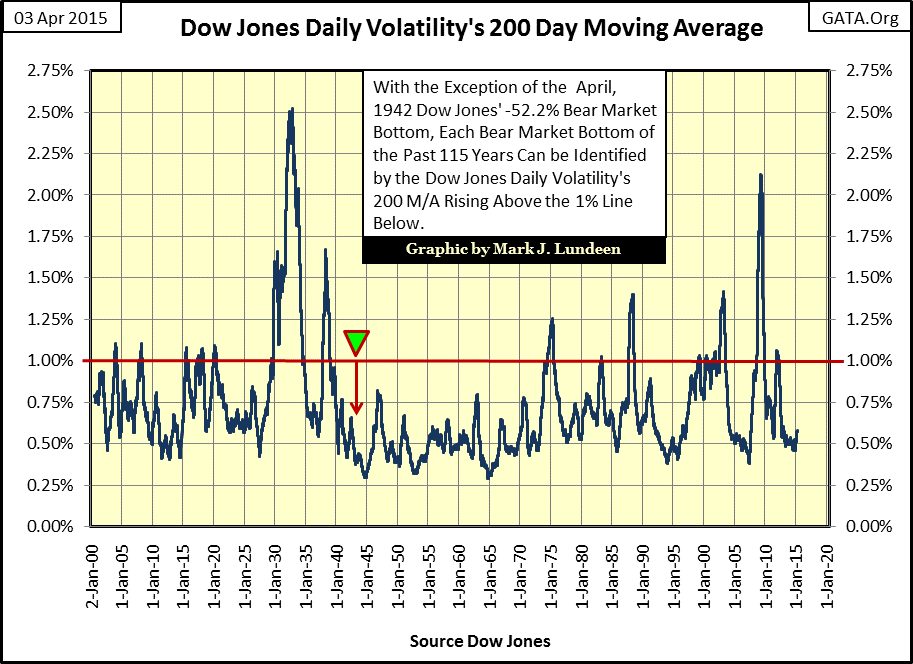
In 2015 “market stability” the world over is only a legal fiction, supported by central bank “liquidity injections” and financial derivatives with a notional value of over a quadrillion dollars. I’ll be keeping an eye on the Dow Jones BEV plot above, because the day is coming when the Dow will once again fall below its -10% BEV line. When it does, I expect it will do so with a rising 200 day count as the market once again prepares for a history making bear market. That thought doesn’t make me happy, but it does make me want to buy more gold and silver.
share
share
share
share
share
More from Gold-Eagle