
Market Analysis Via Four New Charts
 share
share
 share
share
 share
share
 share
share
 share
share
For some months now, I have been experimenting with some new charts. Purely by chance I found long-term data of the DJIA on the data base of the Brazilian Central Bank in the form of the monthly close, going back to before 1900. (Thanks Google)
Playing around with it, the results were fascinating!
More recently, I searched for other similar data and found some, again on the data base of the BCB, but also on the Federal Reserve data base. Again the results were most interesting – in particular because it seemed that some major US markets are reaching very interesting technical positions right now, at the end of 2015. Four of the charts appear below, not all as explicit as one would like, but all showing some signs of reaching a period of major changes in trend.
Despite the fact that changes appear quite imminent, the charts are multi-decade in duration and whatever happens now will take years to develop. Nevertheless, in 2016 the new rends should become visible. In that sense, this report is a preview of the New Year 2016.
1. US 10-year Treasury note: 1962 - 2015
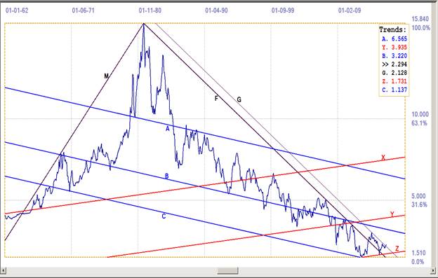
Chart 1: US 10-year Treasury note: monthly close. Last = 2.294%
A similar chart with the same master line has been used before, but this is the first time that a full analysis appeared to fit properly. The main pennant was not drawn, as the two channels, ABC and XYZ, seemed more pertinent. Line F is the shallower, inverse derived trend of master line M, generated from the top of the chart in 1980 and only in 2007 coming into play again – the first of three times trend line F acted as market support for a bearish Treasury note.
The break higher above line F in mid 2013 was read as the start of a long term bear market. However, the yield soon reversed lower again – strongly suspected of being under the influence of the Federal Reserve who, on behalf of the authorities, did not want to see the mortgage rate increasing to trip the housing market. Of course, the rates were being kept low also to avoid shearing off the ‘green shoots’ that most of the official spokespeople were seeing all over.
The reversal lower could have reached line F again before turning bearish again and that would have been a classical ‘goodbye kiss’ on line F, after a major break from the pattern. When the yield continued lower, to break below line F again in January 2015, it seemed that the bull was set firmly in place. When the yield broke above line F again just a month later, the bear was back in place. New market support at line G became the target and the yield is breaking higher right now, in December of 2015, and will have broken higher on the 30th if the bond market is closed on the last day of the year.
The two channels have the exact same ratio, at 384:616, very close to being equal to the Fibonacci ratio, 382:618, which is the second most frequent ratio seen on all charts – and typically associated with strong chart patterns. It therefore seems that the break back below line F intended to reach line Z, as then happened. Such brief breaks of very few periods duration through a major trend line happen frequently in order to satisfy the presence of a nearby preferred gradient.
With the break above line G – and perhaps to see a new goodbye kiss, this time on line G during 2016 – the long term bear is back in control of the Treasury note. Line B is the first level of significant market support and it remains to be seen if the new trend will be as steep during the bear markets of the late 60s and late 70s.
2. Dow Jones Industrial Index: 1985 - 2015
The chart shows only the latter and more interesting part of the chart that stretches back to before 1900. The master gradient, M, defined between the top of the 1987 bull market and the more recent low after the 2008/9 sell-off, is practically identical the same as the trend line that connects the highs in 1929 and 2011. Line A passes through the first part of the top in 2011 – with a brief spike higher, similar to what happened at line F in Chart 1, during the attempted goodbye kiss.
That location is correct for line A, because then the channel ratio of channel ABC at 481:519 is then exactly the same as the channel ratio of channel BCM. The recent research has highlighted the importance of channel ratios in the development of an analysis and applying this principle was attempted in all four these charts. Also note that lines B and C pass through significant bifurcated patterns; a frequent feature of important preferred gradients. At 392:608, the ratio of channel XYZ differs from the frequently seen 400:600 channel ratio only in the third decimal, which is acceptable accuracy over this extended time scale.

Dow Jones Industrial Index. Monthly close. Last = 17604 (12-30-2015)
With one day’s trading left in 2015, the DJIA is sitting poised, either to break clear above line X to remain bullish, or to close below that resistance to signal a probable bearish start to 2016. Interesting times!
3. Silver fix. Monthly close. 1968 - 2015
The most impressive part of this chart is how line X, parallel to master gradient M, which is defined between the extreme spike tops, fits accurately through low points in the two very steep bifurcated tops. Then the steeper gradient of line P also picks out two other bifurcated centre points. This good fit adds credibility to the analysis.
Coincidence strikes again, as both channels MXY and ABC have channel ratios that are exactly the same, at 384:616, just two points off in the third decimal from the Fibonacci ratio, 382:618. The technical implication is that silver, when it held at and reversed higher off line Y at $14.56 on the monthly close, should have started off on its new bull market. Instead, the price reversed steeply lower off the initial spike higher to break clear below lines Y and B.

Chart 3. Silver price. Monthly close. Last = $13.82 (12-30-2015)
This break would normally not be expected, but the first two charts both had false breaks through significant trend lines, or preferred gradients. This break lower can also turn out to be such a brief and limited break, perhaps even with this new low right at the support of line R. The value of line R in the trend Table is $13.82, which applies to January, 2016. The line value for December is exactly $13.80, which can be in place for the fix on the 30th, one day before the end of the year.
The ratio of channel PQR is a strange one, at 464:536; line R is drawn for the best fit through the number of small trend reversals at the chart low. It now remains to be seen if it will hold into the silver fix on the morning of the last day of the year.
4. Gold PM fix. Monthly close. 1968 - 2015
The master gradient is a steep gradient from the early history of the gold price PM fix. It is generated tangent to an early part of the bull trend, in the early 1970s and the low of the large bifurcated top in the early 80s. Line X is parallel to line M, and so located it passes just by the centre of the second large bifurcated top in 2011.
With these two lines in position at key points on the chart, line Y was positioned so that the channel ratio, 498:502, was as close as possible to the ideal 500:500 ratio of a channel that is evenly divided.
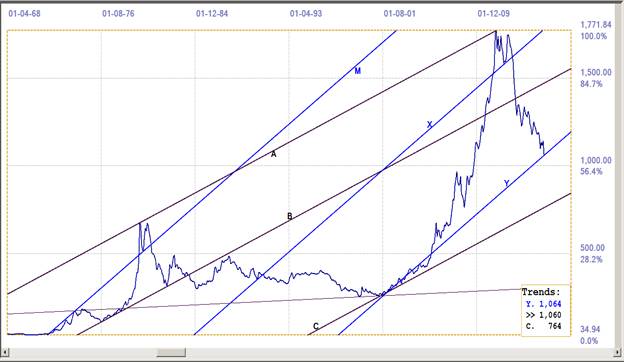
Chart 3. Gold PM fix. Monthly close. Last = $1060 (12-30-2015)
If, as usually happens, there is only an AM fix on the last day of the year, which does not count, the $1060 on the 30th will be 2015’s closing PM fix for gold. This is right at line Y, which has a value of $1059.50 for Wednesday, 30th December. The $1064 in the trends Table then is the line value for the first PM fix in January 2016.
Conclusions
The fits of the channels on all four charts obey what is known of the features of the preferred gradients that were discovered more than 30 years ago and studied since. As mentioned, certain new discoveries using monthly charts were recently made – the charts shown here are the first of the new versions to be published.
The charts are fascinating in terms of the unique analyses they present, and even more so in terms of the long term implications for major changes in trend for the four major markets these charts represent. Time will tell.
Best wishes to all readers for a peaceful and prosperous 2016 and the good health to enjoy it to the full.
©2015 daan joubert, Rights Reserved
chartsym (at) gmail(dot)com
share
share
share
share
share