
Market Timing Using The Dow Jones’ 200 Count
 share
share
 share
share
 share
share
 share
share
 share
share
The Dow Jones Index made its last all-time high (BEV Zero) on August 7th - and for the past fourteen trading sessions the Dow moving in tiny baby steps, hasn’t gone further than 2.01% from it. Following this market is like watching paint dry. Moreover, it’s been that way for weeks. But about the time you believe you have a market figured out, it always goes that someone changes the rules.

Somewhere up ahead market volatility will once again dominate the stock market. Ahead of us are days where the Dow Jones can, and will move (+/-) 5% or more in a single trading session. It’s called a bear market, so I spent much of this week’s focus on the Dow Jones 200 Count below, or the number of days the Dow Jones has moved (+/-) 2% or more in a running 200 day count.
Before we do that, let’s look at trading volume for the NYSE (Red Plot below) and the Dow Jones itself (Blue Plot). Trading volume is demand for what Wall Street is selling to the public.
Maybe not for each individual day; but over time rising demand results in rising market prices; falling demand declining prices. This explains why bull markets are liquid markets, as it’s easy even for large institutions to sell securities in volume at market prices. In bull markets, there are many bidders in the market willing to pay top dollar for what sellers have to offer.
However, bear markets are illiquid markets, sometimes even for retail traders who discover there is no one looking to buy what they desperately want to sell, at any price. At the bottom of a big-bear market, there may be no bids at all.
Looking at the insert in the chart below (1979 to 1999), demand for stocks trading at the NYSE increased, and so did the share prices in the biggest bull market of the 20th century. But beginning in 2000, things became weird.
At the High-Tech (Red Triangle) and Sub-Prime Mortgage (Red Star) bear market bottoms, trading volume was near or actually at all-time highs. Before 2000, seeing an ocean of “liquidity” flooding into the stock market at a bear market bottom was unheard of; but so far in the 21st century it’s happened twice. And in these 21st century bear markets it wasn’t just market demand for the thirty companies that make up the Dow Jones (Blue Plot) that stands out; NYSE trading volume (Red Plot) didn’t collapse either. In fact it was just the opposite.
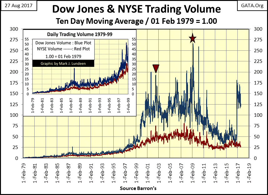
Another anomaly in the chart above is how from March 2009 to October 2016, just before last November’s election, the Dow Jones surged over 11,000 points on collapsing volume. That’s not supposed to happen, but there it is!
These are important points to keep in mind, as they prove how for the past seventeen years the stock market has been managed by forces other than natural supply and demand. When our “policy makers” lose their grip on market valuations, I’m anticipating a historic bear market.
Will the coming bear market also see an ocean of “liquidity” flooding into it as did the last two market declines? Maybe at first. But ultimately, I’m anticipating a bear market that operates as bear markets have in the past, where institutions and retail investors will find selling shares at acceptable prices increasingly difficult as the market declines, to almost impossible at any price at the bottom of the bear market.
That really sounds horrible, and it is – if you’re trying to sell. But for those who have money at bear market bottoms, and have the courage to pay $0.25 for what cost a $1.00 during the bull market, my hats off to them as this is how the game is supposed to be played.
Sounds so simple, but it’s not as doing this is operating outside normal market psychology. At the beginning of a bear market, market participants still believe the market is going higher, so market declines are incorrectly seen as buying opportunities. But on the way to the bottom, one by one, investors wise up – the stock market isn’t for making money, but for losing it. It’s a lesson from Mr Bear most people don’t soon forget.
But bottoms are just that – bottoms. Try as he may, Mr Bear just can’t claw back anymore from the bulls. So for investors who can ignore the oppressive negative psychology of a bear market bottom, they’ll find bargains of a life’s time. But buying takes money, and you won’t have any money if you don’t sell near the top, and have the patience to wait until Mr Bear is finished with all he has to do!
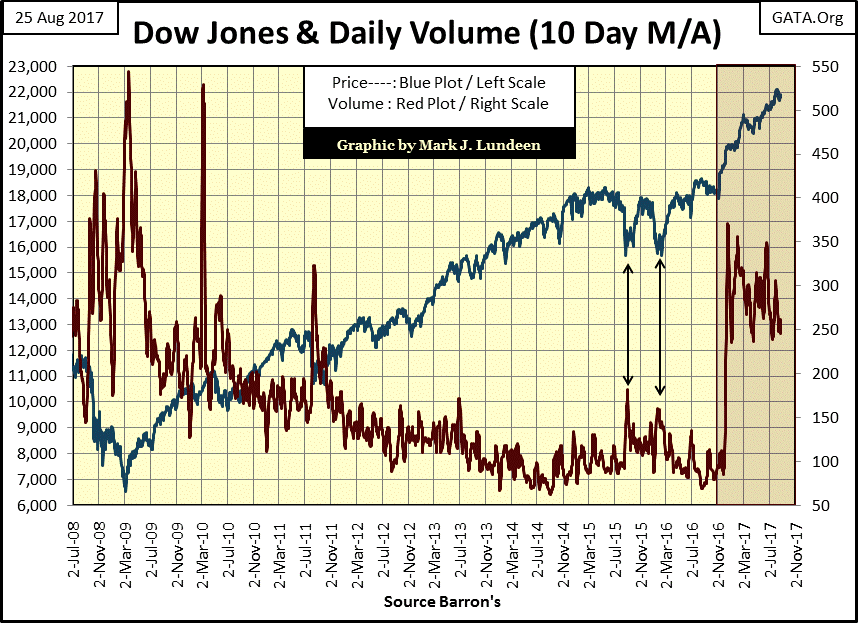
Here’s a shorter term chart for the Dow Jones with its trading volume from 2008 to today. Incredibly, from March 2009 to October 2011 the Dow had advanced over 11,000 points as its trading volume collapsed. How is this possible? How can this be good?
The future may be bleak, but our present is looking pretty good. At least the T-debt market thinks so. This T-Bond’s yield may be a good way’s up from the low of last summer, but it’s down from where it was last February. Obviously this market’s “regulators” have everything under control.

But I note this bond was issued with a 4.5% coupon in February 2006, and sometimes yielded over 5% before the mortgage crisis. I can’t help but think that sometime in the coming unpleasantness, it will once again yield 5%, on its way to double digits.
Of course that would imply a massive bear market for bonds of all sorts. As illiquid as the stock market may become, the coming bear market in corporate bonds will be worse.
Here’s the Dow Jones with its step sum. Nothing new here, and I still say that on a short term basis, the path of least resistance for the stock market continues to be up.

And with the earnings for the Dow Jones once again on the rise, why wouldn’t it be? Still, I see a demon lurking about in the chart below. After the collapse in earnings during the Great Depression Crash, the Dow Jones enjoyed rising earnings for the next five decades. However, I note that beginning in the early 1980s earnings for the Dow Jones developed a bad habit of crashing. They even went negative during the credit-crisis bear market.
But then Doctor Bernanke sprinkled his pixie dust on corporate America’s balance sheets – massive amounts of credit at “attractive low rates”, and look at how earnings for the Dow Jones recovered. I guess everything is alright now, and that is how it will stay until the economy slows down and these companies begin struggling to service all the debt they’ve taken on in the past decade. What earnings will look like in the chart below when that happens isn’t hard to figure out – far from where they are now.

Considering everything, gold and silver bullion is looking better and better as we go ever deeper into the 21st century.
So how come gold can’t break above its highs of last summer and silver struggles with $17? Well, let’s just say that the FOMC and other government “regulators” are doing everything they can to keep the old monetary metals from getting their fair share of the pixie dust they’ve been sprinkling on the stock and bond markets.

As of Thursday this week, the Dow Jones’ 200 count again found itself at zero (chart below). The last Dow Jones 2% day (day of extreme volatility) occurred on November 7th of last year (+2.08%), and that 2% day is now out of the 200 day count. Since last November the Dow Jones hasn’t see a day where it moved (+/-) 2% or more from a previous day’s close, so its 200 count is now zero.
To understand the importance of this, let’s take a moment to study the past twenty-seven years of the Dow Jones (Blue Plot below) and its 200 count (Red Plot) to appreciate the relationship between market volatility with bull and bear markets.
The 200 count below begins at 15, but this is only an echo of the market volatility from the 1983-87 Leverage-Buyout Market bubble and the October 1987 flash crash. The Dow Jones declined 23% on Monday 19 Oct 1987. A whopper of a Dow Jones’ 2% day, the largest single day decline in the history of the Dow Jones.
The mishap behind this history making move is as unique as it was predictable; large financial institutions were beginning to use computers to hedge their positions, and unfortunately their computers ran on similar software. On Monday October 17th the robots ruled Wall Street, as each flooded the markets with mindless sell orders. No one in a position of authority, either at the NYSE or the financial institutions did anything as they were all paralyzed with fear of what would happen should they turn their computers off – so the robots continued selling.
In the wake of this trauma, the Dow Jones’ 200 count increased to 43 by the following June. However, in the following years the market recovered its confidence. At the very beginning of the High-Tech Market bubble we once again see the 200 count in the very low single digits in the early 1990s.
Keep in mind the High-Tech bubble was primarily a NASDAQ event. Still, I’m using the Dow Jones in my chart as it’s a superior historical proxy for the stock market than the NASDAQ. The NASDAQ only goes back to the early 1970s, but using the Dow Jones we can compare this market with those of the late 19th century if we wanted to.
The first indication of the high-tech problems to come was an increase in market volatility (rising 200 count) beginning in February 1997, three years before the actual bear market began. During those three years, and for most of the following 38% bear market decline, the 200 count oscillated between 10 & 25. However, at the climax of the High-Tech bear market the Dow Jones’ 200 count shot up to 49 as the bulls capitulated.
As the 200 count again declined into the low single digits, the “policy makers” began inflating a bubble in the single family housing market, from which the stock market benefitted greatly. Then in July 2007, three months before the Dow Jones saw its sub-prime mortgage bubble top, its 200 count began to rise. The increase in market volatility didn’t stop until April 2009 (a count of 84) the month following the Dow Jones’ second deepest bear market bottom since 1885 (-53.78%).
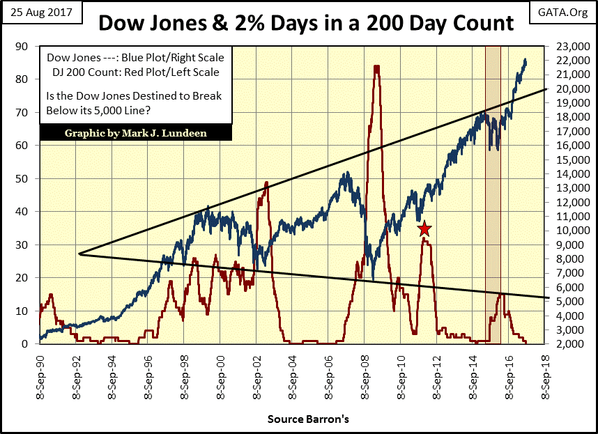
The next spike in volatility occurred in autumn 2011 (Red Star), over concerns of the US Treasury approaching its debt limit. The Dow Jones itself was down only 15% from its highs of April 2011, but the 200 count increased to over 30. In hindsight this was an overreaction, but market memories of the credit-crisis crash were still fresh.
The next bout of market volatility came in Late August – September 2015 and again in Late January – February 2016 (Red Box). These two market declines were identical to the autumn 2011 decline (-15%) but they each produced less than ten Dow Jones 2% days. However, as they came within 200 days of each other, the seven 2% days from the summer and the eight for the winter totaled 15 days of extreme market volatility by March 2016.
This is a good point to keep in mind, since the beginning of 2012 (last 5.5 years), market volatility has been quite low as the Dow Jones advanced 10,721 points or 78%.
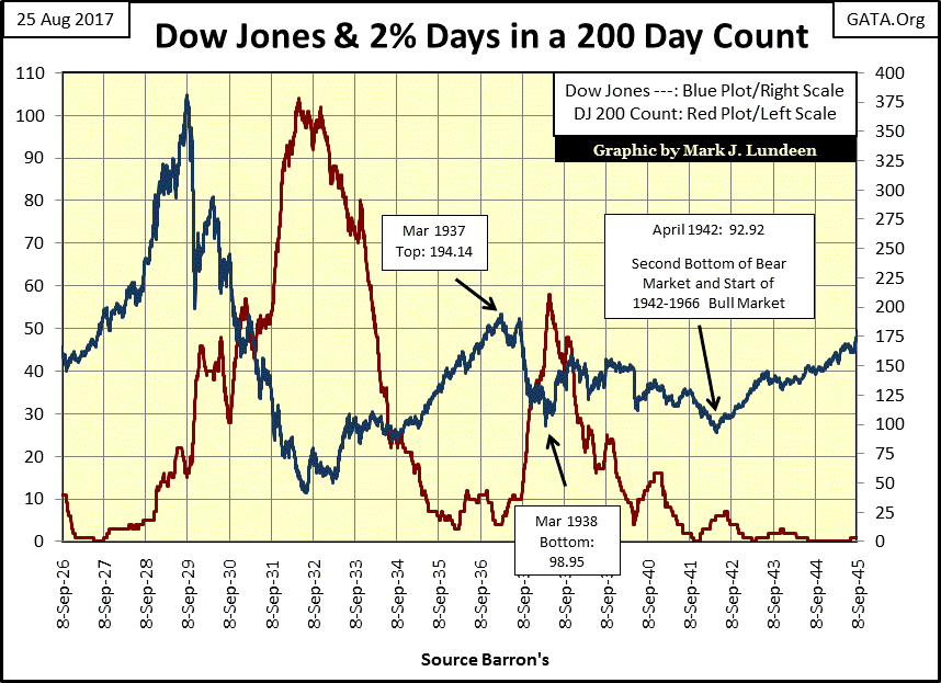
This relationship between market volatility and bull and bear markets is not a new phenomenon. It was present during the Roaring 1920s and Depressing 1930s, as seen in the chart below.
I won’t comment in detail on the market action below, but point out some useful Dow Jones’ 200 count rule-of-thumbs. If the stock market is going up, market history suggests it’s safe being bullish as long as the Dow Jones 200 count remains below 5.
With the 200 count closing this week at zero, and if what you’re doing is making you money, there is no reason for you to stop doing it. Or so the history seen in the charts above and below would have us believe, and I for one believe it.
Thinking about big bear markets, seeing the Dow Jones’ 200 count between 5-9, the potential of a market decline is growing even if the Dow Jones is still going up, or could actually begin its initial bear market decline before the 200 count sees a 9. And seeing the 200 count above 10 is as good a reason to immediately exit the market as any other you’ll find. These market declines, and advances in the 200 count can take years, and see many twists and turns. So don’t begin to second guess your decision to exit the market.
When should you return? Again, look at these charts. As the 200 count advances during a bear market, it’s impossible to know how high the count will go, or how it will travel to its ultimate top. The High Tech and Great Depression bear markets saw the Dow Jones’ 200 count oscillate up and down for over twenty months before surging to its ultimate high. No so with the sub-prime mortgage and 1937-38 bear markets, which saw their 200 count advance from low values to their ultimate highs almost in a straight line.
Just understand that market bottoms occur as selling pressure reaches its point of exhaustion; the point where the market refuses to go any lower. This is also the point where the 200 count also sees its ultimate bear-market peak. But no one will know the ultimate count of any bear market until its 200 count begins to decline.
Keep in mind a 200 count, like a 200 day moving average, tends to lag the market by weeks or even months. Although that wasn’t true for the Great Depression bear market bottom in July 1932 (chart above), for the other bear market in these charts that was true.
In any case, patience is a virtue in a big-bear market. Waiting for the 200 count to begin declining from its ultimate peak in three of the four bear markets highlighted in this article provided safe and extremely profitable reentry points for investors. The 1937-42 bear market didn’t follow this pattern, proving there’s no sure thing in the stock market.
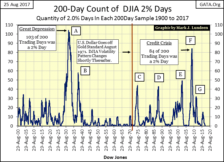
For your information, I’m including the above chart for the Dow Jones 200 count from 1900 to 2017. Note how market volatility increased after the US took the dollar off the Bretton Wood’s $35 gold peg. And I don’t see anything done by the Yellen Fed to make me believe that anything has changed.
I know it’s coming, volatility spike H in the above series. I expect it will be real history in the making when it finally arrives, though I couldn’t tell you when. Like I said before, patience is a real virtue at times like this.
Mark J. Lundeen
share
share
share
share
share
More from Gold-Eagle