first majestic silver

The Mythical Magical Bullish Rising Wedge

April 1, 2013

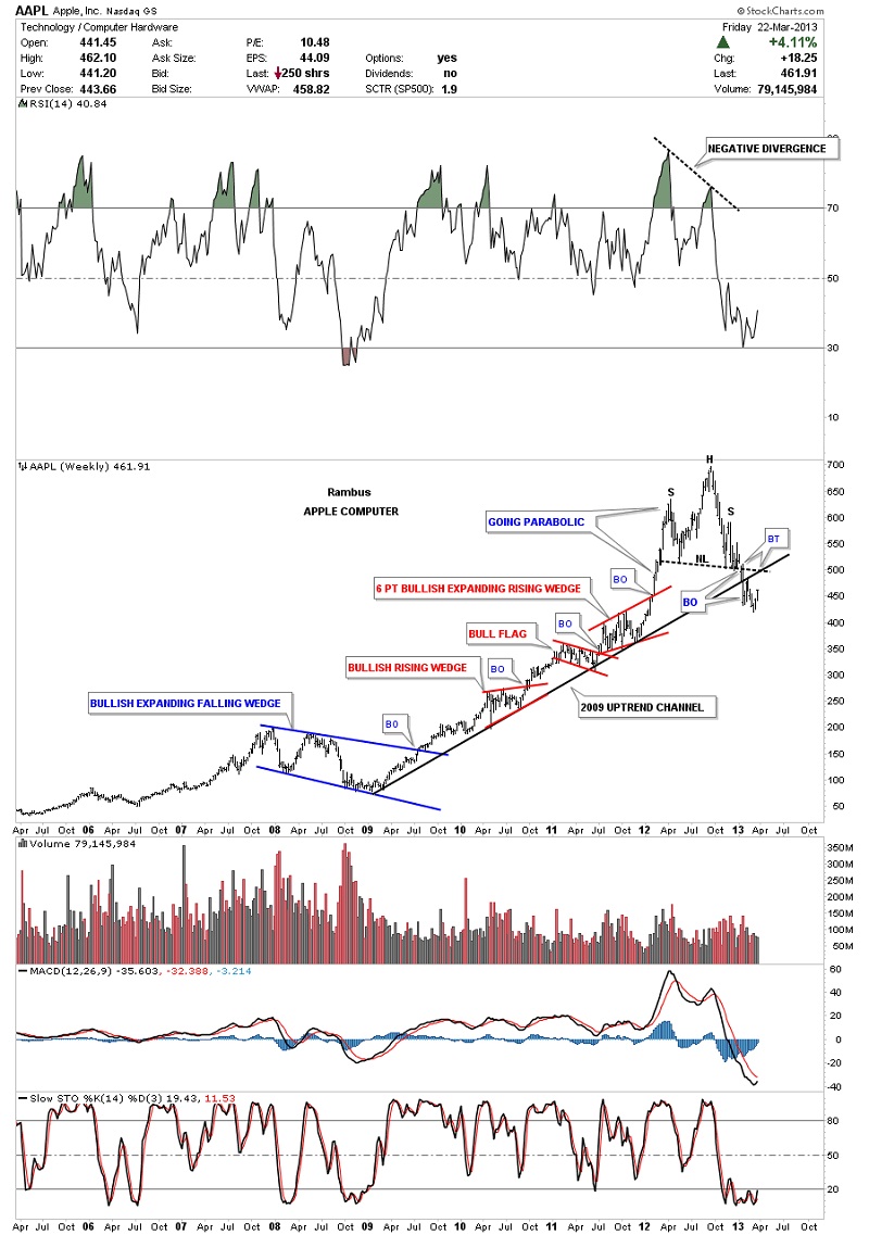
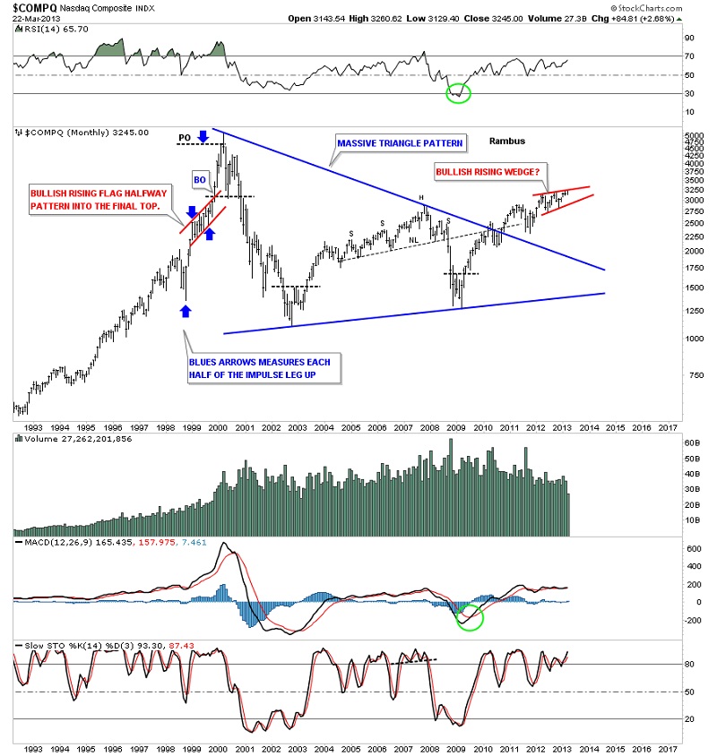
In today's Chartology Report I would like to clear up a misconception about rising wedges and flags. I have gotten more negative e mails from folks that assure me there is no such thing as a bullish rising wedge or flag. I'm repeatedly told to go back to charting school to learn my lesson. These type patterns are missed by 95% of chartists because they supposedly don't exist and if they do exist they can't be trusted. Keeping an open mind in the stock markets is the first lesson to learn. That means anything is possible regardless of what is  taught by the so called experts. I've been following these two types of patterns for many years and find that are just as reliable as any another consolidation or reversal pattern.

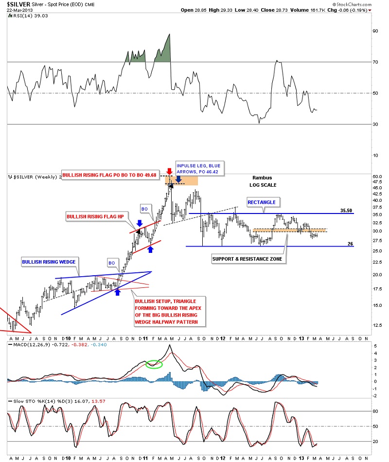
A bullish rising wedge or flag forms in an uptrend. Instead of pointing down into the uptrend these type of patterns point up into the uptrend. A typical consolidation pattern, like a bullish falling wedge or flag, points down in an uptrend which everybody sees and is accepted as the norm.

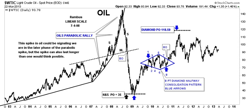
I have found out through many years of following these bullish or bearish wedges or flags that they tend to show up in fast moving markets. When a stock is in a strong move up you can see series of these patterns that from one after another until a top is reached. The opposite is true in a downtrend where you can have a series of bearish falling wedges or flags form. They are also like any other consolidation pattern that generally shows up as a halfway pattern.

Let’s look at a few charts that shows a very bullish move up that is made of several bullish rising wedges or flags. PCLN is a perfect example of what I've described above. Note the inverse H&S  bottom that formed at the end of 2011 at roughly 450 or so. Note the three red bullish rising patterns that made up that impulse leg to the double top at 775 area. The move was so strong that the bulls never let the correction take on the shape of a normal consolidation pattern that forms pointing down in to the uptrend or a sideways type pattern such as a triangle or rectangle.
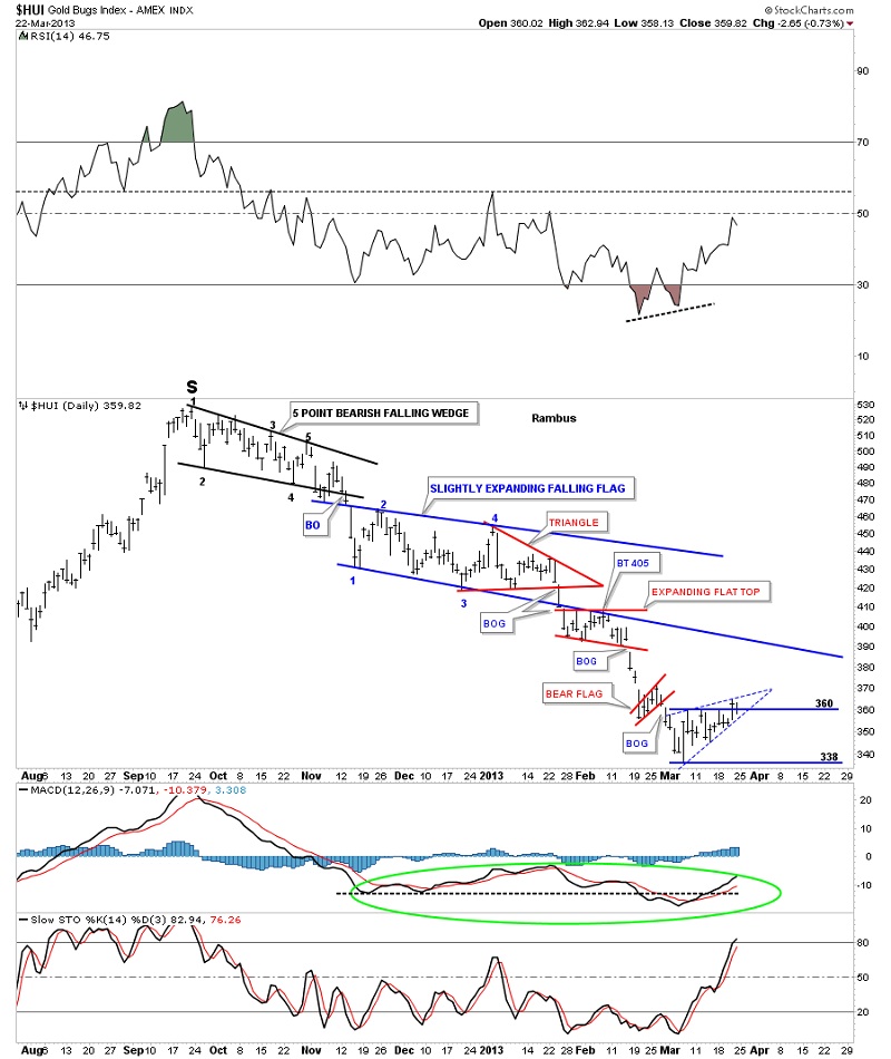
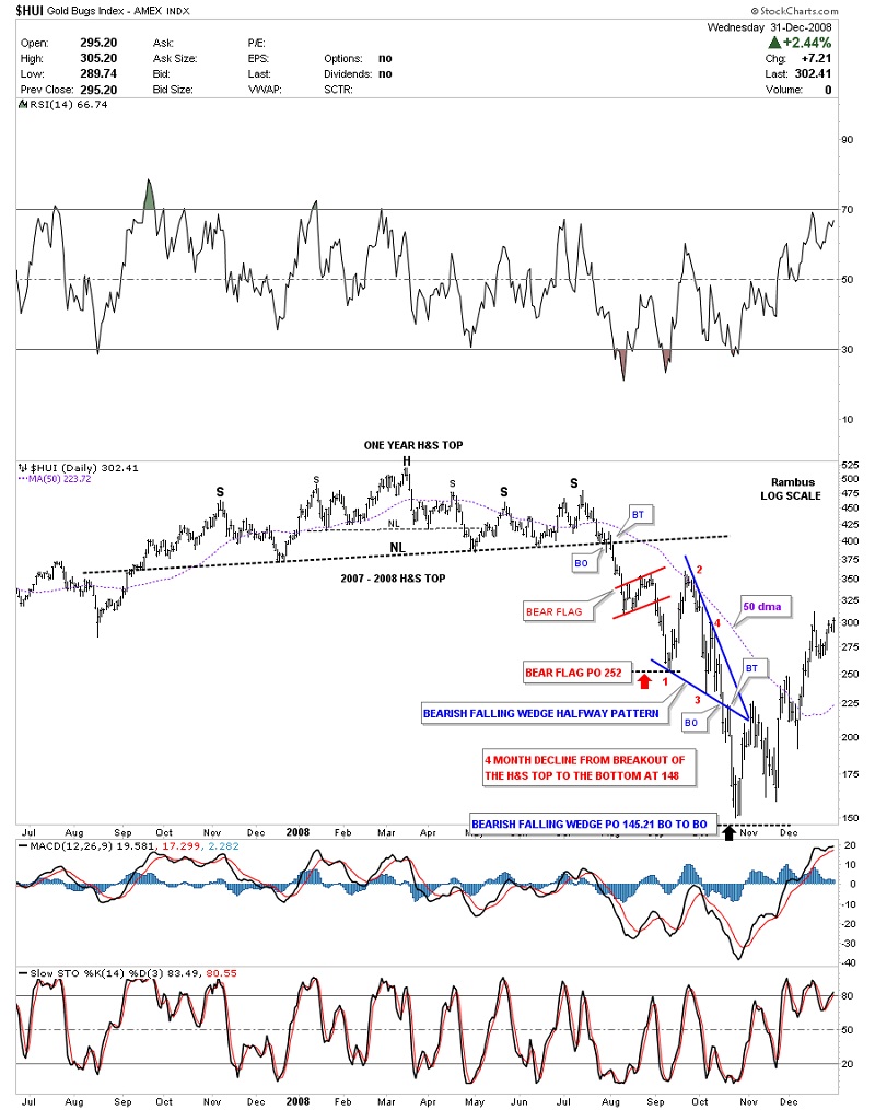
APPL had a strong move up off of the 2009 crash low that went parabolic starting at the end of 2011. Before it went parabolic there were three small consolidation patterns that formed. The first one was a bullish rising wedge that is slopping up into the uptrend. The second little red consolidation pattern was your more " normal" consolidation pattern that was a bull flag that pointed down into the uptrend channel which most chartists would have recognized. The third little red consolidation pattern took on the shape of a six point bullish expanding rising wedge that is pointing up into the uptrend. The last reversal point in this pattern started the parabolic move to the top at 700 or so
Let’s look at one more example of how these small bullish rising patterns work in a strong uptrends. Back in 2005 the SSEC formed a nice inverse H&S bottom that launched the parabolic run China had over the next year and a half or so. Again you can see the two lower red consolidation patterns that formed were pointing up into the uptrend. This is a sign of a strong market. At the time I made a comment after the H&S top formed that something wasn't right because China, which was the strongest market in the world, was topping out. Note how the parabolic uptrend collapsed once the uptrend reversed down. This is generally how parabolic moves end. Even after almost five years the SSEC has been dead in the water unable to make new highs.
I just want to take a minute and show you another parabolic spike that crashed and burned in oil back in 2008. It actually went down faster than it went up.
Next I would like to show you a six point  bullish rising flag that formed back in 1999 on the COMPQ. If one would have known that these type of patterns existed he could have gotten out at almost the exact top just before the crash took place in the tech stocks. As with a lot of consolidation patterns they tend to form at a halfway point in a rally. The chart below shows how I measured this bullish rising flag as a halfway pattern. The two red rectangles are exactly the same size that measures price and time.
This next chart for the COMPQ is a long term chart that shows the bullish rising flag that formed back in 1999, same pattern that is on the chart above. If you look to the right hand side of the chart you can see there is a potential red bullish rising wedge that is knocking on the door of the top rail.
Just so you don't think that these bullish rising wedges, I've shown you on the charts above are a fluke, let’s look at a beautiful bullish rising flag that formed between 2004 to 2007 on the Dow Jones. The red arrows measures the bullish rising flag as a halfway pattern to the infamous 2007 H&S top that led to one of the biggest declines in US stock market history. Again knowing what to look for would have given you a big heads up that the move was going to exhaust itself once the price objective was met. Before we leave this chart I would like to show you another bullish rising wedge this is now just breaking out on the right hand side of the chart. A backtest to the top rail, at 13,900 could happen at any time if there is a backtest. I always like to see a backtest to confirm a chart pattern. It doesn't happen all the time but when it does it’s a nice confirmation.
The NIKK formed a bearish falling flag or channel halfway pattern after completing its own parabolic rally back in the 1980's as measured by the blue arrows.
Gold has produced two bullish rising wedges so far during its bull market. You can see the first one was a blue bullish rising wedge that formed back in 2004 to 2006 time frame. The second one formed in 2010. Again you can see that gold has been in a strong bull market, up until the last couple of years, which is one reason we see two bullish rising wedges that point up into the uptrend.
Silver produced two beautiful bullish rising patterns during its parabolic move to 50. The blue bullish rising wedge formed in 2010 that launched the first leg up of the parabolic rise. You can see the red bullish rising flag that formed as a halfway pattern that led to the second impulse leg up. Again knowing that these type of patterns form at roughly the halfway point gives one a clear heads up on where to look for a top or the start of another consolidation pattern.
AMZN formed a bullish rising flag back in 2009 that was the right shoulder of a H&S consolidation pattern.  It could be forming another bullish rising wedge, at present. Time will tell.
Let’s look at a couple of current bullish rising wedges that are forming in the banking sectors. The first chart is the KRE which is a Regional Banking ETF. It broke out of its bullish rising wedge three weeks ago.
The XLF is another bank ETF that broke out of its bullish rising wedge three months ago.
The US dollar made a near perfect bullish rising wedge back in the late 90's that measured out almost perfect as a halfway pattern. As you can see once the price objective was met the dollar formed a H&S top that reversed the uptrend and started the 13 year bear market.
Let’s look at a chart that has several downwards slopping chart patterns that has shown us how weak the HUI has been since the high made back in October of last year. You can see the first pattern is a five point bearish falling wedge that was a reversal pattern. The price action then went on to form a slightly expanding bearish falling flag that has four reversal points. I know everyone is wanting to be the first one to call the bottom in the precious metals stocks but it’s been a losing battle since the October high. Chartology 101 shows a series of lower highs and lower lows all the way down. To call a bottom has been like trying to catch a falling knife. A lot of hands have been cut trying to call the bottom.
The next chart I would like to show you is a perfect bearish falling wedge that formed on the HUI back in the 2008 crash. Keep in mind these types of patterns show up in fast moving markets. I've labeled the four reversal points with red numbers. What cemented the bearish falling wedge was when the price action backtested the bottom blue rail. You can also see how the bearish falling wedge shows up almost exactly in the middle of the downtrend as measured from the breakout of the big H&S top. 
Deja Vu ?

All the charts above are created from the old school of charting that seems to be a dying art with all the technical indicators out there right now. I still believe there is no better way to analyzing a chart than to watch the price action above all other indicators. There is a place for some if the indicators but sometimes you can get conflicting signals by watching too many indicators. That can cause paralysis just when you need to make a move.  I hope I've been able to show you that these patterns are legitimate and have a spot in everyone's book of chart patterns.


Editors Note:

Rambus Chartology is a Precious Metals Based Technical Analysis Site with a twist

"Give a Man a Chart and he can eat for a day : Teach a man To Chart and He will never Starve"

More Info and  Charts a   http://rambus1.com/

Rambus Chartology is Primarily a Goldbug TA Site following the precious metals markets. Chartology is the Unique Blend of Technical Chart Pattern Identification and Market Psychology,  Developed by Rambus During the Tech Mania of the late 1990s.  His Early Training came the old fashioned way...Reading Edwards and McGee's Bible of Technical Analysis and spending years with a sharp pencil graph paper and ruler refining his skills and accuracy. Visit the Rambus Chartology website at http://rambus1.com/.


Gold is the world’s oldest and most known currency.
Top 5 Best Gold IRA Companies

Gold Eagle twitter                Like Gold Eagle on Facebook