
Seven Months After Dow 18,000 The Bull Is Exhausted
 share
share
 share
share
 share
share
 share
share
 share
share
Two months ago I wrote an article on our lackluster market, how the post credit crisis bull was slowing down. Reasonable people understand that the stock market can go down as well as up; so after a six year run that pushed the Dow Jones up 180%, maybe it’s time to stop looking for reasons to buy stocks and begin looking for reasons to sell. Since May 8th the Dow Jones has made two new all-time highs (Red Star below / May 18th & 19th). However two new all-time highs don’t necessarily confirm the continuation of an aging bull market. Since the Dow Jones made its last all-time high it has been slowly deflating so I thought I’d pick up this topic again but with charts using different data series.
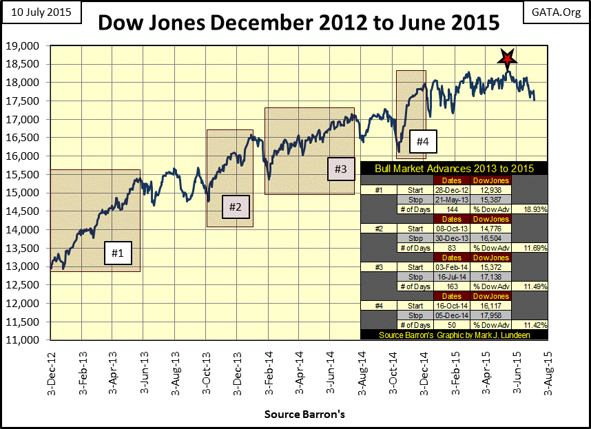
Below is a dollar plot of the Dow Jones from December 2012 to present highlighting the four bull-market advances of the past three years. Number 1 was the most vigorous with a 19% gain during a 144 trading day run. Advances #2&3 both saw gains of about 11.5%, but advance #3 took twice as many trading days to achieve it. Advance #4 also saw an 11.5% gain, and did it in just 50 trading days it also took the Dow Jones above 18,000 for the first time. However having accomplished that, the bulls seem to have lost their enthusiasm.
There is nothing in the chart below that suggests doom is around the corner, but it’s now been a full seven months since the bulls first took the Dow Jones above 18,000 and it won’t look good to investors if it doesn’t make a move soon on 19,000. The imminent advance to Dow Jones 19,000 may be the thinking of many retail investors, but with the bearish market events now occurring in Europe and Asia, I expect market professionals have already distanced themselves from the American stock market.
Let’s examine the Dow Jones Bear’s Eye View (BEV) plot from its credit crisis low of 09 March 2009 through today. One thing that immediately stands out is that the Dow Jones hasn’t suffered a single double digit correction since August 2011. After four years it’s about time for the stock market to clear out the dead wood.

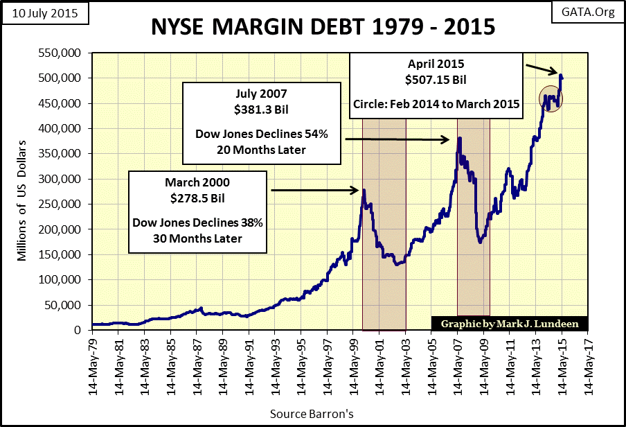
With NYSE margin debt now at record highs, this alone is more than sufficient reason to take profits and exit the stock market now. As seen in the chart below bad things happen at peaks in margin debt. There have been many times in market history when exiting the stock market for a few years was the smart move, I think July 2015 will prove to be one of them.
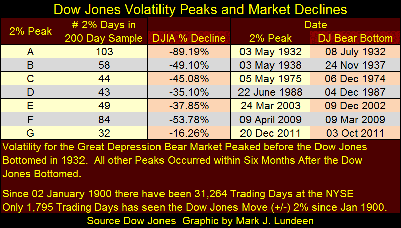
Returning to the Dow Jones BEV plot above I placed a text box at the Aug / Sept 2011 bottom noting the Dow Jones 200 count was @ 32; the 200 count being the number of days the Dow Jones saw a 2% or greater move (up or down) from a previous day’s close within a running 200 day count. The 200 count is a measurement of stock-market volatility, and a rising 200 count is a sure sign that Mr Bear is feeding on retail investors’ net worth. Below is the plot for the Dow Jones’ 200 count going back to August 1900; one hundred and fifteen years of market history.
Except for the April 1942 52% bear market bottom, every market period in which investors would have profited by exiting the market rather than keeping their positions since 1900 can be identified by the 200 count increasing from low single digits to above fifteen in the chart below. Without a doubt, frequent large daily moves on the Dow Jones (2% days) are a dependable indication that one should exit the market. But there is more than just that we can learn from this chart; we can compare the change in market volatility after the creation of the Federal Reserve System in December 1913.

I’ve labeled the volatility spikes in the above chart “A” thru “G”. Note that all of these spikes occurred after the creation of the Federal Reserve. Note too that once the US Government unilaterally broke the Bretton Woods’ $35 gold peg in August 1971, market volatility greatly increased. Can you study the chart above and the table below without wondering when volatility spike H will begin? And it will as soon as the market once again begins to deflate in earnest.
Next we see a chart plotting the Dow Jones (Red Plot) and its 200 day count (Blue Plot) from 1995 to present. The relationship between the advancing or declining Dow Jones with its 200 count is easy to see, except for the choppy 200 count action from between 1997 to 2001. This period was a difficult episode of market history when the “policy makers” were forced to resort to such policy shenanigans as leaking fictions like the “Greenspan put” to the media, or jawboning down (if not actually cutting) the Fed Funds Rate on the many significant down days seen below. These stunts were working remarkably well until January 2000, when the market topped out.
However, Mr Bear can be seen feeding in earnest when the 200 count approached it peak count at 49 in 2002. Note how the sub-prime mortgage bull market began just as the Dow Jones 200 count collapsed in 2002; a market advance which predictably terminated with the 2007 rise in the 200 count. This same pattern in market volatility was repeated with the post credit crisis run up in the Dow Jones.
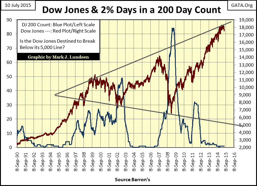
Another significant point shown by the chart above is that from September 1990 to January 2000 the Dow Jones rose from 2,596 to 11,722; a gain of 350%. But it’s been fifteen years now since the top of the high-tech bubble market, a decade and a half during which the Dow Jones increased by a mere 53%, not even double the 11,722 level of January 2000. I realize that today everyone measures the Dow’s performance from its March 2009 bottom, from which it has seen a 180% increase in the past six years. But Geeze Louise, since March 2009 the financial markets have been pumped up with many trillions of dollars of “stimulus”, yet the Dow Jones still hasn’t managed even a double since its January 2000 high fifteen years ago. Not much of a return considering all the efforts of the “policy makers” over the past fifteen years.
Now my crystal ball isn’t any more accurate than the next guy’s, but looking at the trend lines of the Dow Jones since 2000 I certainly can’t rule out seeing the Dow Jones deflate below 5000. That would be a 72% decline from last May’s all-time high. Is such a drop likely to happen? Whether one see this as likely or not depends on one’s opinion of how effective the “policy makers” will be in “stabilizing” current market valuations with their infernal-monetary inflation and bizarre zero interest rate policy (ZIRP). Keep in mind the “policy makers” are the same incompetent-bumbling buffoons who poisoned the global economy by creating unpayable debt on a massive scale at attractive low interest rates. So I see a catastrophic deflationary bear market, with all humanity fleeing for their lives from counter-party risk as being highly probable.
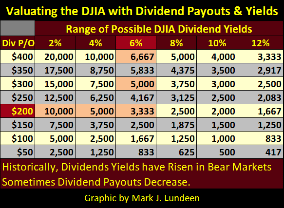
Corporate America is currently assuming trillions of dollars of unpayable debt it can never repay, and using it to buy back shares on the open market. Once the economy takes a turn for the worse, management will be forced to cut dividend payments in order to cover this ill-considered increase in borrowing costs or be forced into bankruptcy. In such a business environment bond yields will be increasing, taking dividend yields up with them. The tale of coming market woe is best described using the table below.
Currently the Dow Jones is paying out $422 a year in dividend payouts. A 50% reduction in payouts is not uncommon during a severe bear market; we’ll call it $200 in the table below. Historically, Dow Jones bear market bottoms yield 6% or more. As you can see a $200 payout with a 6% dividend yield would result in a level of 3,333, an 81% reduction in value from the Dow’s May 2015 last all-time high.
It could get much worse. During the Great Depression the Dow Jones’ dividend payout declined by 77%; call it $100 in the table below. That dividend payout along with the Dow’s July 1932 dividend yield of 10% would take the Dow Jones all the way down to 1,000; a 95% market decline that would actually exceed the 89% decline seen during the Great Depression. As I’ve said, my crystal ball isn’t any more accurate than the next guy’s, but just looking at the brutal mathematics of bear-markets possibilities in the table below is ominous. If one really understands the utter recklessness of “monetary policy” since the Greenspan Fed of 1987, none of the above can be ruled out.
The next chart plots the 200 day moving average of Dow Jones daily volatility. Except that it’s measured in percent, rather than number of 2% days, it looks remarkably similar to the Dow Jones 200 count chart above, but there’s a difference. Since we’ve seen no Dow Jones 2% days since last December 18th (140 trading days ago), things appear relatively calm on the Dow Jones 200 count chart above. However in the percentage chart below, we see that market volatility bottomed early last December with the 200 day M/A at 0.46%. Dow Jones’ daily volatility has increased to 0.62% over the past seven months; nothing to get alarmed about – yet. But since August 1971, whenever volatility has turned up from a bottom, it typically continues increasing until it rises uncomfortably above the 1.00% line.

Lastly let’s take a quick look at NYSE 52Wk High – Low Ratio: the net percentage of 52Wk Highs–Lows to total shares trading daily. There’s no direct relationship between the Dow Jones making new 52Wk highs or lows and the NYSE 52Wk High & Lows data. However in good markets when the Dow Jones reaches a new 52Wk High about 10% to 20% of NYSE listed companies will come along for the ride. We should take notice if this doesn’t happen, because it could mean that something interesting is happening, just as we saw happen after the Dow’s Market peak of October 2007. Once the Dow Jones made its last 52Wk High (its last all-time of the sub-prime bull market), 52Wk Lows on the NYSE soon overwhelmed 52Wk highs and continued to do so for the next twenty-one months.
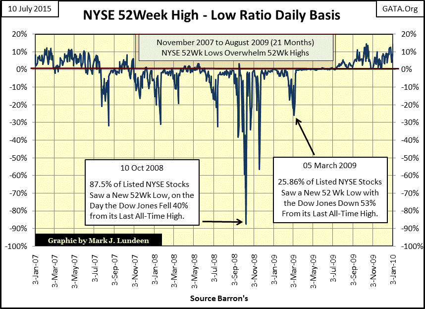
In the table below look what happened with NYSE 52Wk Lows in October 2008 when the Dow Jones saw its first 40% decline since November 1974, and then look at NYSE 52Wk Lows in March 2009 as the Dow Jones saw its first 50% decline since April 1942. Even though the Dow Jones continued its decline from October 2008 to March 2009, the broader market had already bottomed, reaching its maximum number of 52Wk Lows in October 2008. Apparently Doctor Bernanke’s trillion dollar market intervention had begun reflating the majority of equities traded on the NYSE months before the Dow Jones saw its bear market bottom the following March.
For your information the “DJIA BEV” column lists the percentage decline from the Dow Jones’ last all-time high and the “Days BEV Zero” column gives the number of trading days since the Dow Jones’ last all-time high.

In recent developments, since July 1st of last year (Red Box Below) the Dow Jones has made thirty new all-time highs. But note how for more than a year the NYSE has failed to produce sufficient 52Wk highs to drive the 52Wk H-L Ratio above its 10% line. The last two Dow Jones all-time highs (18 & 19 May 2015) saw the 52Wk Ratio peak at a pathetic 2.65%.

Just a look at the ratio above shows us why the Dow Jones is having difficulty remaining above 18,000; since March 20th the 52Wk H-L Ratio has collapsed. For the past four months, stocks have been finding it easier to make new 52Wk Lows than 52 Wk Highs because the smart money is slowly exiting the stock market. Predicting whether or not this trend in the NYSE 52Wk H-L Ratio will continue would require a better crystal ball than mine, but if a massive bear market is at the door, this is what I expect to see happen.
But considering the deteriorating foreign markets, and the increase in bond yields the world over for the past four months, I believe we are on the cusp of another significant market downturn that will overwhelm the best efforts of the “policy makers” to prevent it. With gold and silver’s bear markets now four years old, the prospects of a financial collapse causing a major rebound in the old monetary metals are looking better and better.
share
share
share
share
share
More from Gold-Eagle