Silver To Gold Ratio 1969-2014
 share
share
 share
share
 share
share
 share
share
 share
share
The silver to gold ratio (SGR) is the number of ounces of silver a single ounce of gold can be exchanged for at current prices. For reasons I’ve never understood some people call this the gold to silver ratio, which it certainly is not. Typically, but not always, precious metals bull markets can be identified by declines in the SGR and PM bear markets by increases in the ratio, but history shows that these market trends are not bolted together. I’ve placed some stars on the SGR chart below at key turning points, and here’s a table listing the metal prices with the ratio at those points.
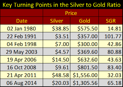
Keep in mind that the table above and chart below are not documenting extremes in silver and gold prices, but extremes in the number of ounces of silver that one ounce of gold can purchase. The 1969 to 1980 bull market ended with the ratio declining to 14.81 ounces of silver per ounce of gold on 02 January 1980. The high point of our current silver bull market can be identified by the ratio falling to just above 30 on 21 April 2011, though our current peak in the price of gold didn’t come until August 2011 (not noted in the table or chart) with an SGR of 43.63.
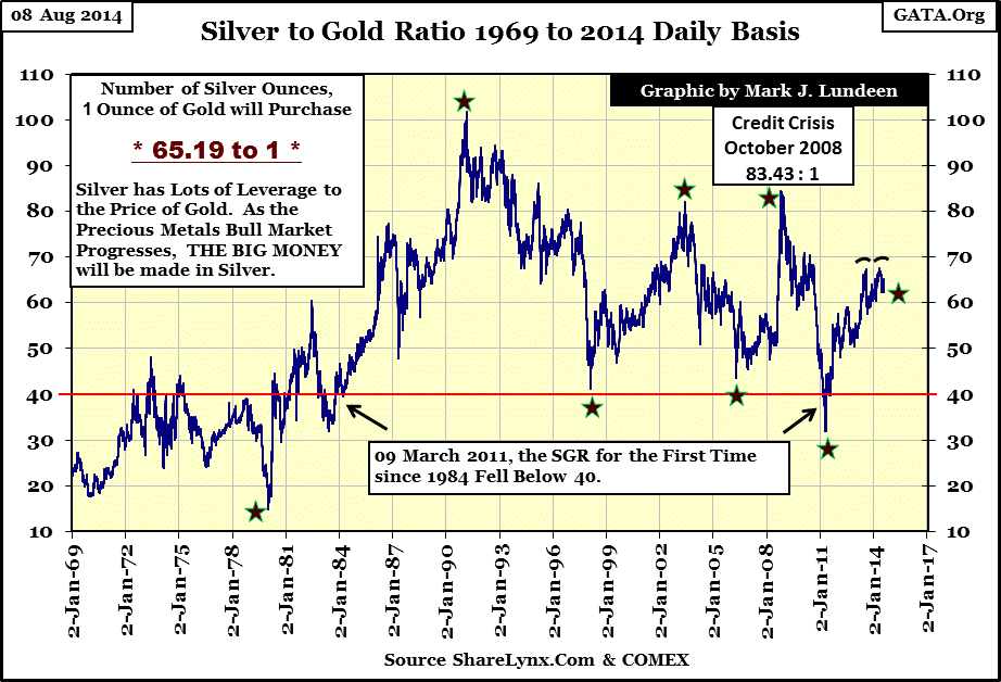
The first ten years of the 1980-2001 bear market saw the ratio increase from 15.5 to 102 ounces of silver per ounce of gold. In terms of gold, and in dollars they were practically giving silver away for free in 1991. However, for the next seven years the SGR declined, ending just above 40 in 1998. This big decline in the ratio didn’t occur during a bull market in the precious metals, but silver did double in price ending its horrific decline relative to gold from 1980 to 1991. Our current bull markets for both gold and silver began in 2001 with the SGR rising from 40 in 1998 to just over 80 in 2003, so it’s obvious that the ratio is not a precise method to gauge entry and exit points for bull and bear markets in precious metals.
The main value in following the SGR is to gauge the potential gains and losses investing in silver relative to gold, which is no small thing. In the past year the ratio has twice failed to exceed 70 ounces of silver per ounce of gold. I believe that the SGR has peaked, making silver a compelling bargain relative to gold. In the next phase of the precious metals’ bull market, the ratio should once again approach, and possibly decline below 30. With the SGR currently at 65, a decline to 30 would make today’s investment in silver twice as profitable as one in gold, and if the ratio once again returns to 15 as it did in 1979, silver would yield four times the return enjoyed by investors in gold.
But the real kicker in the ratio comes from understanding the availability of the two metals in the economy. Naturally, since the availability of silver to gold in the Earth’s crust is something like 16 ounces of silver for every ounce of gold, this makes the current SGR of 65 ounces of silver per ounce of gold an unnatural ratio, and the price of silver today unnaturally cheap. This imbalance is even more compelling when we realize that in the past 100 years silver, unlike gold, has become indispensable in electronics, solar, and medical products. Most of the silver mined in the past 5,000 years has already been consumed in manufacturing and disposed of in landfills, making market-available silver today actually rarer than gold.
Who knows what the future holds for us? I don’t. However it’s not inconceivable that one day industrial demand for silver could drive its price above that of gold, driving the SGR to 1 (or even lower). Such an event would make a silver investment today sixty five times more profitable than investing in gold. However from today’s vantage point, it’s difficult believing that the price of silver could ever equal or exceed the price of gold. But we can count on the future holding many surprises. In August of 2014, over four pounds of silver can now be purchased for what one spends for a single ounce of gold. Considering the possibilities, there are many good reasons to accumulate as much silver as possible at today’s prices.
Let’s look at the gold market from 1969 to 2014. Here is the dollar price of gold spanning the past forty-five years. In it we see two bull markets and one bear market. When looking at any market denominated in dollars over the past five decades, one must keep in mind that since August 1971 the dollar has been an undefined unit of account, which has resulted in distorted market valuations. What exactly does that mean? That prices; for goods, services and commodities are determined by market supply and demand. But when a government assumes a monetary policy of inflation, the increasing money supply increases demand for goods, services and commodities, but does little to increasing the availability of good and services in the market place. So as the decades pass by, prices rise as we see in the gold chart below.
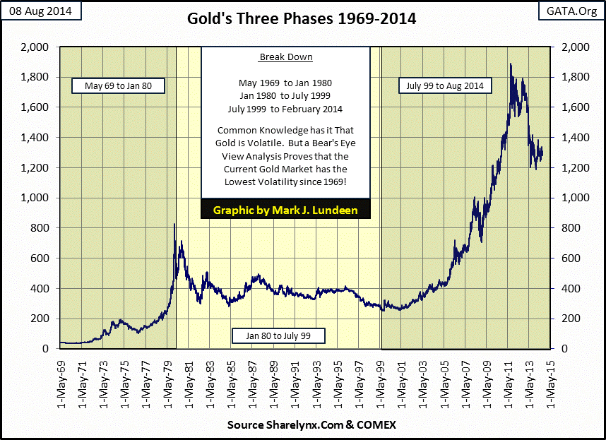
Here’s a fact that most people are unaware of; the 2011-2014 correction in the gold market has resulted in a larger dollar decline than the entire 1980-2001 bear market (as seen in the table below). Yet during the bear market, gold saw a percentage decline twice that of our current correction. This is an example of market value distortion caused by inflation, as a dollar in 1980 purchased much more than it does now in 2014.
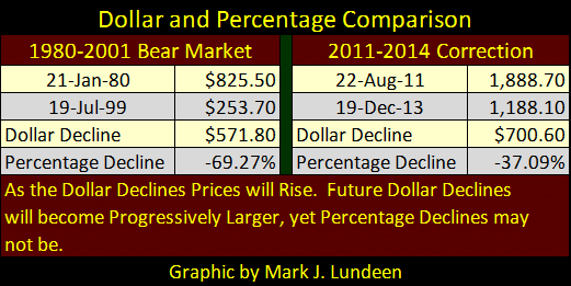
So, when we look at these declines in the dollar-price chart above, the 2011-2014 correction appears to be a larger decline than the entire 1980-2001 bear market, (because in dollar terms it actually is), yet the smaller dollar decline actually resulted in a larger percentage decline.
That is why I prefer to view data which spans decades using a Bear’s Eye View (BEV) chart, where each new all-time high shows as a big fat ZERO%, and Mr Bear is only interested in how many percentage points he can claw back from each new all-time high. The BEV chart provides insight into the gold market that is not apparent in the simple dollar plot above; in terms of percentage declines, market volatility in our current bull market is substantially less than it was during the 1969-1980 bull market. From November 1974 to August 1976, the price of gold declined by a full 47%, nearly half. For all the downward pressure applied to gold by the “policy makers” since 2001, we have yet to see a similar decline, which indicates significant underlying strength in the gold market.
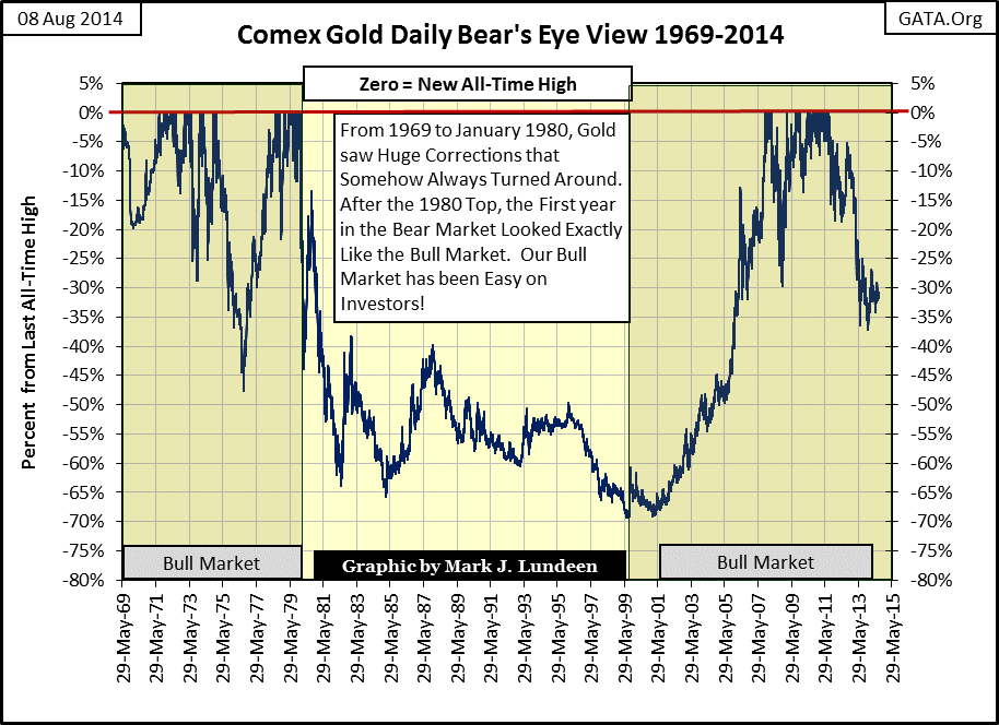
Gold’s BEV chart (below) begins at the absolute low point of the 1980-2001 bear market, the $253.70 closing price of 19 July 1999. Having an absolute bear market low register as a BEV Zero, or new all-time high, is due to the unavoidable fact that mathematically, the first data point of a BEV series is always zero.
Using a BEV chart beginning in July 1999 provides us with a better view of the current gold bull market’s volatility than using the BEV chart above which starts in May 1969. Until the credit crisis (March 2008), riding our gold-bull was more like riding a pussy cat than El Diablo; lots of BEV Zeros (new highs of the move) and no corrections greater than 25%. We can see the difference by comparing the corrections during the eleven year 1969-1980 bull market above.
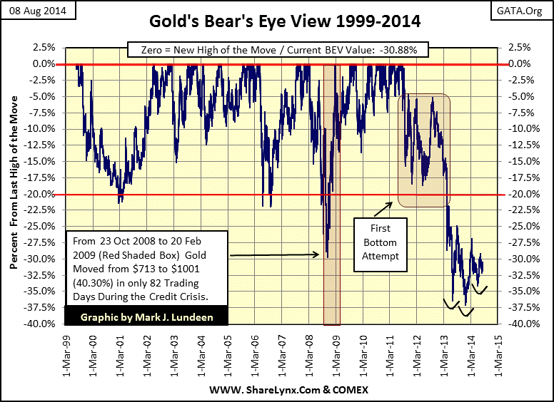
With the credit crisis, gold saw a sharp 29.73% price correction from March-October 2008. But note that from October 2008 to February 2009 it went up faster than it came down, gaining $300 dollars (40%) in only eight-two trading days. After the credit crisis, gold once again began making BEV Zeros (new all-time highs), with no correction deeper than 15%. But since gold’s last all-time high of August 2011, the gold market has been experiencing strange market action unique to the past three years. Both gold BEV charts illustrate the many bull-market corrections since 1969; they’re all the same. As if by some unwritten rule they come to a low POINT, and then bounce off before going on to a new all-time high. That all changed after August 2011.
Gold’s current correction has attempted to bottom twice; the first attempt lasted for a year and a half from September 2011 to April 2013. I highlighted this in the chart above. Instead of declining to a point from which it recovered to a new BEV Zero, three times gold has declined between 15% to 18%, before it three times surged up to but failed to pass through the BEV 5% line. Then, in April 2013, the gold market endured massive naked shorting by the big banks, driving its price down below the BEV -30% line. Again, from this new level gold found it impossible to rebound to a new all-time high. Rather, in the past year and a half it’s formed an inverted head-and-shoulders formation.
As seen in the BEV charts, since 1969 gold has never found it difficult to find a bottom in a bull market correction. Yet since August 2011 it’s happened twice in the same correction. So what does all this mean? Well, with global demand for gold from Asia being what it is (huge), the global bond markets grotesquely overpriced and yielding below the rate of inflation, and as the world watches President Obama raise money in Hollywood and go golfing as the world goes to hell in a hand basket on the television; I believe the reality is that the price of gold actually wants to go up pretty badly. The current prolonged bottom seen in gold’s BEV charts is most likely the result of the Anglo-American banking establishment desperately fighting the bullish-primary trend now driving the gold market – a fight they will ultimately lose. It should be obvious exactly when the “policy makers” are forced to capitulate to gold’s primary trend; we’ll see a historic daily increase in the price of gold.
The chart below plots each trading session with a 3% or greater move in the price of gold from its previous day’s closing price. Since January 1969 there have only been 416 days of such extreme volatility.
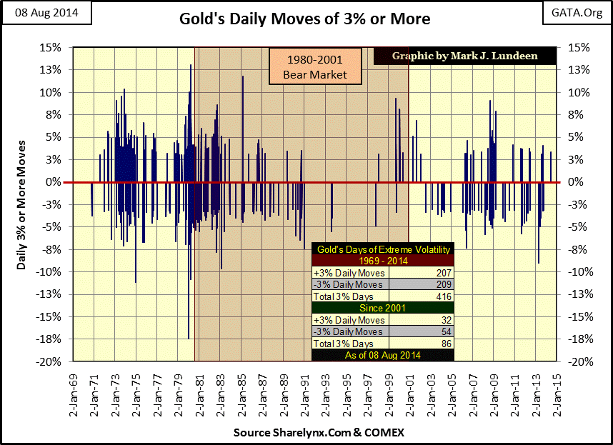
The thing that stands out in the chart is how few days of extreme volatility gold has seen since 2001; only eighty six. And there have been no days when gold has moved 10% or more since 1985, three decades ago. Today, I suspect the lay of the market is one in which a historic market event is highly likely. Currently, gold’s largest positive daily move in history occurred in March 1980 (13.05%). From today’s closing price ($1,309), gold would have to move up more than $170 from a previous day’s closing price to break this old percentage gain. Could gold possibly do something like this? If a panic develops in the financial markets, it surely could, and then some. However if the truth be told, I’d be just as happy if gold began making an honest effort towards $1600 by November. But like me, you’ll have to wait to see what happens in the months and years to come.
share
share
share
share
share
More from Gold-Eagle