BSE SENSEX The Party Is Over In Bombay


The Indian stock exchange, the BSE SENSEX, seems relatively neglected compared to its more famous counterparts in the US and UK. But with a country in excess of 1 billion people, I feel it should garner more respect on the world stage. Based in Mumbai, the home town of the great Sachin Tendulkar, this index has smashed it out of the park in recent years. Let’s take a look using a bottom up approach beginning with the daily chart.
DAILY CHART
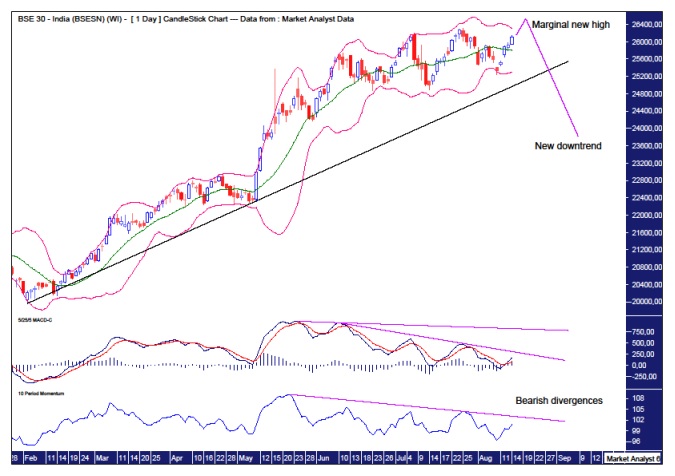
I have added Moving Average Convergence Divergence (MACD) and Momentum indicators and what stands out like a sore thumb is the bearish divergences that have formed on its four, no less, previous highs. If that isn’t a sign that this bull trend is in its final throes then I’m completely bamboozled.
I have added some Bollinger Bands and we can see price has been toing and froing in recent months between the upper and lower bands. All the while still nudging ever higher. Price now looks headed for the upper band once more. Surely, with those bearish divergences, this is the final thrust!
I have drawn a black uptrend line from the February 2014 low. A break of that line will most likely confirm the beginning of a bear trend. But will the bear trend be just a correction or something bigger? Let’s move on to the weekly to see if that gives us any answers.
WEEKLY CHART

Well, this is interesting. I have drawn uptrend lines beginning from the lows in March 2009, August 2013, February 2014 and May 2014. That’s four consecutive steeper trend lines. That is pushing it to the limit and generally means the end is nigh. Occasionally there might be one more trend line but four normally does the trick.
Also, the Relative Strength Indicator (RSI) shows this last surge higher is getting weaker. The next weekly high, most likely this coming week, looks set to throw up a fourth bearish divergence. It’s like the bulls know they’re about to be slaughtered but just keep pushing forward with every last bit of energy they have, trying to delay the inevitable for as long as possible.
I have added a MACD which shows a bearish crossover with the red line now above the blue line indicating lower prices are likely going forward. It looks as if only a strong surge higher now will change that. Given the evidence gathered so far, that appears unlikely in my opinion.
Now let’s move on to the monthly chart.
MONTHLY CHART
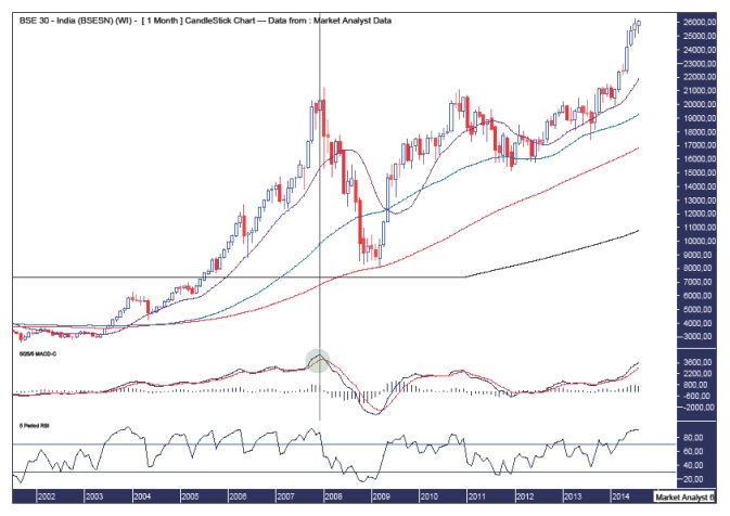
The main point of this chart is to demonstrate the extremes levels at which the BSE SENSEX is currently trading. Let’s break them down.
Firstly, I have added moving averages with time periods of 14 (purple), 50 (blue), 100 (red) and 200 (black). We can see they are all ordered as per the great bull market that has been in force. Now look at how the 14ma generally stays close to price. It is only in the last few months that price has streaked away and not even this 14ma can keep up. Price is now like a rubber band being stretched to its limits. A big snap back could happen at any moment. The last time price diverged so much was in 2008 just before it plunged.
I have added a MACD and this also shows just how much price has diverged lately. I have drawn a green highlighted circle to show the last time this happened. It was right at the top in 2008 before calamity struck. But hey, this time it’s different, yeah? Nup, not as far as I’m concerned.
The RSI also shows extremely overbought conditions. Keep in mind, this is the monthly chart and the longer the time frame the greater the indication.
Perhaps this month’s candle will end up a bearish outside reversal candle. That is, the high is higher than last month while the low is lower and it closes the month in negative territory.
Also, as an aside, I did some little calculations of the bull trend from the 2009 low compared to the first great bull trend. The range from the 2001 low to 2008 high was 18612 points. The bull trend from the 2009 to present has just about mirrored that move. So far, this upleg has put on 18253 points. And a marginal new high now will close the gap further. That is just about a direct correlation. Not something to start jumping up and down on couches over a la Tom Cruise. It’s more an interesting tidbit of information.
Now, let’s wrap it up by looking at the yearly chart.
YEARLY CHART
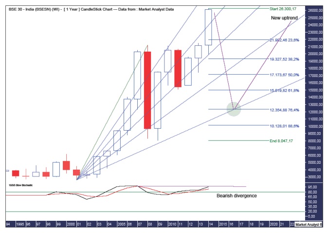
We can see from a low base set in 2001 at 2594, price has absolutely exploded since then to its recent high of 26300. That folks, is a ten bagger. Nice.
The low in 2009 did no structural damage to the bullish picture. And a higher high now is yet more confirmation of a massive bull market in play.
I have added a Stochastic indicator which shows very high or overbought readings. So a move down would certainly not surprise here. But what is very interesting is this high in the Stochastic is lower than its high in 2008. So we have a bearish divergence in the yearly chart no less. That is big stuff!
The daily, weekly and monthly analysis also suggests downward price movement is likely very close. So, where would any bear trend take price to?
I have drawn a Fibonacci Fan from the 2001 low to 2008 high and also Fibonacci retracement levels of the upleg from the 2009 low to current high. Now, the high may not yet be in place but I only expect marginally higher which would have no real effect on this analysis.
I have drawn a green highlighted circle which shows where the 76.4% angle intersects the 76.4% level. I see no better target for low on this chart. That intersection looks set to take place in 2016 at a price level around 12354.
That would then setup up the next higher low and set the scene for the next huge leg up in the following years. So, it isn’t all bad.
The Little Master has reigned of India for the duration of the of this massive bull market. The sport of cricket is such a huge part of Indian life. His retirement in the last year just may be an ominous sign for not only the nation’s cricket team but also its stock market.
******** .
Please register your interest in my website coming soon. Any questions or suggestions, please contact [email protected]
© 2014 Copyright Austin Galt - All Rights Reserved
Disclaimer: The above is a matter of opinion provided for general information purposes only and is not intended as investment advice. Information and analysis above are derived from sources and utilising methods believed to be reliable, but we cannot accept responsibility for any losses you may incur as a result of this analysis. Individuals should consult with their personal financial advisors.
More from Gold-Eagle


