Gold Price Forecast: A Weaker Dollar Is The Easiest Path To $2,000 Gold


In my previous article here on Gold-Eagle.com back in early October, I discussed my primary method to fundamentally value gold using growth of per-capita money supply and real interest rates.
My summarized thoughts on gold’s valuation were as follows:
“My overall view is that gold is moderately-valued or a bit richly-valued at the moment, but that it is deserving of a premium as interest rates around the world are low or negative.
In other words, gold is not overvalued, nor is it a clear bargain. It is above the broad money supply trend line, but only slightly. It is profitable to mine, but not excessively profitable. It is moderately valued compared to equities and median home prices relative to historical norms, and closer to peak value against its historical relationship with oil and copper. There is renewed interest in the precious metal space by precious metal enthusiasts and central banks, but it is still largely dismissed by generalist investors.”
Since then, we have had a bit of a pullback in gold, which puts it a bit more comfortably in the moderately-valued region in my view. This has opened up multiple investment opportunities in precious metals.
I also explained in the article that my long-term view of gold, during the first half of the 2020’s decade, is for gold to reach or at least test new all-time highs of around $2,000/ounce. As the article described, one of the main variables that could lead to that next leg up in the gold price in dollar terms would be a weaker dollar, rather than much stronger gold.
In addition to my primary gold valuation method, I also look at other hard asset relationships for confirmation, or to see which other commodities or asset classes may be bargains. That is what this article will focus on: gold’s current relationship to other forms of tangible value.
Gold vs House Prices
One of my favorite relationships to keep an eye on is the ratio of the gold price compared to the median sales price of houses in the United States.
This chart shows how many ounces of gold it has historically taken to buy a median house over five decades:
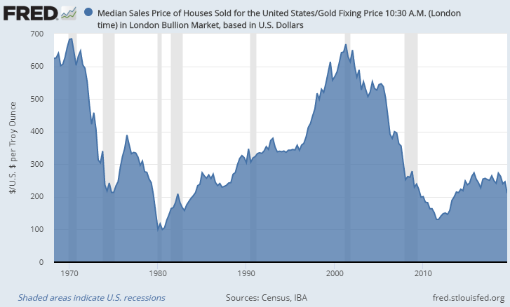
Chart Source: St. Louis Fed
Whenever the ratio is low, like in 1980 and 2011, it means gold is historically expensive compared to house prices. Whenever the ratio is high, like in 1970 and 2001, it means gold is historically cheap compared to house prices.
The ratio reached a low point of about 100 in 1980, meaning it took only 100 ounces of gold to buy the median U.S. house. It also reached another major low of around 130 in 2011. Gold’s ability to buy house value was very high during these times.
The ratio reached a double-top high point of around 680 in 1970 and 2001, meaning it took a whopping 680 ounces of gold to buy the median house. Gold’s ability to buy house value was very low during these times.
As of the third quarter of 2019, the ratio is at 211, meaning it takes 211 ounces of gold to buy the median house. It is not currently at either extreme, but it is closer to the low end, meaning that gold is closer to being historically expensive vs the median house rather than cheap compared to the median house.
There are of course multiple details that can influence this relationship. The average size of the median U.S. house has increased over time, for example. On the other hand, construction technologies have improved, which should theoretically drive down the amount of work it takes to build each square foot of house.
Overall, I consider this to be among the best “sanity checks” for forecasting long-term gold movements.
Gold vs Stock Prices
Another ratio worth keeping an eye on is the ratio of gold to the Dow Jones Industrial Average, or another stock index of your choice.
The Dow consists of 30 blue-chip U.S. stocks, mostly dividend-payers, and this chart shows the ratio of gold to the Dow. Specifically, it shows how many ounces of gold it would take to buy the Dow index:

Chart Source: Macrotrends.net
Whenever the line is low, it means gold is historically cheap compared to stocks. When it is high, it means gold is historically expensive compared to stocks.
Stock prices are a lot more volatile than home prices. As readers can see, this ratio has had three major cycles over the past century and is in the fourth one now. Each top-of-cycle period corresponded to a major (decade long or more) bear market in U.S. equities.
In 1929, the Dow-to-gold ratio peaked at over 18, but then fell to nearly 1.9 in 1933. That was the first cycle.
During the second cycle, the ratio peaked at over 27 during 1966 before collapsing to its all-time low of 1.3 in 1980.
And for the third cycle, the ratio peaked at its all-time high of over 42 in 1999, and fell to nearly 6.3 during 2011.
Right now, the ratio is over 19. In other words, the ratio is a bit higher now than it was in 1929, but not as high as it was in 1966 or 1999.
Gold vs Copper
The gold-to-copper ratio is often cited as a barometer of global economic health. Copper is an industrial commodity associated with construction and electronics, while gold is primarily a monetary metal, a store of value. Higher copper prices often correspond to periods of global growth, while higher gold prices often correspond to economic slowdowns or periods of heightened instability.
This chart shows how many ounces of gold it has historically taken to buy one metric ton of copper over the past three decades:

Chart Source: St. Louis Fed
When the line is low, it means gold is historically expensive relative to copper. When it is high, it means gold is historically cheap compared to copper.
The current ratio is just under 4, meaning it only takes 4 ounces of gold to buy a metric ton of copper. This is near the extreme end of the spectrum, historically, meaning that gold has rarely been this expensive compared to copper.
With the exception of the mid-2000’s where copper had a major boom, the long-term trend here is that gold has steadily gained ground compared to copper.
Also of note is the fact that this ratio tends to have somewhat consistent three-year cycles. The ratio bottomed in 1993, 1996, 1999, and 2002. During the generational China-driven copper boom, it didn’t bottom for several years until bottoming again in early 2009. Then it bottomed again in late 2011 (just under 3 years), and again in 2016 (more like 5 years), and appears to potentially have bottomed in 2019 (3 years again, if the bottom is in).
Copper, in my estimation, is a strong contrarian investment for long-term investors from current price levels.
Gold vs Oil
This last chart shows how many barrels of WTI crude you could historically buy with an ounce of gold:
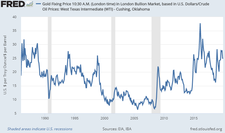
Chart Source: St. Louis Fed
Unlike the previous three charts where the low points mean gold is expensive, this one is the other way around. Whenever the line is high, it means gold is historically expensive vs oil (you can buy more barrels of oil with your ounce of gold). Whenever it is low, it means oil is historically expensive vs gold (your ounce doesn’t go as far).
The high point during this more than three-decade period was in 2016, when one ounce of gold could buy more than 37 barrels of oil. The low point was in 2008, when one ounce of gold would buy you fewer than 7 barrels of oil.
Right now, the ratio is around 25, which means gold is on the higher end of the historical purchasing power range compared to oil. The ratio sits lower than this far more often than not.
Conclusion
Many people believe that gold is extremely inexpensive at the moment, but by most measures, that is not the case. Its purchasing power has held up very well. Gold is trading at above-average historical levels compared to the median house price and compared to many industrial commodities. It is, however, on the cheaper side of its average compared to U.S. equities.
The way that I currently rank asset class valuations is as follows:
- Stocks and bonds in the United States are extremely historically expensive based on most measures. Bonds are at very low interest rates and stocks are at very high valuations.
- Next, gold and median house prices are somewhere in the middle. On the higher end of average.
- Third, industrial commodities are near generational lows. Copper is cheap, oil is cheap, silver is cheap, and so forth.
This is why, for gold to reach another major leg higher in dollar terms, the easier path is for the dollar to decline in real purchasing power than for gold to rise in real purchasing power. The dollar is historically strong compared to many other currencies, and this year’s major shift in U.S. monetary policy sets the stage for that cycle of strength to begin topping out and heading to the downside in the years ahead. All else being equal, a weaker dollar would benefit gold, industrial commodities, and some other asset classes such as emerging markets.
During the past two months, I’ve been scaling into copper producers and oil producers, with an emphasis on profitable companies with low costs of production. I also continue to have exposure to gold and silver for the long-term. My base case is for gold to retest its previous all-time highs in dollar terms during the first half of the 2020’s, and for some of these other commodities to give strong positive returns as well.
Lyn Alden provides a free newsletter at LynAlden.com covering equities, precious metals, and other investments.


