Gold, Silver And Their Miners Are Doing Just Fine
 share
share
 share
share
 share
share
 share
share
 share
share
My proof reader: Harold Goodman, passed away last Saturday. Harold contacted me in November 2008 offering to correct the grammar and spelling in my articles. So each Saturday for the past seven and a half years, Harold spent four to six hours of his time correcting my less than perfect text, never asking for financial compensation from me as he knew I couldn’t afford it. There are some really nice people in the world, and my friend Harold was one of them. I’m going to miss you.
* * *
If you’re bullish on the stock market, you should notice the Dow Jones’ BEV plot below has been trending the wrong way for the past month. At week’s end the Dow closed 4.24% below the red BEV Zero Line; 4.24% below its last all-time high of 19 May 2015. From its lows of last January, it came within 1.18% of making a new all-time high on the 20th of April, but has been slowly losing ground since then.
Maybe the Dow is just consolidating its gains of the past four months. Maybe in the weeks to come it will finally exceed the highs of last May, but I’m not so sure that’s how this will play out. There’s a good chance the BEV Zero of 19 May 2015 (the last all-time high of the March 2009 to May 2015 advance) will prove to be the Dow Jones’ Terminal Zero in the BEV plot, making the past year the first year of a massive bear market that will make history before it’s over.

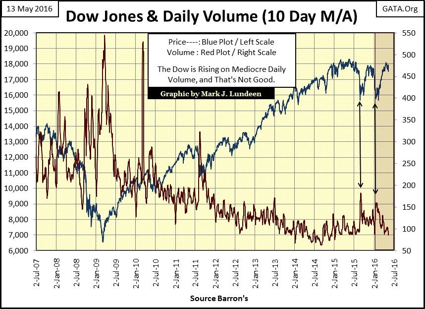
One difficulty I have in believing the current advance is for real is the fact that since January 2000, valuations in the stock market apparently are no longer are determined by the law of supply and demand. Trading volume is a solid indication of demand, or lack of demand for shares trading in the stock market. From January 1900 to January 2000 (one hundred years) bull markets floated higher on rising trading volume; bear markets sank on declining trading volume. But all that changed in the aftermath of the high-tech mania of the 1990s.
Below I’ve plotted the Dow Jones with its trading volume’s 10 Day M/A from 2007 to present. The credit crisis bottom of March 2009 occurred on all-time high trading volume. From this bottom, the Dow Jones has advanced 180% as its trading volume contracted 83%. This is Alice in Wonderland stuff! Look at the two correction bottoms the Dow Jones has seen in the past year; both occurred on rising trading volume. And the market rebounds from both these bottoms saw trading volume contract. This chart is dirty with the finger prints of the “policy makers.” I’ll make an easy prediction; should the Dow Jones continue to decline, before it sees its third double-digit decline since its highs of last May, we’ll once again see its trading volume expand.
It’s been a few months since I’ve published my DJTMG’s “Top 20” chart; time for an update. In the wake of the credit crisis bottom, the DJTMG’s Top 20 saw 52 of its groups within 20% of their last all-time highs in Barron’s 07 July 2014 issue. That was a huge improvement from where it was in March 2009, when EVERY SINGLE GROUP in the DJTMG suffered declines of over 20% from their last all-time high. In fact 57 of the groups declined by more than 50%, and 35, almost half of the DJTMG, saw declines of more than 70%!
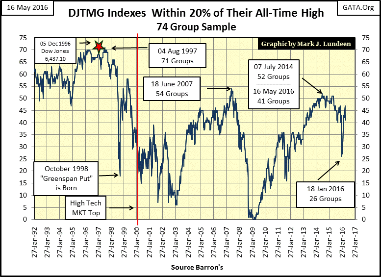
In Barron’s 18 January 2016 issue, the Top 20 contracted to just 26 groups, from where it then rebounded to 47 groups in April. However, once again it’s contracting which tells me the general market isn’t doing as well as the major stock market indexes would have us believe. There isn’t any panic in the market – yet. But looking at this chart since the early 1990s once the Top 20 reaches an inflationary peak, it continues to deflate until the financial system finds itself in a crisis. I don’t believe last January’s down spike to 26 in the Top 20 will keep Mr Bear happy for much longer. But then he doesn’t appear to be in much of a hurry either.
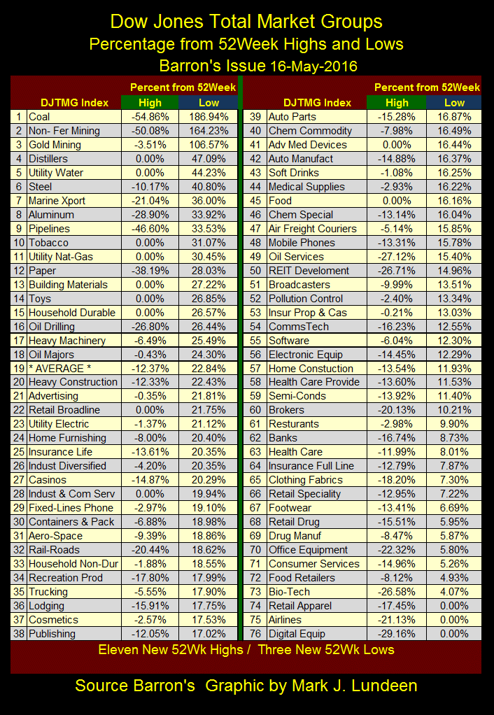
Here’s the DJTMG’s 52Wk High and Low data. Gold Mining (#3) closed the week at 3.51% from its 52Wk high, which is making the gold market’s Nervous Nellies ready to exit the market. Heck the Dow Jones has done nothing for investors in the past year and closed the week 4.24% from its 52Wk High without causing high anxiety at the NYSE.
The difference in attitude between the bulls in the precious metals and the general stock market has to do with market psychology. History shows the best time to be bullish is at a bear-market bottom, but at market bottoms most people are thinking of selling, not buying. The traumatic bottom of March 2009 is a perfect example of when people should be the most bullish – when 57 groups in the DJTMG had declined over 50% from their last all-time high. But when offered this wonderful opportunity few investors took advantage of it.
Today, with seven years separating investors from the trauma of March 2009, and the Top 20 now at 41, most of what the market was going to offer investors is now past them. Yet it’s not hard finding bulls in the general stock market, and no one is concerned how the Dow Jones for the past year can’t seem to close the deal and make a new all-time high.
But the bulls in the precious metals markets have yet to recover from the trauma of the past five years. In the past six months, silver and the miners have both suffered from declines of over 70%, and no one wants to go through that again! However, if history is any guide to the future, and it usually is, now is the time to be selling the general stock market and piling into precious metal investments. To be sure gold and silver will hit occasional speed bumps in the road ahead of them, but then that’s always the case in any bull market.
I think I closed gold’s bull box in the step sum chart below too soon, so I re-opened it and extended it up to the present. Can I do that? Who’s going to stop me? It’s not the price action of gold (Blue Plot) that made me change my mind. It could be better, but it’s doing fine. It’s the stubbornness of the bears, as seen in the step sum (Red Plot) that made me reopen the bull box. So far the bears (the FOMC and the big NY banks) have simply refused to surrender to gold’s bullish primary trend. If the bears can get the price of gold to decline below its lows of April, this bull box will fail, exactly as the 2015 bull box did. But I’m optimistic that won’t happen.
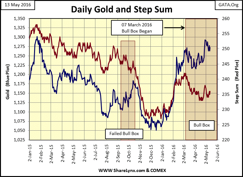
Here’s the step sum data table for gold and silver. For gold we need to see its step sum break above 240, and then move higher. As it is, at the end of the week it’s exactly where it was on April 11th : 236. This too shall pass.

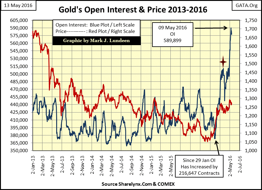
One of the reasons I’m optimistic the lows of last January will hold is seeing how little effect the “policy makers” are having suppressing the price of gold (Red Plot) with their flooding the COMEX market with paper gold (Blue Plot). Since January 29th they’ve sold an additional 216,000 gold contracts with little bearish effect on the price of gold. In March (Red Star), they failed creating a selling panic in the gold market. Will they be any more successful in their next attempt? Time will tell.
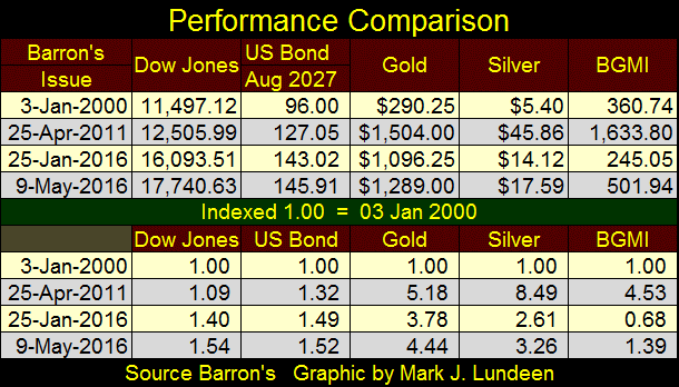
Let’s look at the comparative performance of the Dow Jones, a US T-bond I’ve tracked since August 1997, gold and the Barron’s Gold Mining Index (BGMI). The chart below (Weekly Basis) plots their indexed values (Barron’s 03 Jan 2000 issue = 1.00), and provides an insight to the markets since the top of the high-tech bubble not often seen.
For one thing the Dow Jones (Blue Plot) hasn’t seen a double (rise above the 2.0 Line) since January 2000. For it to do so, it would have to rise above 22,944, a valuation I believe is unlikely for anyone over 40 years old to ever see in their lifetime. That is, unless the “policy makers” become totally unhinged and decide to monetize the companies listed in the Dow Jones; something the Bank of Japan has been doing with the Japanese stock market for years.
Gold (Green Plot) even with its August 2011 to December 2015 45% correction actually looks darn good. The bullish bounce it’s seen since the beginning of the year is very encouraging.

Investors in the precious-metals miners (Black Plot) have been on a roller-coaster ride since 2000. From 2001 to March 2008 the miners actually outperformed gold. As a leveraged play on the metal they mine, that’s how the miners should behave in a gold bull market. Though truth be told; they should have performed better with gold increasing 350% during the same time period.
In March 2008 precious metal assets were in a strong bullish up-trend, just as Bear Stearns, a former Wall Street investment bank went down with their fraudulent sub-prime mortgage “products.” Lehman Brothers was to join them in the next six months. The credit crisis saw the BGMI decline 64% from March to November 2008 as gold itself declined only 27%. That’s how leverage works in a down market, especially when the “policy makers” refused to allow precious metal assets to perform their traditional market function of providing a safe harbor to capital during a financial panic.
From its lows of November 2008, the BGMI made a new all-time high; a 182% advance just two years later in November 2010! Other more widely followed gold mining indexes saw similar stunning gains. Then came late April 2011, where the BGMI began a massive 85% collapse that didn’t terminate until Barron’s 25 January 2016 issue. From its lows of January to its high of early May the BGMI has advanced 112% in a little less than four months – WOW! Gold itself advanced only 22% from its lows of last November. Now that’s how the gold miners should perform!
Can the miners keep up this sizzling performance? Well, my crystal ball’s calibration sticker expired a few years ago so you must understand I can’t provide any guarantees for my visions of the future. But when the investment universe realizes that gold and silver are going rise to new all-time highs, and understand the financial markets are at risk of visiting their old lows of early 2009, I expect we’ll see flight capital stampede into these mining companies, and the metals they mine, resulting in historic capital gains for investors who purchase them at today’s prices. That goes for the exploration shares too.
When will this happen? Maybe as soon as this summer or before October. Maybe not until next year. But if Janet Yellen held a press conference announcing the FOMC finally found a backbone, along with the will to increase the Fed Funds rate a pathetic fifty basis points, it would happen the following week. “Financial stability” is a fragile thing in May 2016. So expect everything to be perfectly fine, until one day it’s not.
I’ve plotted a US Treasury bond (Red Plot) in the chart above for the simple reason that for most of the past sixteen years of monetary hijinks, Treasury bonds have provided more in capital gains than have the blue-chip stocks in the Dow Jones. Does that bother you? Most likely not. But before August 1971 when the US Treasury broke the dollar’s last connection to the gold standard, I doubt there were many market experts or economists who would have believed that such a thing was even possible.
The table below lists the published and the indexed values seen in the chart above at key market turns in the BGMI. I also included silver in the table. For all the trials and tribulations the gold and silver markets have seen in the past sixteen years, on a buy and hold for the long term basis they have outperformed the Dow Jones by at least a factor of 2, and frequently more for the entire period. Not so for the BGMI, but I expect in the years to come the miners will eventually lead the list.
However, keep in mind that we are looking at dollars here, a currency at risk of total ruin as the FOMC’s management of it has been totally incompetent. So I like the miners, but recognize that actual gold and silver bullion in one’s portfolio and stored outside the banking system is important. Investing equal dollar amounts in gold, silver and quality mining shares seems the thing to do in May 2016.
Expanding the sample in the next table we see how gold (#11) and silver (#23), even near their five-year correction bottoms’ are still in the top 30. Many of the perennially popular investment recommendations made by media “market experts”, such as banking stocks (#85) and technology stocks (#84) are below their January 2000 levels. That’s not to say money could not have been made in these stock groups by a good trader. But most retail investors are not good traders, and would have done better by simply purchasing, and holding gold and silver bullion for the past sixteen years; a strategy that most likely will continue to be true for the next five, possibly ten years.
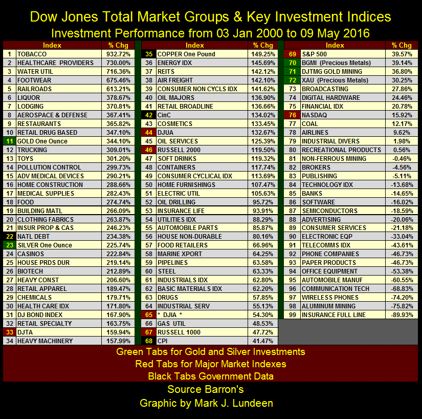
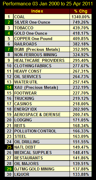
The gold miners (#70-72 above) have underperformed the precious metals themselves, but they are in the early stages of a recovery from an 85% market decline. This is an excuse the S&P 500 (#69 and currently near a new all-time high) doesn’t have, advancing only 39.6% above its highs of sixteen years ago. In Barron’s 25 April 2011 issue (table below) the precious metal miners were in the top 30 along with gold and silver. As the bull market in gold and silver continue, I expect the miners will catch up, and then most likely exceed gold and silver in these tables.
The market action of the past few weeks for gold, silver and their miners have left their investors disappointed. But the gains the miners have seen since the beginning of 2016 have been historic, so a period of consolidation is only natural. Keep in mind the general stock market (using the Dow Jones as a proxy) has done no better and hasn’t seen a new 52Wk high in the past year. Yet the moral for bulls in the stock market is better than the precious metals bulls for all the wrong reasons. Exiting the general stock market and buying gold, silver and the mining shares at today’s prices is not a bad thing to do.
Mark J. Lundeen
share
share
share
share
share
More from Gold-Eagle