The Market Is Down For The Count – A Knockout For Mr Bear?


 Since the first day of the New Year the stock market has had a difficult time. Why? Maybe a better question would be; how did the Dow Jones, my proxy for the general stock market, recovered to new all-time highs so soon after its March 2009 bottom? The Dow Jones recovered from its second deepest bear market bottom since 1885, a decline of 54% to new all-time highs in just four years! How this was accomplished is the worst kept secret on Wall Street: the Federal Reserve initiated a massive program of US Treasury Debt monetization to rescue the big banks, (and Washington’s political class) from the Frankenstein monster they’d created in the sub-prime mortgage market.
When speaking of the Federal Reserve bailing out Wall Street, the elected officials in Washington must also share the blame as they were the ones responsible for passing legislation creating the secondary mortgage market, the Federal Reserve System and the Federal regulatory agencies tasked with overseeing the entire mortgage fiasco.
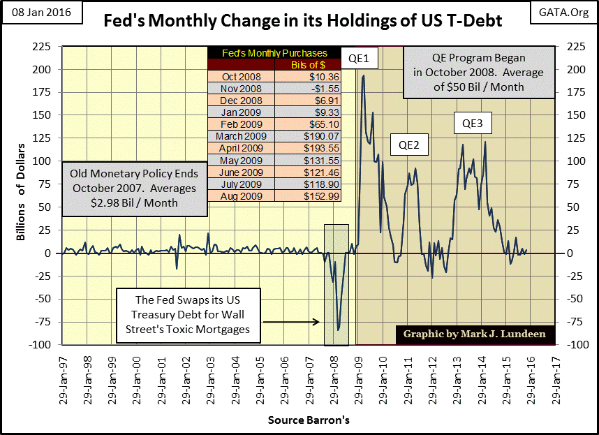
Looking at monthly changes in the Federal Reserve’s holding of US Treasury Debt in the chart below, the damage done to the credit system by the sub-prime mortgage debacle is made crystal clear. The ten years spanning 1997 to 2007 (ten years that saw the high-tech boom and bust as well as the reckless inflation of US real estate), was accomplished by monetizing on average only $2.98 billion dollars of US T-debt a month. Then in autumn 2007, as the problems in the mortgage market could no longer be denied, something very strange happened; the Fed’s portfolio of US Treasury debt began to contract. In fact over the next seven months the Federal Reserve’s holdings of US Treasury Debt would decline a historic 39%.
What was happening? Had you believed Fed Chairman Ben Bernanke it wasn’t because the Federal Reserve was bailing out Wall Street.
"It is not the responsibility of the Federal Reserve – nor would it be appropriate – to protect lenders and investors from the consequences of their financial decisions."
- Doctor Ben Bernanke, Fed Chairman, 31 October 2007
But officials of the Federal Reserve System have a long tradition of saying one thing for public consumption, then doing the exact opposite for the benefit of Wall Street insiders. Bernanke had been covertly swapping the Fed’s dollar reserves (US T-debt) for Wall Street’s illiquid mortgage assets. Had he not done this the credit crisis would have erupted in late 2007 instead of late 2008.
In the chart above we see the monthly purchases of US Treasury debt during the three episodes of QE, with a table giving the specific monthly purchases during the QE1 spike in 2009. Since October 2008 the Federal Reserve had been monetizing on average $50 billion dollars of the US national debt per month. Prior to the credit crisis it had been inflating high-tech stocks and the American real-estate market to ridiculous levels by monetizing on average only $2.98 billion a month.
The effects this massive “injection of liquidity” had on the stock market are seen in the chart below. From October 2008 to May 2009 I had been predicting a Dow Jones decline of 70% or more, a decline I’m sure would have happened had the Federal Reserve not interrupted Mr Bear with its QE program. By April 2009 Doctor Bernanke had flooded the banking system with enough “liquidity” to reverse the stock market decline and fuel its ascent to new all-time highs just four years later with its QE3.
Soon after initiating the second round of QE in December 2010, doc Ben discussed the success of his “policies” with CNBC’s Steve Liesman:
“Policies have contributed to a stronger stock market just as they did in March 2009, when we did the last iteration of this. The S&P 500 is up 20% plus and the Russell 2000, which is about small cap stocks, is up 30% plus.”
- Doctor Benjamin Bernanke, CNBC Interview with Steve Liesman 13 Jan 2011 (1:40 PM).
Obviously the Fed Chairman was quite proud of himself. Mr. Liesman never pressed Doctor Bernanke with hard questions of exactly how this amazing climb in market values was actually accomplished by the Federal Reserve. He wasn’t the only member of the media who didn’t care how the stock market was rebounding, as long as it continued to go up. But the charts above and below tell the tale; the Federal Reserve was inflating its third, and most dangerous monetary bubble since Alan Greenspan became Fed Chairman in August 1987.

Understanding the current “bull market” as an inflationary event, it’s no surprise the Dow Jones would:
- cease its energetic advance in December 2014 with the termination of QE3,
- fail to break above its last all-time high of May 2015, reverse course and begin to decline in price since July of last year, as the financial markets are now starved for monetary inflation (“growth”) from the Federal Reserve.
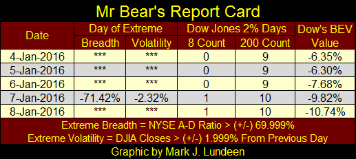
Should the Dow Jones break below its 52Wk low in the chart above, (as I expect it will in the months to come), we’ll see some excitement in the financial markets. Deflationary declines in the stock market are always accompanied by days of extreme market breadth and volatility. On Thursday the stock market gave us one of each as we see in Mr Bear’s Report Card below.
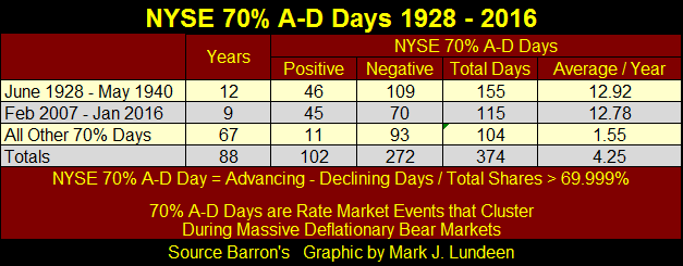
Extreme days of market breadth are actually rare market events. Since 1926 just 374 trading sessions of the 23,791 trading days I have data for have been days of extreme market breadth at the NYSE.

That’s not many days at all, just 1.57% percent of all trading sessions, and note in the table below how 270 of these extreme days occurred during the depression era and over the past nine years.
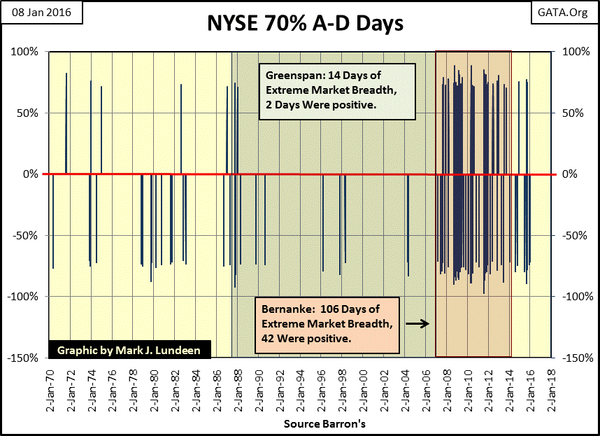
Here’s a chart of NYSE 70% A-D Days (Days of Extreme Market Breadth) from 1970 thru this week. The current cluster began forming in February 2007, at the very beginning of the sub-prime mortgage crisis and has continued to build up until this week. Concerning NYSE market breadth, nothing like this cluster of extreme days has happened since the Great Depression stock market and that should be telling us something.
Next is a chart plotting the raw data for days of extreme volatility, days the Dow Jones moved (+/-) 2% from the previous day’s closing price. As with days of extreme market breadth, days of extreme volatility are rare market events and tend to cluster around big market declines. Note how the largest daily advances have all occurred during huge bear markets. It’s just Mr Bear’s way of letting the short sellers know he’s thinking of them too.
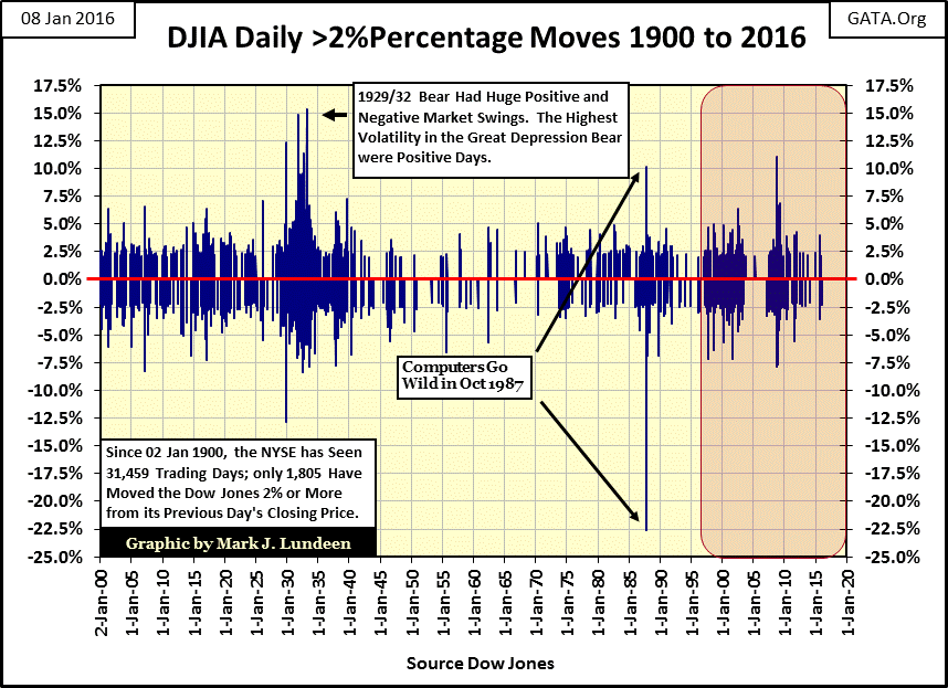
Since January 1900, (one hundred and sixteen years / 31,459 NYSE trading sessions) there have been just 1,805 days when the Dow Jones moved (+/-) 2%, or more from a previous daily close. Seeing the raw data plotted is interesting, but the best way to comprehend the bearish consequences of Dow Jones 2% days is plotting them in a 200 day running sample in the chart below. Exactly like days of extreme market breadth, days of extreme volatility form clusters during bear markets. With the exception of the April 1942 52% bear market bottom, each time the 200 count increased above 10 since January 1900, it’s been a strong indication that Mr Bear was soon to pay Wall Street a visit.
The standout feature in the chart below is how market volatility was altered with the 1971 termination of the Bretton Wood $35 gold peg for the dollar. This is a story whose final chapter has yet to be written.
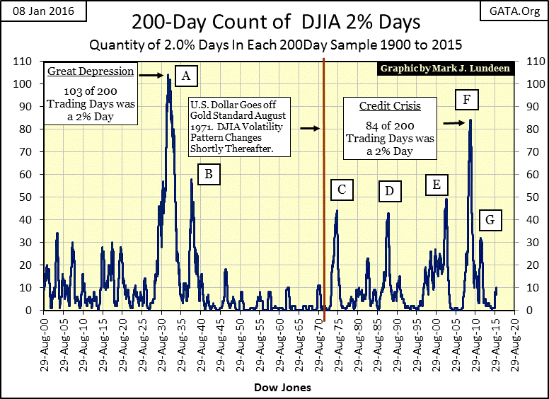
The above chart is very useful. Not only does it identify the large and small market declines since 1900, it also identifies the safe and profitable re-entry points back into the stock market – when a bear market reaches its peak level of volatility (peak number of Dow Jones 2% days in the 200 count). Of course this assumes one can identify the actual top in a bear market’s 200 count. Good luck with that. However I predict the 200 count will be much higher than the current 10 seen at the end of this week when the Dow Jones reaches its next bottom, which will likely exceed the March 2009 54% market decline. I’m still thinking a market decline (Dow Jones) of over 70%.
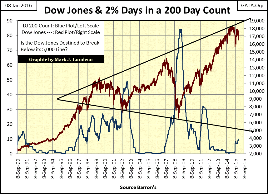
Here’s a chart plotting the Dow Jones with its 200 count for the past twenty-six years. Note how the 200 count reached a peak at the bottom of both the high-tech and mortgage bear markets, and was sensitive to the Aug/Sept 2011 market decline. Seeing the recent rise after the last August’s market decline is a matter for concern.
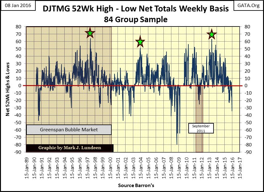
Data from the Dow Jones Total Market Groups (DJTMG) is getting bearish. There were no new 52Wk Highs this week but the DJTMGs did see 34 new 52Wk Lows. Unless the FOMC soon initiates another round of QE, continued deflating market valuations in the stock market seem inevitable.
Another matter for concern is that this week the Dow Jones Total Market Group saw a big decline in the number of groups within 20% of their last all-time high. In the most recent cycle the “Top 20” peaked in July 2014 at 52 groups. Then this week it collapsed by ten groups, declining from 43 to 33 in a single week.
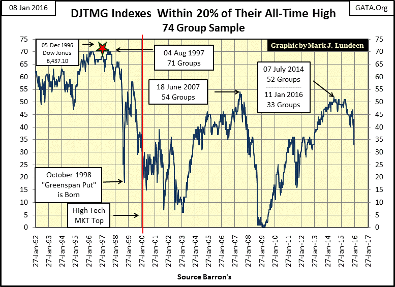
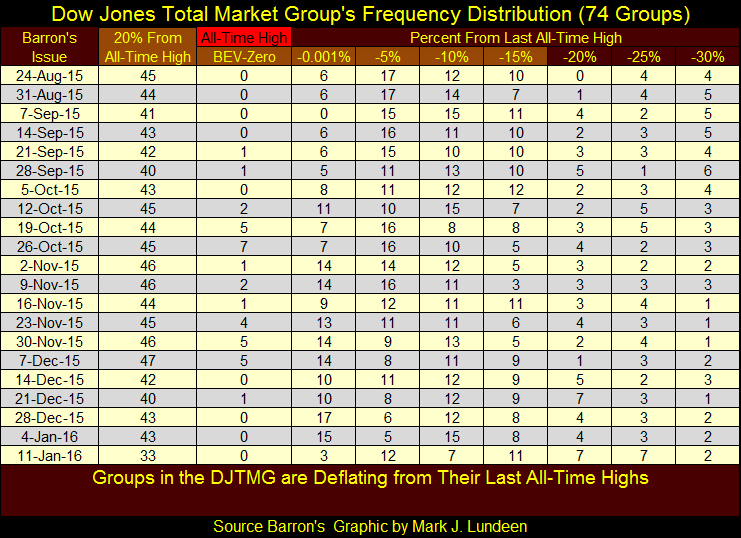
Here’s the table for the frequency distribution used in computing the Top 20; we see the big decline from this past week and how more and more DJTMGs are migrating away from their last all-time highs. Most of these 74 groups are off this table, having declined more than 30% from their last all-time high. I think it’s fair saying that since the summer of 2014 when the Top 20 peaked at 52 most retail investors have at best broken even in the stock market.
All in all the data I follow indicate the stock market has entered a period of deflating market valuations. The past week was hard on the bulls, so don’t be surprised if next week we see a relief rally. But then don’t be surprised if next week we see more of the same as Mr Bear has pounced on the market and is dining on market valuations, which are no longer supported by the FOMC since the end of QE3. Transferring a portion of one’s capital from the stock market into gold and silver (not ETFs) seems a prudent thing to do in today’s market.
Mark J. Lundeen


