S&P500 – Time To Be Defensively Pro-Active


We are no fans of the Fed-sponsored stock market takeover, but that seems to be the way of central planners, these days…eliminate free markets and get them to react how it puts central planning and Lying Ben’s disastrous QE4Ever in a positive light, no matter that everything else is falling apart.
As we look at the artificially driven charts, like those of gold and silver, there are some warning signs of which one should be aware. Now is the time to take stock of your stocks, and weed out the poor performers. One of the biggest mistakes individuals make is to hold onto them in the hopes that they will “catch up” to the rest of the market. It is always best to jettison anything that is not working or creating losses, or even just marginal gains, for they can quickly turn red and not look back.
For the balance of stock positions, use tight stops, even though many who are in the stock market do not use them. Big mistake! Stops lock in price and eliminate the emotional element for making a decision at a time when a decision needs to be made.
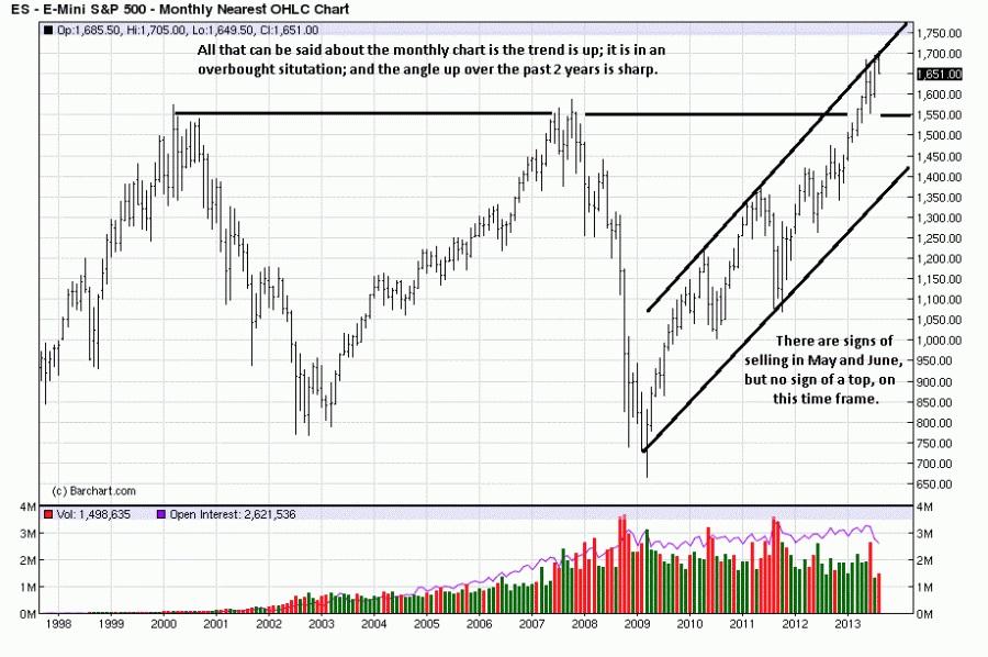
We will use a weather analogy for the various time frames. Everyone can relate to the weather and understand what clouds and sunshine mean. The monthly time frame is first. Remember, higher time frames are used to put a market into a context, and they take longer to turn. The process is typically from up, to sideways, before turning down.
The monthly chart shows a sunny day, but there are a few clouds forming. Price is at new all-time highs, but the activity is not very convincing. Note how the bars are overlapping, unlike the rally bars just prior to the previous four weeks. The 3rd and 4th bars have mid-range closes on much higher volume than the 1st two bars. From this we know that sellers were active at the highs. The lower volume of the last 2 weeks says demand is flagging, and it could be a red flag waving. Needs more information/time.
What makes the above more interesting is that the activity is occurring at the overbought channel line. This, too, bears watching because while overbought can lead to a correction, it can also lead to more overbought. The point is to respect the momentum of the trend, and the monthly trend is up, with just a few clouds.
The weekly chart represents a cloudy day with occasional breaks of the sun. The clouds are not storm clouds, for they are not dark enough.
The decline, at “A,” was on sharply higher volume, while the “B” rally was on decidedly less volume, [lack of demand]. The possible “kicker” is “C.” It was a decline that erased the previous 4- 1/2 weeks on the highest volume over the same time span. That would be a darker cloud formation because it followed a brief series of small range rally bars that were overlapping and making minimal upside progress.
Patterns show up in the markets all of the time, and just like weather patterns can tell you what to expect for the foreseeable future, so can chart patterns. We point to a similar one from early 2011, [see boxed area]. While a weather pattern can look ominous, if a break in the clouds leads to better weather, the previous warning signs have changed, for the better. If there is no break to be seen, expect the developing pattern to continue, as it did in 2011. It is too soon to tell for 2013, at this point, but one cannot deny there are warning signs.
Relative to the monthly chart, the weekly is not as sunny, but an umbrella is not yet needed. The “weather” pattern can still change for the better, just as it did after the May decline.

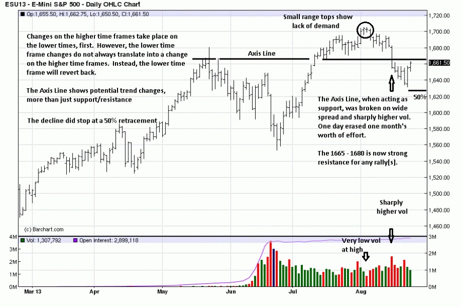
The daily, a weatherman’s dilemma. [We still remember Ginger Zee when she was in Chicago, so we include weatherwoman, too]. It looks promising for a while, then some clouds form overhead, remaining for some time, and finally they turn for the worse, as happened at the Axis Line, seven TDs ago. If the “change in weather” on the daily chart does not improve, it will impact the weekly chart, and that will then impact the monthly, but that has not yet happened, for the changes are not yet conclusive. Not good, but still needing confirmation. Seven days ago the rains started.
What helps keep a little hope for the daily chart is the fact that the monthly and weekly are still showing up trends. The daily is sideways to almost down. Last week’s decline did stop at a 50% retracement area. It is a general measure to indicate the strength or weakness of a trend. For now, the daily remains tenuous.
If the daily says anything, it is a reminder that while dogs may make great pets, they do not belong in anyone’s stock portfolio. Get rid of them and protect what remains, and keep the umbrella handy.
- See more at: http://edgetraderplus.com/market-commentaries/s-p-time-to-be-defensively...


