Stocks And Precious Metals Markets Update
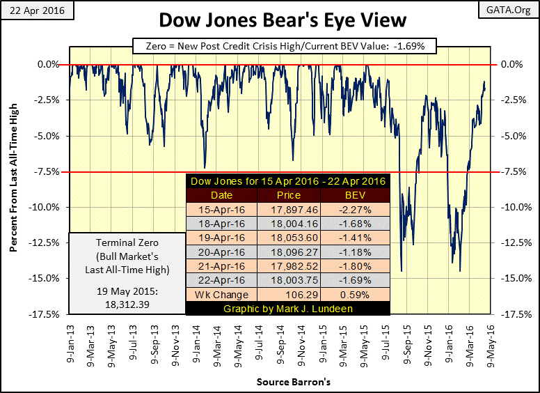
I intended to take a few weeks off. However, as the Dow Jones Index closed the week up only 1.69%, just three hundred points from making a new all-time high, I was motivated to make a few comments on the stock market.
With the Dow so close to making a new all-time high, should we consider becoming bullish on the stock market? Well, there’s nothing so bullish for a market than having its valuation increase week after week, but I see some red flags warning me that things aren’t all they appear to be…for one thing daily trading volume. Price is defined by the law of supply and demand, and in the stock market demand is determined by trading volume:
More Trading Volume = More Demand = Higher Prices.
And
Less Trading Volume = Less Demand = Lower Prices
There isn’t an actual mathematical equation involved here, but it’s evident that as more people enter a market the number of bidders increases along with the price of what everyone is bidding on. So how since last January (four months ago / Red Box below) has the Dow Jones increased 14.19% on a contraction of daily trading volume of 37%? With a little study of the chart below you’ll note how during the credit-crisis crash (2007-2009) trading volume exploded. What; historic market demand resulted in a 54% decline in the Dow Jones? That’s strange! Then from March 2009 to May 2016, the Dow Jones advanced 11,769 points (179%) as trading volume contracted by 84%. That’s just bizarre, but obviously that’s how the “policy makers” are running this railroad.
Also, as was true during the 2000-02 tech-wreck bear market, in March 2009 volume actually peaked at a new all-time high at the market bottom. Since the January 2000 market top the one hundred year relationship (1900 to 2000) between trading volume and the valuation of the Dow Jones has been turned upside down as a matter of “policy.” Here’s the Dow Jones (Red Plot) and NYSE Volume (Blue Plot 40Wk M/A) indexed from 1926 to 1943, a span of seventeen years that saw two bull market advances with expanding trading volume and three massive bear market bottoms (Red Plot & Stars) on contracting volume.
This apparent repeal of the law of supply and demand in regards to the NYSE since January 2000 is a big red flag as far as I’m concerned, and there are others too.
Current market commentary focuses primarily on earnings; but that’s only a lingering artifact of the Greenspan era. Before the Maestro began inflating bubbles in the financial markets one had to look long and hard to find market commentary on earnings, for the good reason that decades ago it was widely accepted that price trends for the Dow Jones were a leading economic indicator, while earning trends were at best a coincidental economic indicator. In other words price trends predicted future earnings * NOT * earning trends predicted future prices. As one could not invest capital on corporate earnings, market analysts spent little time on corporate earnings. Why can be seen in the chart below where I plotted the indexed values of Dow Jones with its earnings from 1968 to 1984.
Red boxes are Dow Jones market declines, green boxes are Dow Jones advances. Note the 1973-74 40% bear market occurred on rising earnings, and the 1982-2000 bull market began as the earnings for the Dow Jones were in a historic collapse. I’ve published these chart many times in my past articles, and even during the Great Depression it wasn’t unusual seeing the Dow’s price and earning trends go opposite of each other for a year or more.
But the investing public’s perception of the value of following earnings trends changed with Alan Greenspan’s “injections of liquidity” into the financial markets and CNBC with their quarterly “Earnings Central.” Between the two of them they’ve made earnings a market fetish since the mid 1990s, and up to today.
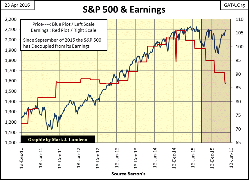
After over two decades of convincing the public that earnings are a leading indicator of future price trends in the stock market, those who live by stock earnings will most likely die by stock earnings. This is most likely why the media has paid little attention to the fact that since their peaks in December 2014 earnings for the Dow Jones and S&P 500 have contracted by over 15%.
Here’s the chart for the Dow Jones. As one would have expected since the Greenspan era from December 2014 to September 2015 the trends for the Dow’s price and earnings were correlated. But in the Red Box we see the September to November 2015 advance in the Dow Jones occurred with no growth in earning until it was terminated, and our current advance in the Dow Jones has actually occurred with a decline in earnings.
But the Dow Jones is only 30 large blue-chip stocks. So let’s see what the S&P500, a market index based on 500 corporations is doing. Here it is below, and to my eyes its chart looks even worse. Keep in mind we aren’t living in the 1970s. In 2016 we live in a world where the investment public sees declining earnings as a leading indicator for future price trends. The Dow Jones and S&P 500 may be approaching their old all-time highs, but their earnings have been declining for the past twenty months with no sign of this trend reversing. In terms of price and time I have to wonder how much longer the bulls (Washington and Wall Street) can take this market up on these wretched earnings.
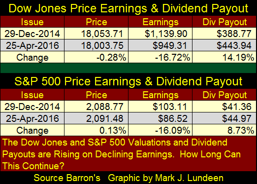
Here’s a table listing the price, earnings and dividend payout for the Dow Jones and S&P500 since their earnings peaked in December 2014. Prudent investors must wonder how much longer these two venerable indexes can maintain their now historic dividend payouts should their earning continue to decline.
What is actually frightening is that many companies trading on the NYSE have taken full opportunity of the trillions of dollars of cheap money now available to them from the FOMC to fund their share buyback programs. This was a concern with Richard Fisher; former Dallas Fed President as far back as May 2013.
"We've made rich people richer. This is great for the Buffetts and for others who can take advantage of this multiple of great money and cheap money that's been available. The question is, what have we done for the working men and women of America? Right now, (companies are) using cheap money to buy back their stock, pay extra dividends, etc. etc. We all know what is going on."
- Richard Fisher, Dallas Fed President, 5/20/2013
All too many companies have gone to the bond market to tap into the almost free money now available to them to buy back their shares or support their dividend payouts. But even though stock valuations continue rising, seeing corporate earnings in decline since December 2014 tells me that the economy itself is in recession. At some point corporate America and investors are going to have to take the bull by the tail and look at the situation square in the eye. And they are not going to like what they see when the economic contraction, now evident in the declining earnings, force corporations to divert dividend payouts to servicing bond obligations taken on since March 2009. I still believe that at the bottom of what is to come we’ll be lucky if the Dow and the S&P decline only 70% from their highs of last May.
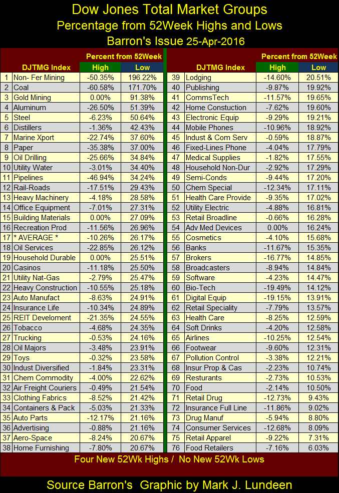
Well that’s the bad news, but I have some good news on the gold and silver front; the DJTMG’s saw four new 52Wk highs last week with one of them the gold miners (#3 table below). The DJTMG’s gold miners gained 5.8% as the XAU advanced 3.77% and the Barron’s Gold Mining Index (BGMI) gain 6.31% for the week. Realize that the gold mining stocks as recently as four months ago were at the bottom of the table below. The 91.38% advance from the Gold Miners’ 52Wk Lows are from just last January, with the XAU advancing 98% and the BGMI advancing 99% in the past four months.
Should you buy them? I’m not an investment advisor. I don’t even play one on TV. But I have the feeling that something historic began last January that has a good ways to go before it’s over. This may just be one of those times where if you wait until the market corrects to get in at a better price, you’ll never get in.
For gold and silver bullion the past twenty five trading days has been pretty good as we see below. With gold’s 15 count now at -3, and a few times dipping as low as -5 in March, it has seen plenty of selling pressure. Yet since March 18th it’s only down by $23. Silver on the other hand ended the week with its 15 Count at +5. Had the silver market not been suppressed by the big banks, in full cooperation with the government’s market regulators, I’d expect we would have seen the price of silver over $19 at the end of the week, but that’s just my opinion.
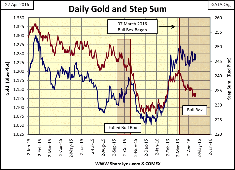
Beginning in early March gold’s step sum chart below began forming a classic bull box. In a bull box we see bearish market sentiment in the declining step sum, while market reality is seen in the price trend that refuses to decline even as the market has seen more declining than advancing days for weeks on end. Typically bull boxes resolve themselves with a break out in the price trend with the step sum reversing upwards with the price trend. Then other times we see what happened in 2015, where the selling overwhelms the price trend and we see the price collapsing down with the step sum causing the bull box to fail. But that’s actually unusual. Seeing a bull box form since early March is very bullish indicator for the gold market, as well as for silver and the mining shares.
So, as we approach the end of April 2016 I’m still bearish on the financial markets, both stocks, bonds and real estate, but bullish on the precious metals and their miners. Just keep in mind that I’m not an investment advisor. I don’t even play one on TV. But that doesn’t mean I’m wrong.
Expect my next article in two or three weeks, or if something interesting happens in the market.
Mark J. Lundeen


