Barron’s Gold Mining Index: A Ninety Six Year Study


What does “real money” mean to you? To many of my readers, I suspect real money would be gold and silver coinage backing the paper money in circulation. But to politicians and economists, it means something completely different:
"A billion here, a billion there, and pretty soon you’re talking real money."
- Senator Everett Dirksen
I like this quote from Senator Dirksen, spoken in protest of the spendthrift fiscal and monetary policies of the Johnson Administration (1963 to 1968). I understand what he meant by it; if Washington continues spending money it doesn’t have by the billions, at some point there’s going to be a crisis. Since 1968 there have been plenty of them, each ultimately resolved with “injections” of ever larger doses of monetary inflation into the financial markets.
A billion dollars was a lot of money back then. Even today a billion dollars is a lot to most of us. However in 2016, a billion dollars to Congress’s Chairman of the Ways and Means Committee, or a major bank operating in the multi-hundred trillion dollar OTC derivatives market, is only a rounding error in the grand scheme of things, thanks to the “policy makers” relentless inflation of the money supply.
To mere mortals like us, if not to the “policy makers” themselves, a billion of anything is still a lot of something. In 1980, when the US National Debt was then a shocking $800 billion dollars, and the market cap for the entire NYSE was about $1.2 trillion dollars, PBS televised Carl Sagan’s thirteen part COSMOS television series. When Mr. Sagan desired to illustrate the enormous scale of the universe, he would say “billions and billions.” Mind you; not billions times billions. Carl was comfortable that just two or three billion stars, galaxies or lightyears would inspire the appropriate awe in the minds of his viewers.
But that was back in 1980. Today, “billions and billions” could actually be a frequently used term to describe the personal net worth of the typical social-media mogul. Though still impressive, today’s “billions and billions” isn’t especially awe inspiriting.
In the past, I’ve noted how monetary inflation doesn’t flow into investments of gold and silver. “Market experts” and “economists” will dispute this easily provable thesis, but this is a simple fact of life; that the Federal Reserve controls the credit system (the engine of inflation) in the United States. Because of this a broker can provide credit for individuals’ margin accounts; banks can write mortgages for a family, and credit card companies can finance a summer’s vacation. But no institution associated with the Federal Reserve System is going to lend you money to finance delivery of an ingot of gold or silver from the COMEX.
So, where monetary inflation actually flows into, is directed by the banking system. And the banking system typically extends credit towards the financial markets; stocks, bonds and real estate during those periods of time we call “bull markets.” Usually, as long as financial assets are being inflated by the banking system, gold and silver does little for its owners, but that isn’t always true.
What inflates the value of gold, silver and precious metals mining shares is DEFLATION (capital flight) from the previous INFLATED stocks, bonds and real estate assets. And inflationary bubbles in the financial markets always deflate.
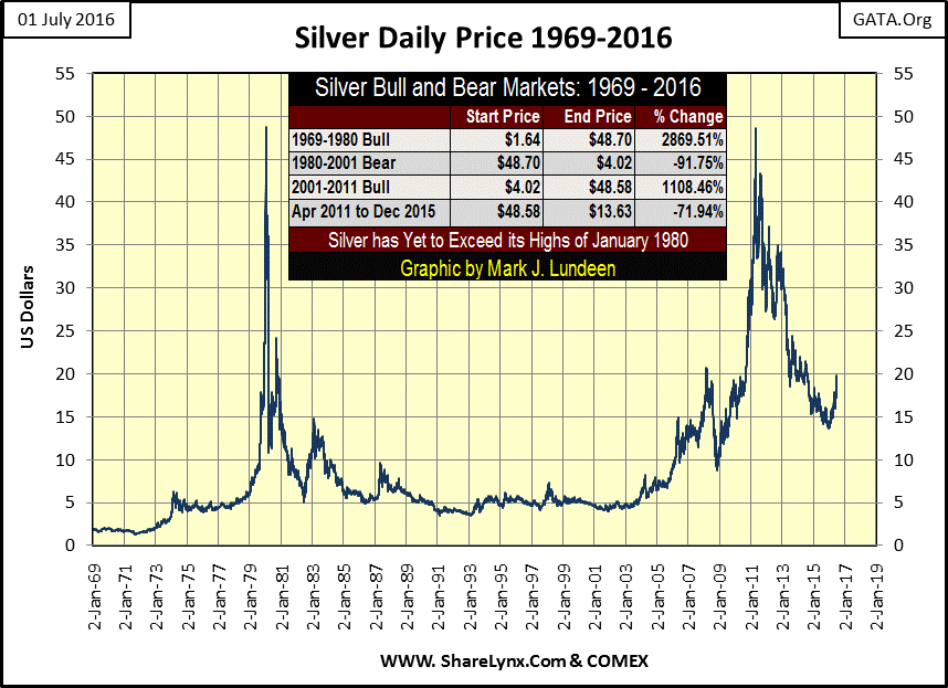
The magnitude of the resulting flight of wealth from the deflating financial assets into gold, silver and mining shares depends on the magnitude of the inflation the financial assets were subjected to. Given the horrific inflation seen in the global economy in the past decades, come the next prolonged deflation of the financial markets, there will be an abundance of rocket fuel to propel the old monetary metals and their miners to levels few today can believe possible in the coming years. This is especially true for silver, a metal whose last all-time high price still dates from January 1980; thirty-six years ago.
Originally, Barron’s Gold Mining Index (BGMI) was one group of about twenty five in the now discontinued Barron’s Stock Averages data set. Barron’s from 1938 to 1988, published weekly values for industry groups such as gold mining, steel, automobile manufacturing and others. When Barron’s discontinued their stock averages series in October 1988, their gold mining average was repackaged as the BGMI, and has continued to be published weekly to this day.
To extend the data to 1920, a good mate of mine (Geoff; a true gentleman and scholar from the Land Down-Under), made the effort to obtain weekly data for Homestake Mining (HM) going back to 1920. As HM was one of the two gold miners Barron’s used in the construction of the BGMI in 1938, what Geoff contributed to the data in the following charts (1920 to 1938) is good data. Thanks Geoff!
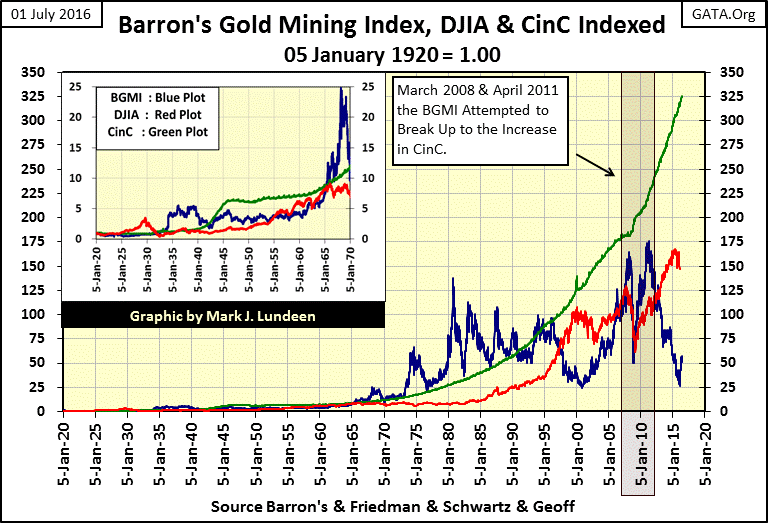
To better visualize how gold mining stocks have performed over the past century, I indexed the BGMI data to 1.00 = January 1920. So below, when the BGMI saw 25 in 1968, we know that its valuation had increased by a factor of 25 from where it began in January 1920. I also constructed a chart for the Dow Jones using identical indexed weekly closing data, and placed it below the BGMI in the same graphic. This allows a direct comparison in the performance between the two since 1920, proving how gold mining shares for almost a century have frequently provided an excellent countercyclical investment to the stock market.
Unlike the Dow Jones, the BGMI did little during the inflationary 1920s. Below, using weekly closing data, the Dow Jones peaked in September 1929 at 3.5 while the BGMI had declined to 0.79 from January 1920. But as it was to do many times in the 20th century and into the next, in the chaos that followed, the BGMI served as a safe harbor to wealth during the depressing 1930s.
At its July 1932 bottom, the Dow Jones found itself at 0.38; an 89% decline from the 3.50 seen in September 1929. This was even a significant decline from its January 1920’s 1.00. However, by July 1932, the BGMI increased to 1.23 DURING the Great Depression Crash. The Dow Jones, from its lows of July 1932, was to see an excellent bull market which peaked at 1.79 in March 1937. After the US dollar was devalued from $20.62 to $35 an ounce of gold in the spring of 1934, the BGMI saw a bull market that outperformed the Dow Jones’ gain of 3.5 seen in September 1929.
In January 1938, the BGMI broke above 5.0, and ended the month at 5.29, while the Dow Jones found itself at 1.40, far below its September 1929 peak value. After January 1940, both the Dow Jones and the BGMI entered a bear market that didn’t bottom until April 1942. With the post WW2 inflationary monetary policy of the US Treasury and Federal Reserve, it was the Dow Jones that entered a substantial bull market, not the BGMI.
But all that changed after 1965, as once again the BGMI saw market gains that far exceeded those seen by the Dow Jones in the past half century. Looking at the inserts for the two indices, by 1970 the BGMI had increased by a factor of 25, as gains from 1920 for the Dow Jones were still single digits.
What changed after 1965? Monetary inflation flowing into consumer prices forced bond yields ever higher (deflating bond prices). In this environment of rising consumer prices, the Dow Jones for the next two decades made five failed attempts to break above 1000 as the BGMI peaked in October 1980 at 137.88.
The Dow Jones wouldn’t see 138 until May of 2013; thirty-three years later.
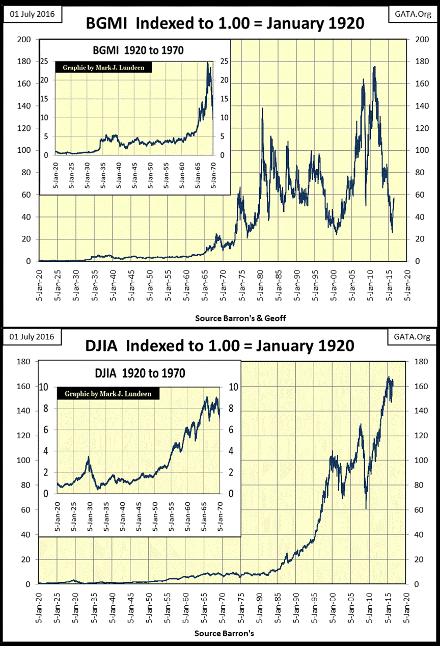
After its September 1980 peak of 137.88, the BGMI entered into a strange bear market that saw massive moves both to the up and downside. By 1997, it formed a pendant formation in the charts above and below, with a series of higher lows and lower highs. After 1997, with the high-tech feeding frenzy entering its terminal stage, the BGMI began its terminal descent in a bear market that began in 1980.
Looking at the BGMI with its step sum (weekly data) below, we see what is best described as a failed-bull box form from 1982 to 1997. The pattern of higher lows in the BGMI (Blue Plot) gave no encouragement to market sentiment (the step sum / Red Plot), as from 1982 to 2001 the BGMI all too frequently closed the week below the previous week’s closing price.

After bottoming in 2001, the BGMI once again entered into a bull market. I say a bull market that continues to this day despite a 70% market correction from March to October 2008, and an 85% market correction from April 2011 to January 2016. Though no doubt, many people would disagree that any bull market could include the two massive corrections the BGMI endured since 2001.
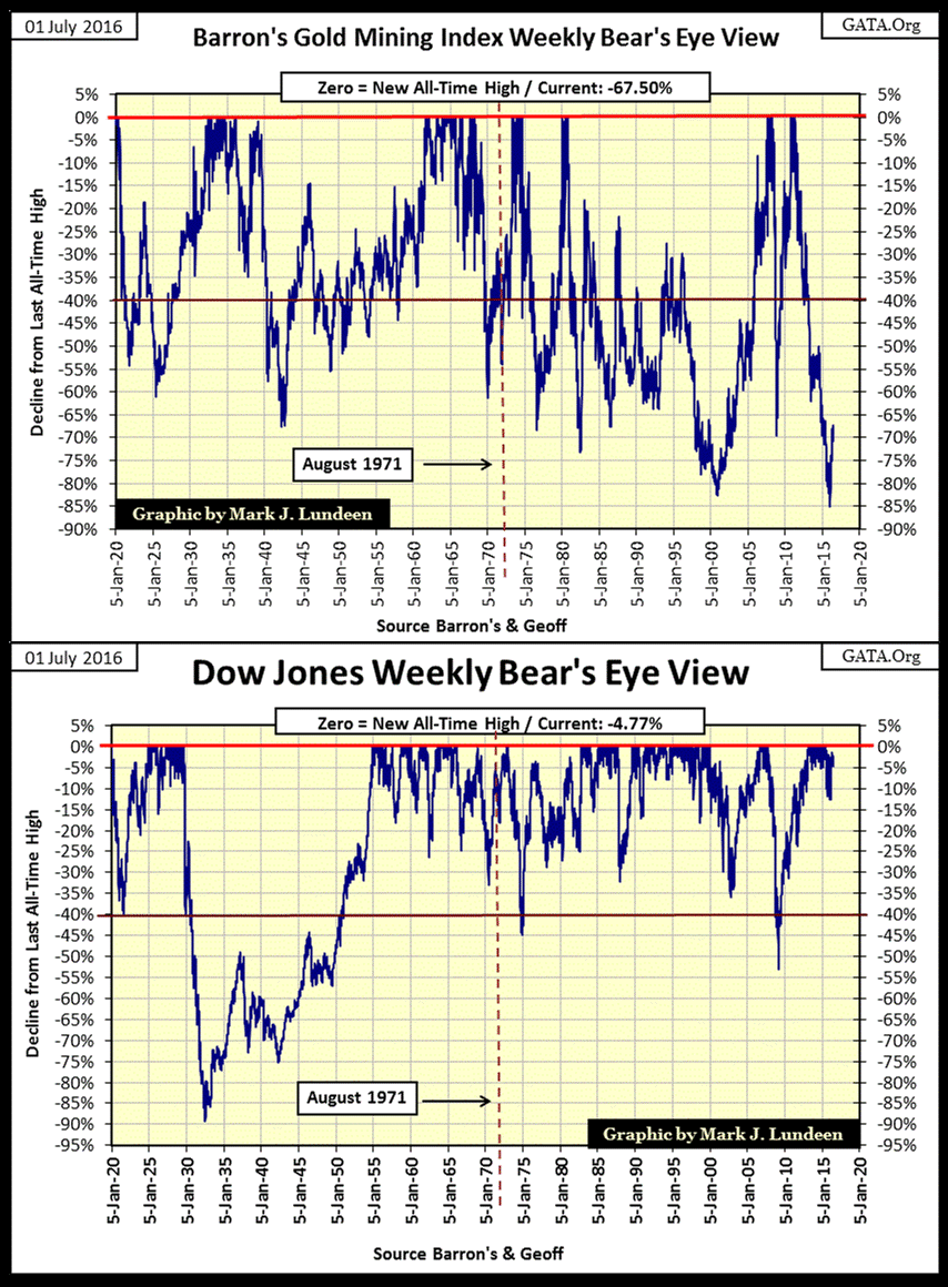
Below are the BEV charts for the BGMI and Dow Jones. The two indexes couldn’t be more different from each other. Incredibly, for an index that’s seen tremendous gains since 1920, and bull markets much superior to those seen by the Dow Jones, one would assume that new all-time highs (BEV Zeros) would be frequent events.
But in the BGMI’s BEV chart below, we see that BEV Zeros are actually infrequent market events. What happens is that when the BGMI is making new all-time highs, it does so with great upward thrusts in short bursts of time. This has been especially true after the dollar was decoupled from the $35 gold standard in August 1971. With the coming collapse of the current monetary regime, we may once again see the BGMI shed much of the volatility the miners took on after 1971, which would be good.
However, whether that proves to be true or not, it remains a historical fact that the best time to purchase any investment is on the rebound after a sharp market decline. The BGMI’s BEV chart below shows that the April 2011 to January 2016 85% market decline was the deepest the index has seen since 1920; greater than the 83% decline seen at the bottom of the 1980-2001 bear market. After the historic collapse in market valuation seen below, and the sharp rebound seen since January, it’s hard to be anything but wildly optimistic for the prospects of the precious metals miners.
After examining the BEV charts above for the BGMI and Dow Jones (noting how frequently they’ve declined below the Red BEV -40% line) , let’s move on to their Frequency Distribution tables below, analyzing the BEV data plotted above.
Since January 5th 1920, there have been 5034 weekly data points seen in the charts above. In their Frequency Distribution tables below, derived from the BEV data plotted above, the 0% row lists the number of weeks since January 1920 the Dow Jones and BGMI have closed at a new all-time high: 472 for the Dow Jones, 157 for the BGMI. The -0.000001% row lists all the weeks the indexes have closed just short of making a new all-time high, to -4.999% from a new all-time high: 1114 for the Dow Jones, 282 for the BGMI.
To make a long story short, look at the 0% to -25% row at the bottom of the table. Compared to the Dow Jones, the BGMI since 1920 has closed the week far below 30% from a previous all-time high, more times than not.
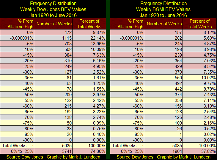
But in July 2016, with the BGMI coming off the bottom of an 85% market decline, I don’t think that’s a point one needs to dwell on. The next chart, plotting the indexed values of the Dow Jones, BGMI and Currency in Circulation (CinC) will justify my point.
As bull markets are inflationary events, we should see a relationship between the Dow Jones, the BGMI and the inflationary increase in paper dollars in circulation (CinC) from 1920 to present, which we do in the chart below.
Since 1920, the Dow Jones (Red Plot) has only seen one bull market that outperformed the inflationary increases seen in the green CinC plot: the Roaring 1920s Bull Market. The BGMI on the other hand routinely found itself above the increase in CinC inflation. During the 1930s and then again for decades from 1965 to 1995, gains seen in the BGMI handily beat inflation as measured by increases in CinC. Twice since its 2001 bear market bottom, the BGMI in March 2008 and then again in April 2011, attempted to increase up to the CinC plot below. Both attempts failed as the “policy makers” imposed “stabilization” on the financial markets.
In every BGMI bull market since 1920, the BGMI plot exceeded the inflationary gains seen in the CinC plot below by a large margin. At its October 1980 peak seen below, the BGMI crested at 137.88 as CinC peaked at only 29.01. A similar BGMI to CinC Ratio today would fix the BGMI at 1543 in the chart below. That would be a bull market advance by a factor of 62 from the lows of 2001.
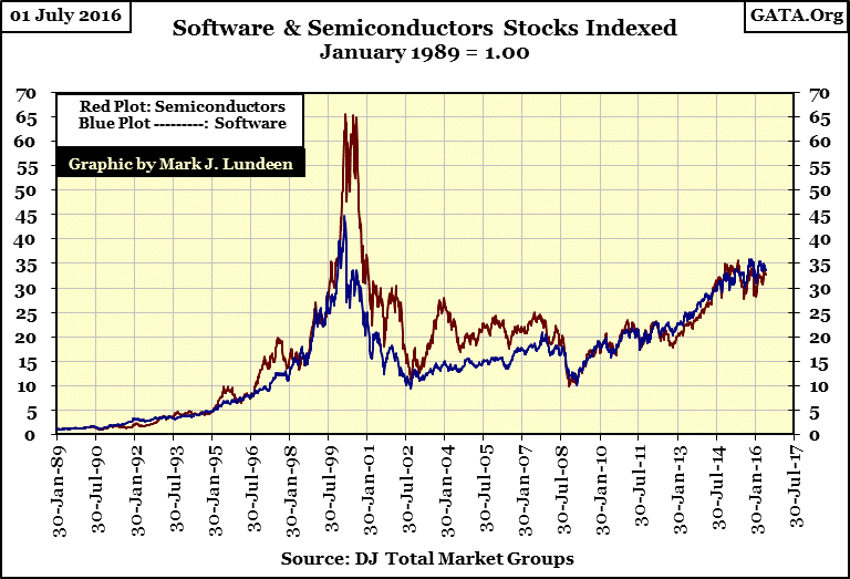
With the BGMI currently at 50 in the chart, that suggests the gold miners have much in the way of capital gains coming in the years to come. But today, gains such as these sounds outlandish to “respectable market experts.” But “respectable market experts” weren’t surprised to see software stocks (Blue Plot below) increase by a factor of 45, or semiconductor stocks (Red Plot) increase by a factor of 65 in January 2000. If I had data for these series beginning in August 1982, at the start of the 1982 to 2000 bull market, I suspect the factors-of-increase seen in the software and semiconductors indexes would have been over 200.
I have one more chart I want to cover, where I plot the Dow Jones and the BGMI as a ratio to CinC from 1920 to present. The raw data for the chart below can be seen in the Barron’s Gold Mining Index, DJIA and CinC graphic; two charts above.
When advances in the Dow Jones (Red Plot) or BGMI (Blue Plot) are equal to the advances in CinC, their plots rest on the 1.0 green line. Advances above the 1.0 line denote market gains above the rate of inflation, as measured by increases in CinC. Market advances failing to break above the green 1.0 line, as is the case for all Dow Jones bull markets since 1937, failed to produce market returns above the rate of inflation.
In terms of the ever increasing CinC, the BGMI is currently at 100 year lows. Take a moment to study the BGMI plot below. Consider the reaction the precious-metals miners had to the Great Depression, and the post-WW2 consumer price inflation, with its rising bond yields and interest rates. It’s a reasonable assumption the BGMI will once again become a stellar investment when the financial markets once again begin to deflate in earnest.

However, the real purpose of publishing this chart has to do with the three Red Triangles seen in the chart, each identifying a “macro-economic event” that lit a fire under the BGMI.
World War I knocked global finance off the gold standard, a situation that has continued to this day. But in the 1920s, there were attempts to restore it; one by the Bank of England.
In 1925 (the first triangle), the newly created Federal Reserve assisted the Bank of England in cheating on the rules by artificially lowering US interest rates. This action by America’s central bank made UK’s Gilts (UK Treasury Bonds) more attractive, and in so doing, stopped the gold flows from the Bank of England. The Fed also provided a $200 million line of credit to the Bank of England, while the House of Morgan provided a $100 million dollar loan to the British Treasury.
(Source: House of Morgan, by Ron Chernow Copyright 1990. Pages 276 & 277)
In 1925, high finance has yet to begin to deal in terms of billions and billions, even between central banks. Anyway, this action by the Federal Reserve in 1925 was blamed by many economists to be the cause of the 1920s stock-market bubble, and the deflation of the grim 1930s. I agree with that, but note what the response to the gold mining stocks was at this action in 1925: government manipulation in the financial markets marked the start of a bull market in the BGMI that didn’t terminate until 1938. And the bull market in the BGMI actually went higher than the Dow Jones in September 1929.
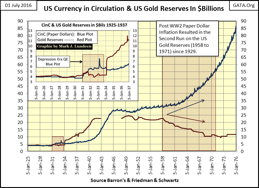
In 1958 (second triangle), after over a decade of issuing paper money in excess of its reserves of gold (chart below), the US Treasury had instigated a run on its gold reserves that didn’t end until President Nixon closed the Treasury’s gold window in August 1971. It was also in 1958 where the BGMI bottomed, marking the beginning of a bull market in the gold miners that didn’t terminate until 1980 (chart above).
In 2001 (third triangle) with the economy in a downturn from a bear market in the high-tech shares, US “policy makers” decided to inflate a bubble in the US housing market to re-inflate the economy. Now in 2016, we all know what a boneheaded decision that proved to be. But as was the case in 1925, and again in 1958, I expect policy blunders by our “policy makers” will once again result in a bull market in the BGMI that will become historic in the fullness of time.
So I don’t care what “market experts” think of the future prospects of the gold mining companies, if they think of them at all. When the stock and bond markets begin to deflate in earnest in the coming months and years, Mr Bear is going to chase trillions of dollars into the BGMI. Because since 1925, that’s just what Mr Bear does, if just to rub it in the noses of the “policy makers.”
Today, the gold miners are a compelling investment opportunity that offers low risk and high rewards. But as I’ve said before, you’ll want some gold and silver bullion too. Investing a third of your capital into equal dollar amounts of gold, silver and established miners seems the thing to do. And if you want to take a speculative position in the precious-metals industry, take a small position in the mineral exploration sector. I like Eskay Mining (ESK: Toronto’s Venture Exchange).
Mark J. Lundeen


