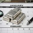
Commercial Gold Traders Appear To Be Losing Their Grip!
 share
share
 share
share
 share
share
 share
share
 share
share
For years the best trading strategy in gold and silver has been to buy when the ‘net short’ position of commercial traders was low, and sell when the numbers were high.

This chart courtesy Cotpricecharts.com shows commercial gold traders are ‘net short’ (purple bars) 207,000 contracts in the futures market. Last week the number was 208,000 and this was the largest number since December 2012. If we compare this chart to the gold chart just below this chart, we will see that in the past there was almost always a correlation between a large increase in the ‘net short’ position in the COT chart and a top in the price of gold.
This chart courtesy Stockcharts.com shows the price of gold as a dotted line, along with the ‘net short’ position in blocks. Notice failure on the part of commercial traders (so far at least), to bring the gold price down to where they would like to cover their short positions, as they have done so many times in the past. In May the ‘net short’ position at the COMEX was 132,000 and over the next two months gold fell 129.00. In October the ‘net short’ position had risen to 166,000 and during the next two months gold dropped by 130.00. This time the ‘net short’ position is the highest since December 2012, but the commercials have only been able to cause gold to drop by 50.00.
In this analysis we are drawing the assumption that gold has found support at the $1220 level and is ready to rise from here, notwithstanding the large number of ‘net short’ positions put on by commercial traders.
We draw this conclusion from the performance of gold and silver mining stocks.
This chart courtesy Stockcharts.com shows the HUI index of gold and silver producers is breaking out from a bullish ‘cup with handle’ formation (blue arrow). The purple arrow points to a ‘bear trap’ that ignited the January rally in mining stocks. The green arrow points to the breakout with a target at 255 (in stair-stop fashion). The supporting indicators (RSI and CCI) are positive, and the 50DMA is in positive alignment to the 200DMA, while both are trending higher! In a bull market we expect mining stocks to lead the way, and HERE WE ARE!
Featured is the weekly HUI chart with 17 week and 43 week moving averages. The green arrow points to the two moving averages rising in positive alignment. This confirmed the bull market in mining stocks that started in late 2008. The purple arrow points to the ‘17’ moving below the ‘43’, thus warning that the trend was about to change. The two moving averages remained in negative alignment until recently when the ‘17’ rose back above the ‘43’ (blue arrow). Patient investors who prefer to make a decision just once every few years, can make good use of this signal. The supporting indicators (RSI and MACD), are positive.
Featured is the monthly chart for HUI with a 20 month moving average. Arrows #1, #3 and #5 point to HUI closing above the MA. This is where a purchase is likely to pay off. Arrows #2 and #4 show price closing below the MA, warning that the trend is changing. The last arrow represents the first buy signal from this system, in 8 years! In order to avoid being whipsawed (as in 2012), it is recommended that investors wait until the trend is confirmed during the subsequent month (as now).
Featured is the daily gold chart, courtesy Stockcharts.com. Price is breaking out from beneath month-old resistance, and a close above the blue arrow will confirm the breakout. The expectation is that this will likely mark the start of a rally, similar to the February rise. The supporting indicators are turning positive and the 50DMA is in positive alignment to the 200DMA (oval), while both are trending upward.
Featured is the weekly chart for DUST. This is the ETF that people buy when they believe in bankers like Goldman Sachs, and analysts who predict that gold is going to go down in price. Price has just broken down below support that has held since DUST was introduced in 2011. Turn this picture upside down in your mind and you'll see this is very bullish! Notice how the Accumulation/Distribution line is falling off a cliff. Investors are abandoning DUST in droves. Volume is the highest in this ETF's history.
Featured is the bar chart for Deutsche Bank, one of Europe’s largest banks. The stock price has been dropping for the past 12 months and each time price tops out, it is not long before the US S&P 500 follows suit. In the event that price drops below the purple arrow, we could very well see a waterfall decline in both the DB chart and in the S&P 500 index. As investors sell stocks, they look for safety. Some of this money is likely to flow into gold and gold mining stocks.
This chart courtesy US FED shows US Federal Debt is rising sharply. This leads to increased deficits, which are a reason for the gold price to rise.
This chart courtesy Nick Laird shows the demand for gold bullion by China and India, (Russia as well) continues without ceasing.
Featured is the gold price in Euros. Price is carving out a bullish Advancing Right Angled Triangle (ARAT). A breakout at the blue arrow will be very bullish.
Featured is the gold price in Canadian dollars. Price bottomed in November of 2014 and has risen ever since. The channel is rising by 8% per year.
In Summary: Fundamentals for gold are very bullish. Price inflation in key components of the economy exceeds bank interest. Historically this provides energy for gold to rise, as bonds no longer offer protection. Stock markets around the globe are in decline. This money is looking for safety. Negative interest rates are causing people to withdraw savings and look for a place to put this money – gold and silver to the rescue. Commercial traders are short – but then they are always short. Perhaps this time they will help the bull market along by covering short positions.
The technical picture for gold and silver is improving by the day, as we attempted to show you in this article.
********
Peter Degraaf is an investor with over 50 years of experience. He publishes a daily report for his subscribers. To receive a recent copy of a report, visit www.pdegraaf.com
DISCLAIMER: Please do your own due diligence. Peter Degraaf is NOT responsible for your trading decisions.
share
share
share
share
share
 Peter Degraaf became interested in silver and gold when the Governments of the US and Canada proceeded to remove silver coinage from circulation in the mid 1960s.
He noticed the effect of Gresham’s law: “Bad money drives out good.” He became a coin dealer, attending coin shows all over The US and Canada. In 2001 he semi-retired from coin sales and concentrated on investing in precious metals. He mastered the art of technical analysis and applies this to his investments. In 2001 he started publishing a daily and weekly market report. His website is at http://www.pdegraaf.com/.