Consolidation Time (The Easy Trade Has Ended)


Before we look at tonight's chart I would like to reiterate once more that we have traded one of the best bull markets runs in history. There was hardly a time over the last year or so that the stock markets were down more than 2 or 3 days in a row. It seemed like every day I would log on to Stock Charts in the morning the SPX would always be up 3 to 5 points. It was just a steady move higher with little volatility.
Last Friday that nice gentle uptrend we had grown accustomed, came to an exciting climax. What we are experiencing right now is the beginning of some volatility that is going to take some time to get back under control. Think of dropping a super ball off the top of the Empire State building. First you get a really big bounce followed by a big decline then another bounce that is less strong with the next bounce getting weaker. At some point the initial volatility will be reduced back into normal price action.
During those volatile swings we should see some type of consolidation pattern build out that will be unrecognizable in the beginning, but as time passes it will slowly show itself. We know where the top of the new trading range is, but the bottom still needs some confirmation that Tuesday’s low is in fact the low for this next consolidation phase.
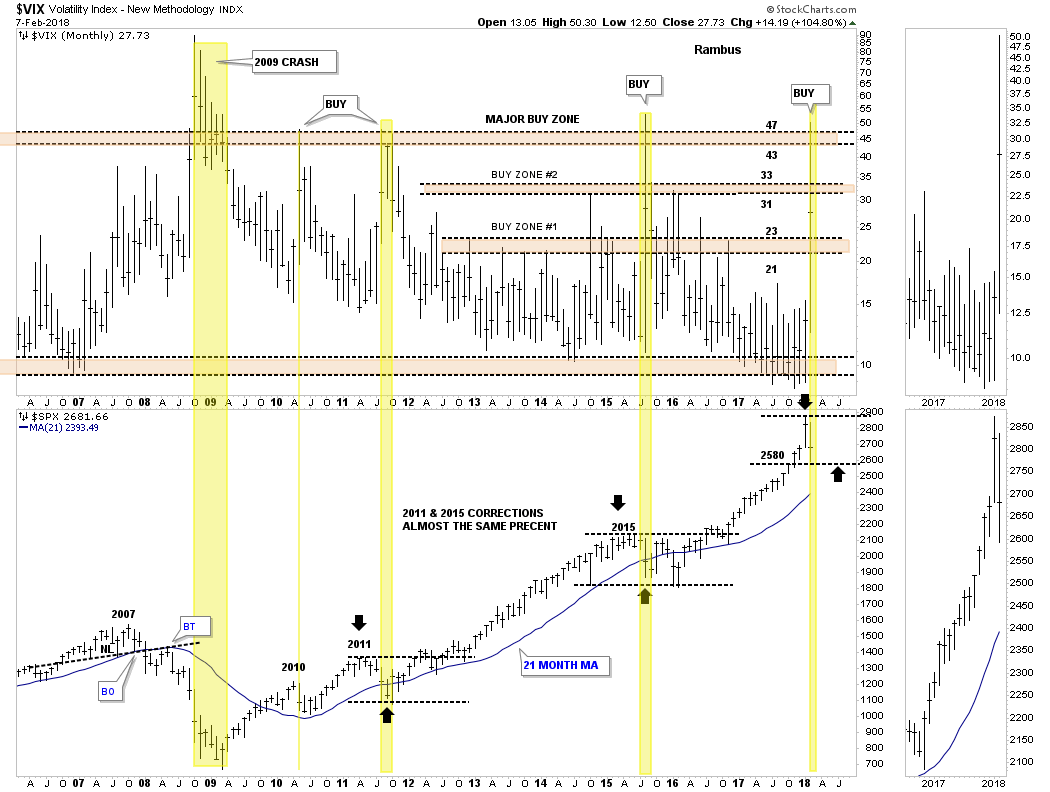
Let’s start by looking at the 12 year monthly combo chart which has the VIX on top and the SPX on the bottom. When we looked at this chart on Monday night the VIX still hadn’t reached the 43 to 47 area which has shown us in the past where an important low on the SPX was. Tuesday we got the spike into the major buy zone which is strongly suggesting an important low is in place.
That being said a new trading range should develop to consolidate our previous impulse move up similar to what happened in 2011 and 2015. As you can see the VIX spike nailed the low, but there was a lot of chopping action before then next impulse leg up began which is how markets are supposed to work. The spike in the VIX marked the low in 2010, but it still took several months of bouncing along the bottom before the SPX rallied into the 2011 high. Even the 2011 VIX spike took the SPX three months of chopping around the bottom before the next impulse started.
It’s possible that the SPX could just reverse back up and takeout January’s high, but that would be the exception…and not the rule. The horizontal black dashed lines show the 2011, 2015 and now our 2018 trading range that are all the same height. At this point in time I think it’s going to be more of a time thing than anything else as far the sideways price action goes.
This next chart is a daily combo chart we’ve been following for some of the US stock market indexes, which is showing some interesting price action. I have mentioned many times in the past that an important trendline never dies, it just slowly fades away. From February to September of last year, most of the US stock market indexes built out a bullish rising wedge formation. Normally during a corrective phase, support can be found on top of a preceding consolidation pattern.
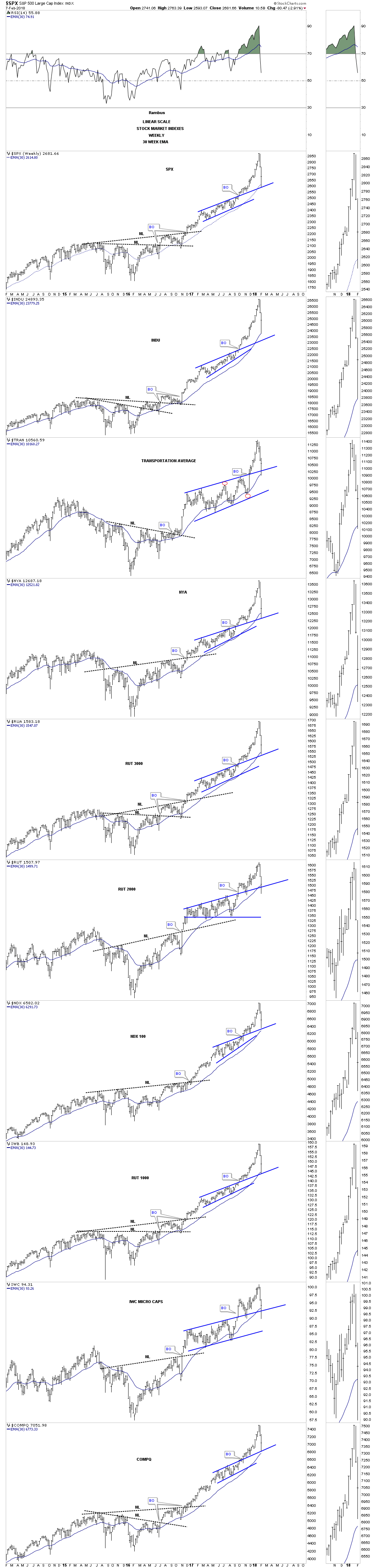
This next chart is the weekly combo chart we’ve also been following, which has the all-important 30-week ema on it. This week the 30 week ema was tested on all the indexes except for the tech indexes, the COMPQ and the NDX, which came very close to testing their 30 week ema. It’s been well over a year on many of these stock market indexes, when the 30-week ema was last tested. So we can now add two more layers of support, the-30 week ema, the top rail of the bullish rising wedges to go with the spike on the VIX above 47.
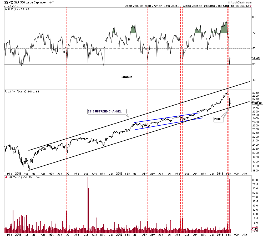
Next, let’s look at some of the 2016 uptrend channels with the down to up volume chart below it, starting with the COMPQ. Normally when the down to up volume rises to 5.00 we are beginning to see some strong selling taking place, which can start the bottoming process. The last time we had a massive spike in the down to up volume chart, like we had on Monday was way back in September of 2015, which began the sideways trading range. Note how the 200-day moving average has formed the bottom trendline of the 2016 uptrend channel. Also note how the down to up volume spike looks on the RSI at the top of the chart.

Below is the 2 year daily chart for the SPX which shows its 2016 bull market uptrend channel with the price action testing the bottom rail with the high, down to up volume spike on Monday.
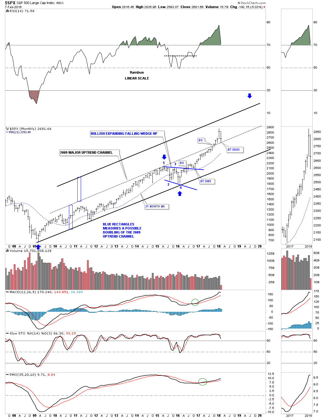
Below is a long-term monthly chart for the SPX which shows its 2009 bull market uptrend channel. If the original 2009 bull market uptrend channel below the dashed mid-line is in the process of doubling, then I would like to see the dashed mid-line hold support around the 2600 area.
I’ve been so focused on the stock markets I haven’t had much time to look at the PM complex. Until gold can take out the golden neckline, the bear market is still in force. That neckline is still holding resistance this week.

Three weeks ago it looked like SLV had a decent chance to finally breakout from that three plus year diamond pattern. When the price action hit the top rail that completed the seventh reversal point, which would have put the diamond into the reversal category to the upside. The failure to breakout now put the price action into a possible 8th reversal point which would be a consolidation pattern to the downside if the bottom rail gives way. As you can see the price action is getting more compressed as the chopping action into the apex continues.
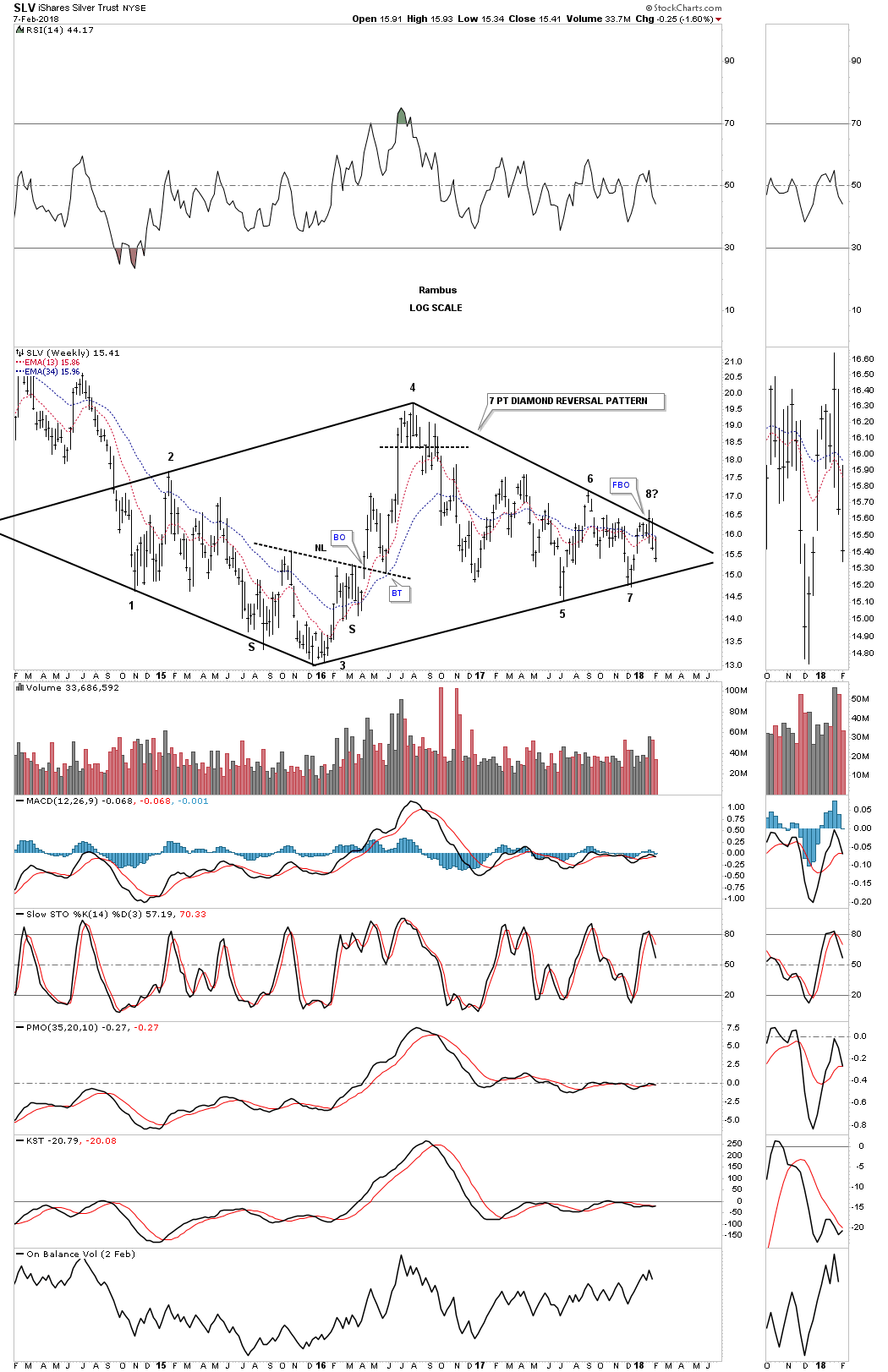
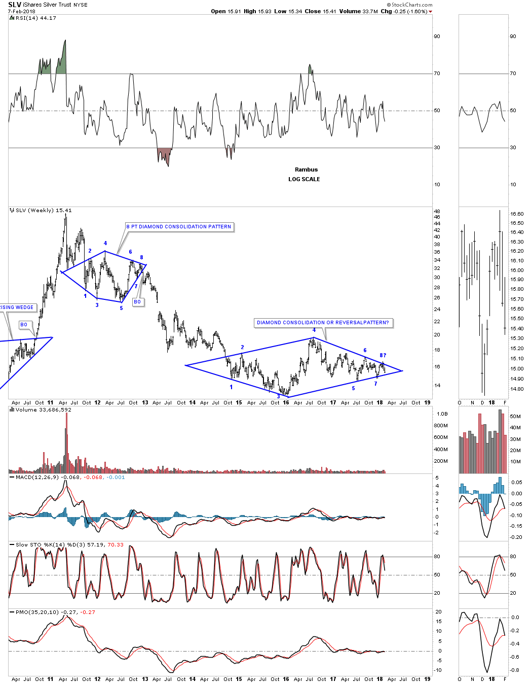
This long-term weekly chart puts our current diamond in perspective. The million dollar question is what direction will the diamond breakout?
The easy part of our bull market in stocks is now over. Now the hard part starts. The volatility is going to be insane for a while - and that will drive most investors nuts. Understanding what is happening can relieve some of the pressure, but the markets are made up of emotions, which are hard to control for most investors. Greed will trump fear every time. All the best.
 Meet Rambus, a seasoned trader and technical analyst renowned for his unbiased and insightful chart work. Through his website, Rambus Chartology, and Substack newsletter, Rambus shares his expertise with a global community of subscribers, providing daily updates, commentaries, and hands-on training in the art and science of chartology. With his calm, humble, and down-to-earth approach, Rambus demystifies complex market trends, helping his followers navigate the challenges of today's volatile markets. Join the Rambus Chartology community today and discover a unique blend of technical analysis, trading expertise, and time-tested protocols. Subscribe now at www.rambus1.com or https://rambuschartology.substack.com/


