Current Position Of The Markets


SPX: Long-term trend - Bull Market
Intermediate trend - Is the 7-yr cycle sketching an important top?
Analysis of the short-term trend is done on a daily basis with the help of hourly charts. They are important adjuncts to the analysis of daily and weekly charts which ultimately indicate the course of longer market trends.
IS AN IMPORTANT TOP IN PLACE?
Next week should tell us!
Market Overview
Since the SPX made a lower high on 3/23, preserving 2119.59 (which occurred on 2/25) as the all-time high, the index has shown little incentive to try for a new high. Instead, last week’s activity consisted of a sideways pattern with descending peaks, in what looked like a distribution pattern which was restrained on the downside by an essentially flat trend line drawn from 2040 which had stopped four short-term attempts at going beyond it. The entire formation looked as if traders were waiting for some sort of a catalyst to push prices below that trend line and the 2040 level. The trigger was probably provided by the disappointing jobs report which was released on Friday morning since futures closed down 19 points for the day, the equivalent of 2047 on SPX, 4 points below that key trend line.
The June futures closed down 19 points at 2039.95, barely above the 2039 support level which has been holding prices since March 11, and which has been tested 5 times including Friday. Considering the market action since the 2119 SPX high, I don’t have to warn you about the significance of Monday morning’s opening prices! If, after breaking the trend line, SPX also breaks below 2040, it will all but confirm that an important top has been made!
Indicators survey
Weekly, daily and hourly momentum indicators are neutral at best, since they did not register Friday’s sharp decline. Had they, all would be in a sell mode.
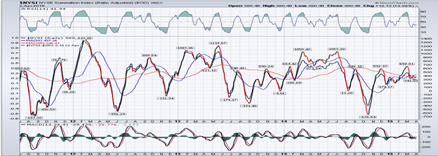
The Summation Index (chart below courtesy of StockChart.com) is also on neutral and hardly changed from last week. If the market declines next week, it could display a significant change.
The 1X P&F chart now shows a pattern of what could be significant distribution above the 2040 level. The 3X chart looks more and more like a massive top is in the process of forming.
Chart Analysis
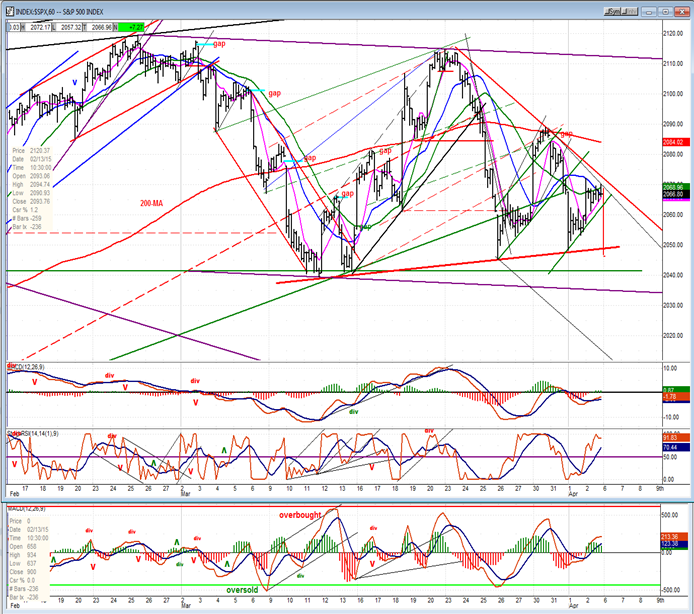
On the daily chart (courtesy of QCharts.com, as well as others below) I have simulated the price and oscillator action as if it had registered on the chart because of the shortened futures trading period.
Last week, I mentioned that the previous week’s failure of the SPX to make a new high could be a game changer. This week’s action could be even more so. By closing at 2047 (down 19 points for the day) the index has put itself in a very precarious position. It closed below the red trend line drawn across the lows and right on the 120-DMA. It would be surprising if the downside momentum experienced Friday did not push prices lower to the next support level which consists of the two dashed trend lines with the 200-DMA in between. Should that support level give way, we could expect prices to continue droping all the way to the lower dark blue channel line. There is more than enough (emphasis on more) distribution above the 2040 level to carry the prices that far. If that does take place, it would simply be a normal continuation of the pattern that has been forming since the rally from the October low. This would be the minimum expectation. However, if the entire formation above the 1972 level is taken into consideration … well, let’s save this for some other time! Just be aware that there is enough distribution above 2040 to potentially carry prices well below 1972.

On the hourly chart, Friday’s activity looks even more dramatic (and negative), considering that the 19-point drop took place during the 45-minutes during which futures were open for trading. I have not tried to simulate the effect on the oscillators since I have no idea how this price drop would have affected them, but I have placed a vertical red line representing the price action. One would think that it made a sizeable impact on the momentum oscillators.
The red trend line across the four short-term lows only goes back to 3/11, but the green support line slightly above the 2040 level goes all the way back to 2/9. Breaking both would be a significant sign of weakness. I have already pin-pointed the potential price repercussion of breaking this support. If you wish to know what it is, sign up for a free trial.
Unfortunately, none of the indexes followed on a regular basis will be representative of what really happened last week since Friday’s activity is not factored into them. Consequently, I will simply show the charts as they appeared at Thursday’s close and not do any analysis until next week.
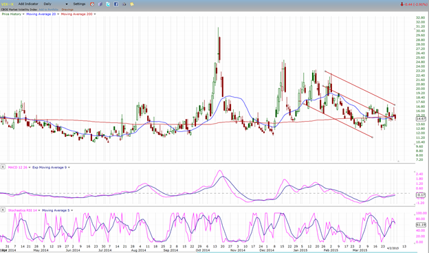
VIX (NYSE Volatility Index) - Leads and confirms market reversals.
XLF (Financial ETF) normally leads the market at important tops.

UUP (dollar ETF)

GLD (Gold trust)

USO (US Oil Fund)

Summary
For some time I have been pointing out the long-term deceleration pattern which was taking place in the SPX. Last week I also mentioned that the index’s inability to make a new high before being pushed back toward previous short-term lows might be carrying some special warning. Finally, I have noted upon several occasions that the 2040 level has become a key support level.
On Friday, the disappointing jobs report triggered a negative reaction in the futures, dropping them 19 points during the 45m of a shortened session and closing them essentially on their 8-week low which had resisted penetration several times during that period. One does not have to be a genius to visualize what this could portend for Monday’s opening and beyond.
********
FREE TRIAL SUBSCRIPTON
Market Turning Points is an uncommonly dependable, reasonably priced service providing intra-day market updates, a daily Market Summary, and detailed weekend reports. It is ideally suited to traders, but it can also be valuable to investors since highly accurate longer-term price projections are provided using Point & Figure analysis and Fibonacci projections. Best-time reversal estimates are obtained from cycle analysis.
For a FREE 4-week trial, send an email to: [email protected]
For further subscription options, payment plans, weekly newsletters, and for general information, I encourage you to visit my website at www.marketurningpoints.com . By clicking on "Free Newsletter" you can access the latest newsletter which is normally posted on Sunday afternoon (unless it happens to be a 3-day weekend in which case it could be posted on Monday).
The above comments and those made in the daily updates and the Market Summary about the financial markets are based purely on what I consider to be sound technical analysis principles. They represent my own opinion and are not meant to be construed as trading or investment advice, but are offered as an analytical point of view which might be of interest to those who follow stock market cycles and technical analysis.

When Andre Gratian was a stock broker years ago, a friend introduced him to technical analysis of the market. Consequently, it is not an exaggeration to say that Andre fell in love with this approach! Ever since then, it has become an increasingly important part of his professional life. Gratian has studied the works of Wyckoff, Edwards & Magee, Edward J. Dewey (cycles) and many others. However, one of my most profitable undertaking has probably been to study Point & Figure charting, which he finds invaluable in analyzing stocks and indices. If he were restricted to one methodology, this is the one that he would choose. This well-rounded background has given him what he feels to be a special insight into the stock market, facilitating the recognition of meaningful patterns and the ‘turning points’ in all trends, whether they be short or long term. Andre feels very comfortable discussing the stock market and passing on meaningful information to others. His subscribers include individuals and money managers throughout the world. Moreover, his Newsletters are currently published on several financial sites, here and abroad.


