The Danger and The Opportunity


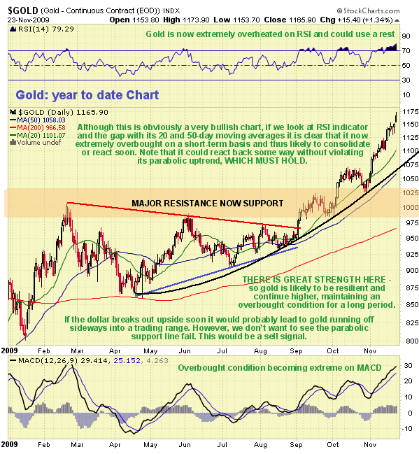
Gold is now pushing deeply into critically overbought territory on its RSI indicator, so consolidation/correction can be presumed to be imminent. Look for the gap with the 20-day moving average, shown on our 1-year chart (the green line), to be closed in the near future.
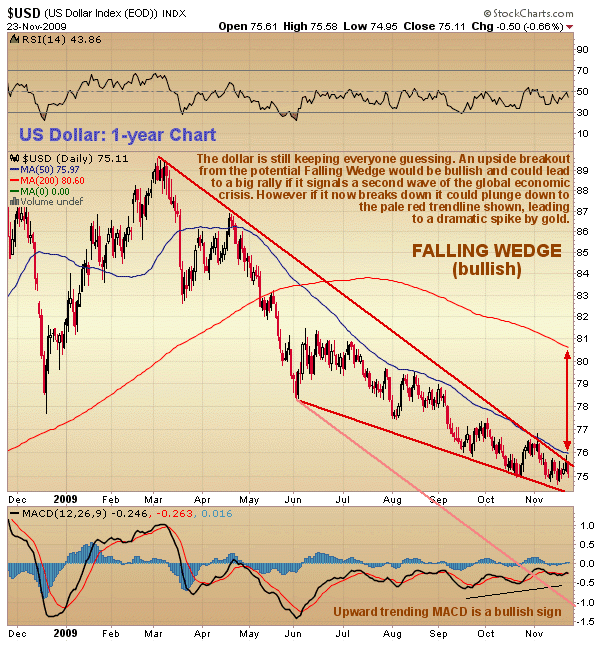
Not known at this point is how the very tight standoff in the dollar will resolve itself. If we are on the verge of a second wave of the global economic crisis, involving another acute deflationary contraction, then the dollar will break out upside soon from its bullish looking Falling Wedge pattern and possibly spike as a torrent of funds flows back into short-expiry Treasuries. The rollover in stock indices and sickly looking bank stocks suggest that this is an increasing danger. However, if liquidity can be maintained and this grim scenario averted or at least postponed again, and the dollar breaks down from this converging channel, it could plunge down to the bottom pale red trendline on our 1-year dollar chart. This would be a disastrous development that would be expected to lead to gold going ballistic. We will know soon enough for the dollar must break one way or the other shortly. To gold's credit it has soared even though the dollar has only dropped incrementally in recent weeks. This is a sign that it is less and less a hostage to the fortunes of the dollar.
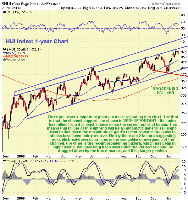
Considering the strong performance of gold in recent weeks, Precious Metals stocks have put in a decidedly pedestrian performance as we can see on our 1-year chart for the HUI index, having only risen up to the top of the contracting inner trend channel shown. Although this uptrend in PM stocks looks orderly enough, there are some potentially bearish points that we should note. One is the woeful underperformance relative to gold - while gold has been making new highs and bounding ahead, the HUI index has thus far been unable to break above its 2008 highs. Next is the gradual but significant convergence of this channel, meaning that it is a potential bearish Rising Wedge. Finally a broadening pattern, also bearish in its implications, has become evident since September. These bearish factors would be expected to come into play of course in the event of the broadmarket turning sharply lower. The lower supporting trendline of the channel in force from the start of the year is clearly very important, as the index has rallied from it at least 5 times. Failure of this channel would therefore be an automatic general sell signal for the sector.
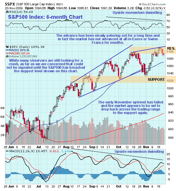
If the PM sector underperformance relative to gold itself has its root causes in the lurking threat of a severe downturn in the broad stockmarket, it is obviously important for us to keep an eye on what is going on in the wider world. So we will now examine the chart for the S&P500 index to assess the risk of it dropping heavily. On the 6-month chart for the S&P500 index we can see that the uptrend in force from July is petering out, with each successive minor upwave making less progress than its predecessor, the dwindling upside momentum evident from the downtrending RSI and MACD indicators shown at the top and bottom of the chart. While some market observers are looking for a crash soon, which can't be ruled out if the continued big money transfusions fail to keep things humming along, as far as we are concerned the risk of a crash only becomes real and immediate once the support in the 1020 area gives way. Whether or not that happens the market does appear to have completed a minor top and looks set to react back towards this support, which given gold's overbought extreme calling for a reaction, suggests that PM stocks are set to back off near-term.
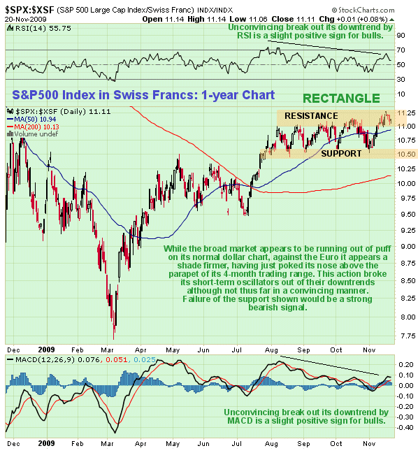
Although the general public in the US believe that the stockmarket is still rising and that, perhaps, things are set to get better, they do not realise that if you take into account the drop in the dollar in recent months, it has actually been standing still. This is made starkly obvious by our 1-year chart for the S&P500 index in Swiss Francs (it is very similar on the Euro chart). On this chart it is tracking sideways in a narrow range, failure of the support at the bottom of which would be a clear sell signal.
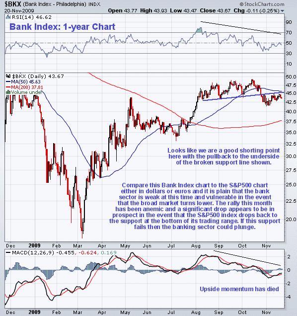
Bank stocks look really sickly at this time. Compare and contrast the 1-year chart for the Banking Index with the S&P500 index charts, either in dollars or Swiss Francs, and you should be able to see that they will be among the first to disappear into the gurgler if the broad market drops heavily. We were a bit early shorting these stocks a few weeks back, but as we can see although they have since rallied, it has only been a feeble rally, although Canadian bank stocks have fared better than US bank stocks.
More follows for subscribers...
Clive Maund, Diploma Technical Analysis
[email protected]
www.clivemaund.com
Copiapo, Chile, 25 November 2009

Clive P. Maund’s interest in markets started when, as an aimless youth searching for direction in his mid-20’s, he inherited some money. Unfortunately it was not enough to live a utopian lifestyle as a playboy or retire very young. Therefore on the advice of his brother, he bought a load of British Petroleum stock, which promptly went up 20% in the space of a few weeks. Clive sold them at the top…which really fired his imagination. The prospect of being able to buy securities and sell them later at a higher price, and make money for doing little or no work was most attractive – and so the quest began, especially as he had been further stoked up by watching from the sidelines with a mixture of fascination and envy as fortunes were made in the roaring gold and silver bull market of the late 70’s.
Clive furthered his education in Technical Analysis or charting by ordering various good books from the US and by applying what he learned at work on an everyday basis. He also obtained the UK Society of Technical Analysts’ Diploma.
The years following 2005 saw the boom phase of the Gold and Silver bull market, until they peaked in late 2011. While there is ongoing debate about whether that was the final high, it is not believed to be because of the continuing global debasement of fiat currency. The bear market since 2011 is viewed as being very similar to the 2-year reaction in the mid-70’s, which was preceded by a powerful advance and was followed by a gigantic parabolic price ramp. Moreover, Precious Metals should come back into their own when the various asset bubbles elsewhere burst, which looks set to happen anytime soon.
Visit Clive at his website: CliveMaund.com