Dollar Bears Prepare To Hibernate


Today I would like to show you the Chartology of the US Dollar based on charts from the short term to the very long term that are painting a positive picture for the US Dollar. What I'm seeing on the charts is not going to be just a short term event type thing but a longer multi-year positive change for the dollar. Understanding the movements in the dollar can help us understand other movements in other areas of the markets which is very important to getting the big picture right. If you can get the big picture and trend right that goes a long way in knowing which side of the market to be on. In a bull market you want to trade with the uptrend and when you’re in a bear market you want to trade with the downtrend. This is simple to understand but much harder to do in practice. So with that said let’s take a good long hard look at the US dollar and see what the charts are telling us.
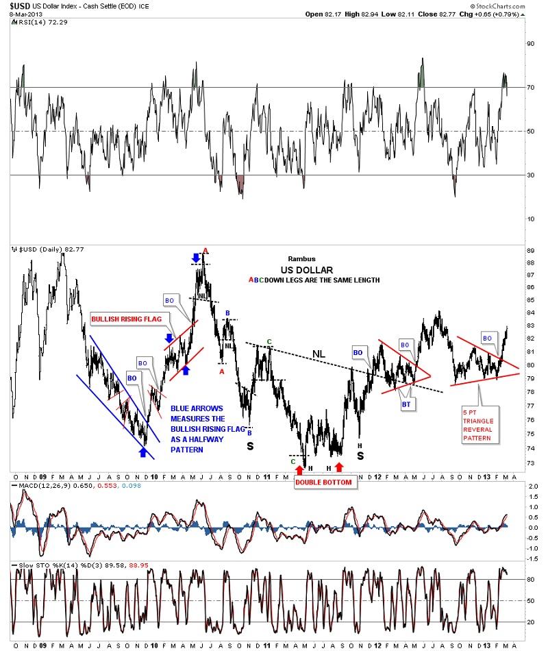
I'm going to start a little out of sync first so I can show you the Head&Shoulders top that so many investors are looking at to reverse the dollar back down again. IMHO this Head&Shoulders pattern is dead, broken and is giving many a false sense of security that the dollar Head&Shoulders top on the right side of the chart. As you can see on the chart below it was a beautiful looking Head&Shoulders top during its formation. It wasn't until the last low was put in place that the Head&Shoulders top scenario began to breakdown. There are two blue triangles that made up the left and right shoulders while the potential Head&Shoulders top was forming. Those two blue triangle look the same but they have two complete different scenarios. The blue triangle on the left side of the head was an even numbered triangle that told us it would be a consolidation pattern to the upside. The blue triangle on the right side of the head told us it was going to be a reversal pattern to the upside as it has an odd number of reversal points, five. This was a very big clue to understand at the time as I told my subscribers that we would be one of the first to know that the Head&Shoulders top was a failure as soon as the blue 5 point triangle broke out to the upside. The US dollar has been trading out of that blue five point triangle for three weeks and is now much higher than the original top of the right shoulder. The last order of business will be for the dollar to trade above the Head which will leave no doubt about the Head&Shoulders top failure.

Now that we have that cleared up lets now look at some more charts of the dollar. In order for the US dollar to have a multi-year rally there has to be a big enough base to sustain such a move. This next daily chart shows an inverse Head&Shoulders bottom that broke out in late 2011 where the price action formed the red triangle consolidation pattern just above the neckline. That was a bullish development at the time. The rally eventually ran out of gas and corrected back down which looked like that was going to be the head of the Head&Shoulders top we discussed on the chart above. The bulls came back in and saved the day by building out the right shoulder triangle reversal pattern to the upside. As you can see on the chart below the bulls have wasted little time in rallying the dollar higher in an almost vertical move. If you look at most consolidation patterns this is usually the result once a consolidation pattern is finished forming. Note the red bullish rising flag that formed back in 2010 that worked out as a halfway consolidation pattern with a near vertical move going into the pattern and a near vertical move leaving the pattern. This is Chartology at its best.
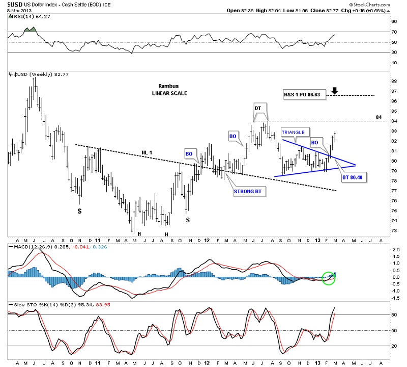
Let’s look at a weekly chart that shows the inverse Head&Shoulders bottom a little more clearly than the daily look. The take away from this chart is that the dollar has been making higher lows except for the small low made at the double top. Other than that this is an uptrend regardless of what the fundamentals maybe saying. A break above the small double top at 84 will be the highest the dollar has been since the rally high back in 2010.
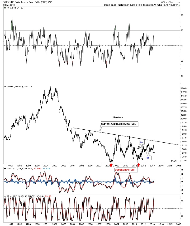
With this next chart I want to show you that the inverse Head&Shoulders base, that we looked at on the chart above, is only just a very small part of a much bigger base that is being built. You can see how tiny that inverse Head&Shoulders bottom is compared to the big picture.
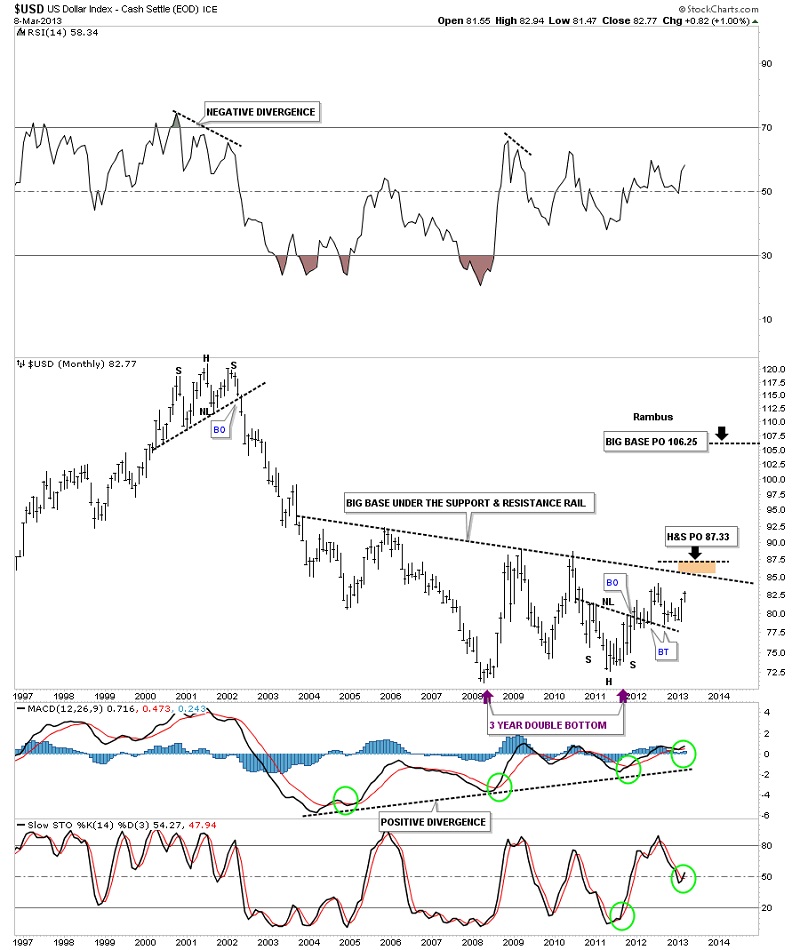
I would like to show you the big base that is under construction from the monthly perspective so you can see that the price action is starting to close in on the big black dashed support and resistance rail. Our small inverse Head&Shoulders bottom that I've shown you on the charts above strongly suggest that the dollar will breakout through the big support and resistance rail by its price objective. Folks that is a huge base the US dollar is building and the consequences will be felt for several years to come in many areas of the markets.
This next chart for the US dollar is a very long term monthly chart that goes all the way back to 1980. Sometimes in charting one can have an Epiphany or an eureka moment where all of a sudden there is clarity beyond what you were initially looking for. I had such a moment with this next chart that has a lot of information on it. First you will see two bases labeled Big Base #1 and Big Base #2. These two bases are uncanny in their similarities. Some might call them fractals. The two bases are almost exactly the same height as well as time. The only real difference between the two bases is at point #3 which was a tad higher on Base #2 whereas in Base #1 it was a little longer. Other than that they are amazingly similar. Note the breakout and backtest from Base #1. If you look real close you can even see a small gap that was made right at the breakout point. The support and resistance rail held on two backtest which told us the Head&Shoulders rail was hot. Note the blue bullish rising wedge that worked out as a beautiful halfway y pattern. Also the height of Base #1 also measured out real close to the top where you can see the Head&Shoulders top. As I said there is alot of information on this chart so I'll post it right here and carry on with the same chart again a little further down.

Carrying on with the same chart there is another important observation I would like to share with you. Note the Head&Shoulders top that formed back in 2000. If you look at a gold chart you will see a big inverse Head&Shoulders bottom that launched its bull market. A dollar top and a gold bottom. Now I want to draw your attention to the bottom right hand side of chart that shows point #4. That low at point #4 marked the absolute high for gold back in the fall of 2011. So what is this chart telling us? Strictly from a Chartology perspective I think its talking loud and clear to us. If that pattern rail on big base #2 gives way we are looking at a multi-year rally for the US dollar and most likely a decline in the precious metals complex.

Let’s now look for some clues to see if the process has started where a rising US dollar is having a negative effect on gold. This next chart is a combo chart that shows gold on top and the US dollar's big base #2 on the bottom. I want to focus your attention to the two purple dashed lines with the purple arrows. What the purple lines shows is how the dollar was showing us back in the fall of 2011, when gold was making its all-time at 1920, the dollar failed to make a new low even though gold went nearly parabolic. This is a very big clue that the dollar was bottoming out. The dollar never made a new low after its low in 2008 while gold rallied almost $1000 dollars into the fall of 2011. That is a pretty big positive divergence for the US dollar to gold.

I could show you several more charts comparing gold to the US dollar but this article is getting a little long in the tooth so I'll leave you with just one more chart that is a 13 year weekly line chart. I know some of you won't believe this next chart because it doesn't meet all the strict rules for Head&Shoulders top pattern. That's fine because I have seen countless Head&Shoulders tops, similar to the one gold is showing right now, play out beautifully. Some will say the neckline is to steep or the symmetry isn't there or the volume isn't right. I could go on and on but until the price action breaks above that neckline on the gold chart below it is what it is. With the US dollar breaking out from that red triangle while gold is breaking down from its Head&Shoulders top the breakouts match up pretty closely.

A good chart should tell a story that everyone should be able to understand even the folks that really don't understand charting. These charts above are telling us a story of what is about to happen with the US dollar over a several year period. Investors create the charts, I don't. I only interpret their actions by uncovering what they are doing. Charting IMHO follows the price action better than most disciplines whether it’s Elliot-Wave, which there are some good ones out there, cycles, or the fundamentals. Right now the folks that are watching the technical indicators in the precious metals stocks have been beaten up waiting for the bottom to happen. The same is true in the stock markets right now. All the technical indicators are telling investors that the Dow is so overbought it can't go any higher until there is correction but the Dow keeps on going up regardless of what the indicators are showing. Yes at some point there will be a good correction as there always is. I'm sure you have heard the saying that the markets can stay overbought or oversold longer than one can hold out if one is on the wrong side of trade. No truer words have ever been spoken in regards to the precious metals complex or the stock markets at this time.
I'm going to start a little out of sync first so I can show you the Head&Shoulders top that so many investors are looking at to reverse the dollar back down again. IMHO this Head&Shoulders pattern is dead, broken and is giving many a false sense of security that the dollar Head&Shoulders top on the right side of the chart. As you can see on the chart below it was a beautiful looking Head&Shoulders top during its formation. It wasn't until the last low was put in place that the Head&Shoulders top scenario began to breakdown. There are two blue triangles that made up the left and right shoulders while the potential Head&Shoulders top was forming. Those two blue triangle look the same but they have two complete different scenarios. The blue triangle on the left side of the head was an even numbered triangle that told us it would be a consolidation pattern to the upside. The blue triangle on the right side of the head told us it was going to be a reversal pattern to the upside as it has an odd number of reversal points, five. This was a very big clue to understand at the time as I told my subscribers that we would be one of the first to know that the Head&Shoulders top was a failure as soon as the blue 5 point triangle broke out to the upside. The US dollar has been trading out of that blue five point triangle for three weeks and is now much higher than the original top of the right shoulder. The last order of business will be for the dollar to trade above the Head which will leave no doubt about the Head&Shoulders top failure.
Now that we have that cleared up lets now look at some more charts of the dollar. In order for the US dollar to have a multi-year rally there has to be a big enough base to sustain such a move. This next daily chart shows an inverse Head&Shoulders bottom that broke out in late 2011 where the price action formed the red triangle consolidation pattern just above the neckline. That was a bullish development at the time. The rally eventually ran out of gas and corrected back down which looked like that was going to be the head of the Head&Shoulders top we discussed on the chart above. The bulls came back in and saved the day by building out the right shoulder triangle reversal pattern to the upside. As you can see on the chart below the bulls have wasted little time in rallying the dollar higher in an almost vertical move. If you look at most consolidation patterns this is usually the result once a consolidation pattern is finished forming. Note the red bullish rising flag that formed back in 2010 that worked out as a halfway consolidation pattern with a near vertical move going into the pattern and a near vertical move leaving the pattern. This is Chartology at its best.
Let’s look at a weekly chart that shows the inverse Head&Shoulders bottom a little more clearly than the daily look. The take away from this chart is that the dollar has been making higher lows except for the small low made at the double top. Other than that this is an uptrend regardless of what the fundamentals maybe saying. A break above the small double top at 84 will be the highest the dollar has been since the rally high back in 2010.
With this next chart I want to show you that the inverse Head&Shoulders base, that we looked at on the chart above, is only just a very small part of a much bigger base that is being built. You can see how tiny that inverse Head&Shoulders bottom is compared to the big picture.
I would like to show you the big base that is under construction from the monthly perspective so you can see that the price action is starting to close in on the big black dashed support and resistance rail. Our small inverse Head&Shoulders bottom that I've shown you on the charts above strongly suggest that the dollar will breakout through the big support and resistance rail by its price objective. Folks that is a huge base the US dollar is building and the consequences will be felt for several years to come in many areas of the markets.
This next chart for the US dollar is a very long term monthly chart that goes all the way back to 1980. Sometimes in charting one can have an Epiphany or an eureka moment where all of a sudden there is clarity beyond what you were initially looking for. I had such a moment with this next chart that has a lot of information on it. First you will see two bases labeled Big Base #1 and Big Base #2. These two bases are uncanny in their similarities. Some might call them fractals. The two bases are almost exactly the same height as well as time. The only real difference between the two bases is at point #3 which was a tad higher on Base #2 whereas in Base #1 it was a little longer. Other than that they are amazingly similar. Note the breakout and backtest from Base #1. If you look real close you can even see a small gap that was made right at the breakout point. The support and resistance rail held on two backtest which told us the Head&Shoulders rail was hot. Note the blue bullish rising wedge that worked out as a beautiful halfway y pattern. Also the height of Base #1 also measured out real close to the top where you can see the Head&Shoulders top. As I said there is alot of information on this chart so I'll post it right here and carry on with the same chart again a little further down.
Carrying on with the same chart there is another important observation I would like to share with you. Note the Head&Shoulders top that formed back in 2000. If you look at a gold chart you will see a big inverse Head&Shoulders bottom that launched its bull market. A dollar top and a gold bottom. Now I want to draw your attention to the bottom right hand side of chart that shows point #4. That low at point #4 marked the absolute high for gold back in the fall of 2011. So what is this chart telling us? Strictly from a Chartology perspective I think its talking loud and clear to us. If that pattern rail on big base #2 gives way we are looking at a multi-year rally for the US dollar and most likely a decline in the precious metals complex.
Let’s now look for some clues to see if the process has started where a rising US dollar is having a negative effect on gold. This next chart is a combo chart that shows gold on top and the US dollar's big base #2 on the bottom. I want to focus your attention to the two purple dashed lines with the purple arrows. What the purple lines shows is how the dollar was showing us back in the fall of 2011, when gold was making its all-time at 1920, the dollar failed to make a new low even though gold went nearly parabolic. This is a very big clue that the dollar was bottoming out. The dollar never made a new low after its low in 2008 while gold rallied almost $1000 dollars into the fall of 2011. That is a pretty big positive divergence for the US dollar to gold.
I could show you several more charts comparing gold to the US dollar but this article is getting a little long in the tooth so I'll leave you with just one more chart that is a 13 year weekly line chart. I know some of you won't believe this next chart because it doesn't meet all the strict rules for Head&Shoulders top pattern. That's fine because I have seen countless Head&Shoulders tops, similar to the one gold is showing right now, play out beautifully. Some will say the neckline is to steep or the symmetry isn't there or the volume isn't right. I could go on and on but until the price action breaks above that neckline on the gold chart below it is what it is. With the US dollar breaking out from that red triangle while gold is breaking down from its Head&Shoulders top the breakouts match up pretty closely.
A good chart should tell a story that everyone should be able to understand even the folks that really don't understand charting. These charts above are telling us a story of what is about to happen with the US dollar over a several year period. Investors create the charts, I don't. I only interpret their actions by uncovering what they are doing. Charting IMHO follows the price action better than most disciplines whether it’s Elliot-Wave, which there are some good ones out there, cycles, or the fundamentals. Right now the folks that are watching the technical indicators in the precious metals stocks have been beaten up waiting for the bottom to happen. The same is true in the stock markets right now. All the technical indicators are telling investors that the Dow is so overbought it can't go any higher until there is correction but the Dow keeps on going up regardless of what the indicators are showing. Yes at some point there will be a good correction as there always is. I'm sure you have heard the saying that the markets can stay overbought or oversold longer than one can hold out if one is on the wrong side of trade. No truer words have ever been spoken in regards to the precious metals complex or the stock markets at this time.
Editors Note:
Rambus Chartology is a Precious Metals Based Technical Analysis Site with a twist
"Give a Man a Chart and he can eat for a day : Teach a man To Chart and He will never Starve"
More Info and Charts a http://rambus1.com/
 Meet Rambus, a seasoned trader and technical analyst renowned for his unbiased and insightful chart work. Through his website, Rambus Chartology, and Substack newsletter, Rambus shares his expertise with a global community of subscribers, providing daily updates, commentaries, and hands-on training in the art and science of chartology. With his calm, humble, and down-to-earth approach, Rambus demystifies complex market trends, helping his followers navigate the challenges of today's volatile markets. Join the Rambus Chartology community today and discover a unique blend of technical analysis, trading expertise, and time-tested protocols. Subscribe now at www.rambus1.com or https://rambuschartology.substack.com/


