Everything Changes When Bond Yields Begin To Rise


This week (Monday – Thursday) the Dow Jones Index closed at new all-time highs, with Friday’s close being just a whisker from making it five in a row. Looking at the daily closes for the Dow Jones (Blue Plot below) with its 52Wk High Line (Green Plot), since late October of last year, they’ve almost overlaid each other.
Twelve months is a long time for the Dow Jones to advance without seeing even a tiny 5% correction. The bulls are feeling pretty good right now, as if they’re ten feet tall and bullet proof. But the last time this happened in the chart below was in 2006-07, just before the Dow Jones slipped into its second deepest bear market since 1885. Is that what’s going to happen this time too? I’m thinking it. That when the Dow Jones finally does see a decline of more than 5% or 10% from an all-time high, it’s going to roll over exactly as it did in late 2007.
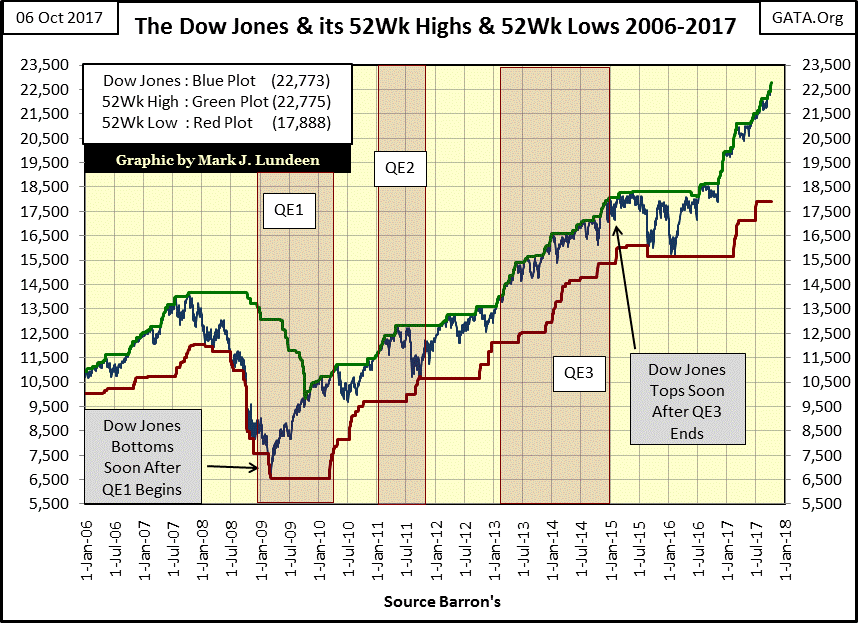
Here’s the Dow Jones’ Bear’s Eye View (BEV) chart going back to 2013. It’s not hard relating to what happen since 2013 above to what we’re seeing below, so take a moment to do exactly that. Since last April the Dow Jones has never closed more than 2.5% below an all-time high (BEV Zero below / Green Plot above).
Also, in the BEV chart below, during 2013-14 it didn’t take long for the Dow Jones to correct down below its BEV -5% line, just a couple of weeks to maybe a month. Looking at the correction table in the BEV chart, from today’s lofty levels, the Dow Jones would have to shed a whopping 1,139 points to correct just 5%, twice that to see a 10% correction. That’s a lot of points to lose in a month during a 5% to 10% correction; people are going to notice that.
With the Dow Jones approaching 23,000, concern of corrections isn’t causing the bulls to develop acrophobia. Maybe when the Dow Jones threatens to break below 20,000 it will be a different story.

Just keep in mind who the BIG bulls are in this market – central banks. These are institutions who have unlimited money to “invest” in the financial system, and so aren’t likely to fear any Dow Jones’ valuation threshold to the up or downside that someone like me would bring to their attention.
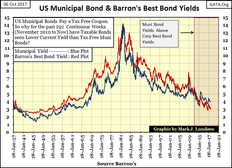
However, what these central banks do fear is rising bond yields, and I have some comments below on that exact subject, specifically the pending massive problems in the muni-bond market. Currently, bond yields are behaving themselves (chart below), and as long as they do, I expect the stock market will continue to do much the same as it has for the past year; ditto for us long suffering investors in gold and silver.
However, when the two plots seen in the chart below reverse themselves to the upside, as one day they must, all this will change. The Dow Jones will break down over 10% from an all-time high, and we’ll see what happens then. That plus gold and silver will once again see some action to the upside that will make the wait we’ve endured since 2011, all worthwhile.
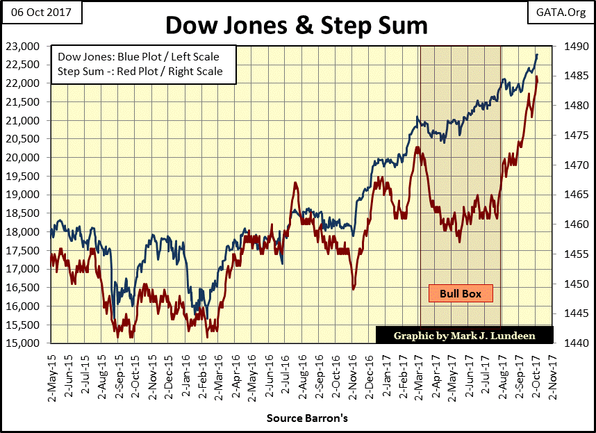
But in early October 2017, as the Dow Jones step sum chart below shows, we’re not there just yet. The overwhelming number of daily advances (rising step sum / red plot) is impacting the Dow Jones. We may be seeing the beginning of a historic feeding frenzy in the stock market. If this continues, don’t be surprised should the Dow Jones finds itself a good way above 23,000 by the close of next Friday, and then maybe even above 24,000 in the weeks to follow.
It’s not just the Dow Jones advancing. The other 21 major indexes I follow are at or near their all-time highs, except for the NYSE Financial Index (#22 in table below).
The banks are another problem that could cause big problems for the “policy makers.” As of October 2017, they’ve yet to recover to their pre-credit crisis highs because they’re still corporate entities who have massive problems on their balance sheets.
I’m not an accountant, so my opinion on this or that bank’s financial situation is just that, my opinion. But what isn’t my opinion is that the big Wall Street banks have played fast and lose for decades, safe in the knowledge that their friends in Washington would always come to their rescue when they found themselves in a crisis.
Nothing has changed since March 2009, except it’s likely these banks’ financial situations have degraded to a point where come the next crisis, even the US government will be unable to save them. That could result in a breakdown of the global payment system, where cash withdrawals from a bank or their ATM, and the option of using plastic for financial transactions (for food or gas and everything else) would no longer be available. This is something that didn’t even happen during the Great Depression. That can’t be good!

The BEV data above is based on last all-time highs. Let’s take a look at the Dow Jones Total Market Group (DJTMG)’s 52Wk High and Low data and see where the banks currently stand. The banks closed the week at a 52Wk High, and 41.54% above their 52Wk Lows, placing them in the #5 position.

Let me say something about 52Wk Highs, they’re not always what people think they are. Take Comms Tech (#28); it made a 52Wk high this week, but was only 15.62% above its 52Wk Low. Now look at #46; Gold Mining. It was 3.68% from its last 52Wk High, but 24.61% above its 52Wk low. One would really have to look at these charts to see exactly what’s happening here, which I haven’t, but I expect more money was made investing in the gold miners this past year than investing in the communication technology stocks. However, truth be told the banks beat both of them. But look at #1, the Aluminum Miners, up 108% from their 52Wk Lows.
Next, the Dow Jones Total Market Group (DJTMG)’s top 20 closed the week at 49 for the second time in a row. Will it break above 50 in the weeks to come? I didn’t think that was likely, but I’m beginning to think it may do just that. Should that happen, nothing changes.
The next big event we should anticipate in the chart below is the coming collapse in the top 20; exactly as happened for the high-tech and sub-prime mortgage bear markets. But in early October 2017, we’re not there just yet, and until bond yields begin to increase, I don’t care to speculate when it will.

With my DJTMG data I also follow 3Yr Highs and Lows, the idea being that it takes a lot of buying or selling over a longer period of time to make a new 3Yr High or Low. During most of 2015-16, 3Yr Highs were in decline from where they were in 2013-14. Then came 2017, and all that changed. This week ended with a net of 29, 3Yr Highs – 3yr Lows.
In Barron’s June 5th issue of this year, this series saw a net of 39 in its 3Yr H-L. It will be interesting to see if the current advance can exceed last June’s peak. If the Dow Jones and the other major market indexes continue advancing, I expect this will happen in the weeks and months to come.

Gold (Blue Plot) and its step sum (Red Plot) below are trending down, and so not rendering moral support to the gold bulls. But then for the bears this isn’t a great chart either. Gold bottomed in December 2015 & 2016, but the lows of 2016 didn’t break below those of 2015. And as we now head towards December 2017, does gold appear to be on track to take out last December’s lows? To my eyes that doesn’t seem likely. Also, beginning in December 2015, gold’s step sum stopped trending down, and then in December 2016 it began to trend upwards.
So, considering both sides of the gold market, gold’s step sum chart below offers more to the bulls than to the bears. As long as last December’s $1125 holds, I expect in the fullness of time, we’ll see how for the past two years gold was forming a solid base from which it can advance on to new all-time highs in 2018.
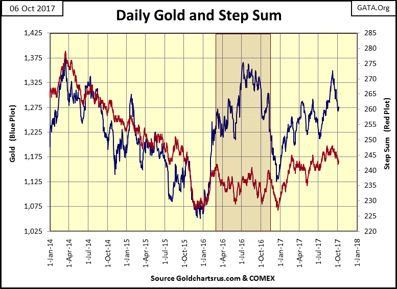
Geeze Louise, look at all those down days on gold’s side of step sum table below. For over a month now it’s been one day up, two days down in the gold market. Gold’s high price in the past twenty five trading sessions was $1348 on Sept 7th (Day 22). In the past month the bears may have hammered gold down by $72, but after all that, they failed to inspire a selling panic in the gold market.

This is nothing like we saw in the gold market after the August 2011 peak down to its lows of December 2015. On Friday, 12 April 2013 gold was down $80.63 from the day before, then on the following Monday it was smashed down by $133 in a single day. Yes these are the extremes during the 2011-15 gold market decline, but daily declines of $30 to $50 were common market events in the gold market. After December 2015, all that changed.
In 2017 the big bears would love to be able to do that again, but since December 2015 they haven’t because they can’t. In the past two years the biggest daily decline in the gold market was only $43.
I don’t enjoy what is happening in the gold market. But try as they may, with all the support of the government’s market regulators willing to look the other way as these banks flood the gold and silver’s futures market with tons and tons of phantom metal, the bears can’t be happy with what they see in the table and chart above. In the daily push and shove in the gold market, they’re slowly losing ground.
Looking at the Dow Jones side of the step sum table above, all I can say is WOW; look out above!
I call gold and silver “monetary metals” for the simple reason that for thousands of years they were money. With the introduction of paper money, it was universally understood by all that paper money was only a claim payable in gold or silver. However, in the 21st century that is no longer true.
The Mark Dice clip below shows the difficulty he had in selling a Canadian 1oz gold Maple Leaf for a US $20 paper Federal Reserve note; aka, a $20 I Owe U Nothing from our central bank.
https://www.youtube.com/watch?v=ndshbH3qZ6Y
I’m sure my readers would have taken full advantage of the deal offered by Mr. Dice, but I’m not surprised so many people did not. It’s just a fact that there is “an establishment” who for decades has dominated our culture and manipulated the economy for their benefit. I’m talking about our entrenched political class and their bankers, the entertainment industry, legal system and academia have greatly benefitted from the inflation flowing from the Federal Reserve.
These people have absolutely no love for gold or silver, except maybe for their personal accounts. The clip above demonstrates the success they’ve have in divorcing the general population from the very concept of honest money, money that the above “establishment” can’t manipulate for their selfish personal interests.
If these people have been so successful quarantining the old monetary metals from the economy, and integrating paper and digital dollars into our lives, why should we be interested in gold and silver? Because what they have done (and continue doing) is a fraud upon all mankind, and ultimately frauds end in ruin. Investors in high-tech companies discovered that in 2002, as did single family home purchasers in 2009.
Up to now, the “policy makers” and their minions in the main stream media have been successful in keeping the public focused on the rising stock and real estate markets. Well, these are on the asset side of monetary inflation’s balance sheet. On inflation’s liability side of its balance sheet is consumptive debt, debt that’s destined to be defaulted on.
Whether this debt was created for someone now in their late twenties’ master’s degree in gender studies from an Ivy League university, or created to provide a short term fix for city and state government’s incompetent administration of the trust the public has in these institutions, it makes no difference. There are many trillions of dollars of consumptive debt will be defaulted on within the coming decade.
The triggering event in the coming wave of municipal debt defaults will most likely be from pending unfunded pension fund liabilities.
Pension fund problem
https://www.bloomberg.com/graphics/2017-state-pension-funding-ratios/
Pending Illinois bankruptcy
https://www.cbsnews.com/news/could-illinois-be-the-first-state-to-file-for-bankruptcy/
This problem is much greater than just the state of Illinois. And when this patch of skunk cabbage comes to bear fruit, it will become a contagion that will infect the perceived solvency of the corporate bond, and yes eventually even the US Treasury markets. As capital flees these debt markets, and bond yields rise toward double digits, counterparty risk will once again headline the daily news, and the old monetary metals, financial assets with zero counterparty risk, will never look so good.
Keeping all that in mind, let’s take a look at silver in the table and chart below. The most interesting thing about the price of silver is how its current last all-time high is still from January 1980, thirty-seven years ago. Other than silver, what’s cheaper today than it was in 1980? Okay, digital integrated circuit chips and computing power are much cheaper today than in 1980, but as far as commodities and consumer goods go, not much else is (Table Below / weekly closing prices).

But both cotton and coffee’s highs of 1980 were taken out long ago. Only silver still finds it last all-time high from four decades ago, and closed the week 66% below it.
Notes on the above table, I believe the Cocoa contract had a change in specifications since 1980, so I doubt it has increased by 1367% since 1980. The energy contracts for crude oil and gasoline did not trade until 1983, so are not listed. Also, gold peaked at $825 (close of week basis) the following week. I find it interesting that the price of gold had once moved 28% in a single week. But the table makes my case that the current price of silver, even at $16.61 is historically very cheap.
The chart below plots daily closing prices for silver since January 1969. The history of its bull and bear markets since 1969 makes for a very odd chart. For one thing, silver’s high price for 2011 is only $0.12 below its bull market high of 1980. I suspect someone worked very hard making sure silver in April 2011 didn’t break above its highs of January 1980. As I recall, in late April 2011 as the price of silver peaked, the COMEX increased margin requirements for the longs three times. That doesn’t happen unless the market’s “regulators” are in on the fix.
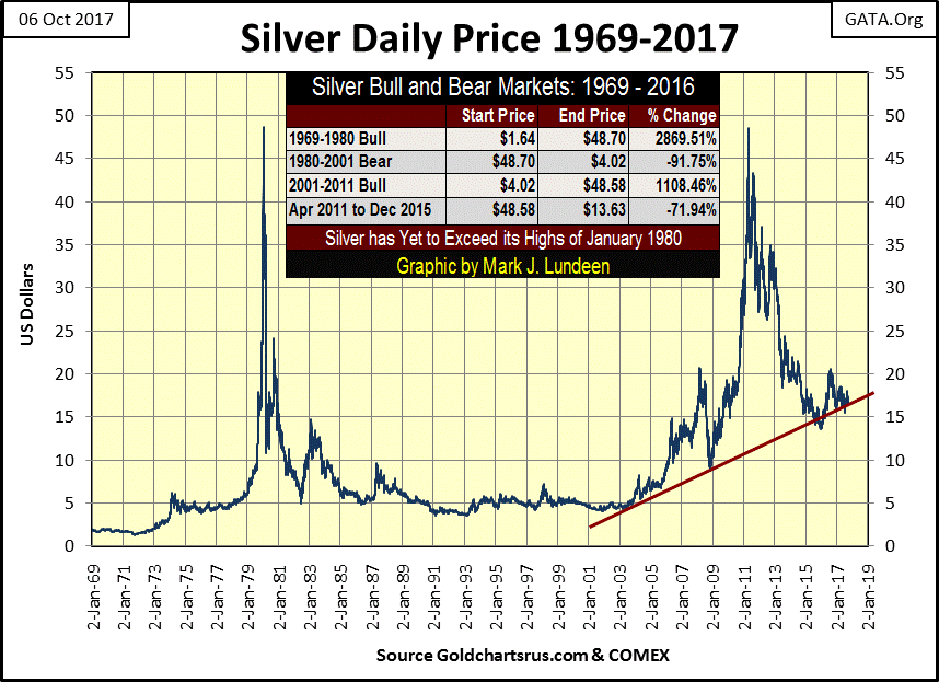
I placed a red trend line for the current bull market in silver. It’s interesting how at silver’s 71.94% decline in late December 2015, the price of silver may have broken below it, but the bears in the silver market couldn’t keep it there. Also for the past two years, on market declines this trend line has given the price of silver good support.
Keep in mind these chart patterns hold until they don’t. Still, seeing this chart pattern hold for the past fourteen years is interesting. But it’s safe assuming the big banks and government market “regulators” responsible for the April 2011 – December 2015, 72% collapse in the price of silver are going to have an increasingly hard time holding down the price of silver in the future. So, I’m assuming the bottom for silver is in, and that red trend line will hold until silver makes its next bid to take out its highs of 1980.
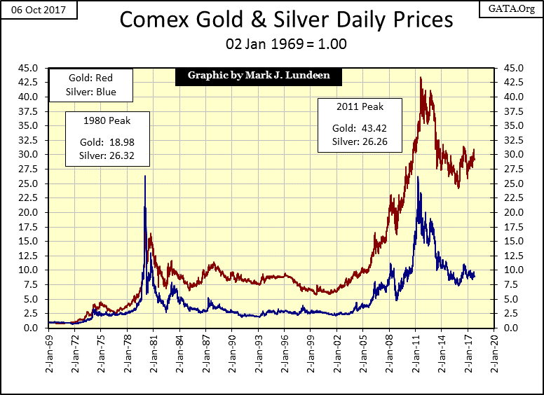
Below I’ve indexed gold (Red Plot) and silver’s price (Blue Plot) to January 1969. Indexing these prices series allow us to directly compare their performance during the past fifty years. During their 1969-80 market advance, silver outperformed gold by a wide margin at its 1980 peak. The reverse was true at their 2011 peak. During their bear markets, silver has proven to be a dangerous asset to hold compared to the losses taken by gold.
Even so, for retail investors I believe that silver will ultimately prove to be a superior investment. For one thing the bottom is in for the post April 2011 decline.
Now, take a quick look at the indexes values of gold and silver above, and compare them to their step sum below. It’s really weird how the step sum plots below are actually inverted from their price performance plots seen in the chart above. One would naturally assume that the blue silver step sum plot below would belong to the red gold price above, but it doesn’t. Silver sees massive price declines above, while its step sum plot below completely ignored a multi decade 90% crash and a multiyear 70% market decline.
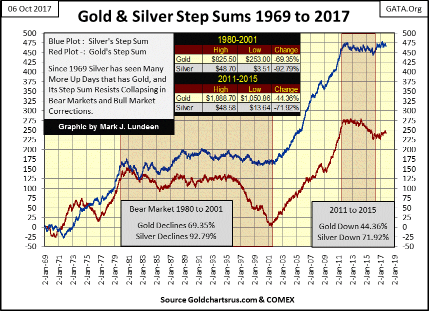
What’s with that? I believe it’s because silver, unlike gold has huge industrial demand, and manufacturers, unlike investors, are price insensitive. When General Motors or Apple requires silver, they buy it by the ton regardless of price. I’m not saying industry doesn’t shop around for the best price, I’m sure they do. But after a major market decline in the silver market, investment demand declines, while for industrial demand, a crash in the price of silver may actually provide a reason to buy more of it, and I think that is what we are seeing in silver’s step sum above.
But the real reason I published this chart this week is to illustrate how gold and silver’s step sum plots have trended during the past forty-eight years in bull and bear markets. During bull markets, these step sums advance nicely. On prolonged market declines, such as we are in now, they don’t.
It’s only a matter of time before these step sums take off again for the third time since 1969, as gold and silver resume their market advance that began in 2001. And I expect that event will be closely linked to the pending problems in muni-bond market.
Mark J. Lundeen


