Feeding The Monkeys On Wall Street


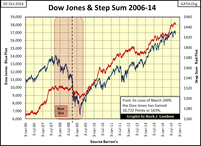
On Wednesday, October 1st the stock market was experiencing a little selling pressure. There was some concern with CNBC’s talking heads that a market correction could be imminent. Well that could be, but so far the chart below shows no indication of any market correction in the Dow Jones. Maybe the question we should be asking isn’t whether the stock market is due for a correction, but how did the Dow Jones manage to gain 10,732 points since March 2009, an increase of 163%? That’s a good question; after all from the summer of 2007 until March 2009 Wall Street was forced by brutal circumstances of its own making to wash its dirty laundry in full view of the public, and what everyone saw wasn’t very pretty.
Geez Louise, from the summer of 2008 to March 2009 the global banking system was upchucking trillions of dollars of illiquid-toxic mortgages. These AAA rated mortgages were bundled with derivatives to protect their purchasers against loss of interest and principal payments – or so everyone was told by Wall Street’s salesmen. From around the world money managers came to Wall Street to purchase what everyone knew were safe and highly liquid assets in the multi-trillion dollar secondary market for US mortgages.
Then one day the secondary market for mortgages became a no bid market; everyone was selling and no one wanted to buy. So the banking system could no longer convert their mortgage reserves into ready cash – that was really bad! But what was even worse was when the derivatives Wall Street had bundled with these now non-performing mortgages came “into the money” during the credit crisis. The derivative losses suffered by the big Wall Street banks were orders of magnitude larger than from the mortgages themselves. The banks who sold these “hedges” to the purchasers of Wall Street’s “AAA rated” mortgage products neglected to maintain any funds in reserve for the likely event that these sub-prime mortgages would default en masse.
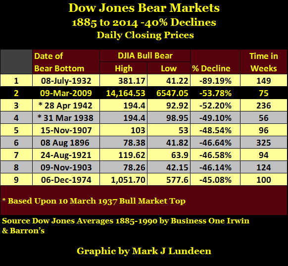
In October 2008, the Pillars of American Finance weren’t just illiquid and insolvent; they were also the perpetrators of the largest bunko scam in the history of finance. Who was prosecuted for this massive fraud? No one. From October 2007 to March 2009, the Dow Jones declined 53.78%, its second deepest bear market since 1885 with “investment experts” from these same banks providing the buy-side market commentary all the way down.
In my opinion, the percentage that the Dow Jones declined in March 2009 was insufficient to accomplish what all bear markets need to accomplish when a financial system is in crisis – to eliminate unviable assets from society’s balance sheet. In 2014 the trillions of dollars of problematic mortgages from 2007-09 are still masquerading as assets somewhere, for instance, on the books of the Federal Reserve (Red Plot below).
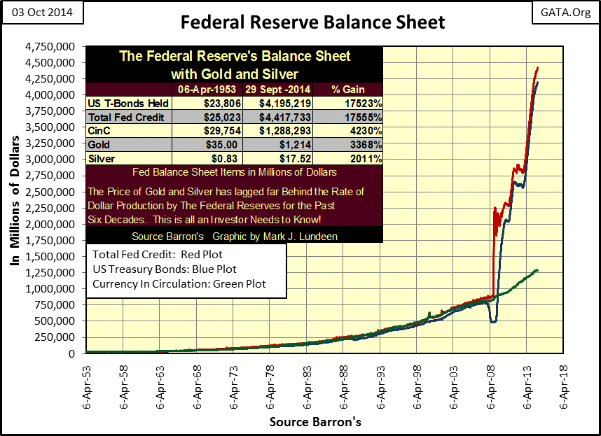
The chart above shows us exactly how the Dow Jones managed to rise 163% since March 2009; the Federal Reserve monetizes toxic-mortgage assets and US Treasury debt and then “injects” the resulting effluent back into Wall Street. This may sound disgusting to people ignorant of the ways of “high finance”, but as noted by Mitchell Stapley below, it feels really good to money managers addicted to the Federal Reserve’s “liquidity.”
“If we learned anything from 2008, it’s that liquidity is the key variable. Liquidity flowing into the system cures a world of ills.”
- Mitchell Stapley, the chief fixed-income officer at Fifth Third Asset Management. 07 Feb 2012
But we must remember that the Federal Reserve’s quantitative easing (QE) program is scheduled to end this month – yeah right. The chart below displays the monthly additions and subtractions of US Treasury debt in the Federal Reserve’s portfolio (Blue Plot chart above). Whenever a Fed official informs the public that they are going to terminate QE purchases, they imply they will be returning to pre-credit crisis “monetary policy” (monetizing US Treasury Debt). This can be seen from January 1997 to October 2007 below. But after five years of monstrous continual monthly injections of “liquidity”, I doubt the old monetary policy of monetizing and “injecting” only a few billion dollars a month into Wall Street would be capable of keeping the monkeys on the back of today’s frothy markets happy.

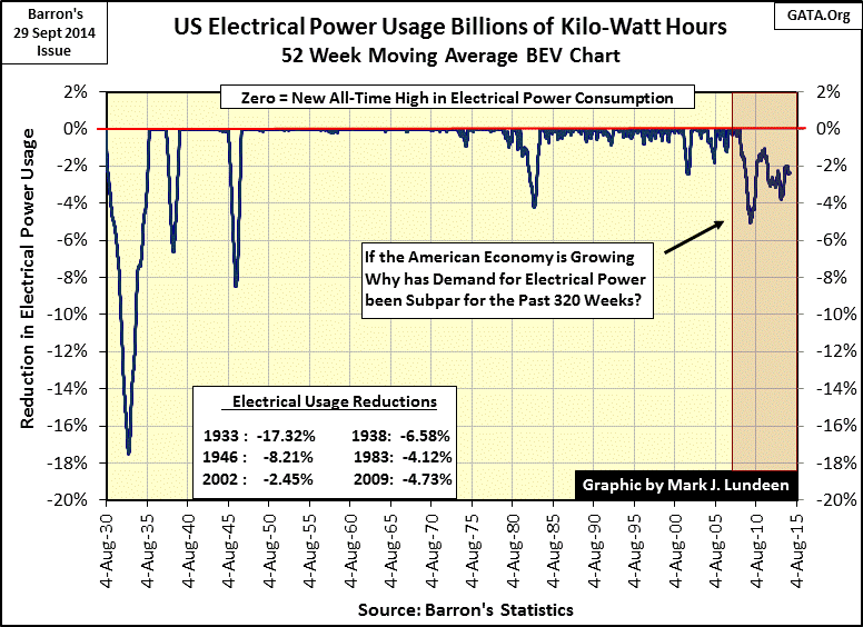
If the Federal Reserve doesn’t want another Panic in Needle Park I expect the “new normal” monetary policy will look suspiciously like the old QE monetary policy seen above. But then what do I know? Well I know that despite all the crappy assets monetized and injected into the economy since August 2008, economic demand for electrical power has still not reached a new all-time high. Years ago, there was a direct correlation between rising market valuations and its underlying economic activity, but since EP saw its last all-time high in August 2008 (see chart below), this is no longer so.
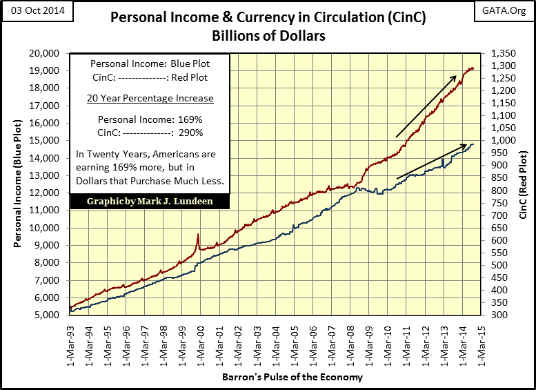
We need look no farther than the Federal Reserve System, that Great Engine of Inflation to see what the problem is; earned income for the middle class is not keeping up with monetary inflation from the Federal Reserve. The chart below shows us that even though Personal Income may have increased by 169% since 1993, the number of dollars in circulation has increased by 290%. Monetary inflation is relentlessly draining the purchasing power from the rising wages of the American middle class.
Below we see how wage earners have leveraged their income with consumer debt in order to maintain their purchasing power, debt which of course was generously provided by the Federal Reserve System. However in doing so people must now also work to pay interest to the banks. Today’s debt burden on the middle class is huge, especially after the mortgage boom and bust.

What a different world we live in from the one before the US decoupled the dollar from the Bretton Woods’ $35 dollar an ounce gold peg. I don’t want to beat a dead horse over this, as I know I make this point often, but ending the dollar’s peg to gold was an important milestone the world passed more than four decades ago. Prior to August 1971 the capacity of the banking system to create credit was checked to a great extent by the dollar’s peg to gold. Consumers for most of the 20th century paid cash for daily purchases and saved money in banks to purchase big box items because banks had to be cautious to whom they extended credit.
This is no longer the case for banking in 2014, where most people, and too many businesses, use interest bearing credit to pay their way from one day to the next. In August 2008, at the cusp of the credit crisis, it seems we passed another important mile stone on our journey towards national bankruptcy, the point where debt service for bloated mortgages, credit cards, student and auto loans finally caused a reduction in economic output as seen in America’s electrical power consumption.
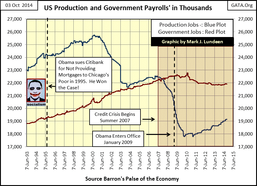
The massive increase in currency, credit and debt since 1993 hasn’t managed to stimulate employment in production either, as we see in the blue plot below. Production payrolls peaked in 2000, only to decline as the high-tech bubble deflated. Factory jobs benefitted little from the inflating housing bubble (mid 2003 to mid 2007), but tumbled greatly as it deflated (mid 2007 to early 2010). The deflating housing bubble had a negative impact on government job creation as well. This is hardly surprising as the economic activity represented in the blue plot is what pays the taxes that support the jobs shown in the red plot. All in all the chart below paints a very sorry picture.
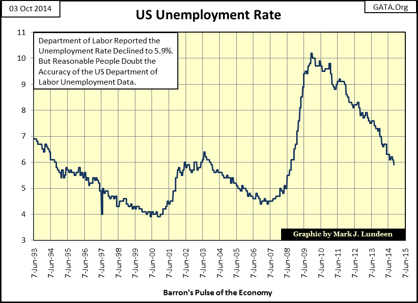
For what it’s worth, here’s a chart plotting the unemployment rate calculated by the Labor Department. The big news Friday was that the unemployment rate declined to 5.9%; the Dow Jones increased 208 points on the “news.” I don’t trust these numbers as politicians use them for electoral props, but they still make the point that the mortgage crisis greatly harmed many in the working class, and economic activity is still far from what it was in the 1990s.
One of the untold stories of the sub-prime mortgage bubble is how President Obama played a critical part in its creation as an attorney for the far-left Acorn organization in his days as a community organizer in Chicago. Obama sued Citibank for not providing mortgages to Chicago’s under-employed minority population. Obama won the case, and the courts forced Citibank to lower its standards to qualify for a thirty-year mortgage. But don’t let that lead you to believe Citibank was a victim; many powerful politicians in Washington made sure that big banks would find it very profitable writing mortgages to people with no hope of ever servicing the payments on a six-figure thirty-year loan. And when the bubble ultimately popped in 2008-09, Washington never prosecuted a single Wall Street executive for fraud as many members of Congress, as well as President Obama were co-conspirators. The YouTube video below is about seven minutes long and makes the case that Wall Street had a lot of political support during the mortgage debacle.
http://www.youtube.com/watch?v=hxMInSfanqg
But who cares about declining EP and factory jobs, or the astounding increase in both the Federal Reserve balance sheet and the debt load on consumers? It seems not many people at all, and until a crisis once again comes to Wall Street, the rising stock market will continue to be the lead story in the financial media. But no tree grows to the sky, and the current bull market in stocks will eventually end. We may not have much longer to wait before Mr Bear once again attempt to take out the garbage from Wall Street.
The table below lists the NYSE 52Wk Highs and Lows from August 14 to today. Pay close attention to the “H-L Nets” column, which posts the net sum of the daily 52Wk Highs – Lows. Since 01 October 2013, there have been a total of 255 trading days at the NYSE. The NYSE’s H-L Nets were positive (Up-Day) for 217 of those trading sessions and negative (Down-Day) for the other 38. As is typical during a bull market, NYSE 52Wk Highs overwhelm the 52Wk Lows for months on end.
The interesting thing about this is that ever since September 12th the H-L Nets have been negative, except for the three days the Dow Jones made new all-time highs (17-19 September). And on those days the Dow Jones made new all-time highs, nearly as many NYSE companies reached 52 Week Lows as 52 Week Highs.

Looking at the action in the 52Wk Highs and Lows in the table above, I’m not predicting the Dow Jones all-time highs of 17-19 September will prove to be a historic high, such as the ones seen in January 2000 and October 2007. However, when the ultimate top of this bull cycle does come and pass by, it will look like this. Still, if Janet Yellen is willing to “inject” sufficient “liquidity” into Wall Street, she can certainly make those NYSE 52Wk Highs once again overwhelm the 52Wk Lows and keep those new Dow Jones all-time highs coming.
Even so, we are near the top in the stock market’s cycle, the point where market gravity becomes irresistible, or so it would seem when looking at how many groups in the Dow Jones Total Market Group (DJTMG) are within 20% of their last all-time high. We’ll call this plot the DJTMG’s 20% data, and by the way my data is weekly closing prices.
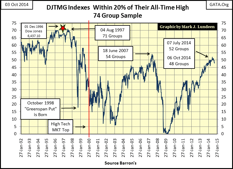
For your information, my version of the DJTMG is not exactly the same as Barron’s publishes; I include seventy four of these indexes in it, but you can see how crazy it was in the 1990s with seventy of these seventy four indexes within 20% of their last all-time highs. The red star marks 05 Dec 1996 when Alan Greenspan asked if the stock market was being influenced by “irrational exuberance”. As you can see in the chart – it was.
The Dow Jones Industrials Index topped out years after the DJTMG plot above did. Well the roaring bull market of the late 1990’s was in high-tech stocks, not energy, auto manufacturing or water utilities stocks; so the number of indexes within 20% of their last all-time highs began to decline in 1997 as the mania in high-tech stocks begun to heat up. The chart above also displays when the “Greenspan Put” was first used, and more importantly why; the market in October 1998 was crashing for the want of Doctor Greenspan’s “liquidity.”
At the bottom of the high-tech crash, the DJTMG’s 20% data bottomed with only six groups within 20% of their last all-time high in February 2003, this was quite a difference from August 1997 when seventy one groups were within 20% of their last all-time high. Then above we see how during the mortgage bubble, the DJTMG’s 20% data peaked in June 2007 at 54, and then things got really nasty as the credit crisis progressed. In Barron’s 09 March 2009 issue, no index in the DJTMG was closer than 30% from its last all-time high.
In the table below I have broken down this data. The data used in the chart above is located in the “20% From All-Time High” column, just to the right of the dates. The next column is labeled “Zero”; which tells us how many indexes saw a new all-time high for the week. The next four columns go up to -15%, and as the -15% includes all indexes between -15% to -19.99% that is the last column included for the 20% data. I don’t want to bore my readers, but this table is very interesting. Each week there are seventy four indexes in the data, and for most part during the credit crisis they all declined much more than 30%. Look at all the zeros in the table. Many indexes lost more than 60% during the credit crisis. This was a horrible bear market bottom!

Below is the 20% table updated to today; note how few zeros are seen on it. Go back and look at the chart of the DJTMG’s 20% data. The stock market has really done superbly since March 2009, but the best of what this bull is going to deliver has to be behind us now.

This data is based upon all-time highs. If you go back and look at my charts for EP, personal income & CinC and payrolls, does it seem reasonable seeing so many sectors in the stock market within 20% of an all-time high with the economy and working people doing so poorly? It doesn’t to me. But since October 1998 when Alan Greenspan first used a “Put”, injecting the stock market with a large dose of inflation to keep those damned market valuations up, the stock market’s connection to economic reality has become increasingly tenuous. I don’t care to predict when, but this is all going to end in tears and with a bear market worse than what we saw from October 2007 to March 2009.
More from Gold-Eagle


