The Fingerprints Of “Policy” In The Markets
 share
share
 share
share
 share
share
 share
share
 share
share
Since August 1971 when the US unilaterally abandoned the Bretton Woods’ $35 an ounce gold peg, the financial markets have changed in fundamental ways; for instance in market volatility as seen in the frequency of Dow Jones daily moves of 2% or more. Though Dow Jones patterns of volatility have changed from time to time since January 1900, the post Bretton Woods market era’s volatility pattern is unique.
The chart below plots the stock market’s days of extreme volatility: (days the Dow Jones moved 2% or more from the previous day’s closing price) over the past 114 years.

The plot below displays the number of daily moves (up or down) of 2% or more by the Dow Jones seen above in a 200 day running sample, or count. These charts present an illusion that 2% moves in the Dow Jones are common market events, but they are not. Since 02 January 1900 (114.5 years) the Dow Jones has seen daily moves of 2% or more in only 1,794 (5.77%) of 31,087 trading sessions. Periods of market distress are identified by peaks in the number of Dow Jones 2% days, proving the wisdom behind the old market rule-of-thumb: “one should never short a boring market.” Daily moves of 2% or more by the Dow Jones, even positive 2% moves are extremely rare in bull markets except during bull-market corrections.
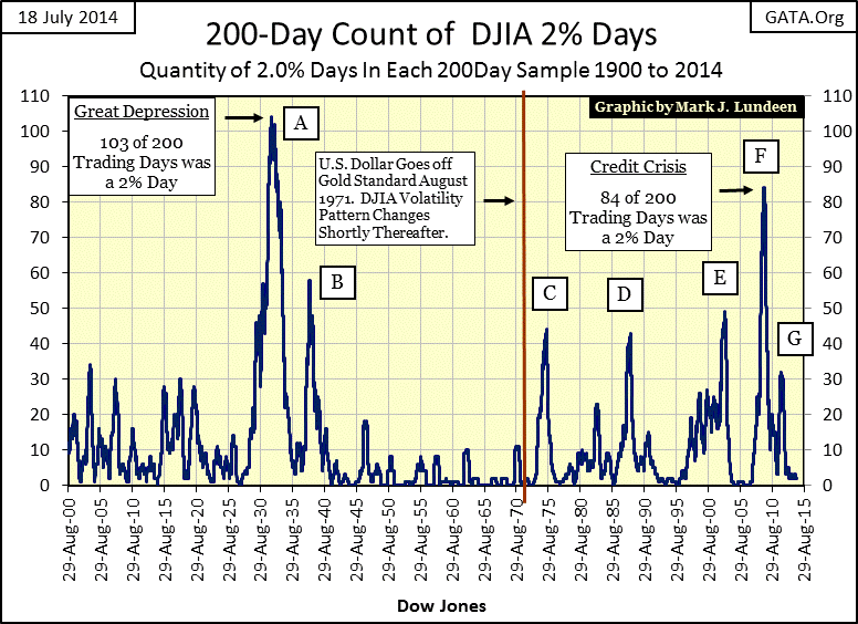
Market history before the creation of the Federal Reserve in December 1913 is ancient history with little relevance today. But not so with the Roaring 1920s’ bull market and the Great Depression’s bear market which even Keynesian economists such as Doctor Benjamin Bernanke admit were caused by “policy missteps” by the Federal Reserve. The market panics of the Great Depression are evident in the chart’s volatility spikes A & B. The horror of these market events not only frightened the public away from Wall Street for a generation, but inspired monetary integrity within the Federal Reserve itself until the 1950s.
For a generation (1940 to 1970), market volatility (shown by days of 2% moves in the Dow Jones) was never so subdued, but all that changed after the Federal Government decoupled the US dollar from the Bretton Woods $35 an ounce gold peg in August 1971. The post August 1971 manic-depressive market volatility seen in the chart above is unique in the 114 year history of the Dow Jones shown in the chart and is solely driven by Fed “monetary policy” now unshackled from the discipline of a gold standard.
The table below gives the specifics for volatility spikes above.
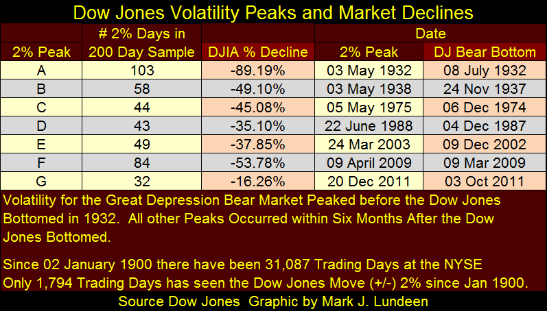
Volatility spike G strikes me as a bit odd that so many Dow Jones 2% days in a 200 day running sample should result in a Dow Jones decline of only 16%. I suspect that had the market been allowed to run its own course, unaltered by government “policy”, the bear market terminated by Washington bureaucrats and Wall Street bankers in March 2009 would have resumed and today we would now be over the worst of what must come to pass.
The last Dow Jones’ 2% day occurred on 03 February 2014, 116 trading days ago. However, though volatility is currently low and the Dow Jones is again making new all-time highs, its 200 day count hasn’t been free of Dow Jones 2% days since 26 February 2007. So, not since the peak of the mortgage bubble has the Dow Jones 200 day running sample been free of 2% days which suggests that the financial markets are still not safe from the claws of Mr Bear. Also, though the public no longer celebrates each new all-time high in the Dow Jones as they did before October 2007, the public’s trust in the best and the brightest managing the Federal Reserve is as strong today as it was in 2007.
“One reason that monster declines are less likely now is that investors recognized something that they didn’t in 1987: The Federal Reserve is on their side.”
- Andrew Bary, Barron’s 15 October 2007 issue
Exactly one year later with the Dow Jones down 40%, I’m sure Mr. Bary was having second thoughts about the Federal Reserve’s ability to prevent massive market declines. Today, for those who still trust in the academic brilliance that controls “economic growth” and “market stability”, I suspect the coming year will once again test their faith in allowing people smarter than themselves to control financial markets. As for myself, I’m still waiting for the Dow Jones to retest the March 2009 53% decline, before it ultimately goes on to test the 89% decline of July 1932.
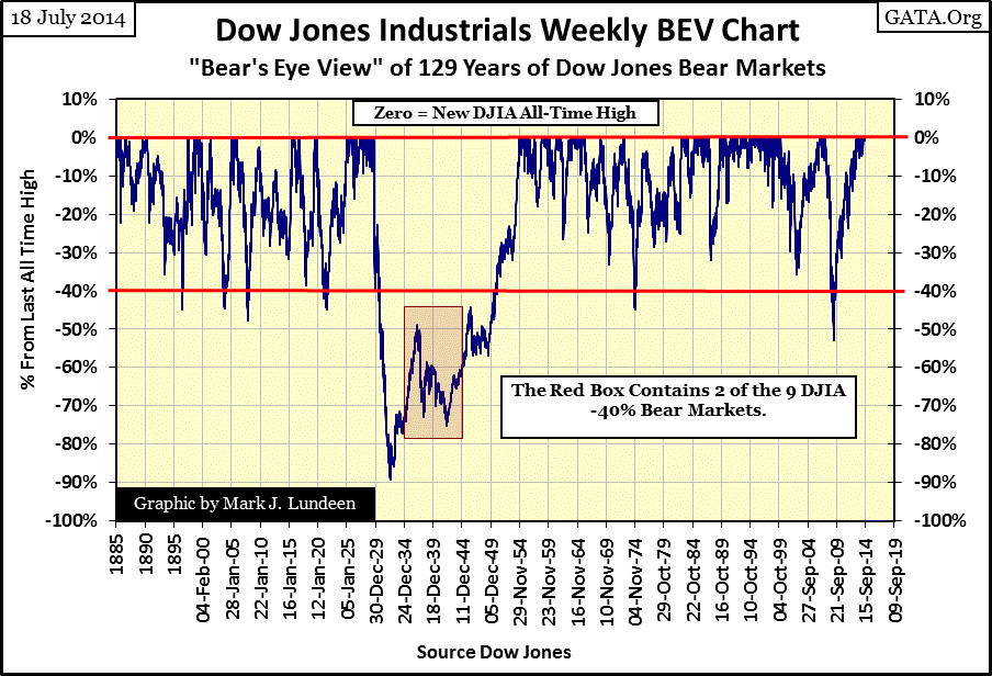
Here’s a table listing each Dow Jones 40% decline seen in the chart above, sorted by percentage decline.
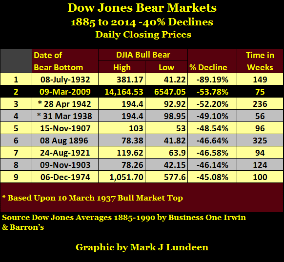
Expecting the Dow Jones to decline by more than 40% from its current all-time high for the tenth time since 1885 may sound extreme to most people, but actually it’s not if we understand how inflated financial asset valuations are today. Mr Bear provides an important service to our economy – financial hygiene. After a prolonged period of inflationary “economic growth” during which the financial markets have seen a substantial advance in valuations, there’s a lot of overpriced garbage assets, such as underwater mortgages and overpriced junk bonds littering the asset side of society’s balance sheets.
Since Alan Greenspan became Chairman of the Federal Reserve in 1987, bear markets have been prevented (through manipulation), along with the financial hygiene they provide the economy. The “policy makers” have thwarted Mr Bear’s cleanup crew by monetizing Wall Street’s financial garbage and re-injecting the liquefied residue back into the banking system in the name of “economic stability.” In the process the Federal Reserve’s balance sheet has become totally trashed with illiquid reserves as has the global reserve currency it manages (chart below). In the past year America’s friends and foes alike have both begun to settle their international trading accounts in currencies other than the US dollar because of what’s shown in the chart below. Should global commerce abandon the US dollar in the settlement of international trade, future domestic inflationary implications for the United States’ economy are bleak.

Well garbage created by the banking system eventually flows into the reserves of insurance companies, pension fund and private individual’s investments. Allowing these assets to deflate in valuation to where they can once again trade in a free market, a market free of bureaucratic supervision our current market can’t exist without will be painful. But the only other choice is to allow events to continue as they are which will terminate in a hyperinflationary depression, which would be worse.
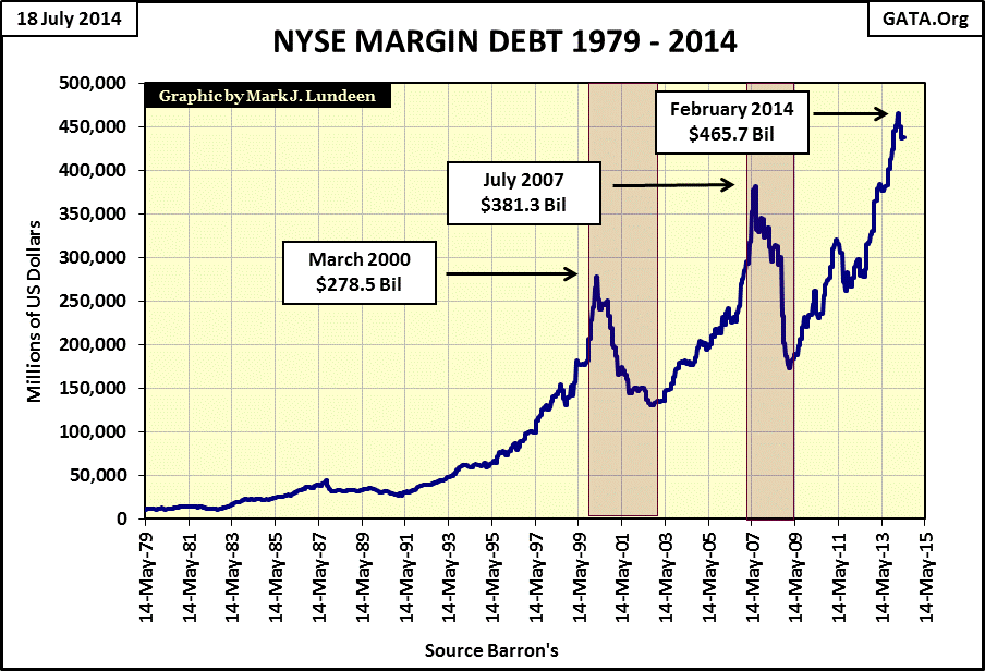
I don’t care to predict when the current situation will come into crisis. What I can say with certainty that when the end of the current good times approaches, the Dow Jones will once again see a dramatic increase in 2% days. And even if time proves me excessively pessimistic (which would be good), the following chart for NYSE margin debt suggests that the best is now past for the current advance in the stock market, and the wise investor needs to take some profits out of the market.
Post August 1971 “monetary policy” has influenced more than market volatility, it also influences interest rates and the price of gold. The key to understanding price trends in gold was found in the US Treasury’s long bond yield; or it was until 2001. From 1971 to 2001 rising bond yields (bond bear markets) went in hand with bull markets in gold and silver, while declining bond yields (bond bull markets) coincided with bear markets in gold and silver. The chart below illustrates this point. I placed a few vertical red lines at key gold trend reversal points (Blue Plot / Left Scale). Before January 1980, the movements in gold and long-term bond yields (Red Plot / Right Scale) were almost synchronized. After the 1980 peak in gold this relationship decoupled somewhat, but note how during the entire gold-bear market (1980 to 2001) the long bond yield declined dramatically as stocks and bonds experienced a massive bull market.
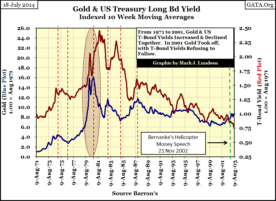
This relationship is logical. From 1971 to 1980, US Treasury long-bond yields increased from 5.5% to over 12% as the US dollar’s purchasing power diminished as a result of Washington’s inflationary-monetary policy. Seeing the price of gold increase from $42 in 1971 to over $840 just nine years later in January 1980 during this bond-bear market is not surprising. But note that the bottom of the bond-bear market didn’t occur until twenty months later in October 1981. The price of gold had already declined 50% when US Treasury long-bond yields finally peaked at 15%. In this twenty month counterintuitive move (decline in gold price as bond yields increased) the gold market made a remarkable call; the decade long bull market in commodities (consumer prices) was coming to an end and that a multi-decade bull market in financial assets was at the door.
Then something remarkable occurred in 2001 (chart below); the price of gold began a multi-decade bull market as the bond bull market continued onto its third and then fourth decade. This is not logical as rising gold prices indicates capital flight from the financial markets while declining bond yields indicates the exact opposite. If one was seeking the point in time when “policy decisions” began to overwhelm free-market forces in the financial markets, the night Doctor Bernanke gave his “helicopter money speech” (21 November 2002) is as good as any.

Then in 2012 another counter intuitive market event occurred (shaded area right side). As US Treasury long-bond yields jumped from 2.45% to 3.85% (June 2012 to December 2013) resulting in a 22% decline in price of long-term Treasury bonds, the price of gold also declined 24% from $1606 to $1215. If money managers were looking for a safe harbor from rising bond yields in the gold market, the “policy makers” made sure that didn’t happen.
But since 2000 market irregularities have become common. For the past fourteen years the law of supply and demand has been violated at the NYSE as the stock market saw two multi-year bear markets occur on rising trading volume (2000-02 & 2007-09), and two multi-year bull markets (2002-07 & 2009-14) on declining trading volume. Geeze Louise; since March 2009 the Dow Jones has advanced 162% on a 60% decline in volume at the NYSE, and an incredible 88% decline in trading volume of its own 30 blue-chip companies. During the 100 year period from 1900 to 2000, that had never happened before so what changed after 2000? Any regular viewer of CNBC can answer that question: government intervention in the stock market.
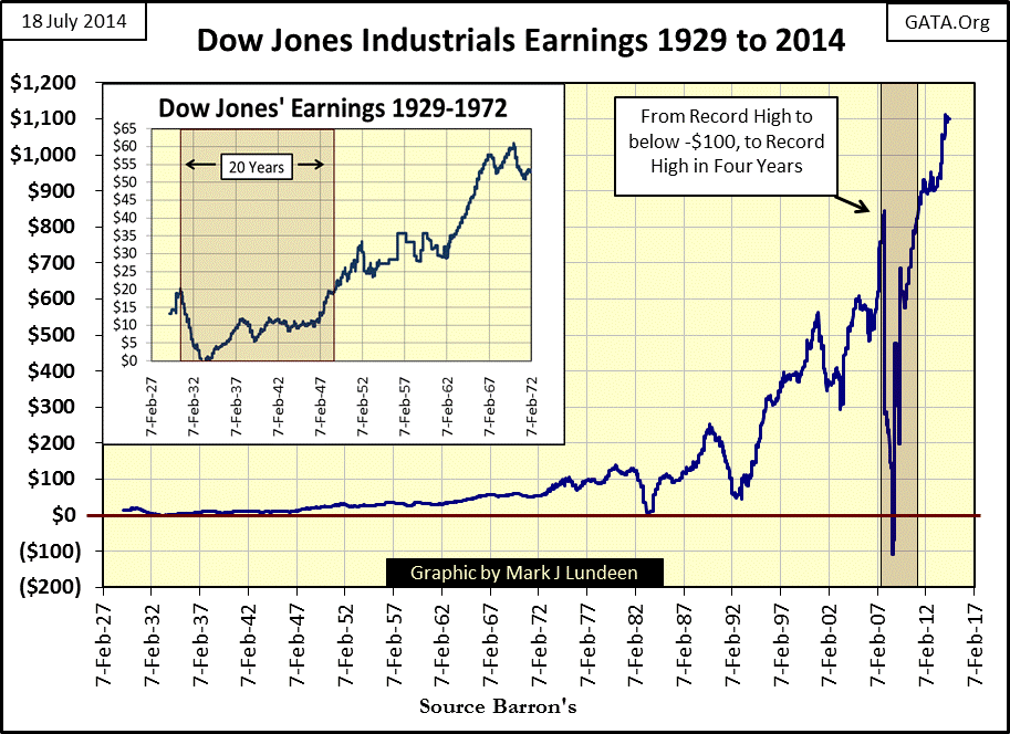
Below, during the credit crisis the Dow Jones saw its earnings drop from $835 to -$109, a drop of $944 in less than a year only to completely recover three years later in 2011. Compare this to the Dow Jones earnings collapse of the Great Depression (chart insert), the only other time the Dow Jones ever experienced negative earnings. After the Great Depression it took two decades before the Dow Jones earnings returned to their highs of April 1930. Returning to the present, seeing the Dow Jones earnings rebound $944 in only three years simply isn’t believable. Corporate accounting today is largely fictional. I’d say fraudulent except that Congress passed legislation in February 2009, legalizing accounting methods that were once criminal.
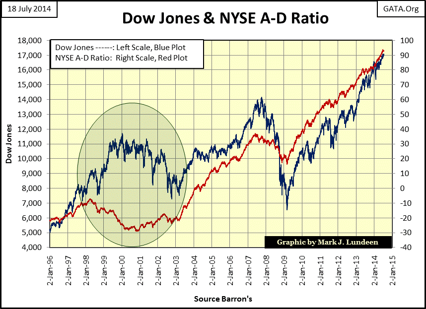
The NYSE A-D Ratio saw some weird action from 1998 to 2003 during the high-tech bubble and its aftermath, where for five years it went down as the Dow Jones went up, and went up while the Dow Jones was going down. There has not been another similar five year period when the NYSE A-D Ratio was so out of whack with market trends since 1926 when my data begins.
So what’s going on with the markets? As George Stephanopoulos (a Washington insider) explained to ABC’s Good Morning America audience in 2001, Washington and Wall Street have their meat-hooks deep in financial markets.
"Well, what I just want to talk about for a few minutes is the various efforts that are going on in public and behind the scenes by the Fed and other government officials to guard against a free-fall in the markets...perhaps most important, there's been--the Fed in 1989 created what is called a * PLUNGE PROTECTION TEAM *, which is the Federal Reserve, big major banks, representatives of the New York Stock Exchange and the other exchanges, and there--they have been meeting informally so far, and they have kind of an informal agreement among major banks to come in and start to buy stock if there appears to be a problem. They have, in the past, acted more formally"
- George Stephanopoulos, former Clinton administration adviser
September 17, 2001 on ABC Good Morning America
Assurances of government intervention may have brought comfort to the markets during the high-tech bear market in 2001, but this intervention was ultimately responsible for inflating a grotesque bubble into the mortgage market. When the mortgage bubble popped, Treasury Secretary Hank Paulson claimed he needed a monetary bazooka to fire at the dragon of deflation marked by declining home prices and trillions of dollars of deep in the money interest rate swaps (derivatives) on defaulting mortgages that the big banks could not honor without going into bankruptcy themselves. The solution to deflation in the residential mortgage market was to inflate yet another bubble in the global bond and currency markets. When this bubble ultimately begins to deflate in earnest, as it must, it will be game over for the “best and the brightest” who now manage the markets and economy. And in the end, after all the misery they brought into everyone’s lives, you can be sure that we won’t even get an apology from these arrogant people. Under current circumstances, prudence demands that positions in the financial market be reduced and transferred into assets with no counterparty risk, like gold and silver.
share
share
share
share
share