Gold & HUI Analysis


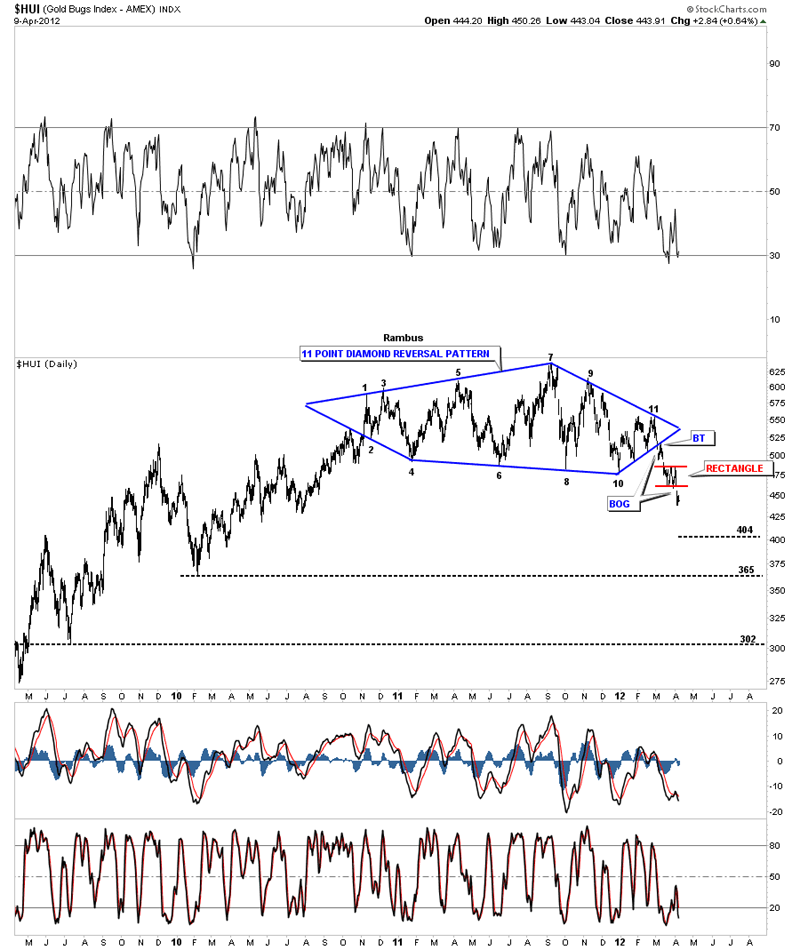
For eighteen months the HUI has been chopping out a sideways trading range that looked like it had the potential to be a huge consolidation pattern. Even up to the first of March the big sideways trading range could have been what all gold bugs were hoping for a giant consolidation pattern that would have suggested substantially higher prices going forward. But it wasn't meant to be.There are two topping patterns that are one and the same that showed their hand over the last month or so. Each topping pattern had a different breakout point and backtest, that for me confirmed the individual patterns.
The first topping pattern for the HUI I want to show is an eleven point DIAMOND reversal pattern. For the most part whenever you have an odd number of reversal points, in a sideways trading range, the pattern will be a reversal pattern, reversing the current trend. An even number of reversal points creates a continuation pattern in the same direction as the preceding trend. As you can see on the chart below the diamond has eleven reversal points making it an 18 month topping pattern. This is a significant turn of events if you have been waiting for this huge trading range to breakout to the upside. This big diamond reversal pattern changes the whole character of the game, for now, if your a gold bug. After 18 months of chopping sideways in a trendless move we now have a confirmed downtrend that suggests much lower prices for the big cap precious metals stocks. The breakout came at 515 in the first week of March that was accompanied by a nice breakout gap. The backtest confirmed for me the breakout was for real and the big 11 point diamond reversal pattern had completed. One last note. Last week we finished off the fist consolidation pattern to the downside that is a small rectangle that also broke out with a breakout gap.
There is another obvious topping pattern that few if any chartists are seeing at this time. It stands out like a sore thumb on a daily line chart. Like the 11 point diamond reversal pattern this huge H&S top is also a reversal pattern. It's really very beautiful with nice symmetry that has two left shoulders and two right shoulders and the head that is higher than both shoulders. The breakout came a little lower than the diamond at 484 but the breakout and back test were picture perfect. Note the little red rectangle that has formed just below the neckline as the back test. This is technical analysis at its finest. This big H&S reversal pattern has a minimum price objective down to the 370 area on the line chart. Keep in mind this is an absolute bare minimum. Prices can fall much further if things really start to get negative.

There is one more chart I would like to present that shows the pain that most gold bugs have been feeling for way too long. The HUI to GOLD ratio chart does a good job of showing how poorly the big cap precious metals stocks have been doing compared to gold. There is nothing pretty about this chart IMHO as it puts into perspective how bad the situation has become for holders of precious metals stocks. The first real area of support may come in around .23 where a small consolidation pattern formed back in 2001 when the precious metals stocks were in their heyday and where the crash of 2008 found support. Looking at the most recent price action it appears to me that the HUI is starting to accelerate to the downside against the price of gold. This is a very unhealthy situation for the big cap precious metals stocks.

I know these charts are not what you want to see if you are a precious metals investor but looking at reality can sometimes save you from a huge draw down in your precious investing capital. I don't believe this is the end of the precious metals complex bull market. As the stock markets have been enjoying a cyclical bull market in a secular bear market its probably time that the precious metals complex has a cyclical bear market within its major secular bull market. There will be some major bargains down the road if one has the capital to pick them up on the cheap.
To Subscribe to Rambus Chartology and see Rambus' 10 Favorite PM Stocks and a World of Charts and Projections including the Chartology Forum where Rambus answers your Questions and even Charts your Favorite PM Stocks by Request, go to : www.rambus1.com
 Meet Rambus, a seasoned trader and technical analyst renowned for his unbiased and insightful chart work. Through his website, Rambus Chartology, and Substack newsletter, Rambus shares his expertise with a global community of subscribers, providing daily updates, commentaries, and hands-on training in the art and science of chartology. With his calm, humble, and down-to-earth approach, Rambus demystifies complex market trends, helping his followers navigate the challenges of today's volatile markets. Join the Rambus Chartology community today and discover a unique blend of technical analysis, trading expertise, and time-tested protocols. Subscribe now at www.rambus1.com or https://rambuschartology.substack.com/
More from Gold-Eagle


