Gold Inverse Parabola Bounce


US T-Bond Breakdown Chart
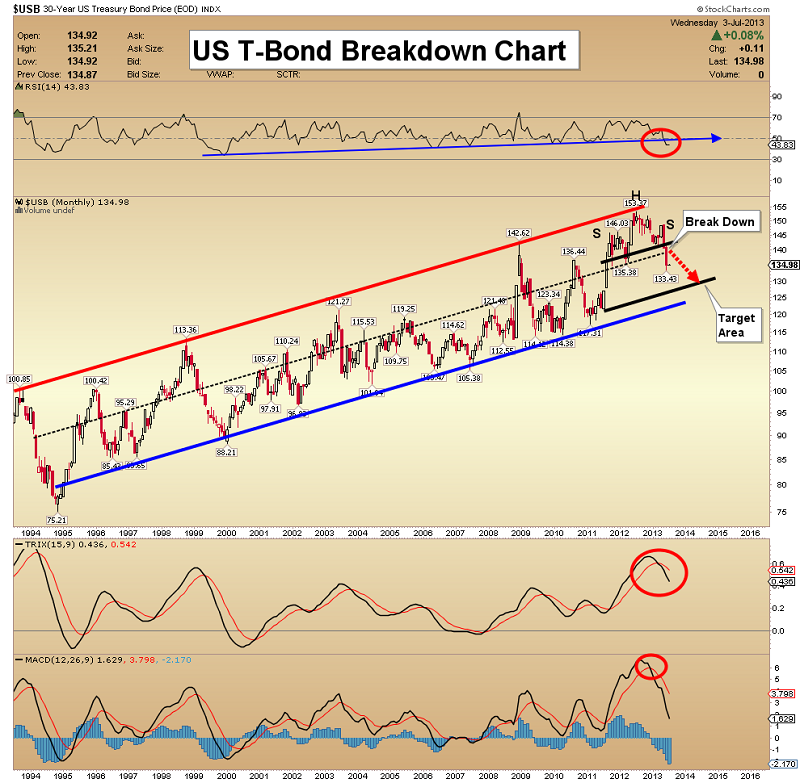
· The Federal Reserve chairman recently talked about reducing QE. The bond market was looking a little toppy before he spoke, but now it looks like a huge bear market may be starting.
· The technical indicators on this chart are showing major sell signals. This type of situation doesn’t happen very often, and if the technical continue to deteriorate, a bond market recovery may not occur unless the Fed actually increases QE.
· The head & shoulders top formation is signaling a decline is coming, to the lower channel. Note the head & shoulders top pattern. The target is about 130.
· An institutional loss of confidence in the world's largest market appears to be gaining a lot of momentum.
Gold Inverse Parabola Bounce Chart
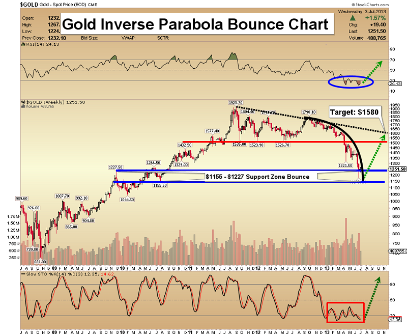
· Note the downward parabolic action identified on this chart. This type of meltdown usually ends with a sharp reversal day.
· Something like that occurred last Friday, but I want to see more volume.
· The gold market is certainly washed out, and hopefully ready to move higher. Price bounces from downward parabolic moves (inverse parabolas) tend to be dramatic.
· Once gold breaks free from the grip of this powerful inverse parabola, I am projecting a violent move to the $1580 area. From there, unfortunately, new lows could occur, before a brand new bull phase gets underway.
HUI Versus S&P 500 Big Picture Chart
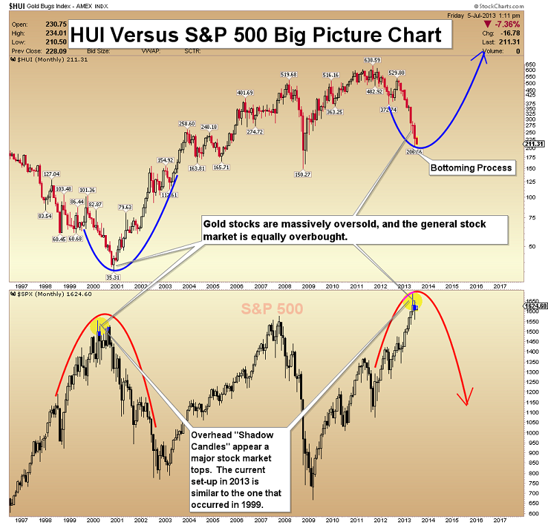
· This chart shows monthly data for gold stocks and the S&P 500.
· Gold stocks have taken it on the chin this year, but the stock market continues to tread water over the much longer term.
· Note that the stock market has similar candlesticks to those of the 2000 top. In the big picture, the S&P 500 is massively overbought.
· My recommendation is to exit the general stock market and buy gold stocks.
HUI (Gold Stock Index) Tuxedo Tails Chart
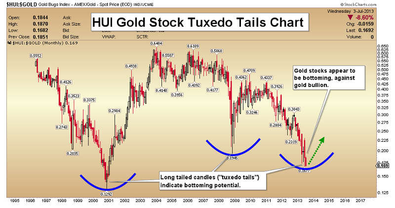
· This ratio chart shows the performance of gold stocks against gold.
· Price movements in these stocks tend be extreme at the end of declines.
· Long tail candlesticks often mark the end of such bearish trends. Gold stocks are hopefully getting dressed in long-tailed tuxedos now, preparing for a great new bull market!
GDX Fuel Cell Volume Chart
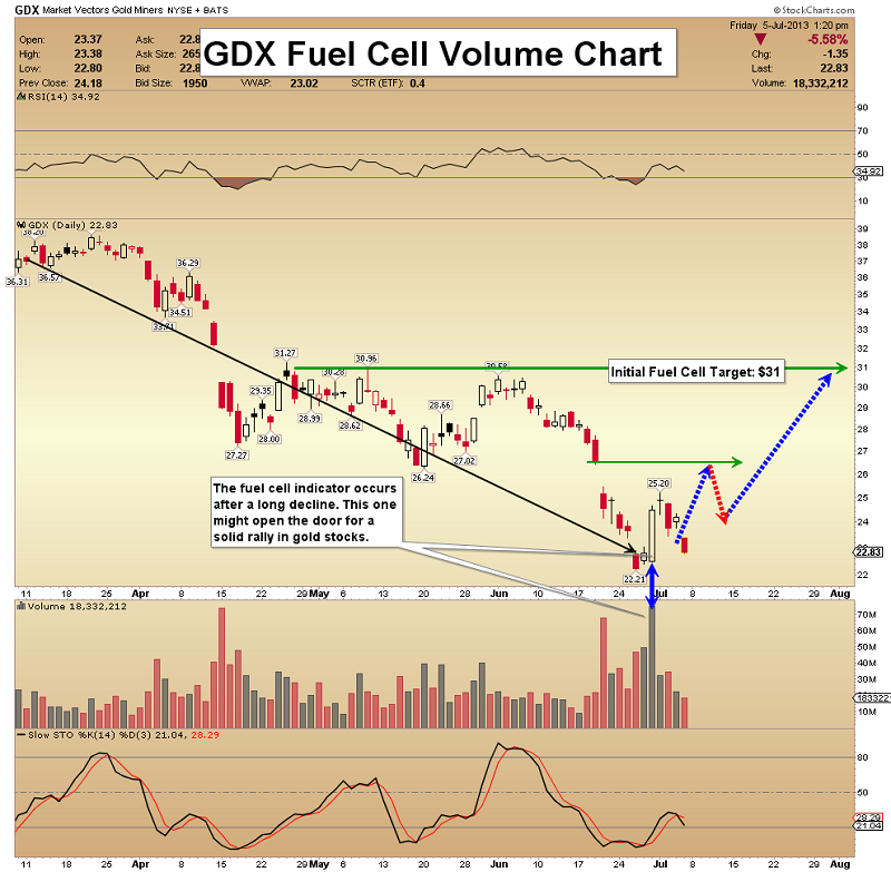
· One of my most reliable indicators is the “Fuel Cell Indicator” (FCI). The FCI is triggered after a long decline comes to an end, with explosive upside volume.
· That is exactly what occurred last Friday.
· FCI signals from similar levels in the past have been followed by solid moves to the upside.
· My intermediate term target for GDX is $31.
Silver Developing Wedge Chart

· An enormous bullish wedge pattern may be forming on this weekly chart.
· I am optimistic that this pattern will fully develop, because there is substantial support at the current price level.
· I am projecting an intermediate term bounce to $25 from here.
I like silver more than gold at this point in time. If the economy declines and QE is increased, silver should follow gold to the upside. If the economy really improves, industrial demand for silver should increase. Focus on the silver stocks, and on physical metal that you hold outside the banking system!


