The Inflation/ Deflation Barometer


One of the biggest questions investors have is what type of environment are stocks and the economy in, deflation or inflation? Knowing the answer to that question can give you a heads up on what different sectors to invest in and what sectors to stay away from. Tonight I would like to update some of the different commodities indexes to see if they can give us any clues on which way the deflationary or inflationary pendulum is swinging. Commodities are often an under analysed asset class as compared to Stocks and Bonds. However they are the nuts and bolts, the real stuff supporting human existence.
Let’s start with one of the oldest commodities indexes around the $CRB index. After the huge impulse move down that began in the middle of 2014, the CRB index finally bottomed in early 2016, putting in a small double bottom which was going to be part of a bigger inverse H&S bottom. After breaking out above NL1 the CRB index then rallied higher stalling out below the 2016 high and began to decline once more. That decline found support at the neckline symmetry line which was a good place to look for a low for the right shoulder of a much bigger double H&S bottom. After trading below NL2 for six months the price action finally broke above it with just a small rally.
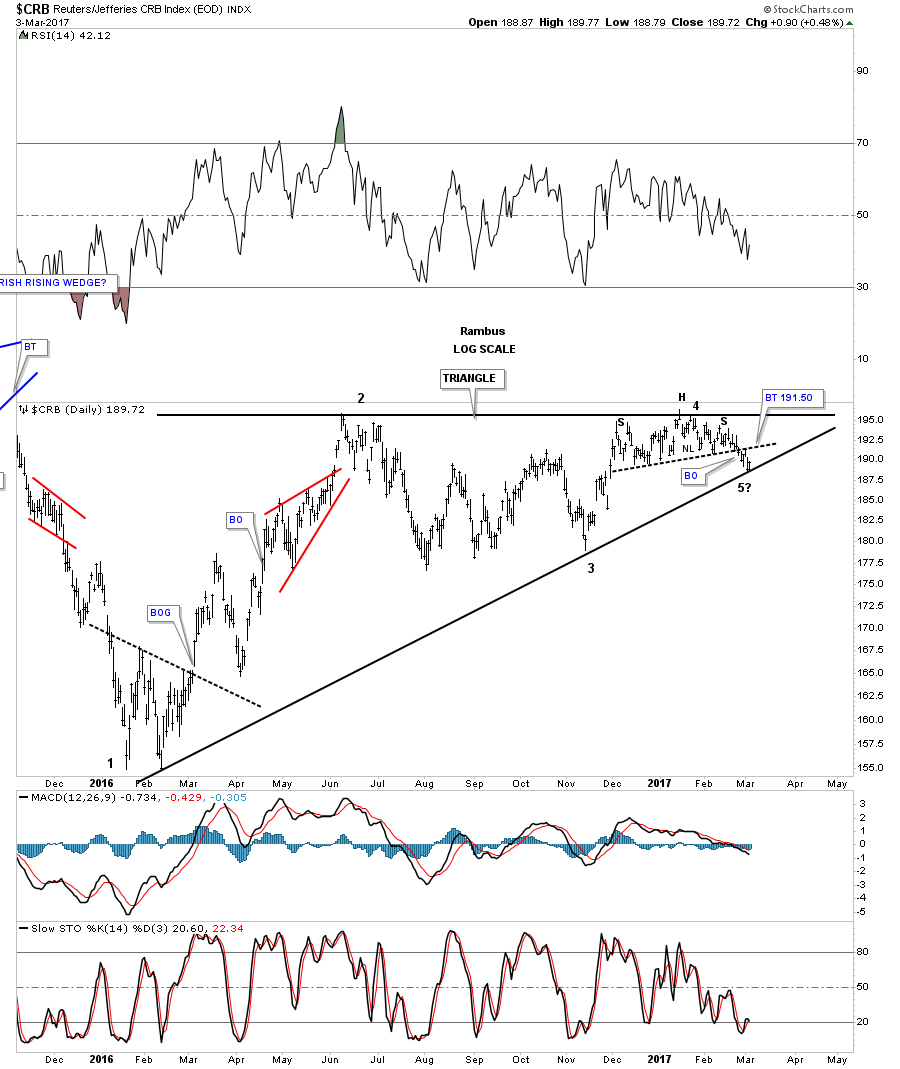
From a Chartology perspective nothing is broken yet on the double H&S bottom, but the price action has been very laborious since the December low of last year. Again, nothing is broken, but I see a yellow flag waving that is signaling caution in regards to the double H&S bottom, which we’ll look at in more detail on the next chart to follow this one.

Whenever a breakout becomes very laborious it can be a sign of a failing pattern, not always, but sometimes, so it’s important to pay close attention. This second chart shows the price action from the 2016 low with a possible ascending triangle building out. Note the price action at reversal point #4 in which the CRB index went nowhere since December. Last week the price action broke below the black dashed trendline and found support on the bottom rail of the black triangle last Friday and got a bounce. Now we have a support line at 188.79 with a resistance line just above at 191.50 which is the black dashed S&R line or NL of a small H&S top. The price is converging into a very tight range which will show us which way the CRB index wants to go depending on which direction the breakout occurs.
This next daily chart for the CRB index goes back almost 5 years and shows the parabolic downtrend we followed during the last deflationary decline that began in the middle of 2014. Taking a step back and looking at the bigger picture the 2016 triangle looks more convincing than the H&S bottom we looked at previously. If the triangle breaks out topside it will be a reversal pattern because it has 5 reversal points. On the other hand if the blue triangle breaks below the bottom rail it will have 4 reversal points and be a consolidation pattern to the downside. If that were to occur the price objective would be down to the 2016 low at a minimum.

Below is a 75 year quarterly chart we were watching very closely during the last impulse move down, because it broke below the brown shaded support and resistance zone going all the way back to the early 1970’s. When the price action was trading below the brown shaded S&R zone I speculated that we could see some reverse symmetry to the downside, as the rally back in the early 1970’s was so vertical. Here we are a year or so later and the CRB index has rallied right up to the top of the brown shaded S&R zone at the 200 area. What had been support since the 1970’s is now turning into resistance at the 200 area? Again, another important area to keep a close eye on.

This next chart is a 20 year look at the $GYX which is an industrial metals index that has been backtesting the neckline from the previous H&S top. Another critical area to keep a close eye on.

This last chart for tonight is a 15 year monthly chart for the US dollar. What we know for a fact is that the possible bearish scenarios on all the charts we looked at above won’t take place if the US dollar declines. The commodities will only decline if the US dollar rallies, so the bulk of the proof lies with the US dollar. How the US dollar goes, so will the commodities complex.

Courtesy of Rambus
 Meet Rambus, a seasoned trader and technical analyst renowned for his unbiased and insightful chart work. Through his website, Rambus Chartology, and Substack newsletter, Rambus shares his expertise with a global community of subscribers, providing daily updates, commentaries, and hands-on training in the art and science of chartology. With his calm, humble, and down-to-earth approach, Rambus demystifies complex market trends, helping his followers navigate the challenges of today's volatile markets. Join the Rambus Chartology community today and discover a unique blend of technical analysis, trading expertise, and time-tested protocols. Subscribe now at www.rambus1.com or https://rambuschartology.substack.com/


