Market Turning Points


Current Position of the Market
SPX: Long-term trend - Bull Market
Intermediate trend - Is the 7-yr cycle sketching an intermediate top?
Analysis of the short-term trend is done on a daily basis with the help of hourly charts. They are important adjuncts to the analysis of daily and weekly charts which ultimately indicate the course of longer market trends.
IS A MINOR TOP TAKING HOLD?
Market Overview
What a week! The Fed did it again! The SPX was potentially ready to extend its decline to lower levels after an 80-point drop from its all-time high of 2119 but, although we had amassed enough distribution on the Point & Figure chart to do so, the index found good support on an intermediate trend line and a key support level at 2040. The market then waited for the next Fed report which was due three days later to see if Janet had lost “patience”! She had, but she found another way to say in explicit terms that the Fed was in no hurry to raise rates. This instantly caused a massive short-covering rally of 45 points which retraced about 50% of its move before settling down for one day, and taking off again on Friday with a another 23-point move. “Vive la volatilite!” By Friday, however, SPX had pretty much exhausted the re-accumulation count at the 2092 level and looked ready for another pull-back.
The question is whether or not this is the beginning of another meaningful decline or, if after a minor correction we need to make another slightly new high before that happens. The wild swings of the last month have only reinforced the view that the market is in the process of making a large rounding top – probably the work of a topping 7-year cycle. At some point, its downward pressure will overtake the bullish forces which still have a slight advantage and the decline will accelerate into its low (which is still many months away). As long as SPX continues to show a long-term deceleration pattern, this is the view that I favor, but I am open to being proven wrong by the market.
Indicators survey
The two weekly momentum indicators have turned up slightly with the rally. The SRSI is essentially neutral while the MACD continues its hesitant pattern of long-term deceleration.
Breadth, as reflected by the McClellan Summation index (courtesy of StockCharts.com) has done little since the rally started. This could be a warning of more weakness ahead unless it begins to move up smartly. The long-term pattern’s series of declining tops has the same implication as the SPX’s weekly MACD.

A short-term count was reached on Friday, but it may only be a phase count. If the pull-back is moderate, there is room for a little more on the upside.
The longer-term 3X chart may be engaged in making a large rounding top formation. Perhaps this is due to the topping of the 7-year cycle which has not quite started its declining phase, yet.
Chart Analysis
The daily chart (courtesy of QCharts.com, as well as others below) shows that prices held the trend line drawn from the October bottom to the early February low. It was a perfect hit and traders took advantage of that level to wait for the Fed’s decision. Had if been negative, you can see how easily it would have been to challenge that February level. Now that we have 3 solid points on that five-month trend line, breaking it could bring some significant selling. However, as long as it is not breached, we can expect the uptrend which started in October to continue.
But what kind of a trend is that? After a gigantic short-term rally of 260 points in only six weeks, what has the market done? If you look at the tops created since then, you can see why it is easy to vizualize the (ever-so slow) formation of a rounding top! The blue trend line had been containing SPX highs since mid-2013 but lately, each short-term top has had increasing difficulty reaching it before turning down. So what can we logically expect the current rally to do? Probably follow the current trend, even if we make a sightly new high. The time to exercize more caution will come when we fail to make a new high. And even then, if we get progressively lower highs and lower lows, the acceleration of the steepness in the curve downward may not come for several more weeks.
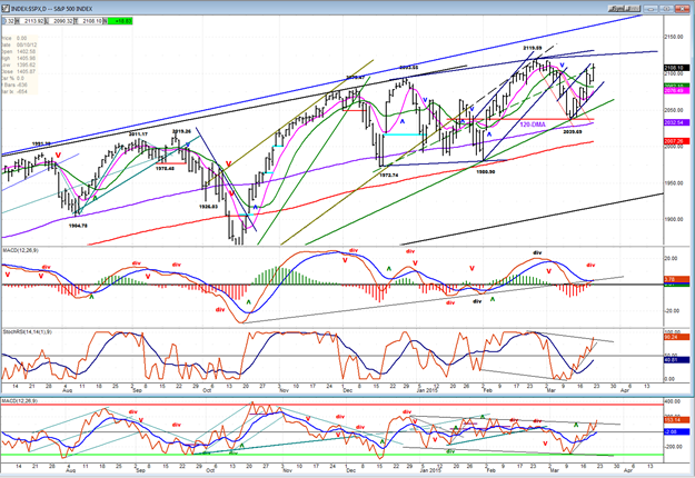
The two bottom oscillators are pretty much mirroring the uptrend and are still not showing negative divergence. For the MACD, it’s a different story! It had been very positive until the trend started to turn down, but retraced all the way down to the zero line during the decline. It has now turned up again, but the reversal is anything but dynamic.
On the hourly chart, I have drawn several (legitimate) trend lines that are converging at 2113, a level which is also the fulfillment of a short-term P&F count. This should provide enough resistance to cause a near-term reversal if the steep green trend line is broken, with a retracement down to the vicinity of the 200-DMA before another rally attempt is made. The longer-term trend lines at the top of the chart will make it difficult for that attempt to go beyond those levels, if they re reached at all.
The oscillators have started to roll over and are preparing to give a sell signal which could come as early as Monday morning.

VIX (NYSE Volatility Index) - Leads and confirms market reversals.
Last week, I pointed out the lack of volatility in this index during the three-week decline by the SPX. I said that I was not sure if it was a bullish or bearish sign. Now we know! It was presaging another market rally.
On a longer term frame, I am noticing that the index seems to be very slowly turning up -- an inverse action to the SPX’s rounding top, but starting a little earlier, around July 2014.

XLF (Financial ETF) normally leads the market at important tops.
XLF begun to show relative weakness to SPX during the decline which started in December. It has retained that divergence while SPX continued to make new highs. In spite of some recent improvement in its relationship to SPX, its indicators suggest that it may be close to resuming its downtrend.

UUP (dollar ETF)
Last week’s Fed report caused a temporary set-back (emphasis on temporary) to the USD’s strong uptrend. If I did not have much higher potential P&F counts for this index, I might think that this could be the beginning of an important correction. I don’t think it is and I believe that a new high will soon manifest itself.

GLD (Gold trust)
GLD has retraced back to the low point of its long term corrective pattern. It could hold here for a while, but with the bottom of the 25-wk cycle due in early May, betting on lower prices is probably the right thing to do, especially if I am right about the USD soon resuming its uptrend.

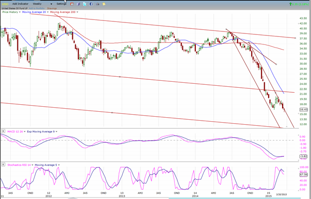
USO (US Oil Fund)
USO has tried unsuccessfully to break out of its steep down channel. It has been riding the outside trend line with lower and lower prices, and this may continue until it reaches its next projection of about 13. Even if it were to move outside of that line, it would probably continue to decline and form a deceleration pattern in the form of an ending diagonal which would likely complete in the vicinity of the target level.
Summary
Last week, I mentioned that several indexes were participating in the 3-week decline half-heartedly. We now know the reason why!
On Friday, the rally which started at 2040 has filled a phase projection at 2113 and come to a resistance level which should turn it down temporarily. There is a 60/40 chance that after a small correction, the index will make a slightly higher high before becoming vulnerable to a larger pull-back.
********
FREE TRIAL SUBSCRIPTON
Market Turning Points is an uncommonly dependable, reasonably priced service providing intra-day market updates, a daily Market Summary, and detailed weekend reports. It is ideally suited to traders, but it can also be valuable to investors since highly accurate longer-term price projections are provided using Point & Figure analysis and Fibonacci projections. Best-time reversal estimates are obtained from cycle analysis.
For a FREE 4-week trial, send an email to: [email protected]
For further subscription options, payment plans, weekly newsletters, and for general information, I encourage you to visit my website at www.marketurningpoints.com . By clicking on "Free Newsletter" you can access the latest newsletter which is normally posted on Sunday afternoon (unless it happens to be a 3-day weekend in which case it could be posted on Monday).
The above comments and those made in the daily updates and the Market Summary about the financial markets are based purely on what I consider to be sound technical analysis principles. They represent my own opinion and are not meant to be construed as trading or investment advice, but are offered as an analytical point of view which might be of interest to those who follow stock market cycles and technical analysis.

When Andre Gratian was a stock broker years ago, a friend introduced him to technical analysis of the market. Consequently, it is not an exaggeration to say that Andre fell in love with this approach! Ever since then, it has become an increasingly important part of his professional life. Gratian has studied the works of Wyckoff, Edwards & Magee, Edward J. Dewey (cycles) and many others. However, one of my most profitable undertaking has probably been to study Point & Figure charting, which he finds invaluable in analyzing stocks and indices. If he were restricted to one methodology, this is the one that he would choose. This well-rounded background has given him what he feels to be a special insight into the stock market, facilitating the recognition of meaningful patterns and the ‘turning points’ in all trends, whether they be short or long term. Andre feels very comfortable discussing the stock market and passing on meaningful information to others. His subscribers include individuals and money managers throughout the world. Moreover, his Newsletters are currently published on several financial sites, here and abroad.


