My Pet Peeve With GDP
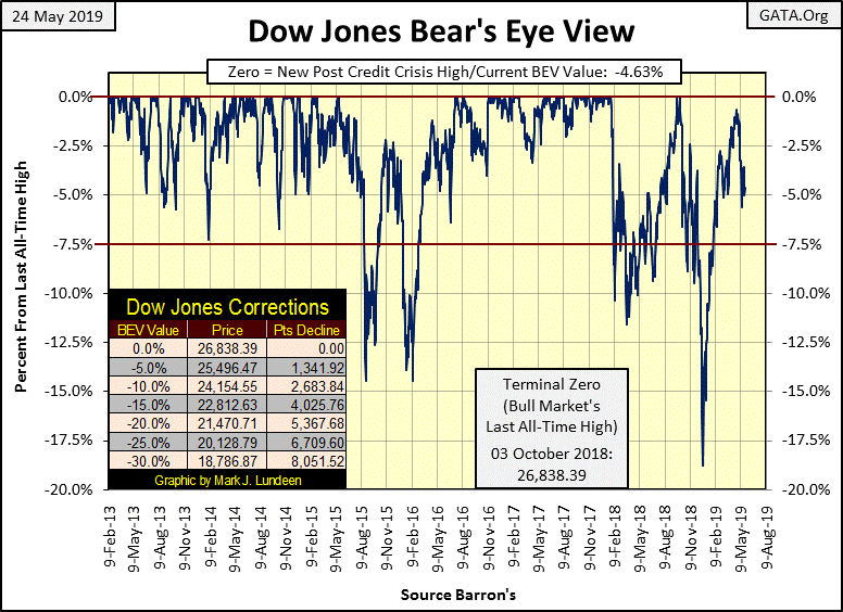
The Dow Jones closed the week -4.63% from its last all-time high of October 3rd. Let’s round that down to -5%, which as seen in the table on the Dow Jones’ BEV chart is 1,342 points below last October’s high-water mark. So, is Mr Bear about to whack Wall Street? I’m not ready to call it quits on the Dow Jones making a new all-time high in the weeks and months to come.
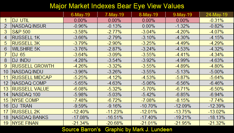
Five percent from a previous all-time high is still in scoring position, and it’s not just the Dow Jones on third base waiting for the “policy makers” to hit a RBI to bring them home. In the table below the Dow Jones Utility Average (#1) made new all-time highs each day this week until Friday’s close, and indexes #1-10 are at or within 5% of their last all-time highs. If the “policy makers” really wanted to push the stock market into record territory, they could do it.
But what about the pending trade war with China? That’s the wild card that could overturn the market. Then there is always something that could stop a market advance - ALWAYS. But if market history offers us any insight of what our future holds, during bull markets Mr Bear doesn’t play his wild card, or if he does the bulls just ignore it. It’s in bear markets that when Mr Bear plays his wildcard he inflicts great pain.
So right now we (and that includes you) must make a personal decision whether we are in a bull or a bear market. Are the all-time highs of October 2018 the last of the bull market, and from here on it’s look out below?
My decision is the bull market that began on March 9th 2009 (ten years ago) is still in play, and before it’s finished we’ll see the Dow Jones rise above its current all-time high of last October 3rd. After ten years I recognize this advance is that of a wheezing old geezer challenging a hill best left to younger bulls, but this aging old bull has the support of “policy makers” and that’s no small thing.
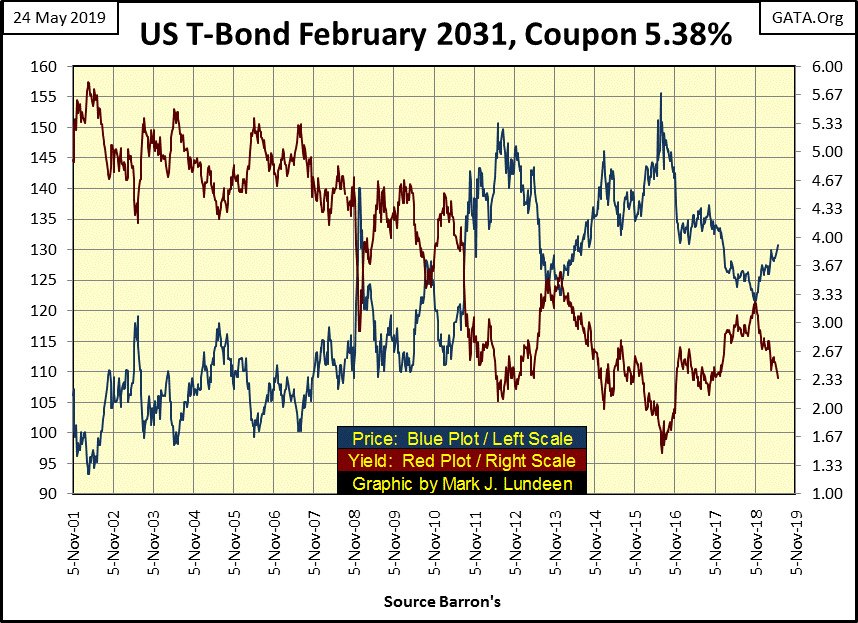
For instance, bond yields continue declining, as seen in this chart for a 30yr T-bond issued in February 2001. After almost twenty years, it now performs more like a 10yr bond, but last November this bond’s yield was increasing as the Dow Jones was in an 18% correction. Six months later this T bond’s yield declined from 3.24% down to 2.36% at the close of this week; and declining bond yields / rising bond prices are very supportive of rising stock prices.
How low can bond yields go from here? You’d have to ask the idiot savants sitting around the conference table at the FOMC for the answer to that question, as they’re the guys making the rules in the rigged casino people call the financial markets. As they don’t return my phone calls anymore I haven’t a clue for how long bond yields will continue to decline. But for as long as they do, I’ll remain optimistic on the stock market, and not expect much from precious metal assets.
One fly in the ointment that could prove to be a problem is the yield curve is inverted, as it has been for the past few months. At this week’s close (Red Plot below) we find the yield for the 10yr T-bond once again below the Fed Funds rate.
Historically, seeing bond yields decline below the Fed Funds Rate has always been a slayer of bull markets on Wall Street. Seeing the Fed Funds Rate higher than some of the T-bond yields for the past ten weeks suggest difficulties in the stock market is at hand. That a major market correction hasn’t already happened is most likely due to some market shenanigans implemented by the “policy makers.”
That’s the assumption I’m making; that the fix is in. So, I’m not making a big deal out of the current yield inversion. I could be wrong, but if I am it won’t hurt me as I’m 100% out of this market.
So what do I like? On the theory that one should sell on strength and buy on weakness, a profitable market theory if ever there was one, I constructed the following table for your consideration.
We’re looking at valuations from Barron’s 09 March 2009 issue, the bottom of the credit crisis bear market and this week’s for various stock indexes (Red Tabs), precious metal assets (Green Tabs) commodity prices and a few inflation indicators. With the exception of palladium (#1) the stock market has been the place to be since the bottom of the sub-prime mortgage crisis. But that was ten years ago, and I can guarantee you that the next ten years won’t be like the last ten.
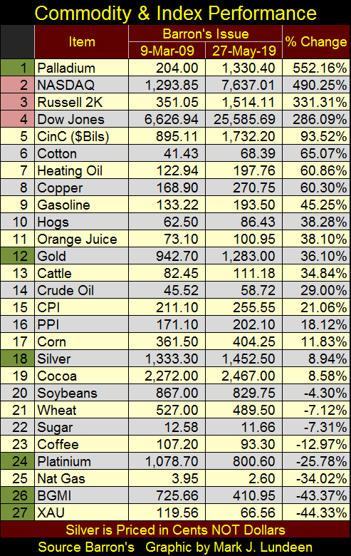
Who knows what the future holds? I don’t! So I completely understand the requirement of having a core position in physical gold and silver bullion. But the student of the market in me sees the Barron’s Gold Mining Index and the XAU (#26&27 in the table above) down over 40% from March 2009, and reflex action leads me to believe we are at an important and historic market bottom in the gold and silver miners.
The big question is when will precious metals assets finally do something profitable for their owners? I for one don’t know when. But when they do, I expect the rest of the financial markets will be slipping into chaos as bond and dividend yields begin to soar. And those who sold their stock holdings near their tops and purchased their precious metals asset at their bottoms will be extremely happy they did.
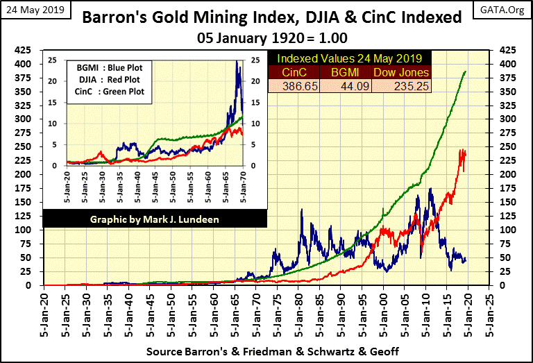
To see the current extremes in valuations for the BGMI relative to the Dow Jones, look at the chart below showing the Dow Jones (Red Plot), the BGMI (Blue Plot) and CinC (Green Plot) indexed to 1.00 = January 1920.
Relative to CinC (paper-dollar inflation flowing from the Federal Reserve) the BGMI has outperformed the Dow Jones for much of the past century. In fact, the only bull market of the past 100 years the Dow Jones outperformed CinC was during the 1920s.
Then seeing the BGMI above CinC was a frequent occurrence during the 1930s and again for the 30 years spanning 1965 to 1995. And twice, in 2008 and again in 2011, the BGMI attempted to rise above the green CinC plot in the chart below.
That it didn’t was because of a “policy decision”, so today we see it languish at 44 instead of over 400, as the Dow Jones is in record territory, yet appears to be stalling out at 235, far below the advance in CinC.
This chart also illustrates the counter-cyclical nature the gold miners have to the Dow Jones. When the Dow Jones comes tumbling down, don’t be surprise should the BGMI once again make a run on the green CinC plot.
Here’s the Dow Jones in daily bars below. Since the end of April the market has been weak, but that can change. Should we break below the lows of last week, that wouldn’t be a good development. This is something to keep an eye on.
Note the Dow Jones saw a day of extreme volatility, a Dow Jones 2% day on May 3rd pushing its 200 count to 17. Since then volatility has calmed down which is good for the bulls.
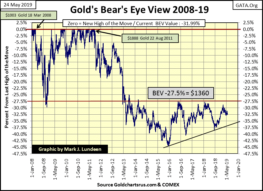
Let’s move on to gold’s BEV chart. As has been the case for the past few months, while not making much in the way of profits for its owners, gold in the BEV chart below remains attractive, and will continue to be until it breaks below its rising line of support. But I don’t expect that is going to happen, so I’m focusing on gold’s line of resistance at the -27.5% BEV line or $1360 on a price chart.
This level has stopped every advance in gold since 2013, making it a tough nut to crack. However, should the financial markets begin to deflate as bond yields rise, we’ll see gold break above this level with enthusiasm. It’s going to happen. I’m just not going to hold my breath until it does as patience is a virtue at times like this.
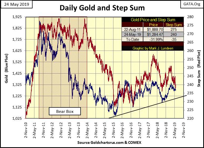
Next is gold’s step sum chart. Both market reality (Blue Plot / the price of gold) and market expectations (Red Plot / the step sum) are in agreement with each other, trending down from their mid-February highs. All and all a boring chart, and will be until something exciting happens in the markets.
Unlike gold’s step sum, market sentiment for the Dow Jones (chart below) so far has refused to recognize the decline in the Dow Jones that began a month ago. I don’t blame the bulls for their stubborn optimism. Since August 1982 being a bull on the stock market has been profitable. Even the 2007-09 -54% market decline in the Dow Jones did little to stop the bulls relentless advance to ever higher ground.
But all things must come to an end, including this bull market in the Dow Jones even if the bulls refuse to see it that way, which since April they have.
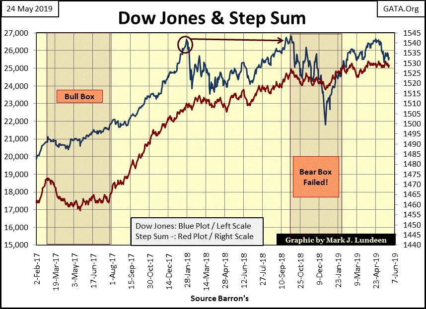
So, am I now saying the bull market is over? Well, every chart tells its own story, and what I read from the Dow Jones’ BEV chart above may be different from its step sum chart below. And below I see a triple top formation, or more accurately a sixteen month head and shoulder top formation. Last October’s top was higher than the top seen January 2018, but our current advance has yet to top the highs of October 2018, that makes this a head and shoulder top. Technically, this is a very bearish setup for the stock market, and will continue to be until the Dow Jones takes out it highs of last October.
However, should the Dow Jones break below its lows of last December it would be a bad development in the stock market. Should that happen I wouldn’t be surprised if market sentiment (the red step sum plot) refused to follow the Dow Jones valuation (market reality) down. Look at the failed bear box now seen in the step sum chart above; should the Dow Jones begin deflating in a big way, without its step sum plot following it down, I’ll reevaluate its current failed status and extend that bear box up to the current date.
As spring turns to summer in 2019 the stock market is beginning to become interesting.
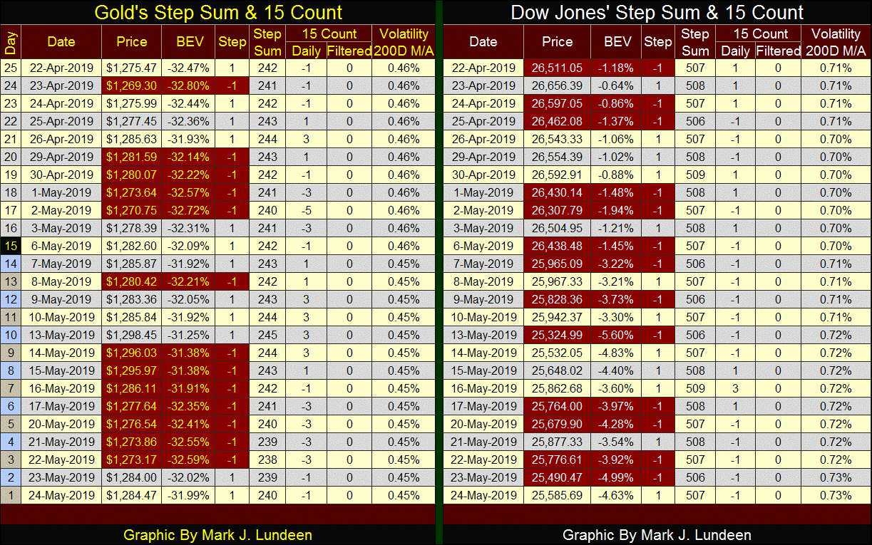
Looking at gold’s step sum table below, we see seven consecutive daily declines from May 14 to 22. Selling pressure on that scale is seldom seen; still for all that the bears could only drag the price of gold down $23.
As for the Dow Jones and its step sum table, the beginning of a bear box is forming. From April 22nd to May 24th the Dow Jones lost 926 points as its step sum remained at 507. What’s going on here?
First of all, in a bear box it’s the bears who are supposed to win, but the bulls don’t see it that way. So, for the duration of the bear box the bulls see all market declines as buying opportunities, where in the table above we’d see one big down day followed by several daily advances that failed to recover the loses of the one big down day. This is a pattern that can continue for years if the bulls are really stubborn.
But at some point, the bulls are ultimately forced to recognize that it’s a bear market and they best cut their losses. This is the point where the step sum plot finally begins to collapse downward with the price trend of the chart, as now the bulls see every advancing day as a selling opportunity.
The three year bear box in gold (chart below) was a picture perfect example of bull psychology during a severe market decline. During the three year bear box the bulls saw every market decline in the price of gold as a buying opportunity. That was until May 2014.
During the May 2014 to December 2015 collapse in gold’s step sum the bulls no longer saw market declines as buying opportunities, but advances in the price of gold as selling opportunities. Then came the November to December 2015 free fall in gold’s step sum, a technical formation telling us the bulls were even selling on market declines as they just wanted OUT!
What’s humorous is that by November 2015, as the selling panic developed, resulting in a near vertical decline in gold step sum, the price of gold was already near its ultimate bear market bottom. Markets are human creations; it’s very hard to keep our emotions out of our decisions to buy and sell.
Anyway, in a step sum chart; this is what a hard bottom in a bear market looks like, and I’m expecting something similar developing for the Dow Jones as the coming bear market progresses.
Returning to the Dow Jones in May 2019, it’s too early to predict the next few years will be a repeat of what gold saw from 2011 to 2015, but I believe current market psychology is conducive for a similar bear box to form. The following quote from Andrew Bary is as true today as it was in October 2007, at the very top of the sub-prime bull market for the Dow Jones.
“One reason that monster declines are less likely now is that investors recognized something that they didn’t in 1987: The Federal Reserve is on their side.”
- Andrew Bary, Barron’s 15 October 2007 issue
I have a pet peeve with the government’s Gross Domestic Product (GDP) calculations. The measurement of goods and services produced in the economy are expressed in dollars; but the dollars GDP is measured in changes over time. Everywhere else key units of measurements are rigidly defined and unchanging from century to century;
- gallons / liters;
- pounds / kilos;
- volts & ohms;
but since 1971 the dollar has remained an undefined unit of measurement. It makes a difference!
Years ago I went to Bureau of Economic Analysis (BEA) to download GDP data for an article I was writing at the time.
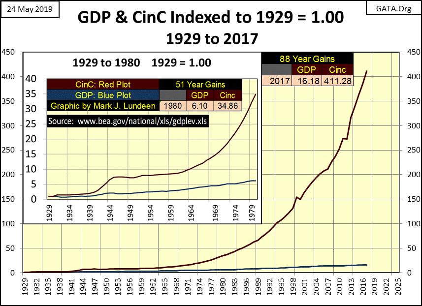
The BEA listed dollars in two flavors; current and chained 2000 dollars (Blue Plot below). Some years later I once again visited the BEA site, where once again I saw dollars still listed in two flavors. However, current dollars going back to 1929 were at odds with the current dollars from years past, and now the chained dollars were chained to 2009 (Red Plot below).
Miraculously, the economists and statisticians working in the Commerce Department got the then living, but now dearly departed of 1929 to increase US GDP of 1929 by one hundred and ninety one billion dollars by chaining the dollar to 2009.
Well it is what it is, and using the government’s statistics (Red Plot / Chained 2009 Dollars) we see that since 2009, the first year of the Obama administration, GDP increased by $2.67 trillion dollars by its last published data point (2017), the first year of the Trump administration.
But exactly what does that mean? I don’t know, though I’m sure the economists and statisticians at the Commerce Department could chatter for hours on this topic. I’m not faulting the experts at the BEA, as they are forced to work with an undefined unit-of-account; the US Dollar.
But how much of this chattering would be on the horrendous monetary inflation the US money supply has seen since 1929? The fact is GDP “growth” from 1929 to 2017 (Blue Plot Below), as they define it, has increased by a factor of 16.18 while US Currency in Circulation (Red Plot Below: CinC) has increased by a factor 411.28.
And that’s just paper money; there’s also bank credit (fractional-reserve bank loans) which purchases goods and services produced in the economy just as well, and sometimes better than does cash money. For instance, what would happen should someone come to a real-estate closing with a brown paper bag containing a half million dollars in $100 bills? The proceedings may demand the purchaser come back with a certified check before continuing, and as everyone waited banking regulations demands that the FBI be notified.
One fact the chart above illustrates extremely well is how little the Federal Reserve System, with its unceasing expansion of the US money supply has actually stimulated GDP growth in the past century, even GDP growth as calculated by the Commerce Department. What the Federal Reserve System has done with its monetary inflation is inflate consumer prices, financial asset valuations (market bubbles) and debt burdens weighing down society.
Still, the main-stream financial media would have us believe otherwise. Whenever the markets or economy slows down all eyes are on the Chairman of the Federal Reserve to see what he’ll do to “stimulate” the economy. As you can see above, the Fed Chairman will do very little to stimulate the economy. But he will lower interest rates and “inject liquidity” into the banking system to restore market valuations back to their previous grossly inflated levels.
The fact is since the 1930s, the Western World’s economy has been greatly abused by the central-banking cartel that now controls every aspect of our markets and much of our government. Malfeasance on this scale can’t continue forever. A day of reckoning is approaching, and if I can do anything with my articles it would be to point an accusing finger at the Federal Reserve System for its responsibility in the coming disaster.
There is much to be learnt from studying history. The following link goes to a video from the YouTube page for Kings and Generals discussing how the Ptolemaic Greeks and Romans administrated Egypt. Little things can and do make a huge difference.
https://www.youtube.com/watch?v=BaCaFpAtm48
President Trump is exactly correct that we must end the $500 billion dollar trade imbalance between the US and China. This has been going on for decades and it’s good that President Trump is doing something to stop it. It really is time to make trade once again profitable for the United States.
I end this week’s article on China’s social score system (link below). This system was developed with the assistance of American high-tech companies. These companies are all controlled by billionaires. Double their net worth and they wouldn’t live any better, yet to increase their standings in the Forbes 100 richest individuals they eagerly assisted the Communist Chinese Party to make life a living hell for over a billion people.
https://nypost.com/2019/05/18/chinas-new-social-credit-system-turns-orwells-1984-into-reality/
What they did was no different than helping the Nazis in the 1930s.
Don’t think these titans of high tech haven’t already begun doing something similar for Uncle Sam. I suspect this is why Washington is so upset by President Trump’s insistence that he declassify much of the investigation of his 2016 election campaign. Good for Trump!
Mark J. Lundeen


