OTC Interest-Rate Derivative Contracts


I’m back from my three-week vacation, three weeks where the market began feeling Mr. Bear’s hot breath on the back of its neck in late December, to now where people can once again anticipate new all-time highs in the Dow Jones Index.
The Dow Jones bottomed on Christmas Eve (December 24th), 18.77% in the BEV chart below, and at the close of this week the Dow has taken back over half of those losses in less than a month.
This BEV chart begins on 09 March 2009, the absolute bottom of the sub-prime mortgage bear market. Since then the Dow Jones’ largest correction was our current market correction, whose recovery from its December 24th low is a bit out of characteristic with the other post March 2009 correction lows.
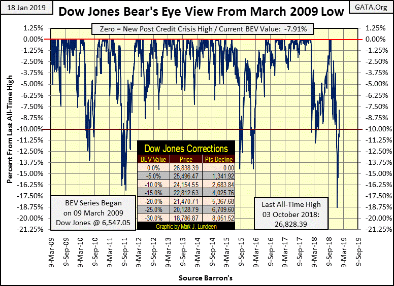
Most notably is the aggressive recovery from its -18.77% bottom. With the other three 10% corrections since March 2009, the Dow Jones took its time at the bottom as if wondering what to do next before advancing to new BEV Zeros. Not so with the latest recovery, where the Dow Jones bounced off the bottom and hasn’t looked back since.
But then the Dow Jones has friends in high places. Below we see once again how volume for the Dow Jones became inverted during its current decline: increasing on a market decline, and declining after the market resumed an advance.

Moving to the Dow Jones in daily bars below, the Dow has once again returned to its pre October 3rd volatility; the daily moves for the past two weeks has been greatly reduced. I would say that should daily volatility remain low, the likelihood for Dow Jones seeing new all-time highs in the months to come is very high.
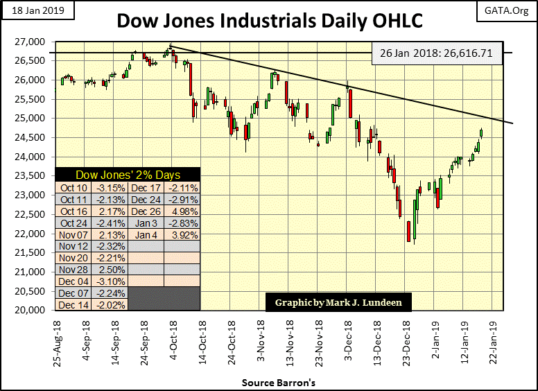
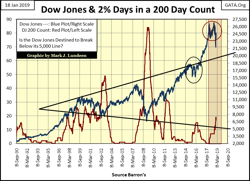
But daily volatility, as measured by the Dow’s 200 count, remains bearish. Keep in mind when the Dow Jones sees rising volatility, and producing 2% daily moves from a previous day’s closing price becomes a regular routine, it’s always bearish. Since the October 3rd top in the Dow Jones it has seen sixteen 2% days, with the last on January 4th (see table in chart above).
The Dow Jones’ 200 count (Red Plot below) was at zero a year ago, but this week closed at 17. The Dow Jones (Blue Plot below) hasn’t done all the bulls would have liked it to in the past year as the count increased to 17.
But two weeks ago it’s as if someone turned off a switch and daily volatility was greatly reduced. Should market volatility continue low in the months to come, as it has these past two weeks, we could once again see the Dow Jones in record territory.
The red plot above is daily volatility measured in 2% days in a running 200 day sample; below I have it in daily percentage moves (percentage move from a previous day’s closing price) in a 200 day moving average. The plots from measuring volatility by these two very different methods are remarkably similar.

So far the plot above hasn’t moved above the critical 1.00% line, which it certainly will if the market begins to deflate again. However, if the current recovery has legs to it, we’ll soon see this plot reverse to the downside. What will it be? Heck if I know. But right now the Dow Jones is going up, so I’ll say that I’m short term bullish while long term bearish.
But if I had to take a position and hold it for a few years, I’d be very bearish as the stock and bond markets are grotesquely overvalued, and the companies whose stocks and bonds trade in the financial markets have taken on more debt than they can service should the economy turn down – which someday it will. As it is I see a historic bear market pending, and the post December 24th advance has done nothing to correct this situation.
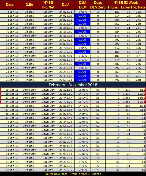
Looking at NYSE 52Wk Highs and Lows below, in late December as the Dow Jones hit its -18.77% bottom, the NYSE saw a few days where 40% of its issues made new 52Wk Lows (December 20th & 24th). After such a decline it’s not unusual to see Mr Bear take a break. In the past month these listings have recovered and we are now seeing 52Wk Highs increasing.
It takes time for an asset to move from one 52Wk extreme to the other. And it takes lots of money to produce a few hundred 52Wk Highs as was common last January as the Dow Jones made new all-time highs (BEV Zeros) in the table below. If the Dow Jones’ current advance is successful in producing new all-time highs, it will be very interesting to see how many issues trading on the NYSE make new 52Wk Highs as it does.
Let’s move on to gold and silver. Below are my plots of gold and silver indexed to 1.00 = 20 August 2015. Both are advancing, though silver appears to have turned down, but that could change this week.
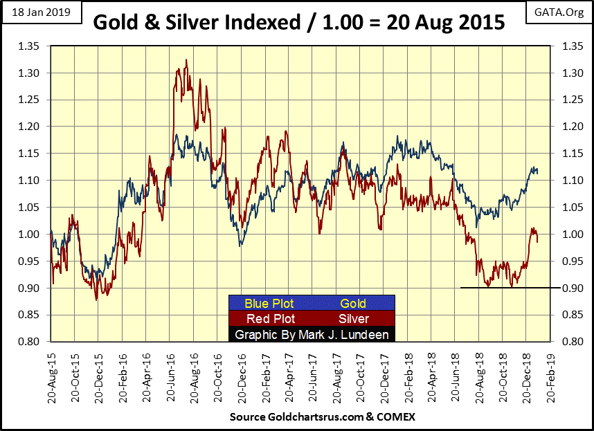
I’ll tell you the problem the old monetary metals are having, their daily volatility has returned to levels not seen since 2000 (chart below). Volatility is ALWAYS bad for the stock market. But for gold volatility increases anytime it’s making a big move; up or down. So if in 2019 gold is doing nothing exciting, we shouldn’t be surprised to see its daily volatility’s 200 day moving average below breaking below its 0.50% line.

The question in my mind is what is the price of gold going to do when its daily volatility once again increases; will it be because gold is once again breaking to lower levels? Maybe, but I doubt it. Since August 2011 when gold last made a new all-time high, precious metals assets have been hammered down, earning a reputation for being a losing investment with the majority of retail investors.
With market sentiment like that, precious metal assets are in little danger of seeing a big decline from current levels. I continue to believe that watching gold and silver will be like watching paint dry, and that will be the case until Mr Bear once again begins to claw back the over inflated valuations in the stock and bond markets.
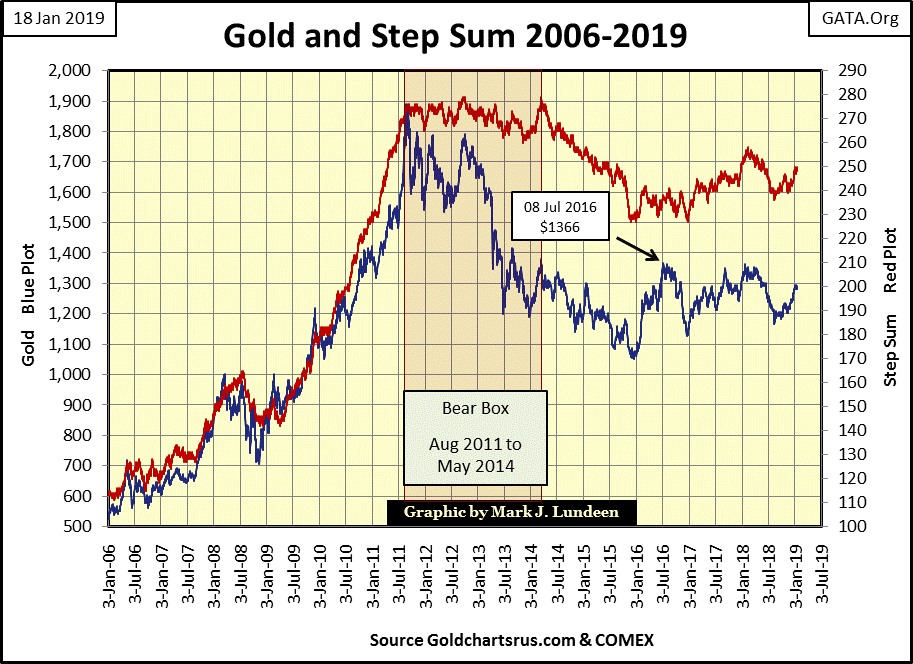
Here is gold’s step sum chart. Market reality (Blue Price Plot) is trending up, as is market sentiment (Red Step Sum Plot). This is a constructive chart, but what is needed now is for gold to break above its July 2016 high of $1366. Hopefully it will do so with authority as the stock and bond markets are deflating. I don’t want to sound ghoulish here, but historically bull markets in gold and silver are fueled from capital flight from the stock and bond markets.
I called a bear box for the Dow Jones a month ago as its price and step sum plots below became decoupled for three months. But since the Dow Jones’ bottom on December 24th, these plots apparently once again are in agreement with each other.
Should I close this bear box? I could, but there’s no need to hurry, so I’m going to wait a few weeks before I do. My concern is that since December 24th the Dow Jones has only advanced. A day is coming where it will have to go down; what happens then? Will that decline be a short-term event, or will Mr Bear take the Dow Jones below its low of December 24th?
As calling step sum box formations is more art than science, I’d like to see more before I decide to close this bear box. Anyway, technically I can’t close this box as the step sum plot has so far refused to collapse, indicating the bulls have yet given up hope for a recovery. So far the bulls have been right, and should these trends continue advancing upwards, then technically it will be that the bear box FAILED as the bulls, not bears were proven right.

Next are my step sum tables for gold and the Dow Jones. Gold’s daily 15 count has remained positive for twenty-four of the past twenty-five trading sessions, and on January 9th it was primed to break above $1300. So why did it close this week at $1281? I guess it just isn’t time for gold to shine. Patience is a virtue here.

The Dow Jones was seeing some selling pressure in late December, but come January everything changed. Look at December 24th BEV value; -18.77%. Eighteen NYSE trading sessions later it closed this week at -7.91%. That’s a huge gain. How much longer can this continue before the Dow Jones is forced to correct this advance, and what happen when it does?
I haven’t looked at OTC derivatives contracts for a while, so this is a good time to revisit this topic. Looking at the BIS site below, the latest figures for OTC interest-rate contracts is $481.08 trillion in notional value for these contracts.
https://www.bis.org/statistics/d5_1.pdf
As all derivatives are financial contracts whose valuation are derived from an underlying asset, such as a commodity or financial asset, to better understand what notional valuation is let’s look at a corn contract trading at the Chicago Board of Trade (CBOT). A corn contract contains 5,000 bushels of corn, and at the end of this week corn is trading for about $3.75 a bushel. So the notional value for the contract in my example is 5000 bushels X $3.75 = $18,750.
This contract is a contract between two parties:
A Long who believes the price of corn is going up
A Short who believes the price of corn is going down
Before being allowed to enter into this corn contract both the long and the short must post capital, typically on margin which in commodities is different than with the stock market. For a corn contract both the short and long must post their own money, as commodities brokers are forbidden to lend funds for margin.
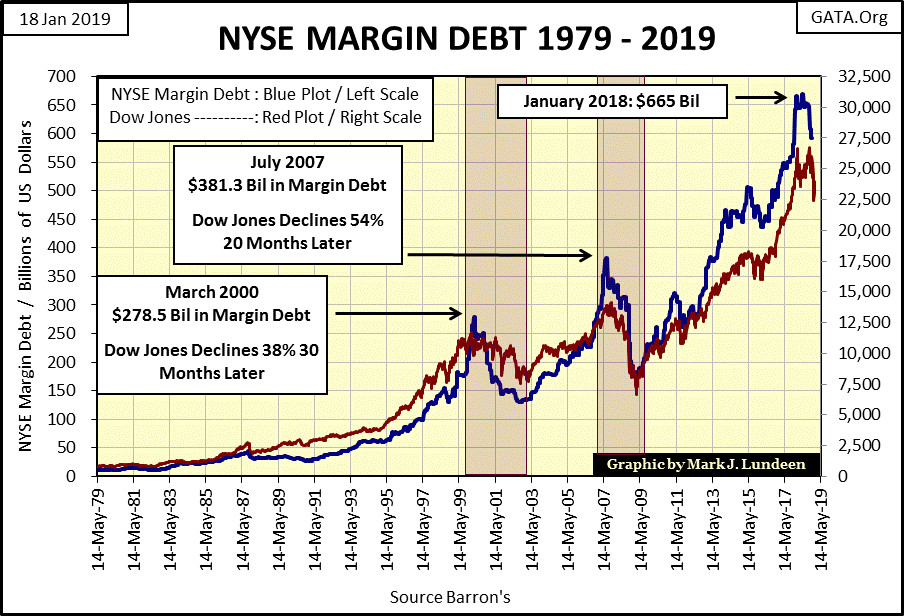
This is a check to prevent “liquidity” from the Federal Reserve System from flowing directly into cost of living assets trading in the commodities markets. This prevents CPI inflation from rising upwards like the Dow Jones (Red Plot) in the chart below as “liquidity” is “injected” (Blue Plot: NYSE Margin Debt) directly into the stock market.
That stock brokers are allowed to tap “liquidity” flowing from the Federal Reserve System, and inject it into the stock market via margin accounts tells us the “policy makers” encourage Wall Street to inflate stock valuations. Currently Wall Street has “injected” $592 billion dollars (Blue Plot below) from the Federal Reserve System into the stock market via margin debt.
A margined investment on this corn contract is different; it means the short and long side was obligated by their broker to post only a fraction of the value of the contract’s notional value. Margins are set by the exchanges, for example a 10% margin on this contract means that the short and long were required to post only $1,875 for this one contract. So neither the long or short side of the contract has committed $18,750 to this contract.
But for the purpose of this example, let’s assume both the long and short in this contract are naked, or allowed to enter this contract without posting any capital. This is something the big Wall Street banks are allowed to do by their regulators.
In the example below the contract was created with corn at $3.75, resulting in a contract with a notional value of $18,750. The net effect for both the long and short’s capital accounts is $0, and that will be the case until the price of corn changes.
Should the price of corn increase to $4.75 (#2) this corn contract’s notional value rises to $23,750 and the short side is obligated to transfer $5,000 to the account of the long. Should the price of corn decline to $2.75 (#3) the contract’s notional value declines to $13,750, and the long side is obligated to transfer $5,000 to the account of the short.
The corn market contains what I call natural longs and shorts; farmers who grow the corn are natural longs as they want higher prices, but if they are successful in producing large harvests, selling their abundant crops will depress the price of corn. Food processors are natural shorts as they want low prices, but it’s their demand for corn that results in rising corn prices. As you can see the corn market operates with a negative feedback loop that stabilizes the price of corn.
CBOT corn contracts are standardized contracts; each containing 5,000 bushels of corn with a known content of water and waste, and guaranteed by the CBOT. This makes these contracts liquid. But interest rate OTC derivatives contracts are nether standardized or liquid. That plus there are at least $481 trillion dollars in notional value of them makes them dangerous.
“The derivatives genie is now well out of the bottle, and these instruments will almost certainly multiply in variety and number until some event makes their toxicity clear....[They] are financial weapons of mass destruction, carrying dangers that, while now latent, are potentially lethal. --- Calling derivatives garbage is an insult to garbage.”
-Warren Buffett, 2002 letter to shareholders
One thing that puzzled me about OTC interest-rate derivatives was I could see who the natural shorts were, or the food processors in the corn market example above. But who are the natural longs in the debt markets, those who profit when interest rates rise?
When the price of corn increases it’s the farmers who benefits, but when bond yields increase who benefits? I can see why bond holders would want to hedge their interest-rate risks as rising bond yields results in declining bond prices. But bond issuers don’t directly benefit from rising bond yields either. Rising bond yields are detrimental for governments and industrial bond issuers, as when old bonds at low yields mature and are rolled over into newer bond issues at higher rates. Higher debt-service expenses in a multi trillion dollar market may be the difference between staying in business or bankruptcy for a large segment of the economy. How does one hedge that?
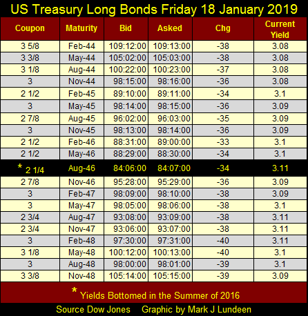
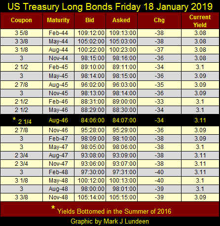
Here’s a table for every US 30 yr. T-bond issued since February 2014. That bond yields were declining, and then bottomed in August 2016 (Highlighted Row) is obvious. That plus the fact the US Treasury had to issue 30-Year Bonds offering higher coupons since. This is a big deal for anybody with $21 trillion in debt they must service. So, who naturally benefits from rising current yields in the US T-Bond market? Neither the buyer of T-bonds nor their issuer (the US Treasury), who since the summer of 2016 has had to issue bonds with ever higher coupons.
Ultimately I anticipate we’ll all discover, to our dismay that one can’t hedge trillions of dollars of credit risk. But Wall Street is more than willing to bundle a credit-default swap derivative on bonds (at a nominal fee) to keep yields in the bond market low and their earnings high.
So the claims made by Alan Greenspan and then US Treasury Secretary Robert Rubin in their 1999 congressional testimonies that the purpose of these OTC derivatives was to hedge market risks was dubious, and they knew that at the time.
So, why during the twilight years of the Clinton mis-administration did the main-stream financial media go along with promoting the dismantling of the Glass Steagall-Banking act of 1933 and allowing the OTC derivative market to be instituted and unregulated? Most likely after reviewing the “academic research” offered by proponents of these unregulated derivatives, members of the financial media agreed with Greenspan and Rubin that the financial markets didn’t need the former if Congress authorized the latter; a theory proven wrong during the 2007-09 sub-prime mortgage market debacle. The fact that Wall Street was the major source of the financial media’s advertising revenue must have been a factor too.
So what was Wall Street’s motive in all this? Go back and review my table on the CBOT corn contract and remember how someone profits being short in the corn market – by declining corn prices.
Below I’ve plotted Barron’s Best and Intermediate bond yields going back to 1934. As a side bar, I noted how Barron’s Gold Mining Index (BGMI) performed from 1958 to 1980, as bond yields went from low single digits to mid double digits: up 3896% as the Dow Jones advanced only 87% during these same twenty-two years. Just keep that in mind next time some “market expert” on CNBC tells you rising interest rates are bad for precious metals and their miners.
But back to interest-rate derivatives; take a moment to study this chart. From October 1981 to the summer of 2016, with the exception of the high-tech and sub-prime mortgage bear markets, bond yields have for the most part only gone down. From their highs of 1981 it was only natural that they should, but for thirty-five years rates decreased down to where they were in the 1940s and that seems very odd.
Think about it, in the late 1940s the dollar was still under a $35 gold peg. Government was much smaller and less intrusive. Also only ten years after the depressing 1930s, debt was still a four letter word. Seven decades ago most people strived to be debt free and corporations would actually publish full page advertisements in Barron’s of their balance sheet – and nothing else to show off their solid financials.
What a different world was 2016, so why in the chart below were bond yields as low then as they were in 1947? I believe there were because “monetary policy” engineered them to be so, and the Wall Street big banks knew it.

So today there is $481 trillion dollars in interest-rate derivatives hedging interest rate risks. But unlike a CBOT corn contract where there is someone (farmers or food processors) who profits from the price of corn rising or declining, who is there in the debt market to assume the risks of rising interest rates? That is especially so as this is a market with a notional value of $481 trillion dollars!
I’m not an expert on interest-rate derivatives, so I could be wrong, but I believe the big banks knew the trends in bond yields had only one way to go – down. They gladly took the other side of $481 trillion dollars in these derivatives as it was like taking candy from babies.
But since the summer of 2016 bond yields stopped going down, and began going up, placing the big banks who marketed these derivatives at great risk. I’m sure the “policy makers” are still intervening in the debt markets to prevent yields and rates from getting out of control, bankrupting Wall Street in the process.
But in big bear markets things tend to get out of control. When bond yields rise above a yet unknown threshold, all hell is going to break loose in the banking system as counter-party failure runs riot on Wall Street. Come that day, you’ll be glad to have some gold and silver.
Mark J. Lundeen
[email protected]


