Shaking The Bush


First I would like to apologize for not having any posts on Friday as I had a previous commitment made several weeks ago. I told Fullgoldcrown Thursday night, of all the days to miss work it would have to be Friday. That’s one of the reasons I exited the stock market trades as I know how volatile these 3 X etf’s can be and with the numbers coming out Friday morning I wanted to play it safe right or wrong.
All in all we had some pretty interesting price action in the stock markets on Friday that was very positive. Let’s start by looking at the INDU which I’ve been showing a H&S consolidation pattern forming. Thursday’s the price action closed below the 200 dma which is another reason I exited the stock market trades but Friday’s rally closed the day just below of the neckline and back above the 200 dma. What I find interesting is Thursday’s low was a reverse symmetry low taken from the left shoulder’s higher low on the far left hand side of the chart that matches the higher right shoulder low on the right side of the chart, Friday’s price action. We now have two neckline symmetry lines. The neckline symmetry lines are just parallel lines taken from the big neckline that sometimes shows us where to look for the lows for the right shoulders. So at this point the reverse symmetry is as pretty as it gets as shown by the S’s.
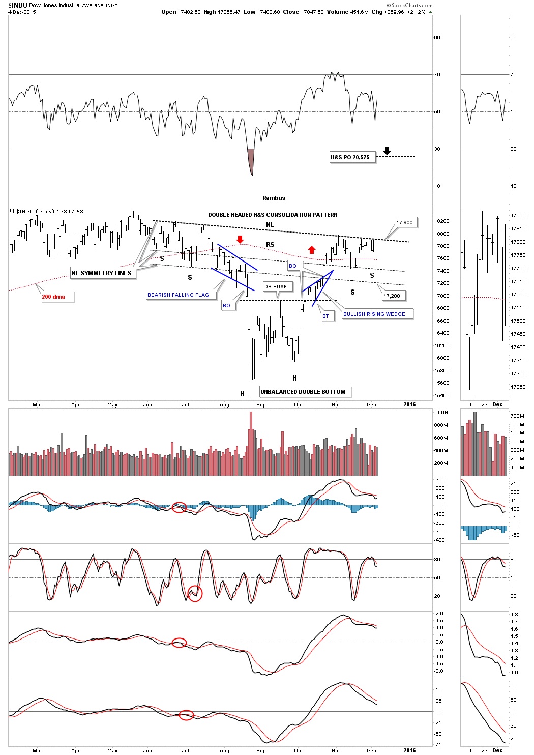
The volatile choppiness over the last 3 weeks or so, since the INDU first made contact with the neckline, looks like a triangle formation which I would view as a halfway pattern to the upside. Below is the exact same chart as the one above but this one has the blue triangle on it that is creating the right shoulder. So when we look at the Chartology since the August low we can see a double bottom with the small blue bullish rising wedge and now the potential bigger blue triangle forming the right shoulder. This is all bullish price action in which the INDU has made higher lows and higher highs except for the top rail of the blue triangle which has a slightly lower high at this point. To confirm the H&S bottom or the blue triangle consolidation pattern is in place the INDU will have to breakout above 17,900 area. This is a fairly large H&S consolidation pattern that stretches back over six months to June, so I would expect a rally of intermediate term proportions at least up to the 20,000 area as a minimum.
One more thing before we leave the daily charts for the INDU. I’m sure most of you have heard the expression “shaking the bush, used in the markets. It refers to a sharp decline which shakes everyone off the bush, the markets turns right around and rallies backup leaving most in disbelief. It only took three trading days to shake the bush once the blue bearish falling flag gave way to reach the August low. How many calls have you heard or read that this is the beginning of a new bear market in the stock markets?
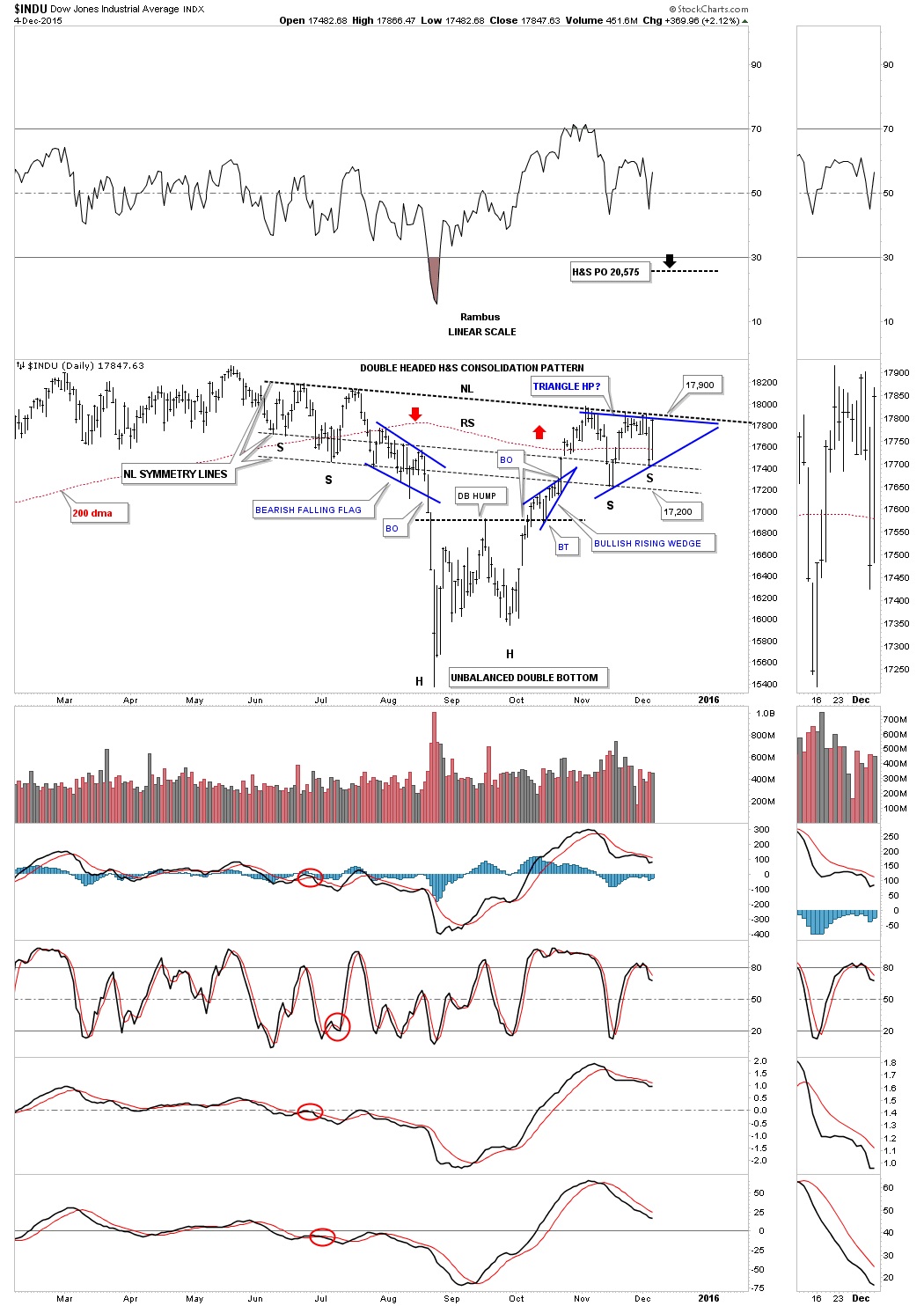
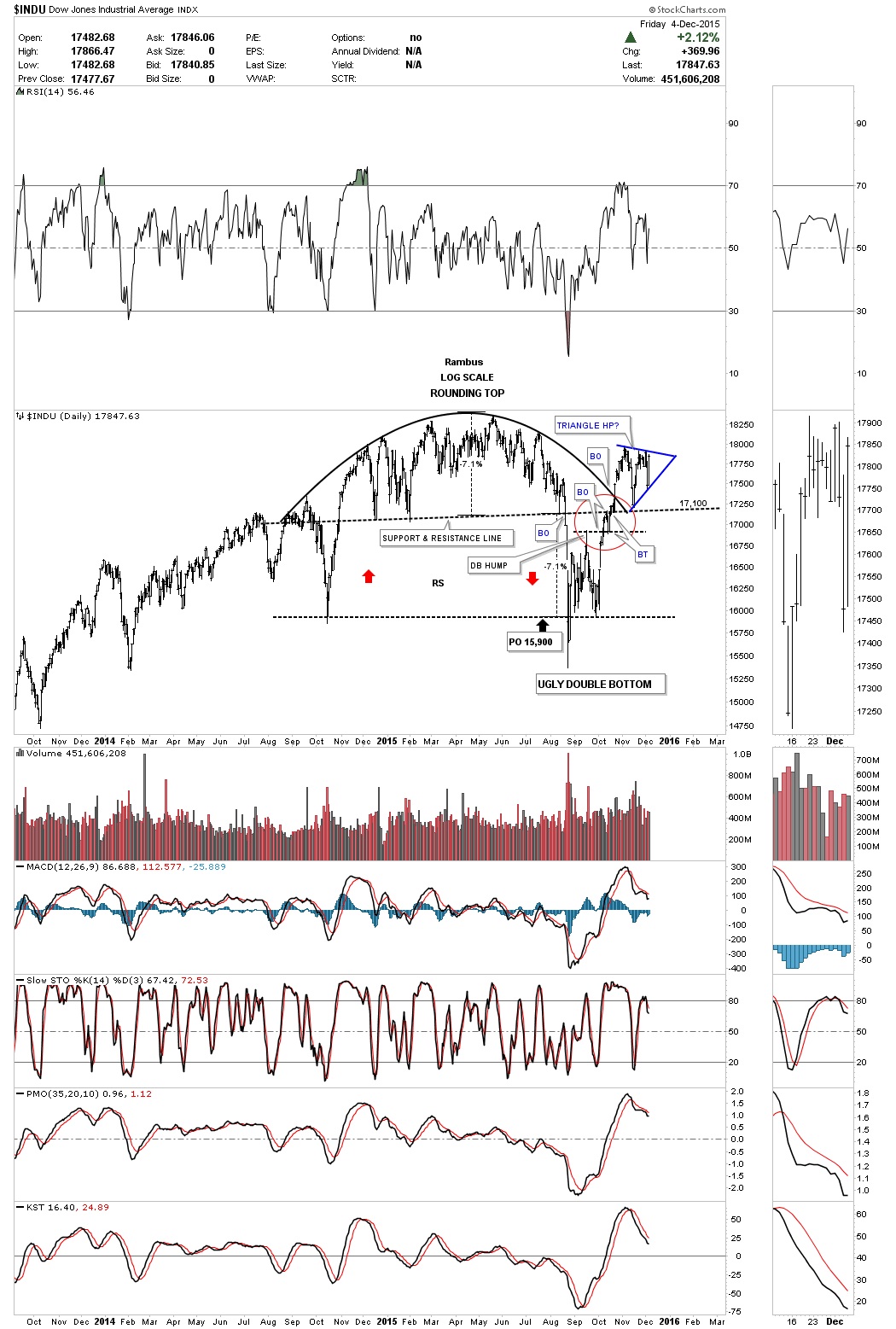
Some of you may remember this daily epiphany or moment of clarity chart I posted back in October of this year the day before the INDU broke out above the rounded top trendline in the Wednesday Report. What I was trying to show you at the time was how nice and clean the breakouts and backtests were. Note the breakout above the double bottom hump and clean backtest. Then there was the breakout of the big black dashed support and resistance line also with a clean backtest as shown by the red circle. Since the breakout above the rounded top trendline the INDU made one more attempt to backtest the big support and resistance line around the 17,100 area. The latest price action shows the potential blue triangle consolidation pattern that is building out.
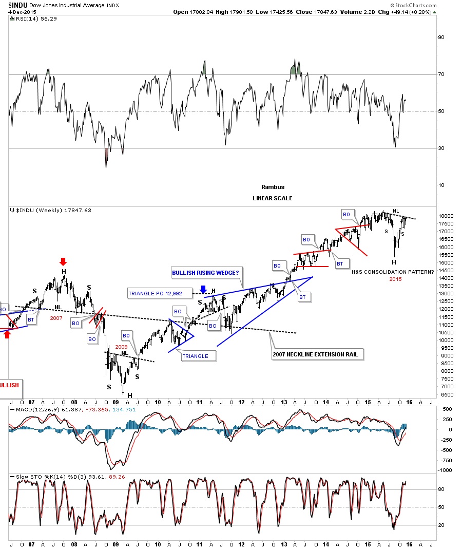
The next chart for the INDU is a weekly look that shows the 2007 H&S top, the 2009 H&S bottom and how our current H&S consolidation pattern fits into the big picture. What’s interesting is that all three H&S patterns are close to being the same height. Our current H&S consolidation pattern is actually the tallest of the three. I don’t know how many of you remember the 2011 correction, which was pretty scary at the time, but we just experienced the same thing in 2015.
This first monthly chart for the INDU shows its bull market that started in 2009 as a parallel uptrend channel. You can see there was a crack of the bottom trendline in August of this year, shaking the bush, which has been corrected.

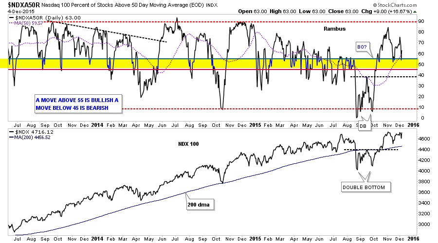
This next chart measures the number of stock in the $NDX that are trading above their 50 day moving average. Basically it shows when the number of stocks is trading below the yellow shaded area you have a sell signal. When the index trades back above the yellow shaded area you have a buy signal. As long as the number of stocks in the NDX stays above the bottom of the yellow shaded area this index remains on a buy signal. So far we’ve had three touches to the top of the yellow shaded buy and sell zone which remains on a buy signal.
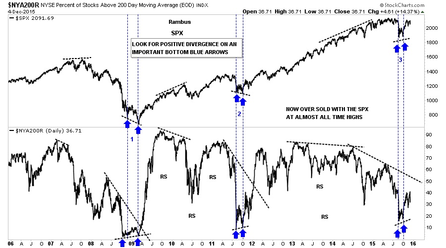
The next indicator chart shows the broader measure of health in the stock markets by using the $NYAR200 which shows the number of stocks trading above their 200 day moving average. The SPX is on top and the $NYA200 is below. Everyone has their own interpretation on how to use an indicator chart like this. For me I like to use when looking for an important bottom and nothing else. First note the bear market low in 2008 and 2009 which formed a double bottom on both charts. Here the indicator chart shows a positive divergence as the SPX made a lower low and the indicator chart made a higher low. Then again at the important low in 2011 where the indicator chart made a positive divergence to the SPX. Now on to our most recent low which shows no divergences but a double bottoms on both charts. Many are looking at this as weakness for the stock markets as the SPX is trading near its all time highs while the indicator chart is still way below its highs. What I see when I look at this chart is that the stock markets have had a small correction while the indicator chart has had a major correction which now leaves plenty of room for the stock market to rally before they become overbought again as shown by the other two double bottoms.
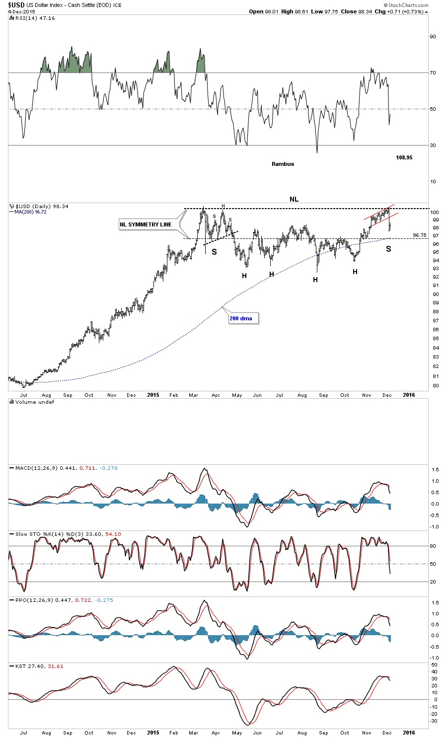
Let’s change gears now and look at the US dollar which had a big move last week. Below is the original daily chart I’ve been showing you which shows the blue falling wedge as the main consolidation pattern. You can see the red rising flag that formed right at the top of the March highs that broke to the downside which I was thinking would breakout topside. It ended up with 5 reversal points so it’s now a bearish rising flag. The US dollar still could be in backtest mode to the top blue rail of the falling wedge which would come into play at the 96.50 area. That area would also be the top of the blue rectangle which should show strong support.

Many times when I see a failure like the chart above is showing I start to look for the original pattern to morph into a bigger pattern. The longer term daily chart below shows a potential large H&S consolidation pattern that maybe forming. The reason I think this could be a possibility is because of all the tops that come into play at the 97.50 area which should produce some strong support. We also have the 200 day moving average coming in at the 97.50 area as well which should help with support. The bearish scenario would be if the US dollar breaks down to all the previous lows at the bottom of the trading range which would then create a rectangle type of consolidation pattern.
********
Courtesy of http://rambus1.com/
 Meet Rambus, a seasoned trader and technical analyst renowned for his unbiased and insightful chart work. Through his website, Rambus Chartology, and Substack newsletter, Rambus shares his expertise with a global community of subscribers, providing daily updates, commentaries, and hands-on training in the art and science of chartology. With his calm, humble, and down-to-earth approach, Rambus demystifies complex market trends, helping his followers navigate the challenges of today's volatile markets. Join the Rambus Chartology community today and discover a unique blend of technical analysis, trading expertise, and time-tested protocols. Subscribe now at www.rambus1.com or https://rambuschartology.substack.com/


