S&P500 All-Time High


Long-Term Daily Chart Outlook
It is not often that I make explicit statements of what markets will do over the near to even medium-term. My work tend to be based on patterns that span long-term history and the forecast tends to cover a quite a long time span. Quite rarely, an analysis gets done for the first time just as there is an imminent change in trend – something that is a source of some excitement! This has just happened to the S&P500 with long-term daily data that were downloaded yesterday.
Exploring the new data, the results prompted me to write to Bill Murphy on Tuesday, 26 July 2016, stating that on Friday, 22 July, the S&P500 had set its all-time high; which will not be exceeded for a long time. The analysis below supports that view.
Introduction
Readers who are not familiar with the methodology used here, may find this summary useful. It can be skipped by readers who understand what is being done.
The methodology of Chart Symmetry is based on the discovery that market prices tend to change along straight lines, known as ‘preferred gradients’. A large number of many different preferred gradients can be identified on a chart of more than minimal length.
- Different occurrences of the same gradient tend to be spaced according to some known ratios, while ratios not on the known list have to occur more than once to be validated
- The known ratios that occur most often are the even or 500:500 ratio and next is the Fibonacci ratio, 382:618. Whole number ratios are also on the list, such as 400:600 and 300:700, while ratios close to 450:550 are also often seen, but these have to be validated
- Different gradients are related through the Fibonacci ratio, 0.618034. Dividing or multiplying a know preferred gradient by this ratio results in what is then a new preferred gradient
- Transforming a gradient can be repeated any number of times to result in a fan of preferred gradients; since any one of them can be used to generate the whole fan, the fan is called a ‘family’ of gradients
This knowledge and more detail about how a price tends to interact with a preferred gradient are the basis of Chart Symmetry. An analysis always begins with a search for a master gradient, a trend line between prominent trend reversals or with a very good fit to the chart, from which all other gradients are derived. The analysis therefore will include only gradients of the same family, which reduces the chances of ‘engineering’ a desired or anticipated result using random trend lines.
As a rule, the master gradient is sought in the early part of the available history and is validated before being used for the full analysis. In this way the sought after results for the later part of the history are more objective. As an analysis proceeds and the results do not produce patterns that assist in understanding the development of the chart, a new search for a master gradient can be done. Not all families of preferred gradients have significant long-term influence of a price and effective analysis therefore requires a very specific master gradient to be identified.
S&P500 daily close – 3 January, 1950 to 26 July, 2016
Chart 1 shows an early part of this long history (16747 data points) with the two points used to define the master gradient that was found after quite a search for a master line that would deliver some interesting results. As usual, the two points on the chart used to define the master gradient – which is tangent to the first significant bull market on the chart – are indicated by an ‘x’. All other lines have gradients that are derived from the master gradient and they are generated from a single point on the chart, indicated by an ‘o’.

Chart 1. S&P500 Daily. 3 January, 1950 to 11 September, 1969
Lines X and Y are parallel to line M. Line X is the support line, similar to line M, of a very small rising trend right after the start of the history. Line Y is also tangent to the chart. The ratio of the three lines XMY is 440:560. It is a not one of the known ratios and has to be validated during the analysis.
The ratio of the channel pair ABC is 401:599, very close to the commonly seen ratio, 400:600. It therefore helps to confirm the master gradient without further validation.
Chart 2, below, shows a slightly longer history of the SP500, also beginning from 1950. Line M is shown, as is two additional trend lines, P and Q, with their origins as shown. At point 1, line P passes within 0.1% of the low at that point. Percentages are always expressed relative to the vertical scale of the chart; this enables comparison between different charts, values and volatilities. Typically, in these analyses, a line has to pas within 0.50% of a trend reversal to be acceptable.
Line Q, a steeper derivative of line M, passes at 0.87%, 0.14% and 0.08% by the three lows situated near the point marked as ‘2’. The first is a clear penetration of the line, but the other two trend reversals are comfortable within the limit. It is clear that the gradient of line Q closely matches the gradient of the bull market that had started in August, 1982, at the origin of line Q.

Chart 2. S&P500 Daily. 3 January, 1950 to 9 December, 1992
Chart 3 shows the history of the S&P500 from August 1988 to the time of writing. Line M is still shown, with lines U, V and W much steeper derivatives and lines T and L forming a large megaphone – typically a very volatile chart formation with strong trends.
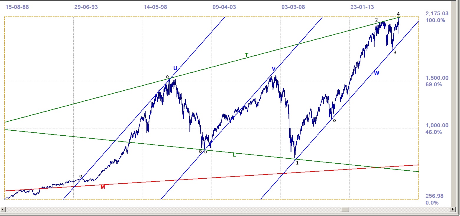
Chart 3. S&P500 Daily. 15 August, 1988 to 26 July, 2016
Line U has its origin in the all time high on 31 January, 1994 (481.61), shortly before the start of the 1990s bull market in December, 1994. Line W is tangent to the chart during the post 2009 bull market and the ratio of lines UVW is 495:505, very close to being an evenly divided channel.
At point ‘1’, line L passes within 0.2% of the steep spike low on 9 March, 2009, when the Federal Reserve pumped money into the financial system. At point 2, the chart top is within 0.05% of line T and at point 3 the spike low is within 0.1% of line W. The all time high (so far) on Friday 22 July, 2016 at 2175.03 is 0.17% above line T, which has a value of 20171.75 on that date – 16 years after the origin of line T.
Line T is a rising trend line and if it is to be the location of the all time high, a higher reading is possible if the bull trend continues for some time, first sideways and then increasing again. Until that happens, it seems correct the call an all time high on Friday 22nd July.
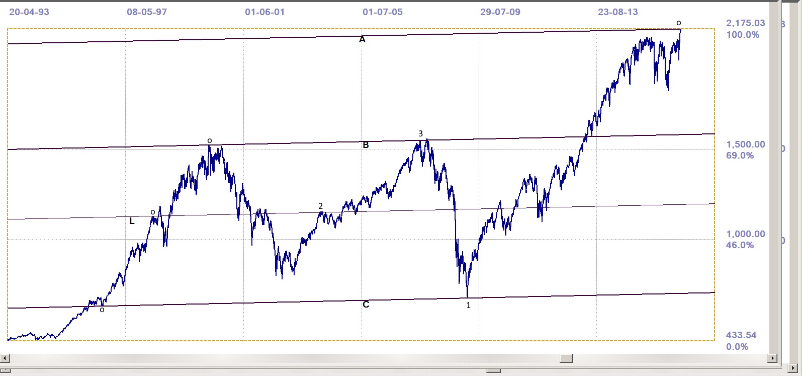
Chart 4. S&P500 Daily. 20 April, 1994 to 26 July, 2016
A final chart again shows the importance of the channel ratios – a set of three parallel trend lines that are divided into a specific ratio. The three lines, A, B, and C are located at points that divide the whole top formation into two bands. Line A has its origin in the all time high; the origin of line B is the March 2000 high in the index and at point 3 it passes just at 0.05% of the first of the two small spike tops.
Line C has its origin in the first correction to the 1999s bull market in July 1996. At ‘1’ it passes at 0.18% away from the 2009 low, almost 13 years later. The ratio of channel pair ABC is 400:600, exactly the third most common of the known ratios.
Line L is added for a specific purpose. At point 2 it passes through a number of small tops and reversals, but not within the 0.50% limit, although there are small reversals in that complex top and elsewhere to offer some confidence in the location of line L. Of greater value in validating line L is that the ratio of channel pair BLC is exactly 440:560 – which is exactly the same as the channel pair XMY in Chart 1. These two channel pairs therefore are validated and can be accepted as representing preferred gradients that belong to the gradient family that is defined by master gradient M.
Conclusion
While one can never say ‘Never’ where the markets are concerned, it seems a claim that Wall Street as reported by the S&P500 closed at an all-time high on Friday, 22 July. The claim has a credible and broad technical foundation, but this is not a guarantee of certainty. It is well known that Wall Street is receiving strong support whenever it looks a bit shaky. It is feasible that this support could force the market higher, beyond normal technical considerations. This is not intended as an advance excuse for being wrong – just a matter of realism in the markets of today.
The important evidence, within the scope of the full analysis, is that in Chart 3 line T is offering significant resistance, while in Chart 4 the ratio of channel pair ABC – with all three lines having their origins in significant reversals and with a good fit to the chart for lines B and C – also offers convincing evidence that the index has now topped out. Perhaps it is time to short the S&P500 and one can do so with a tight stop loss.
********
©2016 daan joubert, Rights Reserved
chartsym (at) gmail(dot)com


