Take the Bait or will You Wait ?


Wednesday Report I'm going to show you a lot of charts of which some are positive and some negative. Today was a day where a lot of investors felt compelled to buy strictly out of emotional reasons. Like a lure going by a big fat Largemouth Bass, the temptations was too great to resist. Maybe today marked the bottom for the PM complex or maybe not. It's still to early to say yet, with any amount of confidence, that the BOTTOM is in. Keep in mind that I want nothing more than for the precious metals stocks to rally big time and clear out some of the overhead resistance that was created on the last leg down. Its so much more fun when a true impulse leg up is in full gear to the upside and the PM stocks are making one new high after another. With that said lets start with some charts of the precious metals complex starting with a combo chart that shows the HUI, GOLD and SILVER.
The brown shaded area shows our current trading area that topped out in September of this year. If you look at the last bar on the far right hand side of the chart you can see today's price action that shows the HUI, on top, being the strongest followed by silver, at the bottom of the chart, which had a good day and then gold in the middle that closed at the lower end of today's bar. The first real positive development would be for the HUI and Silver to close above their bottom red trendlines.

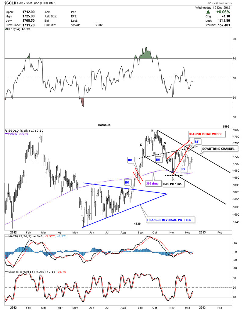
Next let's look at a daily chart of gold that shows the H&S Top that was formed in September and October of this year. The H&S top fell about 5 points short of reaching its price objective at 1665 before it had a counter trend rally that took on the form of the red bearish rising wedge. You can see the backtest to the neckline was a tad strong but it quickly reversed course and the bottom rail of the red bearish rising wedge was broken to the downside. On the third day of the breakout of the red bearish rising wedge it too had a backtest where the price action fell to our most recent bottom just above the 300 dma. You can see the 4 day counter trend rally that has been in place including today's bar where the close was at the lower end of the bar. So what this chart is showing us is we have a H&S top reversal pattern with a bearish rising wedge trapped in the downtrend channel at this time which isn't all that bullish.
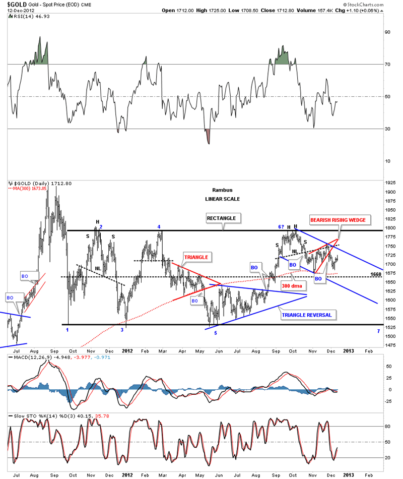
Lets step back and look at a 1 1/2 year chart that shows the big rectangle that started to form on the initial break off the all-time high at 1920. This chart shows you why the H&S Top, on the chart above, shows up where it does. It formed right at the top rail of the rectangle. Please observe how the price action, from the first low in the rectangle at 1530, is stretching out in time. You can see how the first decline was very dramatic taking just a few days to complete. The countertrend rally back up was also very fast, points #1 and #2. Notice how long the second leg down took, points #4 and #5. The last rally phase between points #5 and #6 took much longer to complete then the first two rallies which brings us up to our current decline. You can see the blue downtrend channel that has been forming since the H&S top at point #6. The swings are getting longer in time, both up and down, which cause a lot more stress on investors who are used to the fast moves between the top and bottom rails of the rectangle earlier on. The price action is stretching out meaning the volatility is lessening which is what you want to see as a price pattern matures out. Like dropping a super ball on the floor, the first bounce is hard and fast and as it keeps bouncing up and down it starts to lose momentum. The formation of a consolidation pattern is the same principal.
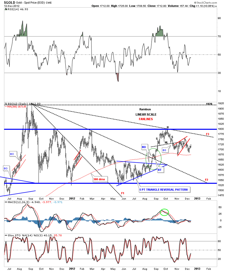
The next chart shows the fanlines that are taken off the all-time high at 1920. The rule is when fanline #3 is taken out to the upside the rally will begin in earnest after one possible backtest. Note the green circle in the center of the chart that shows how gold broke out of fanline #2 with a nice backtest before price went higher. Note the 300 dma that held support on the last low.
Lets now look at several longer term gold charts that are showing support is still holding. I like to use the 10 month moving average when looking at the monthly chart. You can see on the chart below the 10 month moving average came in at 1686 and the low so far for the month of December has been 1684. So far so good.

The next chart is a six month time cycle chart that has done a good job of calling the bottoms over the last several years. You can see its calling for a low around the 17th of December. You can also see the green 65 wma comes in at 1674 which has also done a good job of holding support. It has only failed when we get a big correction like 2008 and our current correction.

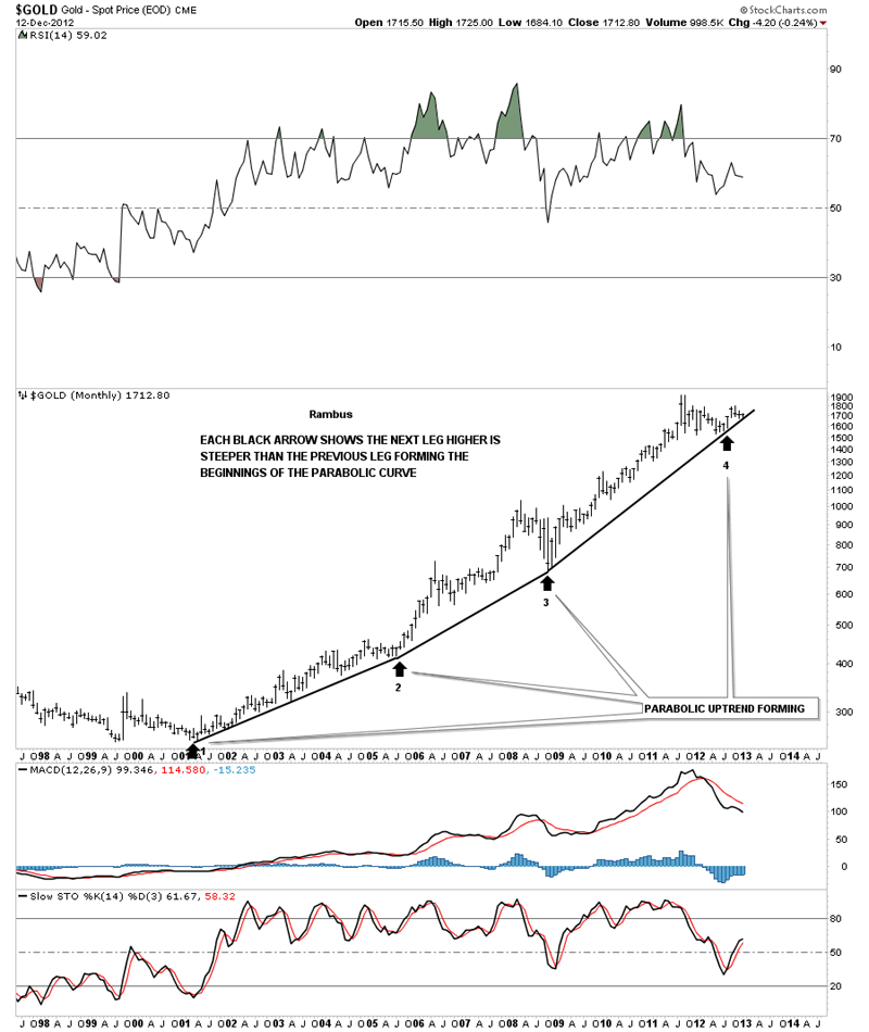
This next chart shows the price action still holding above the parabolic curve, ever so slightly. Critical test taking place right now.
The next chart shows the important chart patterns that have formed during this bull market. You can see how critical this area is for the continuation of the parabolic move to continue.

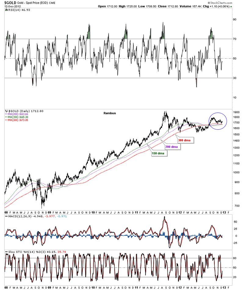
This last chart I would like to show you has the 3 most important moving averages for gold during this bull market. The blue circle shows you how they are all converging within 10 points of each other. This is another critical test taking place right now.
Lets now look at some charts of the precious metals stock indexes and see how they are shaping up. The first chart I would like to show you is the daily look at the GDX that is showing two possibilities right now. The first thing we have to look at and is most important is the 5 point blue bearish falling wedge that is a REVERSAL pattern to the downside. That is the most important feature on the chart below at this time. Since it's a reversal pattern we have to see some kind of reversal pattern form at the bottom to reverse our current downtrend back to up. As you can see with today's price action GDX traded almost all the way back up to the bottom blue rail of the bearish falling wedge for the second backtest. This is where it gets real interesting. Note the two red trendlines. One that has formed on the neckline symmetry rail and the other has formed just below the bottom blue rail of the bearish falling wedge. What we have going on here is a possible red bearish falling flag or if the neckline symmetry rail can hold in here it could be a double bottom that is forming the low for the right shoulder. So choose your poison. One side is going to win out.

This next chart shows the HUI and the double bottom hump that comes in at 465, black dashed horizontal rail. That is the key area to focus on. Above positive and below negative.

This last chart shows you why the 465 is so critically important for the precious metals stocks. If the HUI can trade above that area it will negate the very bearish H&S Top that has been forming for 3 years now. This is why the goldbugs are so frustrated now. We haven't had a decent impulse leg up in a very long time.
I'm going to stop here so I can get this posted before it gets too late. I know many of you are probably frustrated with me right now because I didn't jump on the bandwagon today. That's OK as I need to see some more positive action before I commit to the model portfolio which is still in cash. Cash might seem like a good position down the road if things don't turn around soon. The bottom line is today's price action felt like the real thing to many gold bugs but as the charts show we aren't quite out of the woods yet. How many times have we experienced days like today and then see everything fall apart a few days later. If today was just a short covering rally then there will be more pain for those that jumped the gun today IMHO. Patience is a hard thing to learn and today was a good example of how easy it is to just throw caution to the wind and jump in with both feet. Maybe today was the bottom or maybe it was just a stopping off point for further downside action. We'll know shortly I believe.
To Subscribe to Rambus Chartology and see Rambus' 10 Favorite PM Stocks and a World of Charts and Projections including the Chartology Forum where Rambus answers your Questions and even Charts your Favorite PM Stocks by Request, go to : www.rambus1.com
 Meet Rambus, a seasoned trader and technical analyst renowned for his unbiased and insightful chart work. Through his website, Rambus Chartology, and Substack newsletter, Rambus shares his expertise with a global community of subscribers, providing daily updates, commentaries, and hands-on training in the art and science of chartology. With his calm, humble, and down-to-earth approach, Rambus demystifies complex market trends, helping his followers navigate the challenges of today's volatile markets. Join the Rambus Chartology community today and discover a unique blend of technical analysis, trading expertise, and time-tested protocols. Subscribe now at www.rambus1.com or https://rambuschartology.substack.com/