Technical Analysis Of The Markets


SPX: Long-term trend - Bull Market
Intermediate trend – Waiting for confirmation that the ending diagonal is complete.
Analysis of the short-term trend is done on a daily basis with the help of hourly charts. It is an important adjunct to the analysis of daily and weekly charts which discusses the course of longer market trends.
DE-GREECE-ING THE MARKET
Market Overview
For the past few weeks, two main subjects have preoccupied the market. The first was the question of when the FED would begin to increase interest rates. This was resolved last Wednesday when Janet Yellen made it clear that she was still in no hurry to do so.
With that issue behind us, the second issue – Greece – may soon be resolved as well. Euro Zone leaders have called for a Monday meeting in a last ditch effort to achieve a solution to the Greek solvency situation. Hopefully, some finality will come out of this meeting, whichever way it turns out. With the Fed and Greek issues behind us, some sort of normalcy may return to trading patterns.
It is possible that a new uptrend has started, but it has not yet proved itself. Obviously, much depends on what transpires in Euroland on Monday. If it is possible to guesstimate the current market condition, there appears to be slightly more positives than negatives, especially with the current reading of the sentiment indexes.
Indicators survey
The weekly MACD is trying to form a short-term bottom. It is not even close to making a bullish cross, but at 20.75, it is still strongly positive.
The daily MACD has turned up making a bullish cross but, at -.64 remains slightly negative.
The McClellan oscillator has registered its first positive reading in about a month, but barely; and this was not enough to cause a visible turn in the NYSE Summation Index (courtesy of MarketCharts.com) which is at its lowest reading by far since last October. It is, however, at a level from which short-term rallies have sprung in the past.

The 1X P&F chart has met its minimum projection from the base established at the 2085 level, but there are a few more points still available if the SPX decides to go for them.
Like the daily bar chart, the 3X chart has broken out of a downtrend consolidation pattern. We’ll have to see if subsequent trading extends the rounding top pattern -- or alters it. The bottoming 7-year cycle should encourage the former.
Chart Analysis
In the Daily SPX (chart courtesy of QCharts.com, including others below) the two extreme blue trend lines represent the price channel of the intermediate trend (primary wave III) which originated in October 2011, and the dashed line is the mid-line of the channel. Note that since the end of the October rally, prices have traded in the upper half of the channel. In fact, this was the case for most of the intermediate uptrend with the October decline being one of the rare exceptions. This is a sign that long term strength still prevails.
During the last month the index started to decline and twice attempted to move lower, but this only resulted in the formation of a double-bottom at 2072 where prices held powerful support consisting of the 144-MA and a cluster of trend lines. A rally of undetermined nature and length (at this time) is now underway. Its fate will most likely be decided by early next week.
It is now clear that when the 2072 level is breached decisively, we should experience the type of correction that analysts have been expecting for a very long time.
The pattern that SPX has been making since the end of the October rally appeared to be a diagonal triangle. It also appeared to have completed at 2135, but the fact that the retracement from that level was so shallow suggests that it did not and that it may now be engaged in making its final “e” wave. It is also entirely possible that the consolidation pattern of the past nine months eventually turns out to be a completely different formation.
The indicators confirm that an uptrend has started which is still in place and should continue until the blue trend line on the price chart has been broken.
The hourly chart not only shows why SPX stopped its decline where it did, but also where the rally found resistance. The top red trend line connects the 2119 and the 2135 tops. As you can see, its parallels have consistently provided support and resistance points for the index since the March low. The same can be said of the green trend lines, which are parallel to the original drawn from the October low of 1820. One of them combined with a red trend line to stop the rally from 2072 at 2116. On Friday, the correction stopped on the next lower one. These parallels provide important projection points for short-term price movements within the larger trend.
The hourly indicators have turned down but, because they did not show divergence at the rally top, another leg up could develop as soon as they have stabilized. For now, because they were still declining at the close of Friday, the odds favor lower prices before they do.
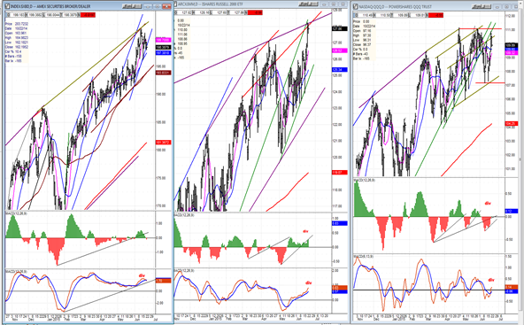
XBD – IWM – QQQ
Our three market leaders are beginning to make some interesting market patterns and the next couple of weeks could be revealing. Of the three, in spite of another sharp rally in the last few days, QQQ appears to be making a toping formation which is beginning to look like a triple top. XBD is less transparent, but it did not participate at all in the second phase of the rally. Breaking below the blue trend line could be important. Let’s not forget that it has reached a minimum price count at 191. IWM is the strongest, but its up-move was stopped by a long-term trend line. Let’s see if it pulls back or goes through.
Their MACDs are progressing somewhat differently, but all three show negative divergence.
Dow Jones Composite
The DJC made a double-bottom at its last level of support and rallied to the 200-DMA before pulling back on Friday. The line of least resistance appears to be well established on the downside but, for absolute confirmation, the index will have to drop below the bottom line of the descending triangle pattern.
UUP (dollar ETF)
UUP looks just about ready to move up. The indicators are in a much better position to support a rally this time. As long as it remains above its 200-DMA, it remains in an uptrend.
GLD (Gold trust)
GLD may be waking up from its torpor. It is getting close to (or at) the time frame when important cycles are making their lows. This process may take a little longer, especially if the dollar is also ready to move up. There is improvement in the MACD, but we’ll see if the index can move beyond its 200-DMA this time.
USO (US Oil Fund)
USO looks vulnerable to resuming its downtrend if UUP starts to move up. The pattern looks like distribution just under its mid-channel line and gives a slight hint that it is about to roll over to the downside to re-test its low.
Summary
In the past two weeks, SPX ended its decline from 2135, made a double-bottom and started a rally. The near-term trend is bound to be affected by what comes out of a last effort at resolving the Greece crisis on Monday. Since so much is at stake, and mere rumors on this subject have shown how they could affect the market, there is little to forecast until we get past this critical time period.
********
FREE TRIAL SUBSCRIPTON
Market Turning Points is an uncommonly dependable, reasonably priced service providing intra-day market updates, a daily Market Summary, and detailed weekend reports. It is ideally suited to traders, but it can also be valuable to investors since highly accurate longer-term price projections are provided using Point & Figure analysis and Fibonacci projections. Best-time reversal estimates are obtained from cycle analysis.
For a FREE 4-week trial, send an email to: [email protected]
For further subscription options, payment plans, weekly newsletters, and for general information, I encourage you to visit my website at www.marketurningpoints.com . By clicking on "Free Newsletter" you can get a preview of the latest newsletter which is normally posted on Sunday afternoon (unless it happens to be a 3-day weekend in which case it could be posted on Monday).
The above comments and those made in the daily updates and the Market Summary about the financial markets are based purely on what I consider to be sound technical analysis principles. They represent my own opinion and are not meant to be construed as trading or investment advice, but are offered as an analytical point of view which might be of interest to those who follow stock market cycles and technical analysis.

When Andre Gratian was a stock broker years ago, a friend introduced him to technical analysis of the market. Consequently, it is not an exaggeration to say that Andre fell in love with this approach! Ever since then, it has become an increasingly important part of his professional life. Gratian has studied the works of Wyckoff, Edwards & Magee, Edward J. Dewey (cycles) and many others. However, one of my most profitable undertaking has probably been to study Point & Figure charting, which he finds invaluable in analyzing stocks and indices. If he were restricted to one methodology, this is the one that he would choose. This well-rounded background has given him what he feels to be a special insight into the stock market, facilitating the recognition of meaningful patterns and the ‘turning points’ in all trends, whether they be short or long term. Andre feels very comfortable discussing the stock market and passing on meaningful information to others. His subscribers include individuals and money managers throughout the world. Moreover, his Newsletters are currently published on several financial sites, here and abroad.
More from Gold-Eagle


