Technical Analysis Of The Markets


Current Position of the Market
SPX: Long-term trend – Still the Bull Market in jeopardy?
SPX: Intermediate trend – The index made a secondary top at the 2116 level and started another decline of intermediate duration.
Analysis of the short-term trend is done on a daily basis with the help of hourly charts. It is an important adjunct to the analysis of daily and weekly charts which discuss longer market trends.
NEARING A PHASE TARGET
Market Overview
Last week, SPX finally broke the mighty 2040 support level decisively, came out of its bullish short-term channel (from the August low of 1867), and was down 126 points for the week. The deterioration of the Chinese economy and the sharp decline in the Chinese stock market were the acknowledged catalysts! But here is what’s interesting: indication that this would happen had been evident for some time in the degree of distribution that occurred at the primary top of 2135, which was subsequently reinforced by the amount of distribution that took place at the secondary reaction top of 2116.
Those who analyze the market with human logic will have difficulty understanding how the stock market, after having already been down 100 points for the week, could tack on another decline of 21 points right after the second best jobs report of the year was released! And yet, the decline which started from 2081 was already factored in the amount of distribution recorded on the 3X P&F chart between October and December. This works like a storage battery receiving a certain amount of charge which is then released by flipping a switch. In this case, the switch was the news about China. The amount of energy which had been stored in this particular phase of distribution looks to be practically exhausted, and this should soon lead to a short-term reversal. However, this may only be the first phase of a two-phase decline, so an important low should not be expected.
Even that explanation for the decline is something that human logic can understand and accept. But the actual trigger for market moves are cyclical in nature. Cycles are a phenomenon that we only observe as part of a universal pattern, but still cannot fully comprehend! However, they were, are, and will be the basic cause of stock market fluctuations! To quote Edward R. Dewey, they are “Those Mysterious Forces that Trigger Events”. (CYCLES by Edward R. Dewey, Hawthorn Books, Inc.) According to Eric Hadik, long-term cycles are in a down-phase for the foreseeable future.
NYSE, DJIA, SPX Weekly Charts Analysis
(The following chart, as well as others below, are courtesy of QCharts.com). The NYSI (courtesy of StockCharts.com) is posted below the NYSE chart.
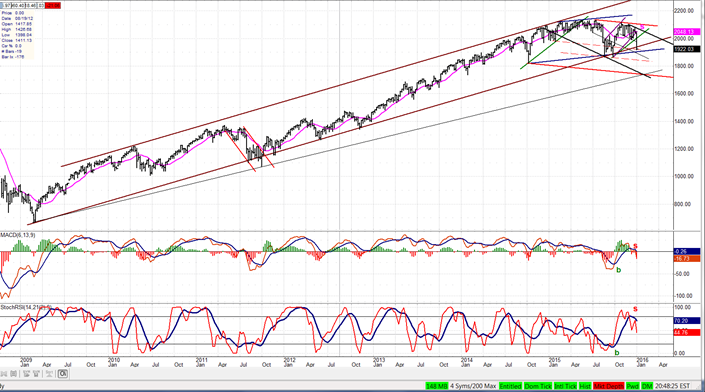
I have posted the three indices together so that you can judge their relative strength as well as whether or not their long-term uptrend is being jeopardized. In the first two (NYSE and DJIA), I have drawn conventional long term channels starting with the bottom trend line; but in the SPX, this method (which is the one I used for a chart presented last week) seems inadequate for a proper comparison with the two other indices below. Therefore, I drew the long-term channel by first connecting the tops with a parallel across the bottoms.
Just looking at the price action within the channels, it’s obvious that the first (NYSE) is the weakest of the three. Since it is also representative of far more stocks than the other two, one might conclude that the overall market is actually weaker than most other indexes suggest. SPX is distorted by the FANGs (Facebook, Amazon, Netflix, and Google) four high-flyers which make it appear stronger than it really is. The NYSE led the market on the downside from the very top and, after dropping below the October 2014 low, it breached its long-term uptrend channel twice but failed to close outside of it until last week. It is also within a few points of its October 2015 low. If it closes below it, would that put it in a bear market?
The DJIA (second chart) did the same thing as NYSE, breaking below the October 2014 low and breaching the long-term uptrend in August, but closing above. DJIA had a much stronger rally from the August low, but this did not prevent it from closing outside of its long-term channel on Friday. Still, it remains much higher above its August low than NYSE.
So what are we to make of all this? I don’t believe that we can yet decide that we are in a bear market, especially with the indicators of all three indices showing strong positive divergence -- a condition which normally precedes a reversal. However, the divergence could be nullified by subsequent weakness. The original distribution level at the 2135 top has correctly, so far, predicted a severe market decline which has not yet exhausted its total downside potential. Nor has the secondary distribution level at 2116 which consists of two separate phases with only the first phase nearing its projection target. If these predictions become fully realized, we could continue to decline to much lower level, thereby confirming that we are in a bear market.

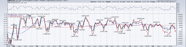

The NYSI, which is posted under the NYSE also shows strong positive divergence on a weekly as well as on a daily basis. This is not the case with the daily price indicators which are still in a strong downtrend and oversold, but show no divergence.
Chart Analysis of SPX
Hourly Chart
Once again, we’ll by-pass the daily chart and go directly to the hourly since the daily would not add anything significant to the above analysis of the weekly charts.
Last week, SPX broke on the downside of a mild corrective channel, expanding it by almost double its width. During the decline from 2081, there was an attempt at holding above the original channel line (first dashed parallel) which also corresponded to a minor phase count. After moving lower, there was another attempt on Friday at holding at another minor count, but that was not successful either and the index decided to go for the larger phase count. That P&F projection (which is a little lower) is supported by a couple of Fibonacci measurements which should make it even more dependable.
That we are approaching a low is evident on the price chart, as we appear to be staying away from the outside line of both channels (a sign of deceleration), but not nearly as evident as the pattern of the indicators which are showing monstrous positive divergence.

TRAN (Dow Jones Transportation Average)
The transportation index has taken advantage of the recent weakness to make another significant low and to close below its long-term channel line, as did the DJIA. As you can see, it has now declined more than double the width of the original blue intermediate up-channel (dashed line), but it has, so far, respected the bottom line of the red correction channel, and could take advantage of a near-by low to continue to hold above the channel line (for now).
The MACD has resisted making a new low during the recent price decline, and this can be considered a minor sign of positive divergence.

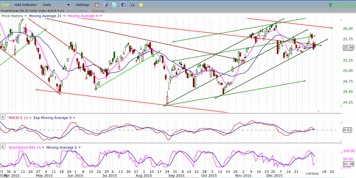
UUP (Dollar ETF)
UUP is having some trouble extending its uptrend beyond the recent short-term top. It is not showing real signs of trouble, yet, and this could be part of a consolidation pattern prior to making a new high. However, Friday’s reaction to a strong jobs report was very muted. Is this a warning? Let’s give it another week to define itself.
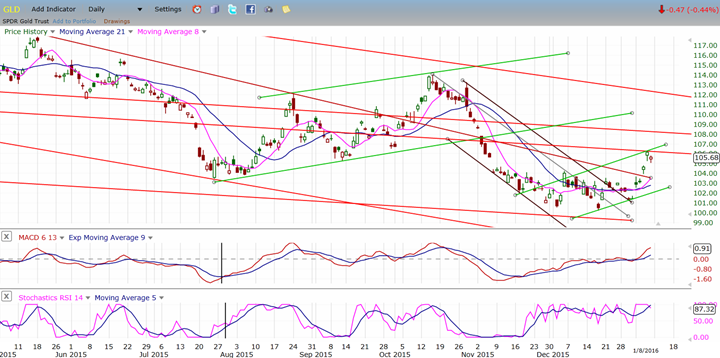
GLD (Gold Trust)
GLD has taken advantage of the pause in the dollar to break out of its base. If this move is genuine, it needs to follow through beyond the minor resistance point reached on Thursday. The base count on the P&F chart only gives it a potential to reach 109-111, so this is most likely not the beginning of a major move, even if it gets to those levels over the near-term
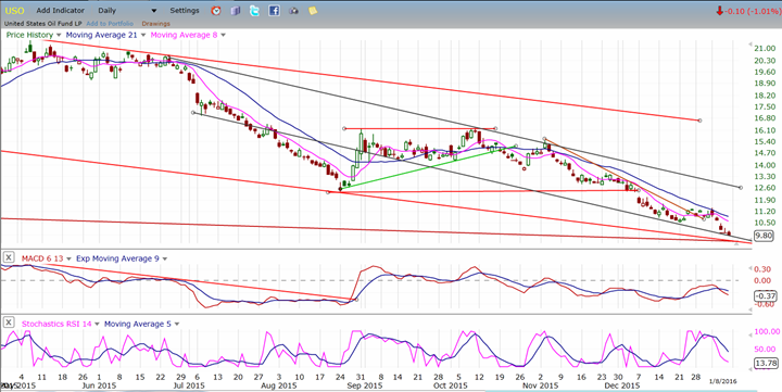
USO (United States Oil Fund)
With a low of 9.71 on Friday, USO is getting very close to its projection. It does not have to reach its 8 target exactly to confirm it and, considering the downward distance it has traveled, it could find buyers a little higher, especially since it has reached potential support from some important trend lines.
Whether it fills its projection in full or not, what follows could be an initial oversold spike; but it should only mark the beginning of a protracted range-bound base pattern which could take weeks and months to form.
Summary
If we define the beginning of a bear market by the breaking of the long-term trend line which goes back to the start of the bull market, some indices have already done this and others are close. However, the penetration of that trend line is still be minimal and at least one more criterion should be added: A move by all major indices below their August 2015 low. So far, only the TRANS Index has done it…but the NYSE and Wilshire 5000 are close to doing it. Since the TRANS Index has been a leader to the downside and the NYSE and WLSH are representative of most listed companies, we could be on the verge of a bona fide bear market, especially since a larger decline is suggested by overhead distribution and with major cycles still pointing down.
********
FREE TRIAL SUBSCRIPTON
Market Turning Points is an uncommonly dependable, reasonably priced service providing intra-day market updates, a daily Market Summary, and detailed weekend reports. It is ideally suited to traders, but it can also be valuable to investors since highly accurate longer-term price projections are provided using Point & Figure analysis and Fibonacci projections. Best-time reversal estimates are obtained from cycle analysis.
For a FREE 4-week trial, send an email to: [email protected]
For further subscription options, payment plans, weekly newsletters, and for general information, I encourage you to visit my website at www.marketurningpoints.com. By clicking on "Free Newsletter" you can get a preview of the latest newsletter which is normally posted on Sunday afternoon (unless it happens to be a 3-day weekend in which case it could be posted on Monday).
The above comments and those made in the daily updates and the Market Summary about the financial markets are based purely on what I consider to be sound technical analysis principles. They represent my own opinion and are not meant to be construed as trading or investment advice, but are offered as an analytical point f view which might be of interest to those who follow stock market cycles and technical analysis.

When Andre Gratian was a stock broker years ago, a friend introduced him to technical analysis of the market. Consequently, it is not an exaggeration to say that Andre fell in love with this approach! Ever since then, it has become an increasingly important part of his professional life. Gratian has studied the works of Wyckoff, Edwards & Magee, Edward J. Dewey (cycles) and many others. However, one of my most profitable undertaking has probably been to study Point & Figure charting, which he finds invaluable in analyzing stocks and indices. If he were restricted to one methodology, this is the one that he would choose. This well-rounded background has given him what he feels to be a special insight into the stock market, facilitating the recognition of meaningful patterns and the ‘turning points’ in all trends, whether they be short or long term. Andre feels very comfortable discussing the stock market and passing on meaningful information to others. His subscribers include individuals and money managers throughout the world. Moreover, his Newsletters are currently published on several financial sites, here and abroad.
More from Gold-Eagle


