Technical Analysis Of The Markets


Current Position of the Market
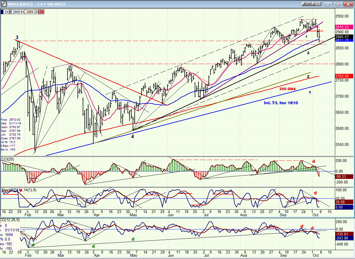
SPX: Long-term trend – The bull market is continuing with a top expected in the low 3000s.
Intermediate-trend – Correction in progress.
Analysis of the short-term trend is done on a daily basis with the help of hourly charts. It is an important adjunct to the analysis of daily and weekly charts which discusses the course of longer market trends.
Seasonal Influence at Work
Market Overview
It’s not always like clock-work, but the September-October period always deserves caution as we approach it. This year, the beginning of the correction came a little late for the major indices, waiting until early October to get started and causing some to wonder if it would actually take place. But the normal signs that we were nearing a corrective phase started to appear in early September when IWM issued a sell signal at the daily level, after SPX had reached an important projection target. The primary indexes spent a little more time creating a top, with plenty of negative divergence showing in the daily indicators, and by the middle of last week, the preparation period was over and it was time to break some important trend lines.
By Friday, SPX had dropped 70 points to a strong support level, also filling a phase target to 2870. With divergence appearing in the hourly indicators, it was time for a rally to start, and it is possible that we have already completed the initial a-wave of the decline and started on the b-wave. That seems to fit both the position on the daily indicators which need more work before they are ready to signal a buy, as well as the distribution phase created at the 2920 level, which is only partially exhausted, and which calls for lower prices before the downtrend is over. From a time perspective, another week or ten days may be required for the market to steady itself and be ready to resume its uptrend.
Chart Analysis (The charts that are shown below are courtesy of QCharts)
SPX Daily Chart
If you were watching the decline on a 5m chart as it was taking place, it looked serious! But as you can see on a daily chart, it’s not a big deal. I have numbered the trend lines which the index must break before we start being really concerned. It starts with the one which originates at the 1810 level, the point from which the second phase of the 2009 bull market started, and even accelerated. When we get to the end of that phase, it will not be the end of the entire bull market, but there should be a correction – perhaps from the ~3000 level -- far more severe than the one presently underway.
So far, only trend line 4 has been broken, and prices have dropped to trend line 3 which has a very good chance of being broken as well. But the correction, at best, should be limited to the dashed line which is a parallel of the dashed line connecting the tops. These two lines represent the channel in which our current wave 5 from the 5/03 low is traveling. Only when that lower channel line is broken, and we are on our way to challenge trend line 2 and then 1, should we be certain that a much deeper correction has started that could retrace the entire uptrend from the February low. Since we will most likely make a new high after this correction is over, it is not yet time to panic!
In the last two days, SPX has retraced all progress it made above the January top of 2872, and it’s no wonder that this is where Friday’s decline found support, especially since trend line 3 is just below, and this is also the current level of the blue 50-dma. As stated above, the rebound which started on Friday is probably only a downtrend rally, or the b-wave of the current correction. Except for the SRSI which cannot go any lower, the other two oscillators have yet to turn and we will most likely have to wait for them to show positive divergence before we are ready to put an end to the entire decline.
SPX Hourly Chart
Although the selling which started Thursday continued into Friday, it was fairly obvious that it was coming to an end -- and where it would come to an end! About mid-day, SPX met a phase projection of 2970 which was very close to the level of the 2872 top of January (dashed red line), and just a few points from the next important trend line. At the same time, the CCI and the A/Ds were developing strong positive divergence and turned up as soon as the index began to rally from the combined target and support levels. By the end of the day, the index had recovered half of its daily loss, with the rebound stopping right at the downtrend line.
I am showing the .382 (2896) and .50 (2904) Fibonacci retracement levels of the three-day decline. It is always a good thing to mark those areas on the chart after each rally or decline, since it is frequently the levels reached by the countertrend move. Note that in this case, the .50 level of 2904 is precisely the area of resistance created by a former low. It’s a price level worth noting for a potential end to the b-wave.

DJIA, SPX, NDX, IWM (Daily)
The reason for comparing the relative performance of these four indexes was made abundantly clear in the past couple of weeks. The pink asterik marks the date when IWM made its high and started to decline. Only NDX peaked at the same time, but it did pick itself up to rally to a slightly new high when remaining strength in DJIA and SPX drove them higher. IWM was not phased by this display of strength in the other three. It rallied a few points and immediately fell out of bed when SPX broke its trend line.
This is one of the best advance warnings given by this index.

UUP (Dollar ETF) Weekly
UUP has had the rally that was anticipated but it does not look quite finished. For one thing, it has only reached 25.49 and must reach at least 25.50 or better. The small increment makes all the difference in the world on the P&F chart. Considering the chart pattern, it is not likely to stop exactly at that price, but may push a little closer to its previous top.

GDX (Gold Miners ETF) Weekly
GDX has been waiting for UUP to reverse in order to make another stab at recovering. Since it may have to wait a little longer, it’s likely that it will not stay at the current level, but pull back one more time to about 18.00(?). Only after UUP reverses will GDX be able to move higher. Since getting past the blue 50-dma line will be a prerequisite to give a buy signal, that’s where we should be keeping our attention.

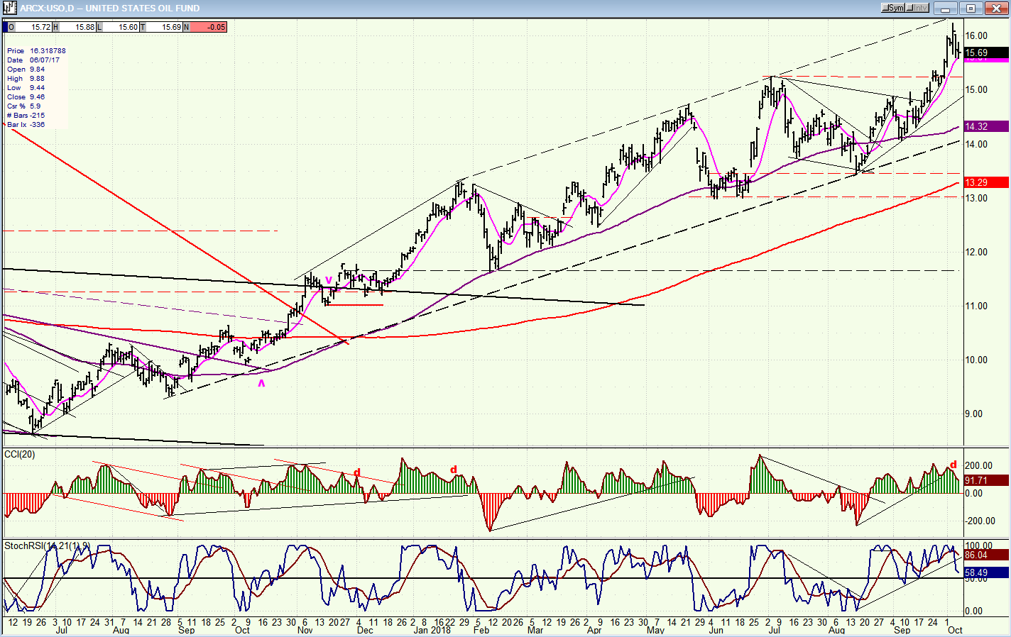
USO (United States Oil Fund)
USO did not wait around very long at its lower channel line, but quickly showed signs that it was ready to extend its uptrend. After a little conslidation, it should peak etween 17.00-17.50.
Summary
SPX has started a consolidation which has completed its initial a-phase and is retracing a portion of its decline as a b-wave. When this is finished, I would expect to see a new low before the corrective move is over and the index is able to resume its uptrend to new highs. ~3000 remains the preferred price level for the final top before a much more serious correction begins.
FREE TRIAL SUBSCRIPTON
With a trial subscription, you will have access to the same information that is given to paid subscribers, but for a limited time period. I think you will find that knowing how far a move can carry is one of the most useful benefits of this service, whether you are a trader or an investor -- especially when this price target is confirmed by reliable indicators which give advance warning of a market top or bottom. Furthermore, cycle analysis adds the all- important time element to the above price projections.
For a FREE 4-week trial, further subscription options, payment plans, and for general information, I encourage you to visit my website at www.marketurningpoints.com.
The above comments about the financial markets are based purely on what I consider to be sound technical analysis principles. They represent my own opinion and are not meant to be construed as trading or investment advice, but are offered as an analytical point of view which might be of interest to those who follow stock market cycles and technical analysis.
*********

When Andre Gratian was a stock broker years ago, a friend introduced him to technical analysis of the market. Consequently, it is not an exaggeration to say that Andre fell in love with this approach! Ever since then, it has become an increasingly important part of his professional life. Gratian has studied the works of Wyckoff, Edwards & Magee, Edward J. Dewey (cycles) and many others. However, one of my most profitable undertaking has probably been to study Point & Figure charting, which he finds invaluable in analyzing stocks and indices. If he were restricted to one methodology, this is the one that he would choose. This well-rounded background has given him what he feels to be a special insight into the stock market, facilitating the recognition of meaningful patterns and the ‘turning points’ in all trends, whether they be short or long term. Andre feels very comfortable discussing the stock market and passing on meaningful information to others. His subscribers include individuals and money managers throughout the world. Moreover, his Newsletters are currently published on several financial sites, here and abroad.


