Technical Analysis Of The Markets


SPX: Long-term trend: Severe correction underway.
SPX: Intermediate trend – Next down-phase close at hand.
Analysis of the short-term trend is done on a daily basis with the help of hourly charts. It is an important adjunct to the analysis of daily and weekly charts which discuss longer market trends.
IS THE BEAR RALLY ENDING AT A 50% RETRACEMENT?
Market Overview
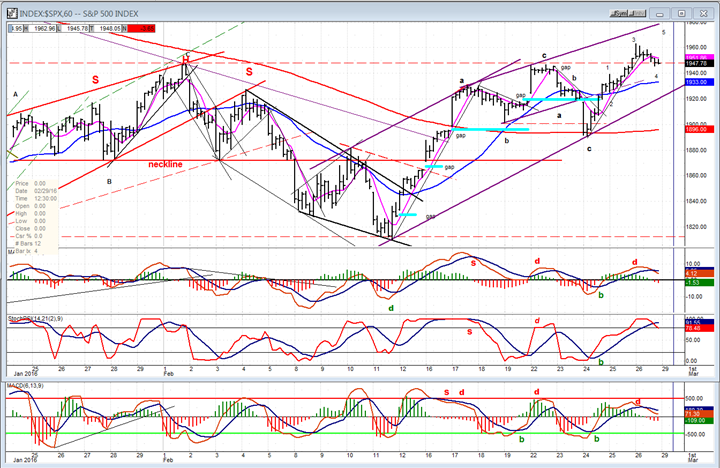
The last short-term top formed a Head&Shoulders pattern, which gave a projection that was almost filled by the following decline. Although there were some potential lower price projections, they were ignored by the SPX which created a double bottom with the January low of 1812, and started a rally from 1810 that rose 120 points to 1930 before taking a breather. After that, the uptrend continued, creating a pattern which, last week, lent itself to the following speculative forecast:
“If we do make an a-b-c pattern, will it complete the entire corrective rally, or only one phase of it? If it is followed by another minor a-b-c pattern to the downside, it could be in process of making an irregular which would complete with a 5-wave move to the upside.”
There is a 90% chance that this will turn out to be correct. As you will better see on the hourly chart (below), this looks precisely like what we are doing. Putting the final touch on this corrective pattern would spell the end of the “bear” market rally and set up the probability that the next bear phase is about to start. Just to make it a little more convincing, the following was also written last week:
“Also relevant is the probability that this time period is a cycle high and that some downside pressure should ensue.
The current market action makes next week a good candidate to put a final touch on the rally top.
SPX Chart Analysis
Daily Chart (This chart, and others below, are courtesy of QCharts.com.)
It is not easy to discern the path of short-term moves on a daily chart. As we will see, they are far more distinct on the hourly chart. But both time frames (as well as the weekly) are invaluable for a correct assessment of the market position.
Market analysis should always start with the longer trend. Defining it is essential in order to correctly identify the present and future trend of the market. The following daily chart has been condensed in order to show that the bull market which started in 2009 ended with a five-month pattern of distribution which, translated in Point & figure count, forecasted the severe correction which is currently underway. We know that during this six-year bull market, the S&P 500 rose 1469 points. If we assume that what we are witnessing is a normal correction of the previous uptrend and use a simplistic formula (.382 measurement) to determine its extent and duration, we come up with a decline of 600 points which should last a little over 2 years years! Granted, the actual measurements could vary substantially by the time it’s over. It is interesting, however, that the combined three phases of the primary distribution top, give us a count of 612 points! That would bring the index down to the 1500 level before the correction is over. Of course, that should be considered a minimum measurement. If we were to retrace 50% of the bull rise, we would drop 750 points to about 1400, and there is plenty of “weak” count to the left of the top to accommodate this projection.
OK! We can see that we made a large distribution top, broke out of the blue intermediate channel in August of last year, found support on the long-term trend line, had a good bounce, re-tested support six weeks later, rallied to back-test the lower channel line of the blue intermediate channel, formed an area of secondary distribution, and then started on the second leg of the long-term correction. Then, we essentially repeated the August-September pattern by making another double bottom at the 1810 level, and began another corrective rally. During the second phase of the decline, we broke below the long-term trend line, and have now made two attempts (back tests) at getting back above it. The second attempt is underway and is deemed to fail, just as the first one did.
The corrective rally from 1810 has now retraced 50% of the previous decline and is showing signs of coming to an end. Above, I have already discussed the wave pattern which apparently needs only one more minor up-wave to complete it. After that, we should start on the next down phase of the primary trend and eventually break below the double bottom.
The momentum indicators still have some remaining strength and are not showing negative divergence. This suggests that the initial decline from this top may be limited until they have completely rolled over, which could mean that additional distribution will form before we move to new lows. However, the A/D indicator (which is always the early bird) leaves little doubt that we are reaching the top of the rally by exhibiting strong negative divergence.
In other words, everything points to next week for the end of the corrective rally.

Hourly Chart
On this chart, the structure of the uptrend is easy to see. I have labeled the phases as a-b-c, a-b-c, 1-2-3-4 with wave 5 still missing but expected to make a slightly new high next week, unless it truncates. The entire trend from the 1810 low is showing deceleration with the top trend lines angling over more and more. If wave 4 is already in place, the final wave could start and conclude by Monday or Tuesday. The confirmation that the rally is over will come when we break the uptrend line from the 1910 low, and drop below 1890.
The three oscillators also suggest that we are at or near a top. They have already started to turn down after the A/Ds and the MACD showed some negative divergence. If there is a final small wave up, all the indicators will show additional divergence, unless exceptional strength appears. This is not expected. The only question is: Is one more up-wave really necessary?
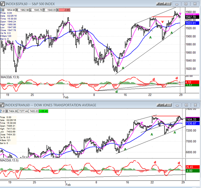
SPX vs. TRAN (Dow Jones Transportation Average)
I am also using hourly charts to show the relative trend of the TRAN to the SPX. Starting with the 1812 low, the TRAN showed strong relative strength to the SPX. This stopped when we made the 1810 low and started the current rally. From that point, both indexes began to make essentially the same pattern. Now, it appears that TRAN is beginning to show some weakness relative to the larger index. At the last minor top, SPX made a new high, but TRAN did not. Of course, this disparity is relatively small at this point, but it could be another warning sign, especially if it increases as we move forward.
UUP (Dollar ETF)
For UUP, the bounce from the trend line extension is beginning to look like a genuine rally, especially since it gapped over the 200-DMA in the last few days. We’ll see how much follow-through it is capable of, now that it has reached its upper downtrend line as well as overhead resistance. Let’s keep in mind that, according to its P&F base count, it is capable of rising to about 30. It now looks as if the 11-month consolidation has created enough of a count to confirm the one determined by the base. That could mean that its next uptrend to a new high (about 30) is in the process of starting.

GLD (SPDR Gold Trust)
GLD’s initial break-out surge has encountered its first significant obstacle to moving higher immediately. Actually, there are two obstacles in the form of two top channel lines. The most important one is obviously the red downtrend line which starts in mid-2013. This almost guarantees that GLD will need to consolidate for a while before being able to break through. A short-term top appears to be forming, which should determine how much of a pull-back we can expect before GLD starts building a base that will allow it to move outside of its red channel. The consolidation time required could take several weeks.

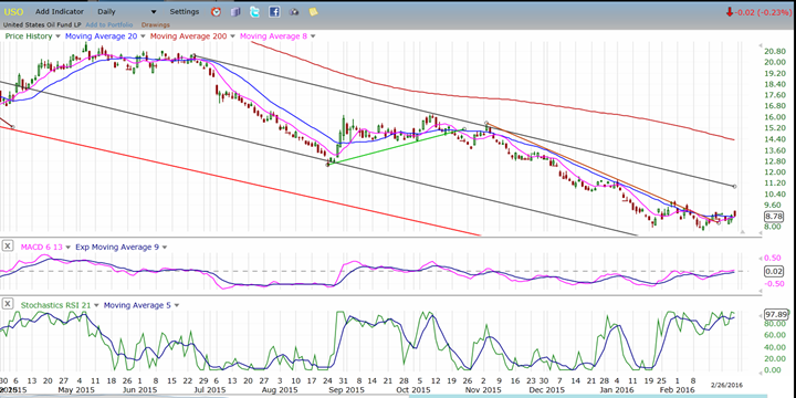
USO (US Oil Trust)
USO probably made an important low when it reached 8 and, although it might be tested several times, it is likely to hold as the index forms a base from which it can eventually start another uptrend. Both fundamental and technical factors support this outlook.
Over the short-term, USO has had significant influence over minor market moves, but there are already signs that this influence is waning, and this should increase as it becomes more and more apparent that USO has nowhere to go for the foreseeable future.
Summary
My analysis suggests that the SPX counter-trend rally, which started at 1810 on 2/11 has run its course and risk is increasing that the next intermediate phase of the larger correction is about to start, probably as soon as another short wave up has occurred to complete the corrective formation.
It is possible and even likely that the 1810 low may hold for a while as some additional distribution is created above that price level. That could include some sort of re-test of the current high after an initial decline -- possibly a 1-2 wave formation.
********
FREE TRIAL SUBSCRIPTON
Market Turning Points is an uncommonly dependable, reasonably priced service providing intra-day market updates, a daily Market Summary, and detailed weekend reports. It is ideally suited to traders, but it can also be valuable to investors since highly accurate longer-term price projections are provided using Point & Figure analysis and Fibonacci projections. Best-time reversal estimates are obtained from cycle analysis.
For a FREE 4-week trial, send an email to: [email protected]
For further subscription options, payment plans, weekly newsletters, and for general information, I encourage you to visit my website at www.marketurningpoints.com. By clicking on "Free Newsletter" you can get a preview of the latest newsletter which is normally posted on Sunday afternoon (unless it happens to be a 3-day weekend in which case it could be posted on Monday).
The above comments and those made in the daily updates and the Market Summary about the financial markets are based purely on what I consider to be sound technical analysis principles. They represent my own opinion and are not meant to be construed as trading or investment advice, but are offered as an analytical point f view which might be of interest to those who follow stock market cycles and technical analysis.

When Andre Gratian was a stock broker years ago, a friend introduced him to technical analysis of the market. Consequently, it is not an exaggeration to say that Andre fell in love with this approach! Ever since then, it has become an increasingly important part of his professional life. Gratian has studied the works of Wyckoff, Edwards & Magee, Edward J. Dewey (cycles) and many others. However, one of my most profitable undertaking has probably been to study Point & Figure charting, which he finds invaluable in analyzing stocks and indices. If he were restricted to one methodology, this is the one that he would choose. This well-rounded background has given him what he feels to be a special insight into the stock market, facilitating the recognition of meaningful patterns and the ‘turning points’ in all trends, whether they be short or long term. Andre feels very comfortable discussing the stock market and passing on meaningful information to others. His subscribers include individuals and money managers throughout the world. Moreover, his Newsletters are currently published on several financial sites, here and abroad.
More from Gold-Eagle


