Technical Analysis Of The Markets


Current Position of the Market
SPX Long-term trend: The beginning of a lengthy correction is most likely underway!
SPX Intermediate trend: Correcting.
Analysis of the short-term trend is done on a daily basis with the help of hourly charts. It is an important adjunct to the analysis of daily and weekly charts which discuss longer market trends.
FIRST SUPPORT LEVEL TESTED
Market Overview
On Friday SPX surpassed its initial downside phase projection of 2043 by a few points and bounced. That is also the price level from which the index, after a two-week consolidation, launched its final rally of the uptrend which started at 1810 and ended at 2111. This makes the 2043 price level a very import support from which a short-term rally should be expected. How much and how long a rally, before that level is broken, will give us some clues about the SPX’s condition. Since the current cycle phase is expected to pressure prices until June, 2043 is estimated to hold only temporarily (as well as the next important level of support at 2020).
After the jobs number came in lower than anticipated, and before the market opened for trading, SPX was sold down to 2036, but bargain hunters were quick to step in and bring it back to a more respectable level by the opening. Afterwards, cash traded above 2040 for a couple of hours and started moving out of its base, ending up 17 points from its low by the close.
Leading indexes behaved similarly, all ending at or near their high of the day…thereby suggesting that the rally could extend into this week -- though some backing and filling is still possible.
SPX Chart Analysis
Daily Chart (This chart, and others below, are courtesy of QCharts.com.)
The supposition that we had a H&S pattern in place at the top was vindicated by the market action. There was an initial decline below the neckline, followed by a rally to the neckline, and then a drop to the minimum projection for this H&S formation. It will be interesting to see if the correction in a downtrend that we started on Friday produces an even larger, massive H&S top by the time that the consolidation is over. I have estimated what would be the neckline and the right shoulder of this potential new pattern. If this materializes, there would be very few analysts left to argue the bullish case.
So far SPX has corrected 71 points from its rally high of 2011, making this the largest pull-back since the uptrend started at 1810. There are several good reasons to expect the decline to continue after a short consolidation in a downtrend. But first, the index will have to break below the strong support level which was tested on Friday. If, by chance, it fails to go through it and simply consolidates before moving higher, it will change the course of the expected future trend and will most likely go on to make new highs. The next few weeks should confirm the market’s long-term intentions.
I have placed a green horizontal line at the price level which would be a 0.382 Fibonacci Retracement of the entire uptrend. Not only would it be logical for the larger correction to reach that level, but it closely coincides with the count generated by the top distribution area which extends across the H&S formation..
The lead indicators (A/D and SRSI) have started to curl upwards which is consistent with the index having found a temporary low, and preparing for a rally.

Hourly Chart
The hourly chart shows even more clearly the breaking of the neckline, followed by a rally to it, before continuing the correction. You could not ask for better conformity. Moreover, the distance from the top of the right shoulder to the low of the correction amounted to 1.618 of the distance from the head to the neckline. Technical analysis works, folks, as long as it is used knowledgeably and objectively! You might also notice that the index found support on the bottom (dashed) trend line which represents the bottom channel line.
As mentioned above, the low also observed the first key support level which is represented by a horizontal purple line. There are two more below, with the last one drawn at the 2020 level. All three must be penetrated sooner rather than later if we are to remain long-term bearish, although that would by no means be enough of a confirmation that we are in a major bear market. It would only be the first minimum requirement, to be followed by more even more crucial ones.
As you can see, for the past couple of days, the indicators were showing positive divergence, even from the next to the last low, causing some uncertainty about whether or not our full price projection would be reached. With Friday’s rally which sent prices outside of the black downtrend line, the indicators turned higher and established the beginning of an uptrend, suggesting that the index should also move outside of the steeper red trend line -- perhaps going as far as challenging the top of the rally to the neckline if enough buying materializes. But first, the red trend line will have to be breached.

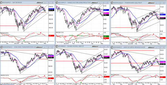
SPX et al…
The five leading indexes (which are compared to the SPX, below) all show clear relative weakness to that index. It is also clear that QQQ (NDX) and SMH (semiconductors) which represent the tech sector are leading the pack on the downside. They have both decisively dropped below their comparable 2043 level of the SPX.
Next in relative weakness is the TRAN followed by XBD and finally IWM (Russell 2000). But don’t let that last one fool you! IWM is actually the weakest of them all when it comes to its relative position to where it was at the October 2015 low. On all the charts, that low is represented by the second lower red horizontal line on the left. That makes IWM at least as weak as the TRAN over the intermediate term, and perhaps even a little weaker.
UUP (Dollar ETF)
This time, when it made a new low, UUP went to the very bottom of the red channel where it found support and reached a price which also corresponds to a P&F projection. This could mean that it is now ready to start a genuine uptrend instead of continuing to decline. The indicators, which showed positive divergence at the low, enhance this possibility. Even with the new low, the entire pattern from March 2015 continues to look corrective and perhaps even complete. I have to keep in mind that UUP has a higher base count which can take it near 30 before it is filled.
The way that UUP bounced off its lower channel line suggests that it may have no problem going through its downtrend line. It is also noteworthy that UUP was up on Friday after a weaker than expected jobs report.

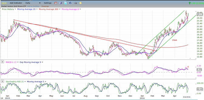
GDX (Gold Miners ETF)
It is obvious that the gold miners are far stronger than gold itself. All you need to do is to glance at the two charts below. It is also very likely that for both indexes, the action of the last couple of days represents a re-test of the highs which may fail to make it all the way to the top. This would especially be the case if UUP breaks its downtrend line and stages a strong follow-through on the upside.
Let’s not forget that UUP and GLD may now be within hearing distance of the sirens which are calling them to the low of the 25-wk cycle due over the next couple of weeks, and to which they will be responding inversely. That should bring a well-deserved correction to both extended indexes.

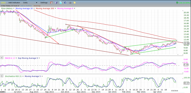
USO (US Oil Trust)
I thought that USO might advance for another point before starting to build its base, but it may not have the strength to break out of is top channel line. If this turns out to be an a-b-c correction from the Feb. low, we could even see another slightly lower low as it completes a fifth wave down from its 21.23 high.
Summary
SPX appears to have completed the first phase of its correction on Friday by reaching a P&F phase correction as well as a strong support level. This price area also corresponded to a normal downside projection for the H&S pattern which formed as a top. It should bring about a rally which may be strong enough to carry it back to 2075 -- a 50% retracement of the move down from 2111.
This retracement would enhance the possibility that it could form a right shoulder of an even larger H&S top which, when broken, would leave no doubt that we have started a major correction. But this is only speculative at this point. We’ll know more in a week or two.
********
FREE TRIAL SUBSCRIPTON
Market Turning Points is an uncommonly dependable, reasonably priced service providing intra-day market updates, a daily Market Summary, and detailed weekend reports. It is ideally suited to traders, but it can also be valuable to investors since highly accurate longer-term price projections are provided using Point & Figure analysis and Fibonacci projections. Best-time reversal estimates are obtained from cycle analysis.
For a FREE 4-week trial, send an email toFor further subscription options, payment plans, weekly newsletters, and for general information, I encourage you to visit my website at www.marketurningpoints.com. By clicking on "Free Newsletter" you can get a preview of the latest newsletter which is normally posted on Sunday afternoon (unless it happens to be a 3-day weekend in which case it could be posted on Monday).
The above comments and those made in the daily updates and the Market Summary about the financial markets are based purely on what I consider to be sound technical analysis principles. They represent my own opinion and are not meant to be construed as trading or investment advice, but are offered as an analytical point f view which might be of interest to those who follow stock market cycles and technical analysis.

When Andre Gratian was a stock broker years ago, a friend introduced him to technical analysis of the market. Consequently, it is not an exaggeration to say that Andre fell in love with this approach! Ever since then, it has become an increasingly important part of his professional life. Gratian has studied the works of Wyckoff, Edwards & Magee, Edward J. Dewey (cycles) and many others. However, one of my most profitable undertaking has probably been to study Point & Figure charting, which he finds invaluable in analyzing stocks and indices. If he were restricted to one methodology, this is the one that he would choose. This well-rounded background has given him what he feels to be a special insight into the stock market, facilitating the recognition of meaningful patterns and the ‘turning points’ in all trends, whether they be short or long term. Andre feels very comfortable discussing the stock market and passing on meaningful information to others. His subscribers include individuals and money managers throughout the world. Moreover, his Newsletters are currently published on several financial sites, here and abroad.
More from Gold-Eagle


