Technical Analysis Of The Markets


SPX: Long-term trend – Still a Bull Market
SPX: Intermediate trend – The index may have made a secondary top at the 2116 level and started another decline of intermediate duration.
Analysis of the short-term trend is done on a daily basis with the help of hourly charts. It is an important adjunct to the analysis of daily and weekly charts which discuss longer market trends.
MORE CORRECTION AHEAD
Market Overview
After making a marginal new high, the index retraced and pulled-back all the way down to the critical 2044 level, closing right on its low of the day and of the week in the last minutes of trading. The bulls attempted to rally shortly after the opening, encouraged by a minor surge in oil prices, but neither oil nor SPX were able to extend their gains, and prices fell back. The battle for the 2044 level, however, may not be over! Immediately after the close, futures surged 14 points, ending up at 2058! We must now wait until Monday morning to find out who will start the new year with an advantage. Technically and very short-term, bulls appear to have it.
All three major indices (NYSE, DJIA, and SPX) have been in a moderate correction since early November when SPX concluded a secondary rally at 2116. In two months, it has only lost about 70 points. This has caused it to form a mild corrective pattern (although the swings within it have been very volatile) which will remain in an intermediate downtrend until the index can break above 2103 and follow through on the upside. Based on cycle analysis (as per Eric Hadik’s www.insiidetrack.com), this intermediate correction is expected to continue another 3 or 4 months before it ends. Should this scenario be correct, and should prices hold above 1868, the pattern could be considered an extension of primary wave IV, with primary wave V starting sometime around April. While important distribution occurred in all the indices between March and August (with a high of 2135 in the SPX) there is still no conclusive indication that the latter will not eventually reach its 2009 potential P&F base projection of 2240.
NYSE Daily Chart Analysis
(The following chart, as well as others below, are courtesy of QCharts.com). Since the secondary high of early November, the NYSE has not only retained its relative weakness to SPX and DJIA, but has increased it. That makes it a little more of a challenge to break out of its downtrend. All three indices are in a minor uptrend within the larger pattern, and they may have one last chance to break out on the upside before rolling over and heading for a new low if that fails. Should more weakness develop over the near term, NYSE would most likely challenge its long-term uptrend line once again. In the last letter, I hinted that this could take us one step closer to being in a bear market; but more than simply breaking the trend line will be needed. It will also need to breach the August low to establish a longer term downtrend pattern.
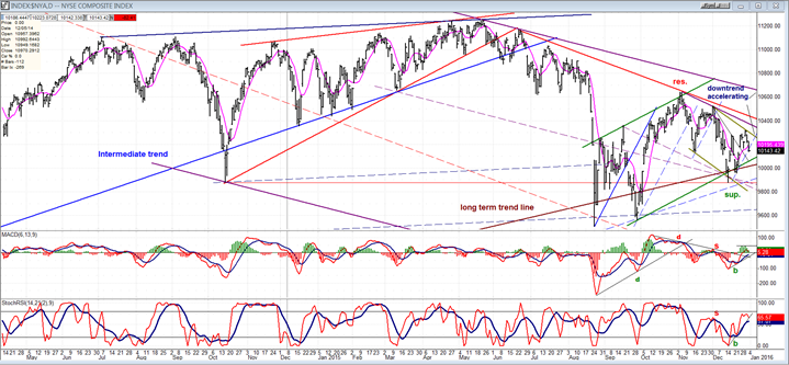
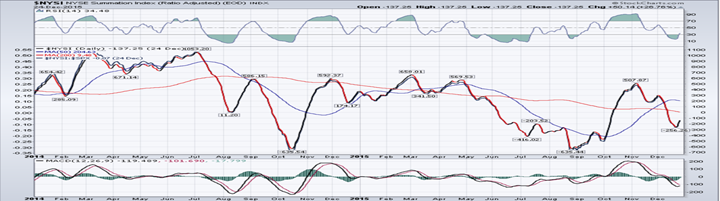
The NYSI (courtesy of StockCharts.com) which is posted below the price chart, had developed some good upside momentum during the secondary rally which started in October. But since the early November peak, it too has become relatively weaker than even the NYSE, and has had difficulty establishing a low and even more of a problem trying to get back into an uptrend. If breadth continues to underperform to this degree during the remainder of the December rally, it would confirm the forecast for additional weakness into March/April.
Chart Analysis of SPX
Weekly chart
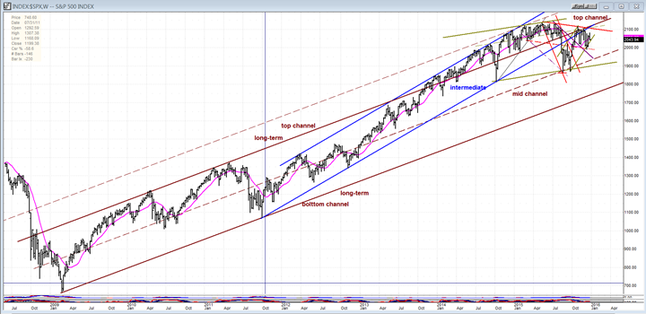
I am posting two weekly charts of the SPX: one spanning the entire bull market, then a close-up of the current action. They are both important in helping us understand its current technical position.
The first one demonstrates the strength of this bull market which resulted from the Fed’s policy of keeping interest rates at a minimum for a long period of time. The brown and blue channels are our concern, here. They are both drawn conventionally i.e. first, a line connecting the first two bottom points, and then a parallel across the first top. For some time, the index remained within the main channel (solid brown lines), but as the Fed extended its QE program, it grew stronger and jumped the top of the channel in early 2014, only coming back inside of it when the August correction occurred (7-year cycle low ?). That correction took it all the way down to the mid-channel line where it found support, re-bounding to the top of the brown channel where it then ran into resistance.
The blue intermediate channel started after the October 2011 correction and remained intact until its lower channel line was also broken by the August correction. The re-bound after the 7-year cycle low took it not only to the top of the brown channel, but at the same time caused it to back-test the broken bottom line of the blue channel. Let’s now move to the next chart where we can analyze recent action in more detail.
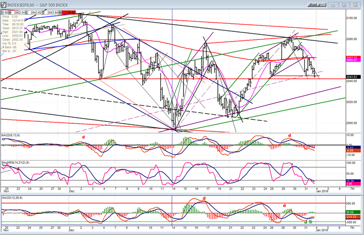
You know by now that trend lines, parallels and channels play an important part in my analysis. So let’s start by looking at the August correction (identified by a red channel) which took the index back inside the long-term channel and at the same time caused it to break out of the blue channel on the downside. It ended when SPX came out of it in early October. At the same time, it broke out of a larger black channel which had also formed during the correction. This channel is important because its top line serves as support for the on-going correction from the secondary top of 2116.
The current uptrend from the August/September lows is delineated with light green channel lines. Prices have traded volatilely within them since its formation and, after a couple of attempts at breaking out of it, they have remained in a general uptrend within the confines of that channel, but with a near-term downward bias.
Now, let’s go back to that secondary top made in November! This is where the rally which started from the second bottom on September 29 at 1872 made its high of 2116 when it encountered severe resistance which it tried to break through, but failed. That resistance consisted primarily of the bottom intermediate channel line (blue), and even more important, the top trend line of the long term channel (brown). We should note that the junction of these two trend lines (aided by the overhead resistance to the left of that peak) were primarily responsible for stopping the rally and starting the brand new up-phase of the next 7-year cycle. Because their actual junction is in mid-January, they will continue to provide strong resistance if the current rally from 1872 tries to extend higher.
Adding to that resistance is the red downtrend line drawn across the July and November peaks, and (to a lesser extent) the dashed light green parallel to the trend line across the last two high points in the index (February and May). If the current rally from mid-December (1994) tries to extend higher, it will most likely be stopped by the resistance created by all these converging trend lines.

A quick look at the weekly indicators tells us that they remain in a sell mode, although the SRSI is currently trying to re-establish an uptrend.
Hourly Chart
We’ll by-pass the daily chart and go directly to the hourly. Last Thursday, SPX closed near the 2040 level which has acted as a strong support level since March. All of the trading until the August decline remained above it and, since the surge from 1872, the same thing seems to be repeating itself; prices remain predominantly above 2040, seemingly forming another range of distribution. If there is some follow-through to the downside on Monday, the index could immediately challenge the bottom channel line of the uptrend from 1868 and 1872, but that does not seem likely.
I have already mentioned that futures soared 14 points after the close on Thursday, and the more likely scenario is that there will be an attempt at extending the current uptrend from 1994 for another day or two. One reason is that the daily indicators remain barely, but still, positive. Also, when we look at the hourly indicators, the SRSI is oversold, the MACD histogram is showing some positive divergence and, most importantly, so is the A/D oscillator which has also begun to issue a buy signal. It looks as if the 2040 level is likely to hold one more time.
As far as the odds for challenging the 2103 and 2116 levels at this time: this is not likely because of the resistance which appears on this chart starting a little below 2080, and the much stronger band just above 2100.
TRAN (Dow Jones Transportation Average)
The technical condition of the TRAN is similar to that of the NYSE. It has steadily led the SPX downward since they both made their highs and, like the NYSE, it has been in a protracted intermediate decline which has been relatively weaker than SPX. This could be about to change. The TRAN has reached the bottom of its declining channel where it could find support. More importantly, it has reached the dashed blue line which represents a 100% expansion of the width of the original intermediate (blue) channel which was penetrated to the downside in June, and warned of the coming August decline in the market. It is often the case that a price channel will expand to twice its width before support is found and the corrective pattern comes to an end. Additionally, like the NYSE, the TRAN is approaching the bottom of its long-term bottom channel line which should also provide important additional support.
Both the NYSE and TRAN combined makes it much easier to correctly assess the longer term position of the entire market. It is clear that both have entered intermediate corrective patterns which may soon be ending and, as they have provided warnings of a market correction, they may give us an inkling of when the fifth and final phase of the bull market will begin.

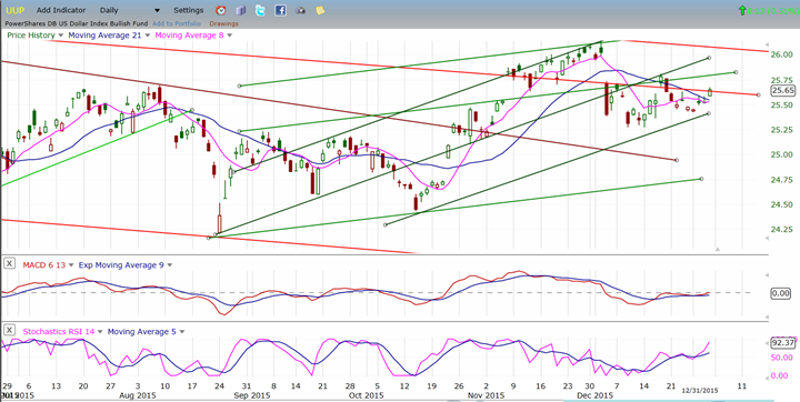
UUP (Dollar ETF)
UUP has consolidated long enough and could be ready to resume its short term uptrend and complete the phase which started in August, by making a new high before going into a more extensive consolidation period. By continuing to rally over the short term, it would also help oil and gold to reach their final intermediate (and perhaps long-term) destinations.
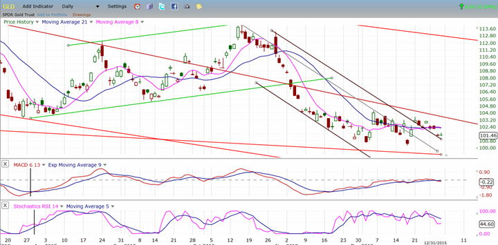
GLD (Gold Trust)
It’s easy to notice some inverse similarity of patterns in GLD and UUP -- even though they do not correspond exactly on a time basis. I have mentioned several times that a final move down to about 97/98 would be appropriate for GLD over the short-term -- although there are also reasonable projections to 93/94 which could come later if good support is found at the higher level. Completing its final phase of a long term correction would put GLD in a technical position to start a good rally.
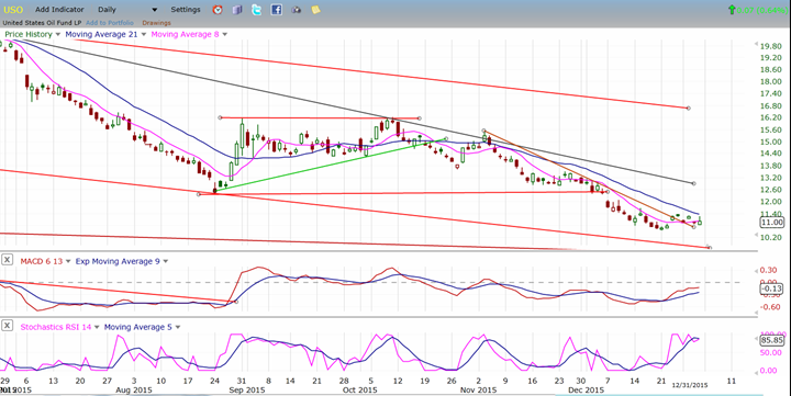
USO (United States Oil Fund)
Another attempt by oil to rally over the short term appears to have failed, although we will know better next week if this is the case. Certainly, if UUP does start to extend its rally, it will not help oil recover; on the contrary, it could help it move closer to its long-term target of 8.
Summary
The analysis of the weekly SPX chart gives us a better sense of what the index is doing. Taking into consideration the intermediate term cyclic climate, we could easily see an intermediate correction starting at the secondary high of 2116 continue into March or April. During the next few weeks, the NYSE and TRAN – both of which give us a better picture of the current market consolidation – could complete their corrections, stabilize, and start to lead the market on the upside to complete primary wave V of the bull market. This is the preferred scenario.
********
FREE TRIAL SUBSCRIPTON
Market Turning Points is an uncommonly dependable, reasonably priced service providing intra-day market updates, a daily Market Summary, and detailed weekend reports. It is ideally suited to traders, but it can also be valuable to investors since highly accurate longer-term price projections are provided using Point & Figure analysis and Fibonacci projections. Best-time reversal estimates are obtained from cycle analysis.
For a FREE 4-week trial, send an email to: [email protected]
For further subscription options, payment plans, weekly newsletters, and for general information, I encourage you to visit my website at www.marketurningpoints.com. By clicking on "Free Newsletter" you can get a preview of the latest newsletter which is normally posted on Sunday afternoon (unless it happens to be a 3-day weekend in which case it could be posted on Monday).
The above comments and those made in the daily updates and the Market Summary about the financial markets are based purely on what I consider to be sound technical analysis principles. They represent my own opinion and are not meant to be construed as trading or investment advice, but are offered as an analytical point f view which might be of interest to those who follow stock market cycles and technical analysis.

When Andre Gratian was a stock broker years ago, a friend introduced him to technical analysis of the market. Consequently, it is not an exaggeration to say that Andre fell in love with this approach! Ever since then, it has become an increasingly important part of his professional life. Gratian has studied the works of Wyckoff, Edwards & Magee, Edward J. Dewey (cycles) and many others. However, one of my most profitable undertaking has probably been to study Point & Figure charting, which he finds invaluable in analyzing stocks and indices. If he were restricted to one methodology, this is the one that he would choose. This well-rounded background has given him what he feels to be a special insight into the stock market, facilitating the recognition of meaningful patterns and the ‘turning points’ in all trends, whether they be short or long term. Andre feels very comfortable discussing the stock market and passing on meaningful information to others. His subscribers include individuals and money managers throughout the world. Moreover, his Newsletters are currently published on several financial sites, here and abroad.


