Technical Analysis Of The Markets


Current Position of the Market
SPX Long-term trend: Uptrend continues with a serious loss of upside momentum in weekly indicators.
SPX Intermediate trend: An ending-pattern appears to be forming.
Analysis of the short-term trend is done on a daily-basis with the help of hourly charts. It is an important adjunct to the analysis of daily and weekly charts which discuss longer market trends.
Running Out Of Steam
Market Overview
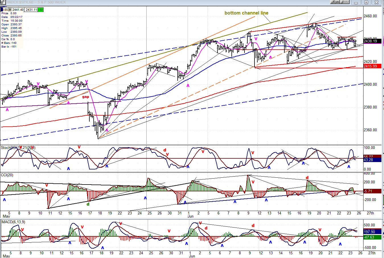
Since SPX touched 2440 in early June, it has been trading sideways in a 30-point range which very much looks like distribution. On the Point & Figure chart, we can count over 250 one-point reversals during that time span. That does not mean that if we start a correction on Monday, the index will have a decline of 250+ points. The one-point chart is very good for estimating the extent of minor moves, but the 10-point chart is much better for estimating moves of intermediate duration. The pattern which is being made by that chart does not look complete and will probably need more time before we can draw some meaningful conclusions about the extent of any correction.
Structurally, there isn’t much doubt that SPX is forming an ending pattern which may have completed at 2353 last Monday. Yes, we discussed the potential for 2500 but it would be a miracle if the index could reach that level before correcting, first. So, next week should tell us a little more about what the market wants to do. After the tech bust of a couple of weeks ago, we suggested that SPX could make a new high at 2455 and perhaps even higher. We’ve reached 2453 and turned down, building a little congestion area between 2431 and 2441. If we can get past 2441 next week, we could get up to 2458-60, but that would probably be the extent of the rally. If, instead, we trade below 2431, we are looking to retest the 2416-20 level, at a minimum.
Analysis: (These Charts and subsequent ones courtesy of QCharts.com)
Daily Chart
Ever since late March, SPX has continued to trade within the second quartile of the blue channel which starts at 1810. After the correction from 2400, two patterns have formed within that trading range. The first one is included between the two red vertical lines which appears to be reproduced by the next pattern as part of a fractal. All the latter needs to become a duplicate, is a minor decline. If that is the only correction we get, there is a good chance that we would go on to form one more similar pattern that could then extend to about 2500 (which was the original count) before we start a larger correction. This would also satisfy the structure expected by some EWT analysts, and fit within the cycle rhythm which anticipates a 20-wk low in mid-August that would complete the third pattern.
I know that this is expecting the market to behave in a specific manner over the next couple of months; whereby it could deviate from it in a dozen different ways. But there is some logic to this supposition which deserves consideration. Since we don’t have to be attached to it, let’s just watch if this is the way things unfold and make adjustments to the suggestion if/when necessary.
As for the short-term, there is a much greater chance that we are about to duplicate the first pattern. Besides the similarity of the two structures, we also have warnings from the oscillators that a decline is about to start. Ths daily SRSI has already given a sell signal and the CCI (above) is in a position from which it could easily follow. The behavior of the A/Ds may be a fly in the ointment. They have been strong throughout the consolidation of the the past two days, and closed strong on Friday. This could suggest that another move to about 2458-60 may be needed before we can get our minor correction.

Hourly Chart
On this chart, the dashed blue lines represent the second quartile of the large blue channel shown above. The top, greenish line is the extension of the bottom line of a short-term channel drawn from 2084. It has added itself to the top dashed blue line to form resistance which the index could not get above. You will also note that there is an even shorter orange channel which has been broken to the downside; but that has not sent the index into a steep correction. This means that, despite the obvious price deceleration, there is still plenty of strength left in this move and it would not be surprising to see one more rally to the dashed blue line at the top before we dip down to the 2416-20 level.
The hourly oscillators could accommodate either scenario, perhaps favoring the first. As I mentioned earlier, the A/Ds have remained strong, and the momentum oscillators were still on neutral at Friday’s close.
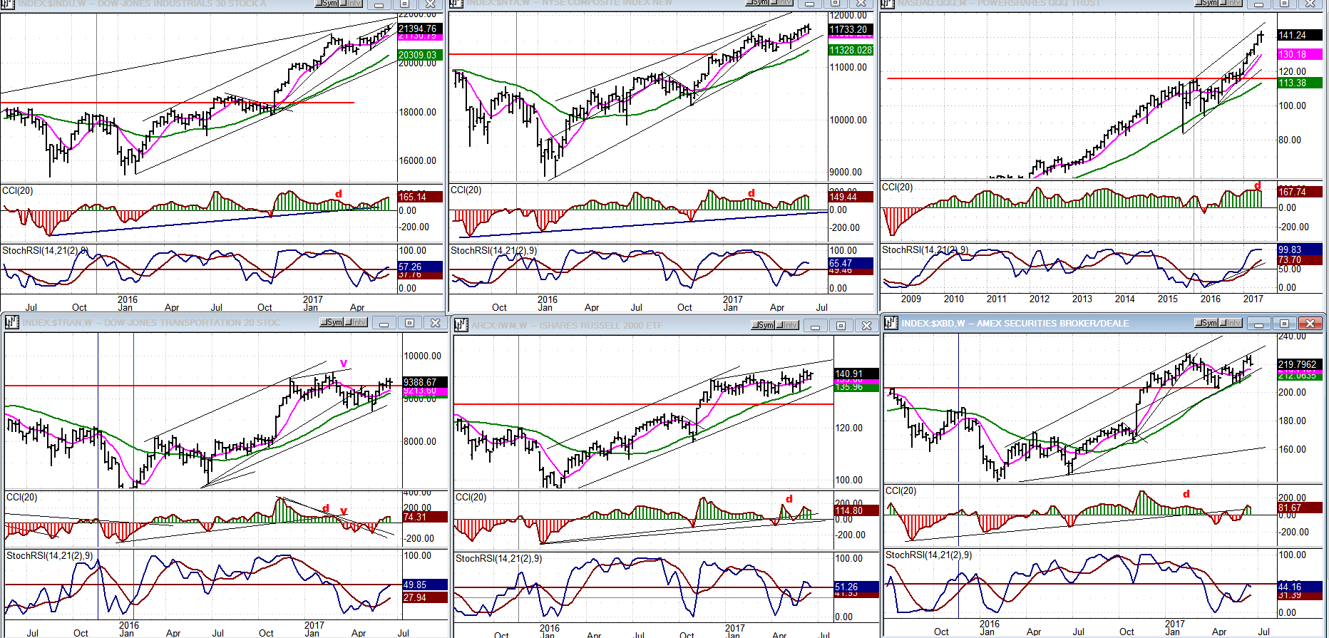
An Overview Of Some Important Indexes (Daily Charts)
There is not much to say about the charts we have assembled to help us gauge future market direction. The top tier remains in an uptrend and the bottom one in a sideways move. But the two top left charts (DJIA and NYA) have been going up by small weekly increments since their last lows, and that is a sign of deceleration and loss of upside mojo.
UUP (Dollar ETF)
UUP has followed a deceleration pattern (upon reaching the bottom of the correction channel) with a bounce which does not look capable of making it to the top of the channel, yet. This may require more preparation in the form of base-building -- perhaps even with a slightly lower low, since there is a potential count down to 24.50.

GDX (Gold Miners ETF)
GDX had a good bounce after its 25-day and 90-day cycles bottomed, simultaneously. If it can get past the trend lines and MAs which stopped its advance on Friday, it could extend its rally, but it should eventually pull back into the 9-10wk cycle before moving higher. If it can get to 23.50 and then pull-back into the cycle low while remaining at 22.50, it will have built an important base capable of supporting an intermediate uptrend.
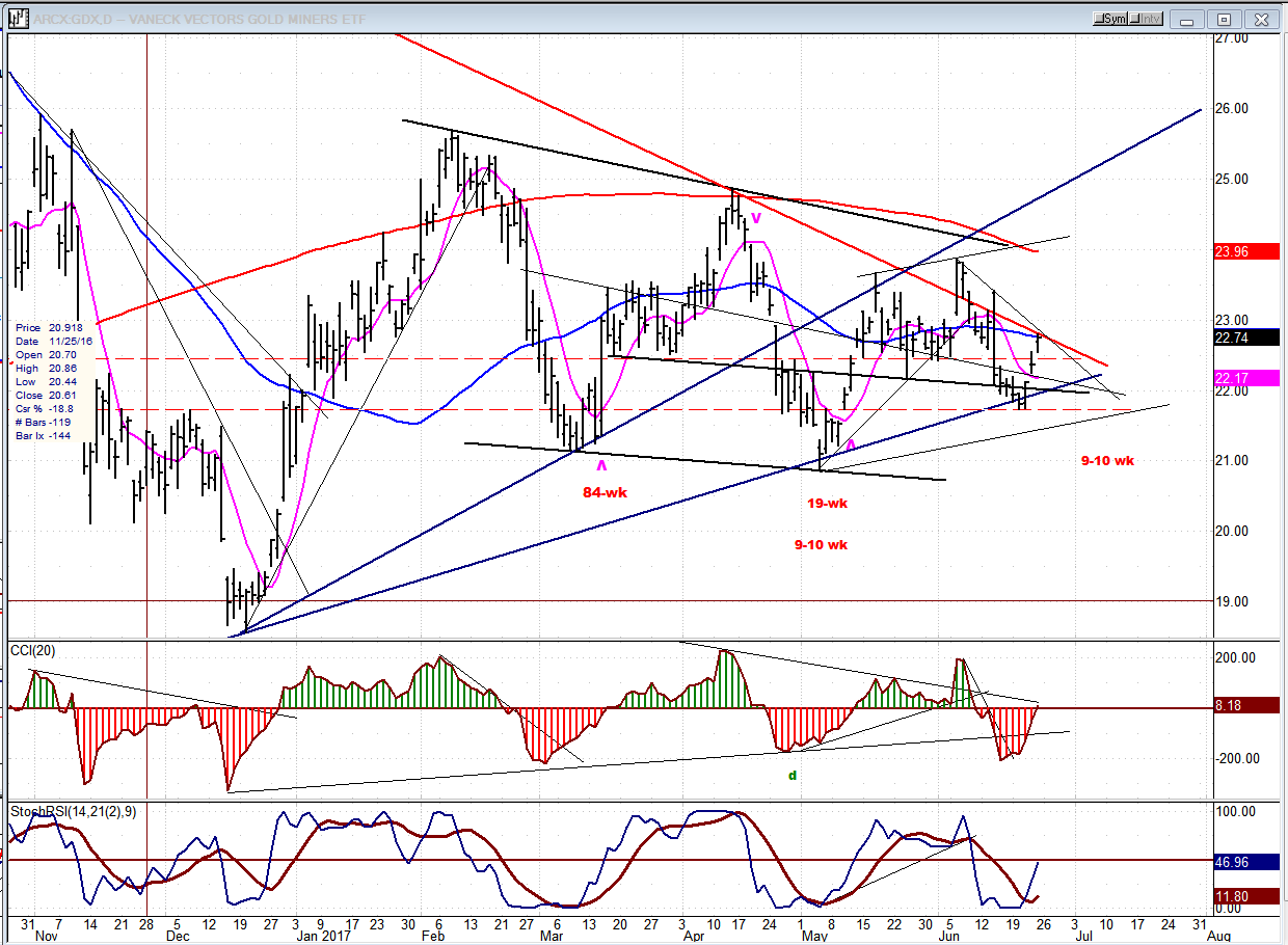
Note: GDX is now updated for subscribers throughout the day, along with SPX.
USO (US Oil Fund)
USO has returned to the low of its base -- about a point above the major low made during 2/16. Not only is that level strong support, but USO is also near filling a count generated by the above distribution pattern marked on the chart. Furthermore, it is at the bottom of an intermediate channel, and the oscillators are making favorable patterns for a low. Things often come in threes or fives in the stock market, and you could not get a better five-wave pattern to the downside if you drew it yourself. USO could be near an important reversal, though not necessarily ready for an extended move to the upside.

Summary
Structure suggests that SPX is near a correction, but could still make a slightly higher high if it can get past 2442. A move below 2430 should lead to a re-test of the 2416-20 support, at a minimum.
********
For a FREE 4-week trial, send an email to [email protected], or go to www.marketurningpoints.com and click on “subscribe”. There, you will also find subscription options, payment plans, weekly newsletters, and general information. By clicking on "Free Newsletter" you can get a preview of the latest newsletter which is normally posted on Sunday afternoon (unless it happens to be a 3-day weekend, in which case it could be posted on Monday).
The above comments and those made in the daily updates and the Market Summary about the financial markets are based purely on what I consider to be sound technical analysis principles. They represent my own opinion and are not meant to be construed as trading or investment advice, but are offered as an analytical point of view which might be of interest to those who follow stock market cycles and technical analysis.

When Andre Gratian was a stock broker years ago, a friend introduced him to technical analysis of the market. Consequently, it is not an exaggeration to say that Andre fell in love with this approach! Ever since then, it has become an increasingly important part of his professional life. Gratian has studied the works of Wyckoff, Edwards & Magee, Edward J. Dewey (cycles) and many others. However, one of my most profitable undertaking has probably been to study Point & Figure charting, which he finds invaluable in analyzing stocks and indices. If he were restricted to one methodology, this is the one that he would choose. This well-rounded background has given him what he feels to be a special insight into the stock market, facilitating the recognition of meaningful patterns and the ‘turning points’ in all trends, whether they be short or long term. Andre feels very comfortable discussing the stock market and passing on meaningful information to others. His subscribers include individuals and money managers throughout the world. Moreover, his Newsletters are currently published on several financial sites, here and abroad.


