But Those Were the Bad-Old Days; Things are Different Today


On Thursday of this week, the Dow Jones made a new all-time high, its eighth since July 12th.
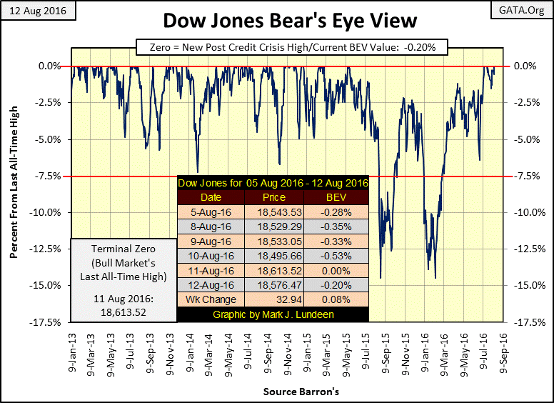
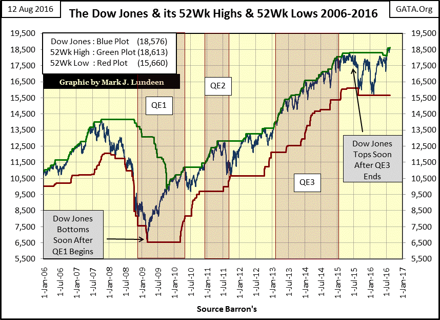
Looking at the Dow Jones with its 52Wk High and Low lines below, we see its 52Wk High Line (Green plot) has been pushed above 18,500.
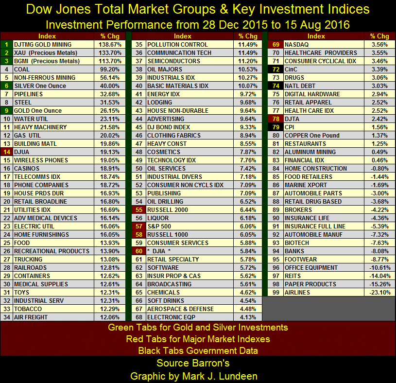
And it’s not just the Dow Jones finding itself in record territory this week. In the table below there were three NASDAQ indexes ending the week at all-time highs, with #4-13 within 1% of doing so. But all is not well with the major indexes; not with the Dow Jones Transports (#21) falling behind the Dow Jones Industrials (#11).
The NASDAQ Banks (#22) and NYSE Financial Index (#23) are 16.7% and 38% below their last all-time highs, highs dating back to before the 2008 credit crisis. The banks and financial stocks, even after the many trillions of direct subsidies by the Federal Reserve and US Treasury, are performing badly.
And I know what their problem is too; as financial institutions they are the living dead, crippled by hundreds of trillions in notional value, toxic derivative positions. If it wasn’t for the “policy makers” constant manipulation of market values and interest rates to keep those derivatives out of the money, our “too-big-to-fail” banks would have fallen into a gravitational black hole of their own making.
It almost happened in 2008-09, with the derivatives that supposedly hedged sub-prime mortgages from default suddenly coming into the money, and the banks couldn’t honor their multi-trillion dollar obligations to their counterparties. That’s why they have been on an IV drip from the Federal Reserve for the past nine years. Without it, the too-big-to-fail banks would have died long ago.
I’m maintaining a vigil on the banking stocks and the NYSE Financial Index, as well as keeping an eye on the price of gold and silver.

Looking at the solid performances seen in the major indexes above, one may wonder why waste time and risk money investing in precious metals and their miners? Well I don’t, but it’s not hard finding market commentary that does. After all, week after week there’s never any good news about gold, silver or their miners. I feel it too, and it’s depressing. However, the current widespread loathing of precious metals investments is all nonsense; they’ve been on fire since the beginning of the year.
Look at the Dow Jones Total Market Groups Gold Mining Index below (data Friday closing basis); it’s up 178% from its 52Wk Low of last January. That plus since mid-April, it’s made twelve new 52Wk Highs. Barron’s Gold Mining Index and the XAU have seen similar outstanding performance.
Here are some facts to think about when looking at the chart below.
From November 2011 to January 2016 (over four years), the Gold Miners declined from 145.74 to 34.70. That’s a 111.04 point, or 76% collapse in valuation, a near total wipeout of the gains seen from 2001 to 2011.
Since Barron’s January 25th issue, just seven months ago, the Gold Miners have increased from 34.70 to 96.47. This is a 61.77 point, or 178% advance in only seven months. What other market has rebounded so strongly after a horrific four year, 76% decline? In the chart below, we’re looking at history in the making, as few market commentators follow what’s happening with the gold miners. It just doesn’t get any better than this in a bull market!

At some point the gold miners will correct, maybe as much as a 20% decline when they do. But they haven’t yet, and I’m beginning to suspect they won’t until gold and silver break above their current resistances of $1400 and $21. Seeing gold and silver break above these levels would certainly take the DJTMG’s Gold Miners well above 100 on the chart above.
Should the miners be bought at these levels? After this huge seven month advance, it’s hard to be short-term bullish on the miners. I’ll leave it up to you if you should buy at these high prices. But I have a feeling that since last April, when the DJTMG’s Gold Miners made its first 52Wk High in Four and a half years, that lots of people, even professional money managers have been waiting for a pullback before taking a position in the gold mining sector. But the miners have so far refused to pullback the 10% to 20% everyone expects them to do.
So, why should they do so now? There’s no reason they have to. I wouldn’t be surprised if this advance still has a good ways to go in both time and points before we see the correction everyone is waiting for.
Do you need more cheering up? Look no further than the table below. Since Barron’s 28 December 2015 issue, gold and silver bullion, and their miners (Green Tabs) are all in the top 10 spots. With the exception of the Dow Jones Utility Average (#14) the major-market indexes (Red Tabs) have only seen single digit advances since the beginning of the year. And where are the banks? Way down at #94. REITS (Real Estate Investments) are at #97. Is the market giving us a hint of future problems pending in real estate?
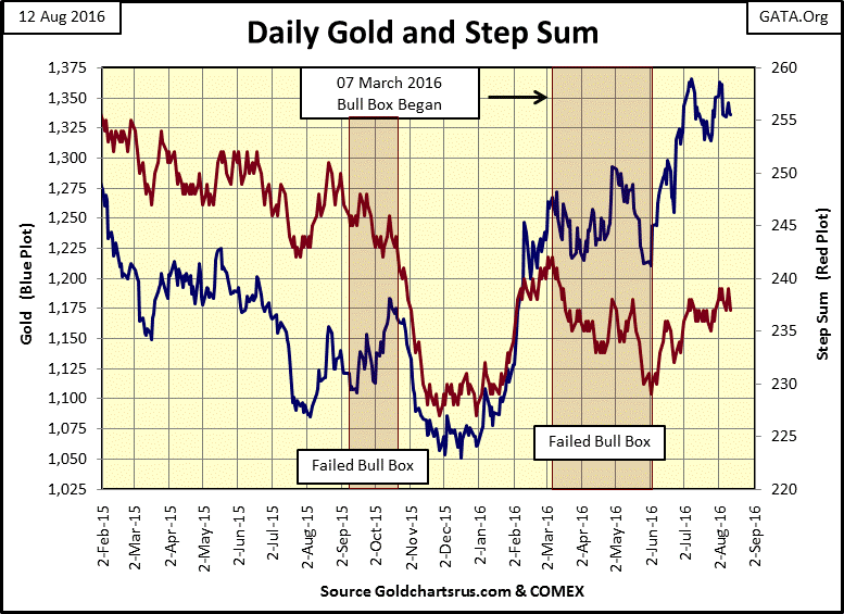
Moving on to gold and its COMEX open interest (OI); the latest collapse in OI began in early July, and appears to have bottomed. For the third time since January 2016, the collapse in OI failed to drive the price of gold down. What happens next? If you’re a precious metals bear, you’ll expect gold’s next move to be down, but I’m a bull. Seeing gold at #9 in the table above outperform most asset classes so far this year by a good margin, I’ll not think poorly of gold should it decide to take a bit of a rest. And looking at gold in the chart below (Red Plot), that’s exactly what gold has been doing since early July of this year.

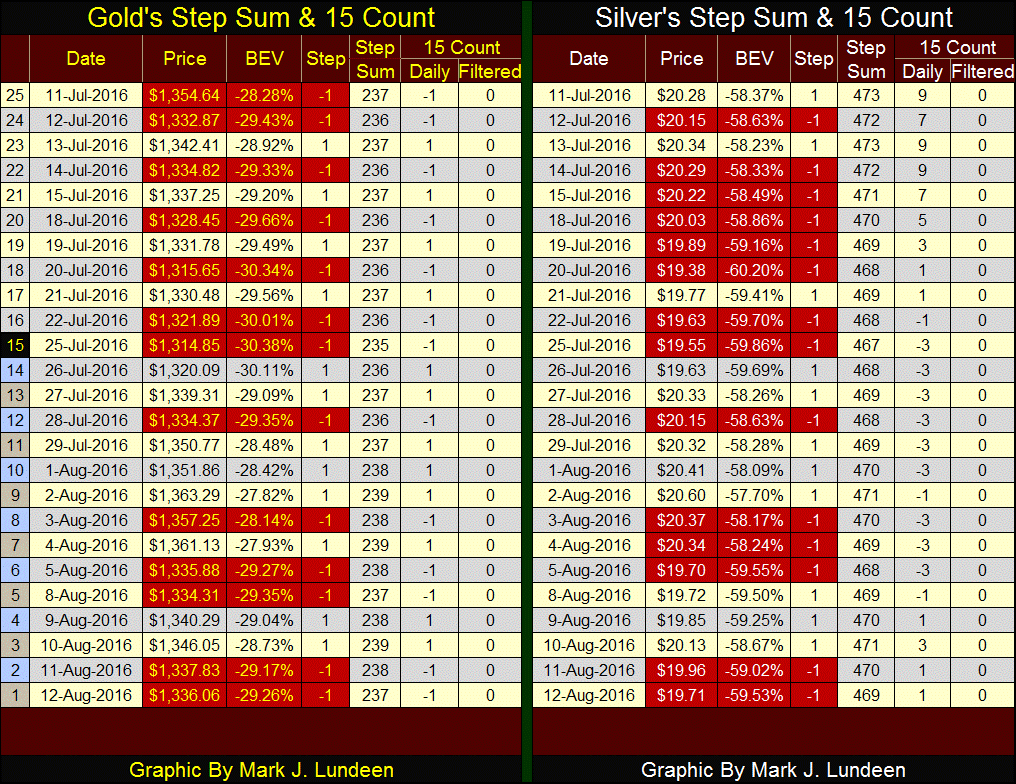
Looking at the price of gold with its step sum (below) it again appears that gold (Blue Plot) is taking a bit of a rest until its next advance. Note market sentiment, the red step-sum plot. It just isn’t convinced that the gains in the price of gold since last December are real.
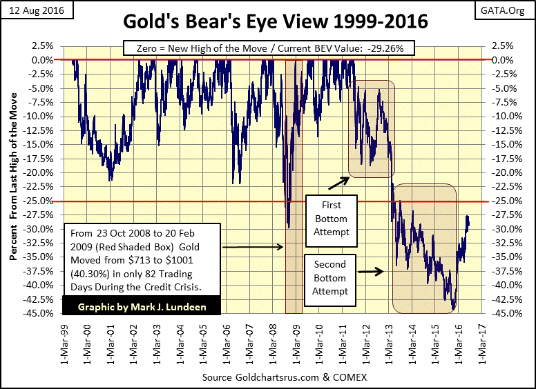
After the fifty-two month, 45% decline seen in gold’s BEV chart below, I’m not surprised the bulls have yet to regain their confidence in the market. Since August 2011, gold suffered its most prolonged and deepest correction of the 2001-2016 bull market.
But those were the bad-old days. Things in the precious metals market are different today. When the gold and silver bulls understand that, we’ll see the price of gold, along with its step sum rising up together in the chart above, hopefully taking the miners with them towards new all-time highs.
Looking at gold’s 15 count since July 11th (below), it has either been a +1 or a -1, meaning there have been as many advancing as declining days. Its step sum is also trending sideways, stuck between 235 and 239 for the past month. Silver isn’t doing any better. Since late January the gold miners have continually advanced. However no one notices the miners as everyone is focused on the old monetary metals themselves. In the past month, the metals have done nothing for either the bulls or the bears.
Currently, the operative word for the gold and silver market is frustration, but it won’t be like this forever. One day soon, gold and silver bullion are going to once again move with authority, and I expect the move to be upwards.
No guarantee of future success can be offered for any exploration play. But if the past is our guide for the future, as gold and silver bullion approach, and then exceed their last all-time highs, gold-mining shares will once again become a glamor sector in the stock market, with successful exploration companies ultimately outperforming the established miners.
For gold and silver bulls, splitting their capital into thirds, with equal dollar amounts for gold and silver bullion and established mining companies seems the way to go, with maybe up to 5% of the investment funds going into speculative exploration companies. As I’ve said before, as a speculative play, I really like Eskay Mining. Taking a hard look at in Eskay’s neighbors; Seabridge and Pretivm isn’t a bad idea either.
I’m seeing more on real estate in the financial media and on cable TV. As before the sub-prime mortgage crisis struck late 2007, TV programs on flipping homes, where people buy a fixer-upper in need of work, who then put some sweat equity into their project for profit are once again popular. However after 2008, until within the past year or two, programs about flipping homes seemingly vanished from TV.
Single family homes today aren’t the mania they were before the 2008 housing bust. Still, just eight years after the real estate crash I’m shocked at the prices flippers have to pay for their homes and what they receive for them when they place them back on the market.
Did the real estate market really crash eight years ago? Yes it did, not that it makes any difference today. Be that as it may, the flippers are due congratulations for making money the old fashioned way; working hard for it. And congratulations must also go to the “policy makers” for their dubious success in reflating the single-family housing market.
The question we should ask ourselves is how much longer will house flippers continue profiting from the monetary inflation the “policy makers” inject into the single family housing market? During the 2001-2008 housing bubble, flipping houses continued to be profitable until first Bear Stearns, and then Lehman Brothers begun upchucking their non-performing sub-prime mortgages.
So far in 2016, we’ve seen none of that. However, one thing to keep in mind when dealing in real estate; it’s a market based on debt. It may actually be more accurate describing the real-estate market as the mortgage market.
In a real estate deal, the structure and the land it sits on are only the collateral in a mortgage contract. All things considered, the mortgage’s term and rate inputs have a greater impact on the size of the principal (aka: market value) than does the mortgage contract’s collateral location or condition. One restriction that used to have a limiting effect on real estate values was the availability of money for mortgages, when retail deposits in savings and loans institutions funded the real estate market.
But that was decades ago. Today the mortgage market is a government market, and because the Federal Reserve is free to issue as many dollars as it want to, mortgage providers are allowed to write mortgages as big as a “home buyer” income allows.
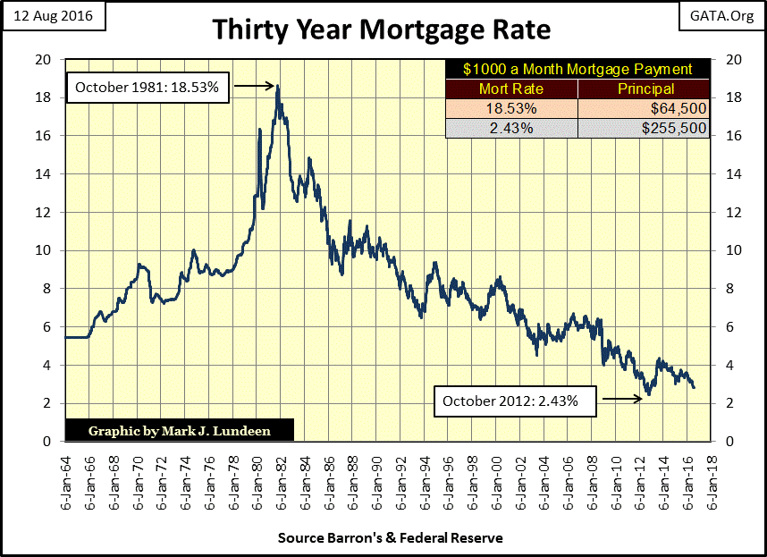
The chart below plots the last fifty-two years of mortgage rates. Rates peaked in October 1981, and fell to fifty year lows shortly after the sub-prime mortgage debacle. If the US mortgage market operated as a free market, unfettered by corrupting political considerations, mortgage rates wouldn’t have declined by 50% in the aftermath of a global mortgage crisis.
But my point in publishing this chart is to illustrate the impact declining mortgage rates of the past four decades have had on real estate valuations. In October 1981, with rates at 18.53% a $1000 mortgage payment could service a mortgage of only $64,500. Thirty one years later, with mortgage rates at 2.43%, a $1000 a month payment could service a $255,500 mortgage, possibly on the same house after thirty years of wear and tear.
I realize there are variables in the mortgage market other than a contract’s rate, term and principal; such as location, Location and LOCATION. But I haven’t figured out how to input location on the mortgage table below. However, using the maximum and minimum mortgage rates of the past half century, with a monthly payment of $1000, the impact rates have on the potential size of the principal becomes apparent.
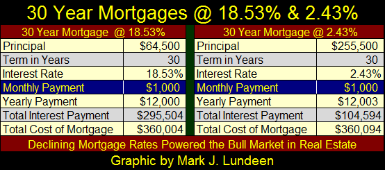
What’s also apparent is how a mortgage for $64,000 @ 18.53% in 1981 and one for $255,500 @ 2.43% in 2012 ultimately costs both homeowners the same $360,000 in interest and principal payments. That’s $104,500 more than the appreciation seen in market value for the 1981 mortgage. How this will play out in 2042 for the person who took the 2012 mortgage I don’t know. But in the case for the mortgage taken on in 1981, during those thirty years the home also provided housing at a fixed cost of $1000 a month for the owner. Should the owner now decide to sell their property, it also offers a way to get back $255,500, or twenty-one years of interest and principle payments a renter could not obtain.
All and all, taking out a mortgage @18.53% in 1981 was not a bad deal. But for the home owner with the 2012 mortgage, assuming mortgage rates remain near their current historic low levels for the next three decades is a BIG assumption!
Historically, mortgage rates rise and fall with bond yields and short-term interest rates. Currently central banks have inflated a historic bubble in the global debt market. There are trillions of dollars of sovereign bonds now at negative rates, where the bond buyer pays the government for the right to hold its debt. This is a crazy world!
However, a day is coming when sanity will once again take hold of the debt market. If not before, then after default becomes more than just another dirty four letter word in the bond market, sending bond yields and mortgage rates upwards towards double digits, deflating bond prices and homeowner’s equity.
In August 2016, the stock and real estate markets orbit a death star called the bond market. When Mr Bear finally rips control of bond yields and valuations from the hands of the “policy makers”, real estate and the stock market are going to implode as the notional value of hundreds-of-trillions of dollars of derivatives come into the money. In a single day, our too-big-to-fail banking system will become too-big-to-save. But our elected officials in Congress will try anyway, as the financial media cheers on the best Congress Wall Street could buy fails miserably.
Flight capital from this inevitable market event will drive the price of gold and silver (assets with no counterparty risk) and the precious metals miners to levels no one today can even imagine.
This disaster won’t be because of the failure of capitalism, but the inevitable consequence of allowing politicians, bankers and left-leaning academics control over the economy for the past century, via their damn central bank – the Federal Reserve. But that won’t the way the financial media is going to report it.
Mark J. Lundeen


