Times Of Easy And Tight Money: 1954 To 2022


For the first time in 2022, the FOMC is on track to drain $40 billion from their balance sheet for the month of August. In the table below, dates are Barron’s issue dates. So, the week of August 1st was actually the last week of July. But for the first two weeks of August (8th & 15th), the FOMC had drained $24.39 billion from their balance sheet.
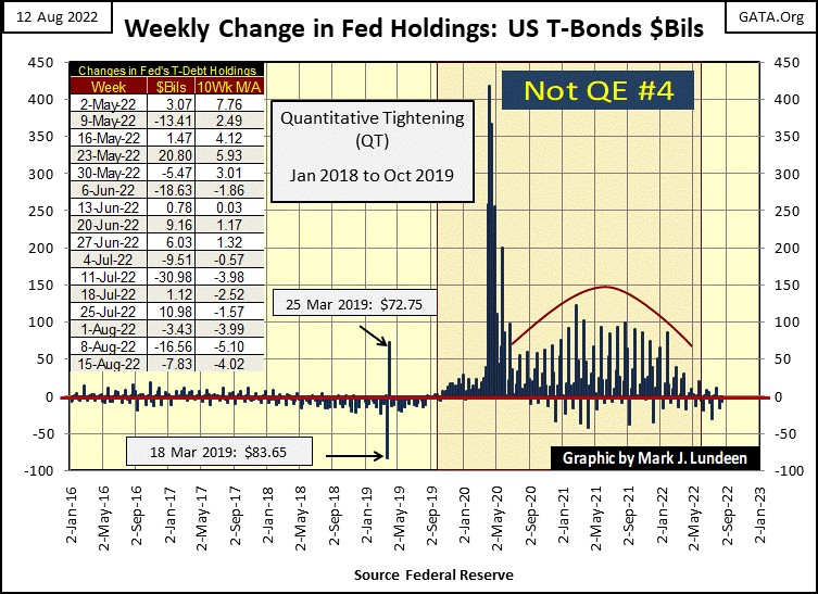
What I find odd about this, is the stock and bond markets continue rebounding off their summer lows, as the FOMC drains “liquidity” from the financial system – what?
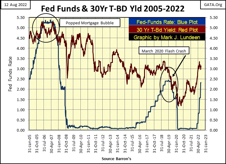
As a market enthusiast, what do I know? Well, I know that to get the March 2020 flash crash to turn around, the FOMC “injected” a trillion dollars, plus, of “liquidity” in a matter of a few weeks into the market, as is painfully apparent above. That plus, to keep the Dow Jones (my proxy for the broad-stock market) going up to its final all-time high on January 4th of this year, I see all those massive “injections” of “liquidity” under the red curve above. What is plotted above is unprecedented in the history of the Federal Reserve; it reeks of desperate actions by desperate people.
Then, as the FOMC significantly reduced its “injections of liquidity” last February, the stock-market valuations began deflating towards their lows of this summer in mid-June. And then this week, the second week of August following a $24.39 reduction in the FOMC’s balance sheet, the major market indexes BEV values seen below have advanced from 15% to over 20% from those June lows. Really? Yes, really!
These are big advances in the best of times, but during a time when the FOMC is draining “liquidity” from the financial system? Like I said, something odd is going on here. If this keeps up, I wouldn’t be surprised seeing some BEV Zeros (0.00% - New All-Time Highs) in the table below before September.
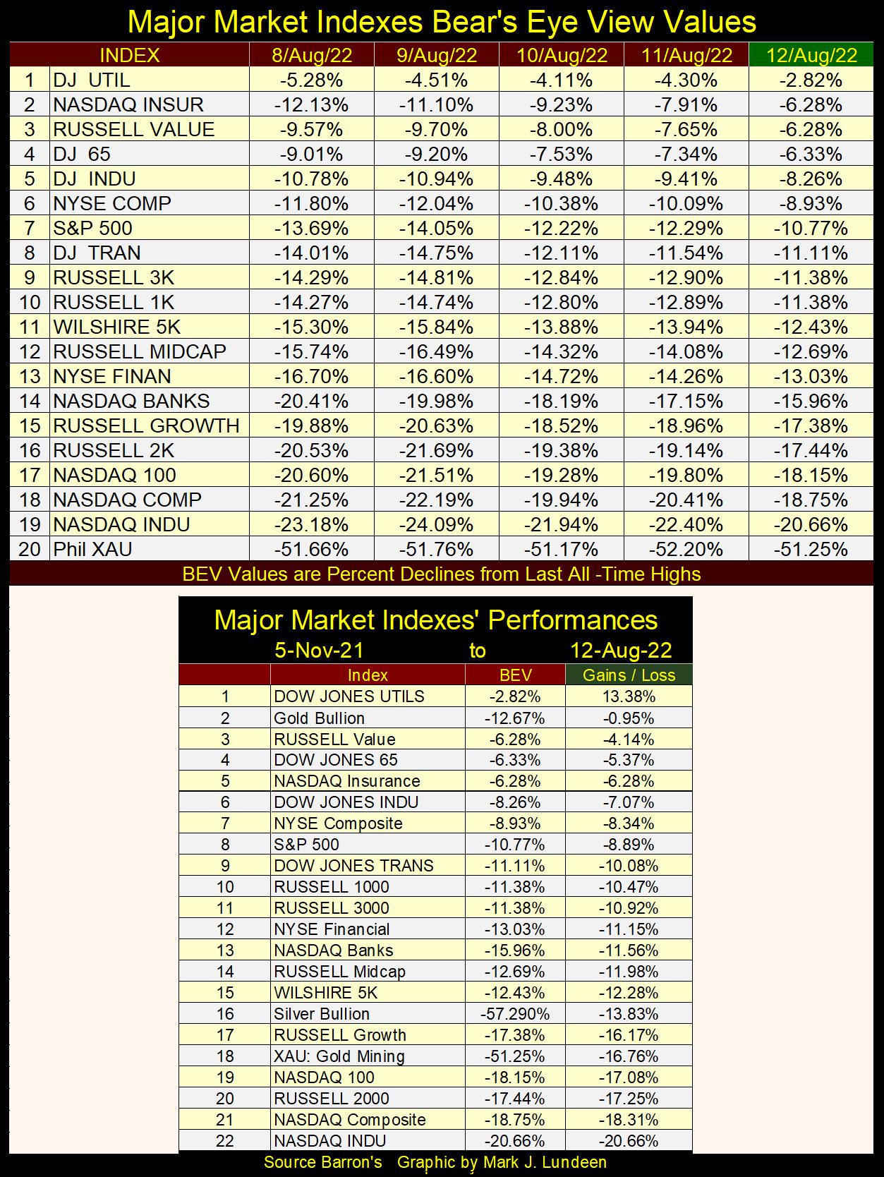
What’s going on here? Oh, that’s easy. If required, water too will flow uphill during an election year in the United States. Seeing market valuations rise as the FOMC drains “liquidity” from its balance sheet is only to be expected, as the entrenched establishment does what it can to keep the voters happy. This is especially true following the Deep State’s blunder; raiding Trump’s home in Florida this week.
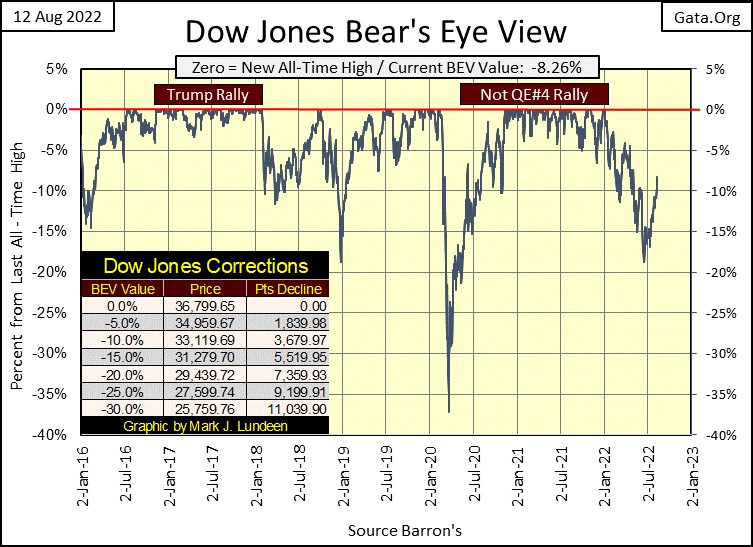
The above is mostly my opinion. What isn’t my opinion is the Dow Jones in its BEV chart below is looking very bullish. Closing the week with a BEV of -8.26%, less than three months from the November mid-term election. I’m taking back all the bad things I said about the stock market since last January. Yes, everyone of them, and until the November election, I expect we’ll see good market action.
Yes, good market action. But not good enough to get me out of the cheap seats in the market’s peanut gallery. The only thing that will make me buy something in this market is seeing a Dow Jones dividend yield above 6%, or even 8%. At week’s close, the Dow Jones was yielding 2.11%, so we have a way to go before I do anything like buying one of today’s glamor issues.
I’ll leave it at that, as it’s too soon to be thinking of what 2023, and Mr Bear will bring to the world in the cold of the coming winter.
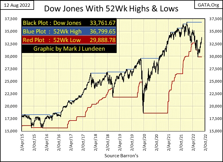
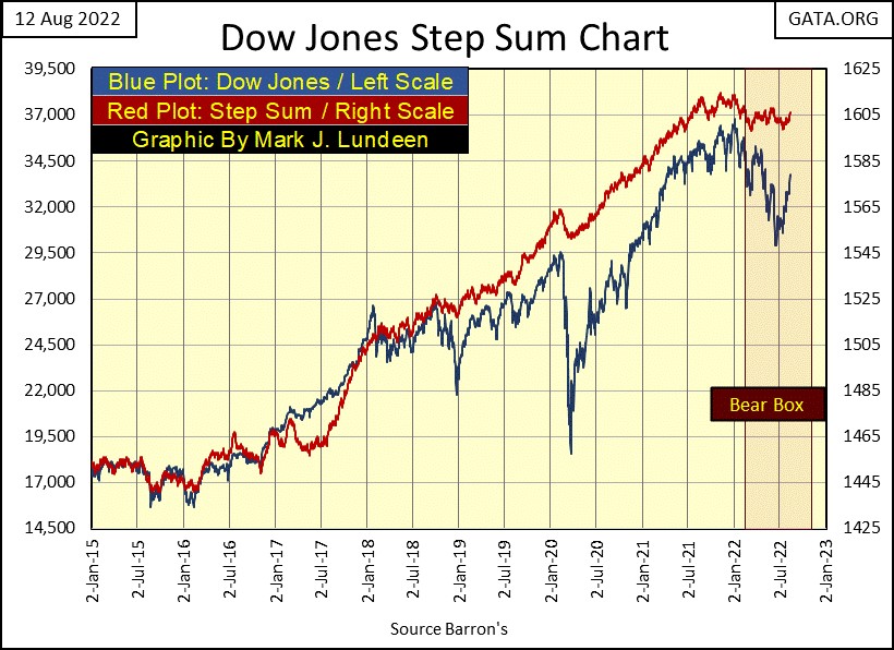
This week, the Dow Jones in its daily-bar chart below broke above its 33,000 line with authority, besting that by 761 points at Friday’s close. If you’re bullish, you have to like that.
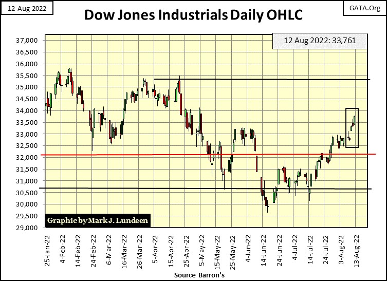
Below, plotting the Dow Jones with its 52Wk High and Low lines, the Dow Jones closed the week only 3K from its last all-time high. Can it once again make market history, and close above last January’s 36,799? I don’t see why it couldn’t. Since its lows of last June (two months ago) the Dow Jones has advanced just under 4K.
In time, all will be revealed.
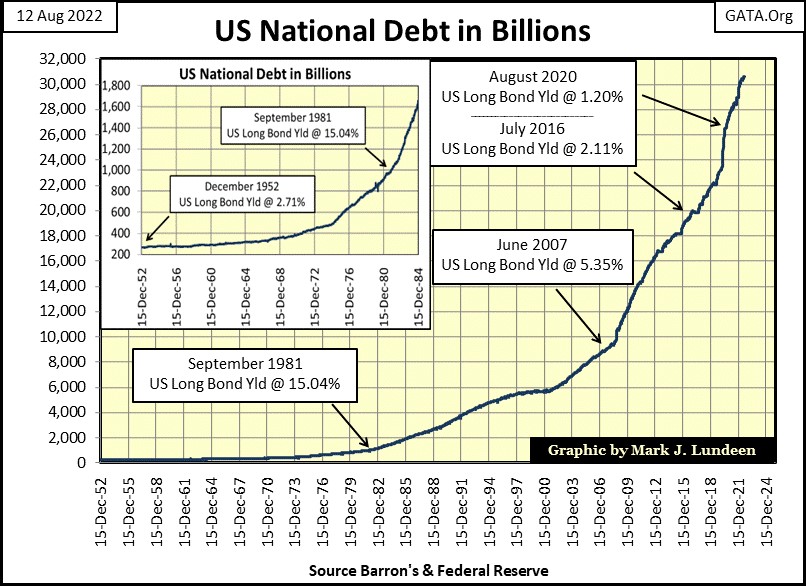
Speaking of water flowing uphill; next is a chart for the US national debt going back to 1952. Treasury bond yields peaked in September 1981, just as the national debt broke above $1 trillion dollars.
Why did bond yields peak in September 1981? Most likely because way back then, the bond market was freaking out that the US national debt had increased to $1,000,000,000,000. Double-digit CPI inflation didn’t hurt either. Inquiring minds of the early 1980s were wondering how Uncle Sam could ever pay back all that money? In August 2022, with the national debt now over $30 trillion, no one asks that question any more, as everyone knows Uncle Sam has no intention of paying back any of it.
Treasury bond yields found their bottom in August 2020, as the national debt broke above $26 trillion. There is just something very wrong about that.
For your information, this week the national debt was at $30.66 trillion, and the yield for the Treasury long bond closed at 3.15%. If you’re bullish on the stock market, these post August 2020 trends of rising debt and bond yields are not working in your favor.
Decades ago, the financial-mainstream media covered tight and easy monetary policy, the interplay between the FOMC’s management of their fed-fund rate and long-term bond yields. Maybe they still do, but for reasons that will become obvious, not to the extent they did before the early 1980s.
Times of easy money, were times when the FOMC’s fed-funds rate were below the yield of long-term T-bonds, and the wider the spread between the two, the easier was monetary policy. Times of easy money were economic good times, times of near full employment, times when it was easy for people to make their monthly payments, plus save a little on the side for a rainy day.
Times of tight money, were times when the FOMC’s fed-funds rate were above the yield of long-term T-bonds, and the wider the spread between the two, the tighter was monetary policy. Times of tight money were economic hard times, times of rising unemployment, times when for many people it was difficult to make ends meet, and they were happy they had saved a little money in the bank.
Let’s take a moment and look at this interplay of the FOMC’s fed-funds rate and the yield for long-term T-bond in the chart below (actually – two charts down). There is a lot of economic / monetary history recorded below. Rising bond yields (Red Plot) from 1954 to 1981 indicates bonds were in a three-decade long bear market. In a bond bear market, where bond yields increased from below 3%, to above 15% three decades later, one can safely assume the cause of the bond-bear market was rising Consumer Price Inflation (CPI inflation); rising from around 3% to above 15% three decades later.
Bonds are fixed-income financial assets, as such are ill-suited for periods of rising CPI inflation. Bond buyers buy bonds knowing they need a certain rate of return, which in 1954 was around 3%, to fund their requirements. When the rate of CPI inflation increases above the yields offered in the bond market, new bond buyers refuse to pay the same price for the same bond, demanding lower prices to raise the yield of the bond in the bond market. As CPI inflation increased to over 15% in the late 1970s, losses in the bond market from 1954 to 1981 became horrendous,
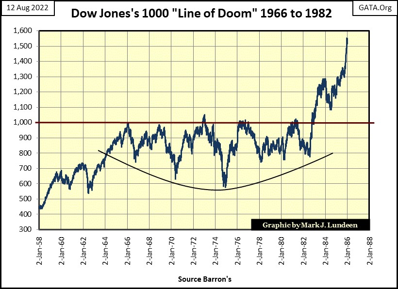
It was better for the stock market, but not by much, where from 1966 to 1982, five times the Dow Jones attempted to break above, and stay above 1000, but failed (chart below). It wasn’t until after bond yields peaked in autumn of 1981, and the rate of CPI inflation began coming down, that the Dow Jones finally broke above, and stayed above 1000 in late 1982.
Now back to my chart plotting long-term T-bond yields and the FOMC’s fed funds rate (below). I divided these charts into three periods of “monetary policy”, the first was when the “policy makers” were fighting inflation. The second was when the “policy makers” were fighting deflation, and the third when the “policy makers” were, and still are fighting for their lives.
In the first period, where the “policy makers” were fighting inflation, they were actually fighting themselves. In a monetary system that includes a gold peg, its “policy makers” were promising they would not over issue paper money in excess of the gold reserves they held. With the Bretton’s Woods Monetary Accords of 1945, that was a promise not to issue more than thirty-five paper dollars for each ounce of gold held in the US gold reserves.
It was a promise the “policy makers” never kept, as seen in the table below. In a monetary system containing a $35 gold peg, as an act of law, by the time “Nixon closed the gold window” in August 1971, the Federal Reserve had issued $198.82 in paper money for every ounce of gold they had. Such criminal activity is no way to maintain a $35 gold peg. But then central bankers only play by the rules they make, laws passed by Congress be damned.
This paper money inflation created a run on the US gold reserves (1957 to 1971), and chronic consumer-price inflation in the post WWII economy.
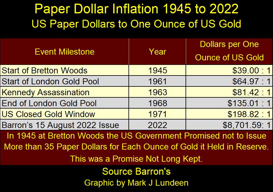
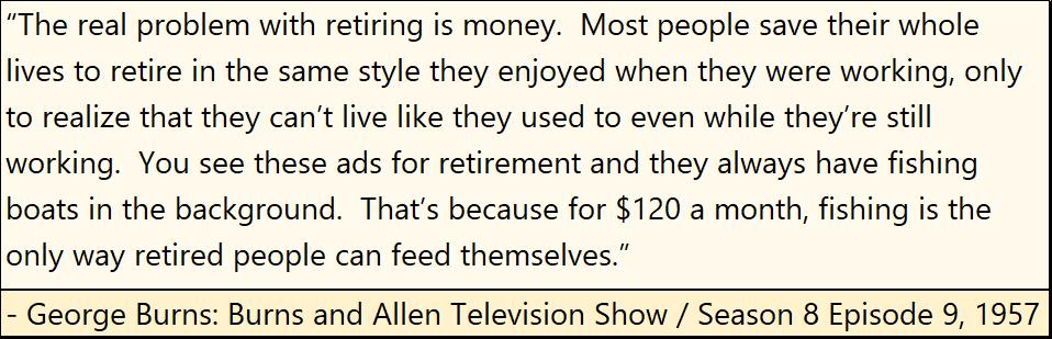
Problems with CPI inflation didn’t begin in the 1970s, as seen in the quote below from the Burns & Allen Show from 1957. Why people can’t retire on $120 a month in 2022 can be seen in the table above, where in August 2022, there are now $8,701 paper dollars in circulation (CinC) for each ounce of gold the US Treasury claims to hold.
This is how monetary inflation works – the Federal Reserve issues more dollars than they have the legal right to. Once issued, the inflation in the money supply flows somewhere in the economy. In the chart below, from 1954 to 1981, monetary inflation flowed into commodities and consumer prices, creating bubbles in the cost of living.
Policy Makers Fight Inflation
During these three decades, the FOMC attempted to pop these bubbles in commodity and consumer prices by increasing their fed-funds rate far above long-bond yields. Their success in popping these bubbles in consumer prices were, as I’m sure, not all they desired. By the last half of the 1970s, the rate of CPI inflation was double-digits, even after all of the significant yield inversions seen below.
Policy Makers Fight Deflation
Then Fed Chairman; Paul Volcker, increased the FOMC’s fed-funds rate far above long-T-bond yields, and kept it there for almost four years, breaking the back of the trend in CPI inflation. But actually, monetary inflation flowing from the Federal Reserve didn’t stop. All Volcker did was to divert the flow of monetary inflation from commodity and consumer prices, into the valuation of financial assets, like stocks, bonds and real estate.
Where before 1981, monetary inflation was called consumer-price inflation. After 1981, monetary inflation was called “BULL MARKETS” somewhere on Wall Street, aka “ECONOMIC GROWTH.” Ever rising market valuations in stocks, bonds and real estate are much more ageable to the general public than is ever rising consumer prices, but bull markets on Wall Street are still inflationary bubbles nonetheless.
The FOMC was painfully aware of this reality, so they shifted their “monetary policy” from one of fighting inflation in the CPI, to one of fighting deflation for fear of triggering a huge bear market on Wall Street. No longer would, or could the FOMC dare to increase their fed-funds rate far above long bond yields for fear of the bearish consequences. And every time they did invert the yield curve, however timidly after 1981, a significant bear market resulted.
In the chart below, note the yield curve inversions – fed funds rate higher than bond yields;
#1: The leverage buyout bubble popped. See the Movie Wall Street for details.
#2: NASDAQ High Tech bubble popped.
#3: Sub-prime mortgage bubble popped.
#4: The March 2020 flash crash, though “market experts” blame this market crash on the covid pandemic.
Policy Makers Fight for Their Lives
The third, and last period of monetary history seen below, is where the “policy makers” no longer dictate “monetary policy”, but are now constrained by the consequences of their past sins, restricting them to what they can, or cannot do.
This is most likely why “market experts” don’t much cover the interplay between the FOMC’s fed-funds rate and bond yields anymore. Not much to talk about when the FOMC can’t lower their fed-funds rate below zero, or increase it to something above the 3% the bond market is yielding without creating a “massive-economic dislocation” in the markets and economy.
Basically, “monetary policy” is now controlled by the reality of our current situation, one of an autopilot fixed on self-destruction. All the “policy makers” can really do now is to find someone to blame the consequences of their decades of malfeasance on.
Russia, Russia, Russia, Trump, global warming, a viral epidemic, even you or me will do. As along as the entrenched Washington / Wall Street establishment escapes any responsibility of their many decades of criminal activity, so they will be allowed to begin again their shitty-little games, any pansy to blame the coming disaster will do.
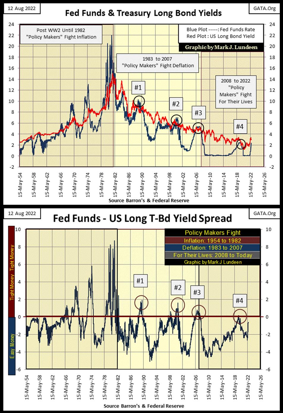
In the chart above, I’ve plotted the spread between the fed-funds rate, and the long T-bond yield. Mathematically: fed-funds rate – long bond yield. When this spread is positive, the FOMC has tightened its monetary policy, resulting in a recession in the economy. When the spread is negative, the FOMC has made their monetary policy easy, or loose, providing good times for all. When the spread is at the Red Zero line; fed funds rate = the long T-bond yield.
Currently (below), the fed-funds rate is only 0.82% below the long bond yield. Unless T-bond yields rise (T-bond valuations decline) from where they closed this week, the next time the FOMC increases their fed-funds rate, they may unleash something very ugly in the markets and economy.
Come the next increase in the FOMC’s fed-funds rate, it will be interesting seeing if the idiots can prevent their monetary system from going into tight money situation.
Using the data seen plotted in the chart above, I’ve constructed three frequency distribution tables below, one for each of the three periods of monetary policy. These tables, displaying the ease or difficulty for the FOMC to inverting the yield curve are startling.
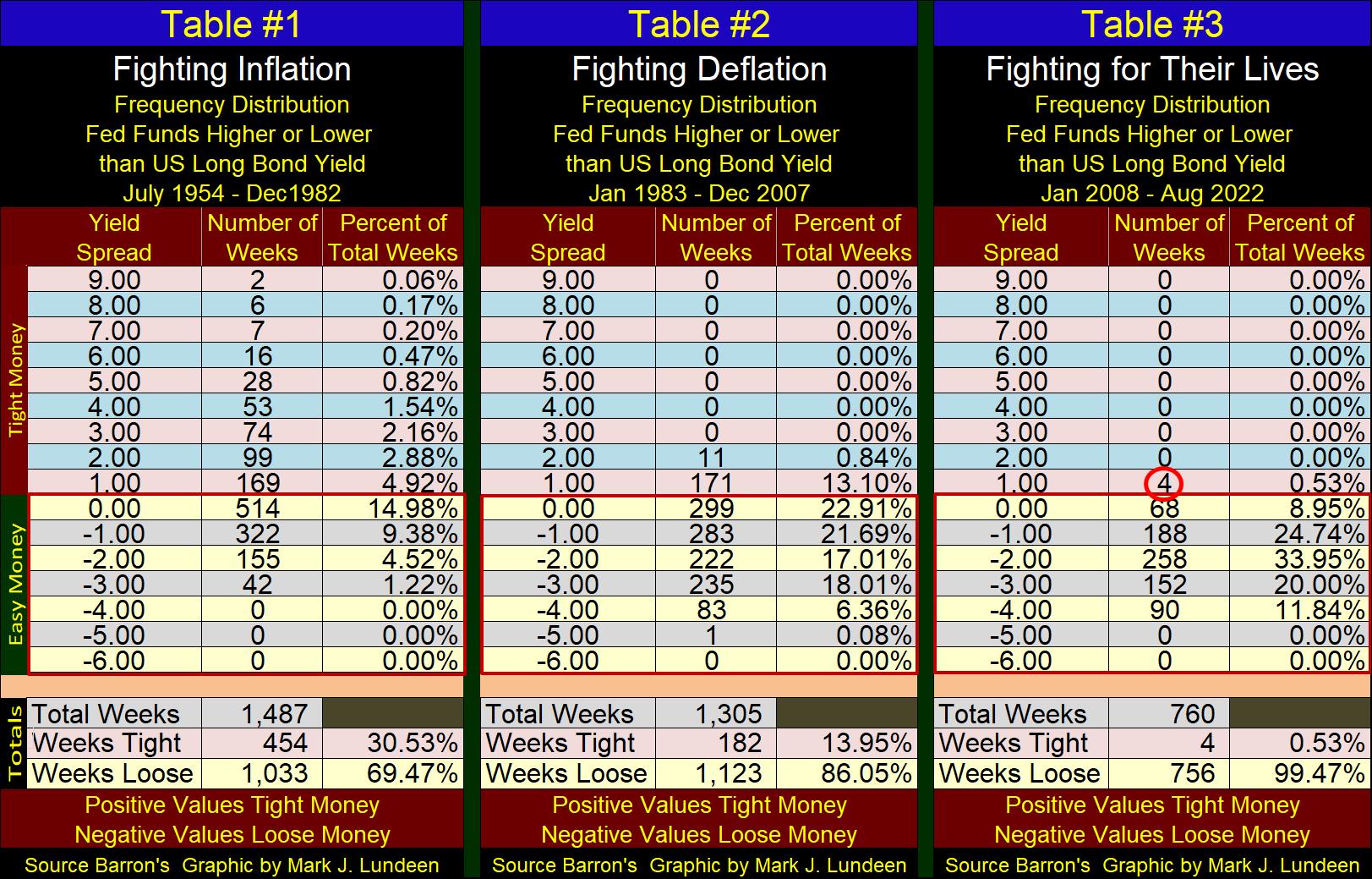
A serious study of these tables is well worth anyone’s time. But to keep it simple, we need only to look at the totals at the bottom of the tables. Specifically, the percentage of weeks the FOMC implemented tight money.
- When the FOMC was fighting inflation, they implemented tight money for 30.53% of the weeks spanning from 1954 to 1982.
- When the FOMC was fighting deflation, they implemented tight money for 13.95% of the weeks spanning from 1983 to 2007.
- When the FOMC was fighting for their lives, they implemented tight money for only * 4 WEEKS DURING A 14 YEAR PERIOD. *
My final thought on all of the above is as follows; if the FOMC can’t invert their fed funds rate to something higher than the current rate of CPI inflation, without instigating another 1930s Great Depression, then they aren’t going to invert the yield curve. But, if they don’t invert the yield curve, with their fed-funds rate a few percentage points above the current rate of CPI inflation, then consumer-price inflation in the next few years will consume what is left of the dollar’s purchasing value. That means the death of the dollar as a global financial asset.
Got gold and silver?
Here’s gold’s BEV chart. Like the Dow Jones’ BEV chart above, gold’s BEV chart below looks good, meaning the plot is trending the correct way – upwards. But looking good isn’t good enough for someone like me, a gold bull suffering from BBS (Battered Bull Syndrome). I’ll feel better when gold breaks above its BEV -10% line with authority, as did the Dow Jones this week with its 33,000 line.
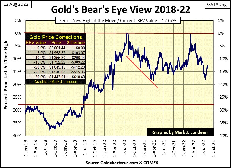
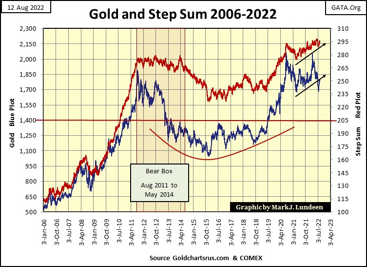
Market sentiment (Red Step Sum Plot / Chart Below) remains bullish on the gold market. And why not? Twice since August 2020’s last all-time high, gold broke below its 1700 line. Once in March 2021, and again in July 2022, and on both occasions the price of gold quickly rebounded above 1700.
This is a market NOT much liked by either the bulls or the bears. The bears can’t take gold below $1700, and keep it there. The bulls tried last March to have gold close at a new all-time high, only to have the bears take it down below $1700 a few weeks ago.
Well, this too shall pass. Hopefully with gold breaking above its last all-time highs of August 2020, with authority. But when? I don’t know when, just that it will, and in a market like this, patience is a virtue that will be rewarded.
Last week I was a bit bearish on the Dow Jones’ step-sum chart below. But that was before the Dow Jones broke above its 33,000 line, with authority late this week. If consistency is the hob-goblin of small minds, let’s not have any hob-goblins dictate to us what we are to think of the markets we follow.
Instead, let’s look at what is actually happening, and what is actually happening is, the Dow Jones is going up. Yes, it may be only from some hanky-panky by the “policy makers.” If so, that doesn’t matter, as all that matters is the Dow Jones is going up as the November elections draw ever nearer.
So, am I ready to leave the market’s peanut gallery, and buy some Tesla or Amazon? Heck no!
If there is one hob-goblin I’m very comfortable sleeping with every night, it’s the one who whispers sweet nothings into my ear as we hold each other in the dark. “Mark”, my hob-goblin whispers; “don’t buy anything in the broad-stock market until the Dow Jones’ dividend is yielding something over 6%, maybe even over 8%.”
You do what you want to, I’m listening to my hob-goblin.
In their step sum tables below, selling pressure has relented for both gold and the Dow Jones. Since July 11th, the step sums for both have advanced by a net of four daily advances. That tells us after a bad day in the market, the bulls aren’t afraid to come back in to scoop up some bargains.
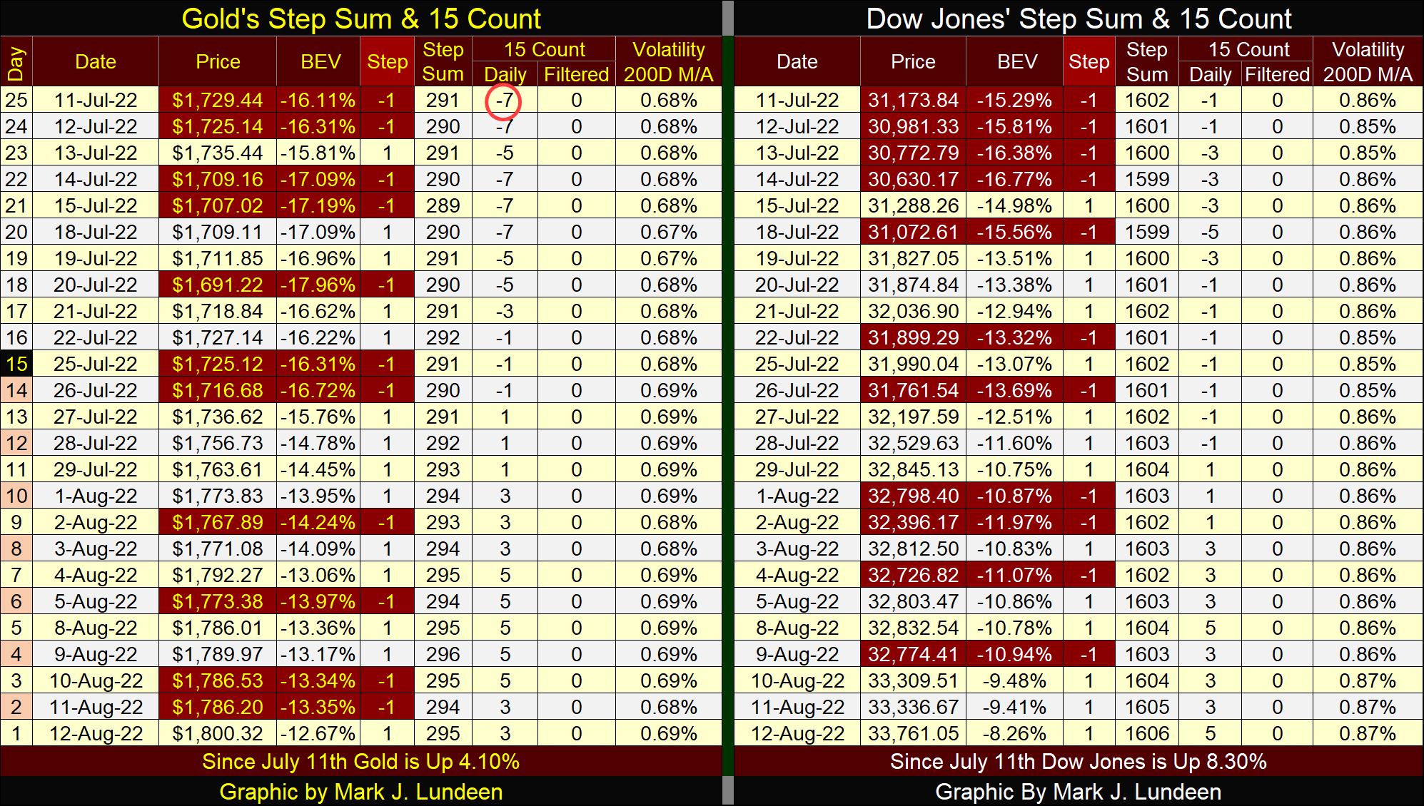
The 15-counts for both remain neutral; between -5 to +5. When a market’s 15-count becomes overbought; +7 to +15, it usually doesn’t like that, and a sell off can be anticipated. Sometimes a market will ignore a +7. But when a 15-count sees a value of +11 or more, one should expect seeing a lot of down days to follow.
Jordon Peterson is a Canadian academic, but one with his feet firmly on the ground and concerned with the best interest of the human race.
In the video below, he discusses the consequences resulting from the covid lockdowns, and the green-energy movement. 2023 is not going to be a good year for most people living on planet Earth. If you believe the bulls will be allowed to be running wild and free around Wall Street during such a time, I expect Mr Bear will prove you wrong.
Jordon Peterson Podcast: Cometh the Horsemen: Pandemic, Famine. It’s about an hour and a half. But if you watch the first fifteen minutes, I believe you’ll watch this video to its finish.
https://www.youtube.com/watch?v=R7gAEkzIgvw
Mark J. Lundeen
********


