US Dollar And US Treasuries Big Picture


Since we covered the many different markets in detail last week I would like to focus back in on the US dollar and the TLT looking for clues for the big picture direction. The huge daily swings, in say the INDU last week, makes it very hard to keep and hold a short or long position unless you’re perfect on your entry point. In a bull market it’s two steps forward and one step backward and in a bear market it’s two steps down and one step up. If an entry point in a bear market is not made in the first part of the two steps down sequence you’ll find yourself behind at some point in the trade if the entry point was made in step two. This is one reason why it’s so important to know the direction of the big trend. Until something changes I believe the US stock markets are now in a bear market. There are a lot of things that can change that outlook but for today that’s what the charts are suggesting.
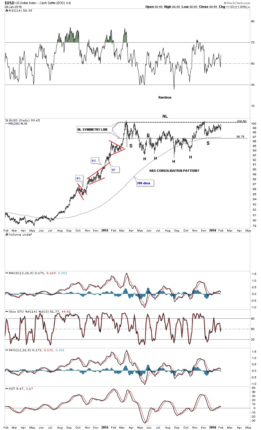
Last Friday the US dollar had a nice up day to end the month of January which was positive. There are two consolidation patterns I’m keeping a close eye on for the US dollar which is the bullish falling wedge and the H&S consolidation pattern. This first daily chart for the US dollar is the H&S consolidation pattern we’ve been following since December of last year. Even though last Friday, the US dollar had a nice up day, the price action still hasn’t broken above the neckline yet. It’s getting close but not quite there yet.
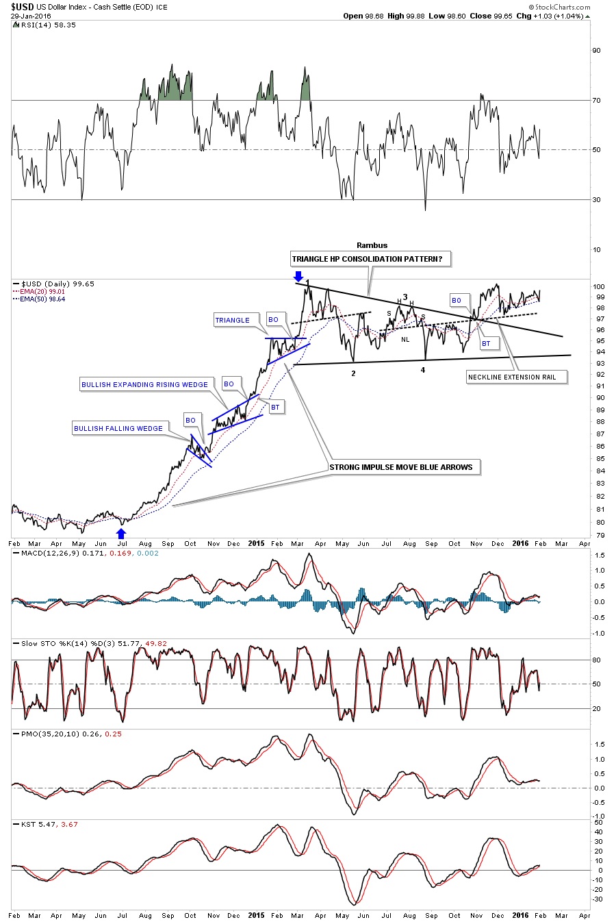
This next chart for the US dollar shows the combo bullish falling wedge and the H&S consolidation pattern being one of the same, a consolidation pattern. The blue arrows shows the last major impulse move up with several smaller consolidation patterns that formed.

Below is a daily line chart for the US dollar which shows the price action still trading above the 20 and 50 day ema’s.
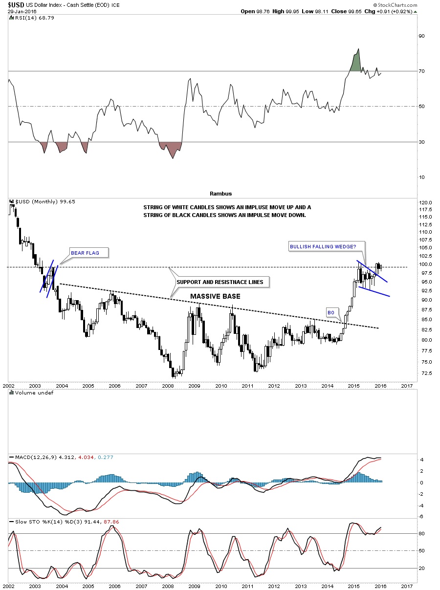
Last weekend I said I would like to see the monthly candlestick chart for the US dollar form a white candlestick and a new high for its bull market. We got the white candlestick but not the new high yet.
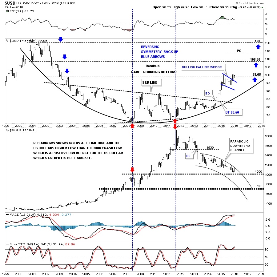
The 30 year chart for the US dollar puts our current big base and bullish falling wedge in perspective. Our current breakout and backtest to the top rail of the blue falling wedge looks very similar to the one that occurred during the breakout and backtest sequence of the 1999 blue bullish rising wedge which took about three months to complete. Tomorrow starts the beginning of the fourth month since the breakout of the blue falling wedge which is similar to the 1999 breakout as shown by the red circles.

This last chart for the US dollar is a long term monthly combo chart which has the US dollar on top and gold on the bottom. As you can see a serious inflection point is right at hand. If the US dollar can breakout to new highs for its bull market, gold which is testing the top rail of its parabolic downtrend channel should decline inversely. Keep in mind this is a monthly chart. It will be interesting to see what the monthly bar looks like for both the US dollar and gold come the end of February.
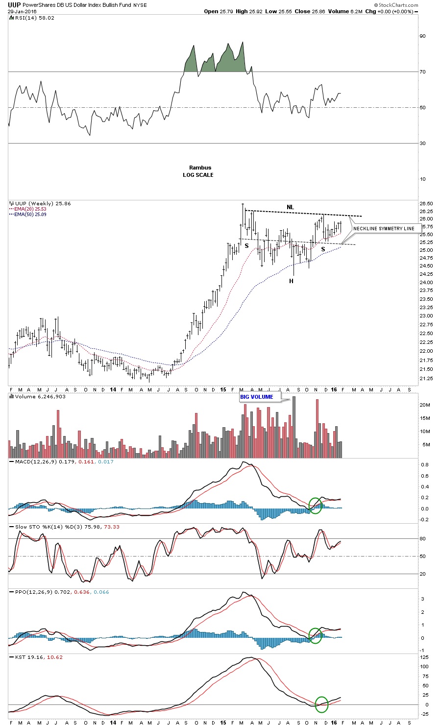
Below is a weekly chart for the UUP which shows the possible H&S consolidation pattern with alot less noise than a daily chart can make.
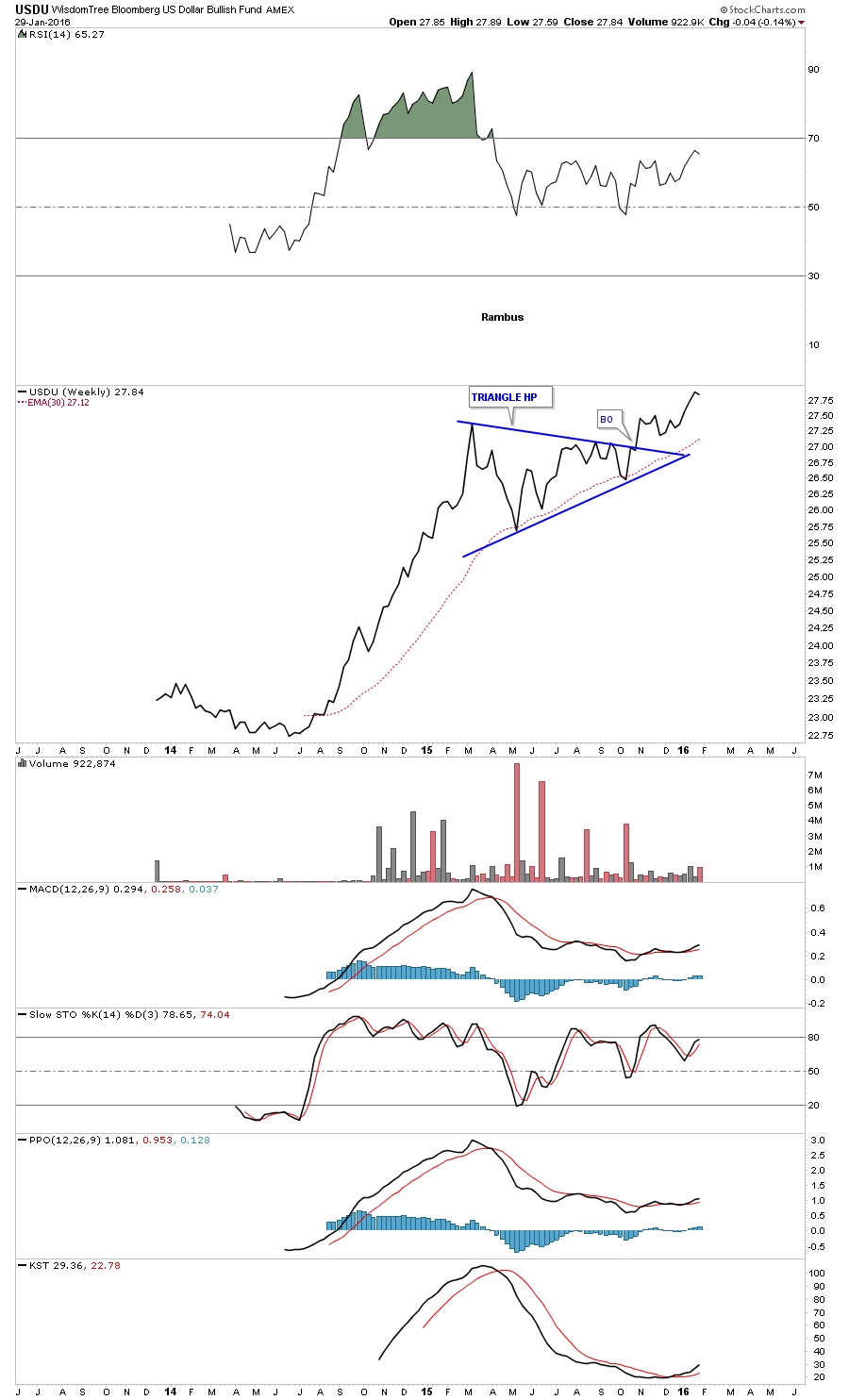
The weekly line chart for the USDU shows it actually broke out of its blue triangle consolidation pattern last fall with the 30 week ema giving strong support.
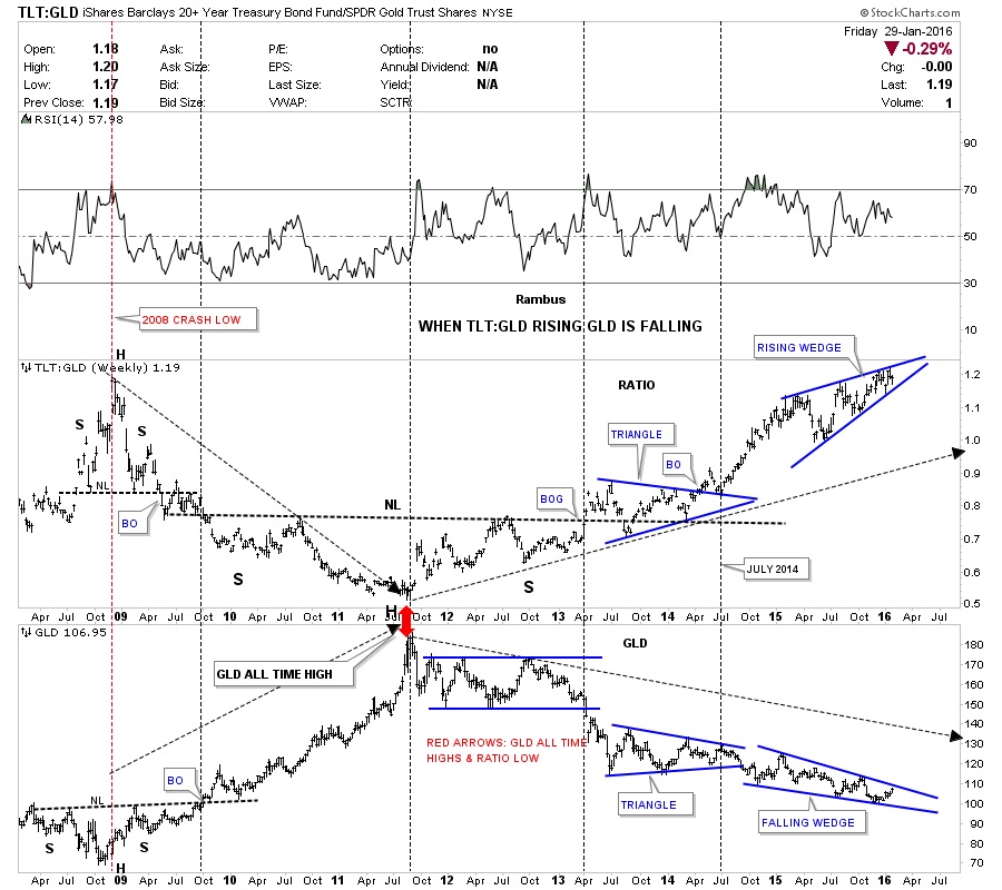
This last chart for tonight I’m going to use the TLT to GLD ratio chart on top and GLD on the bottom. When the ratio chart is rising, meaning the TLT is outperforming GLD, gold generally goes down. Note the inverse look at the 2008 crash low where the ratio chart made a high and GLD on the bottom made its low. From the 2008 crash low GLD then went on its near parabolic run to new all-time highs while the ratio chart on top fell to its low. As you can see the ratio chart bottomed in 2011 while GLD topped out as shown by the red arrows. Note the three year H&S bottom the ratio chart made on top, with the head being the 2011 low. The ratio chart on top built out a blue triangle consolidation pattern as the back test to the neckline which led to the next impulse move higher for the ratio chart. That brings us up to our current situation. Note how the ratio chart on top has formed the blue rising wedge while GLD on the bottom has formed a blue falling wedge. When the ratio chart on top breaks out from that blue rising wedge, whichever direction that is, a good move for GLD will most likely occur. If the charts for the TLT, which I showed you earlier prove to be bullish, then the TLT:GLD ratio chart on top should breakout through the top rail of the blue rising wedge. Until something changes with these ratio charts for the TLT this is the way I have to play the commodities and the PM complex. All the best…Rambus
 Meet Rambus, a seasoned trader and technical analyst renowned for his unbiased and insightful chart work. Through his website, Rambus Chartology, and Substack newsletter, Rambus shares his expertise with a global community of subscribers, providing daily updates, commentaries, and hands-on training in the art and science of chartology. With his calm, humble, and down-to-earth approach, Rambus demystifies complex market trends, helping his followers navigate the challenges of today's volatile markets. Join the Rambus Chartology community today and discover a unique blend of technical analysis, trading expertise, and time-tested protocols. Subscribe now at www.rambus1.com or https://rambuschartology.substack.com/
More from Gold-Eagle


