US Stock Bull Snorting


 I have some free time tonight and the better part of the day tomorrow to post a few charts before I have to catch my flight home on Tuesday. I just want to thank you again for your patience.
Let’s take a quick look at the daily INDU chart I posted on Wednesday that now shows the breakout of the rounding top trendline. So far so good.

Below is another daily chart which shows the horizontal support and resistance lines. Currently the 17,600 S&R line may act as short term resistance to allow the INDU to catch its breath before moving higher. As you can see there was a breakout of a small red bullish rising wedge which took out the top rail to the upside last Thursday. That little red bullish rising wedge formed just below the rounding top trendline we looked at on the chart above which is also bullish. Friday’s price action gapped above the 200 dma also. We had a bullish cross of the 20 ema and 50 ema last week as well. There is a lot of positive price action on this chart below.

The weekly chart for the INDU shows the 2009 uptrend channel we looked at when it was testing the bottom rail during the August low. This chart is one of the reasons I’ve remained bullish during this correction, above the bottom trendline is bullish and below is bearish. Outside of the August low this uptrend channel really shows a beautiful bull market.

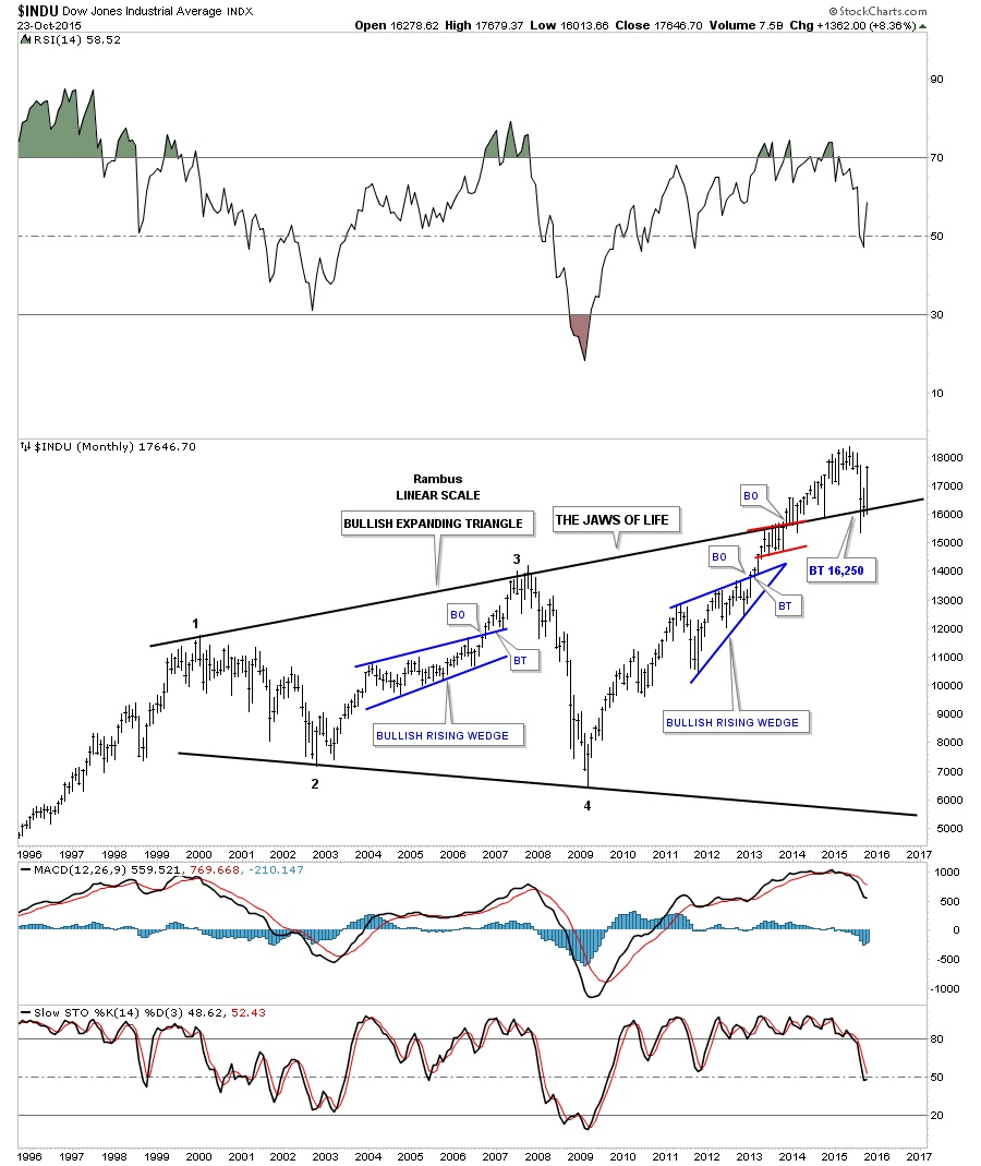
Another big reason I’ve remained bullish on the stock markets is the monthly chart for the INDU, The Jaws of Life, chart. I know a lot of folks have given up on this massive consolidation pattern but until the INDU closes below that very important top trendline, on a monthly closing basis, I have to respect the potential of this consolidation pattern. The top rail was strongly back-tested during the August low but it held support again. Depending on what the INDU does this next week it could be one of the biggest monthly gains since the bull market began in 2009.
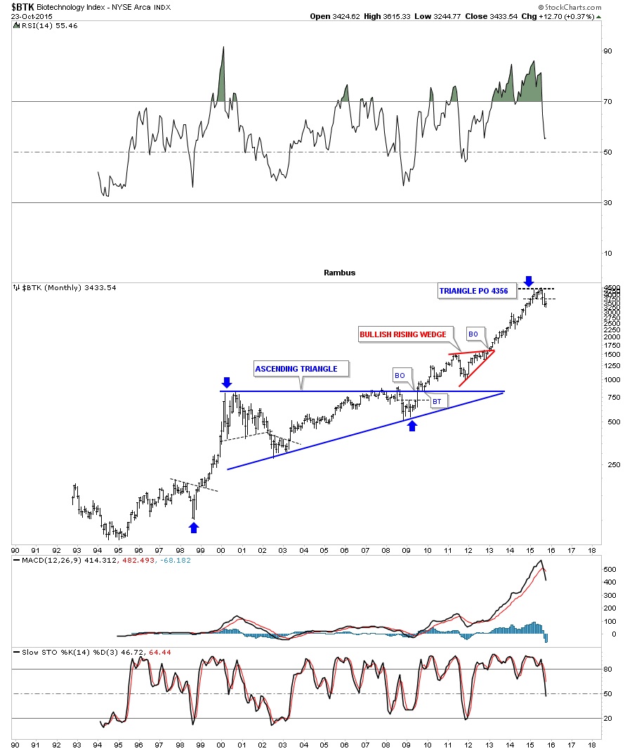
As you know I’ve been showing you a lot of very long term monthly charts for many individual stocks that are also showing massive consolidation patterns. Below is the $BTK, biotechnology index, which shows you a perfect example of what this pattern looks like. The $BTK built out a massive 9 year flat top or ascending triangle which broke to the upside in late 2009 when everything else was bottoming. The 2009 low, which was the fourth reversal point, hardly shows up on this chart which shows us its relative strong performance vs most of different sectors in the stock markets at that time. The blue arrows measures the price objective using the blue triangle as a halfway pattern. As you can see that price objective has been met at 4356. Since the price objective has been met this tells us the $BTK may now under preform some of the weaker areas of the markets as money rotates into some of the lagging sectors.
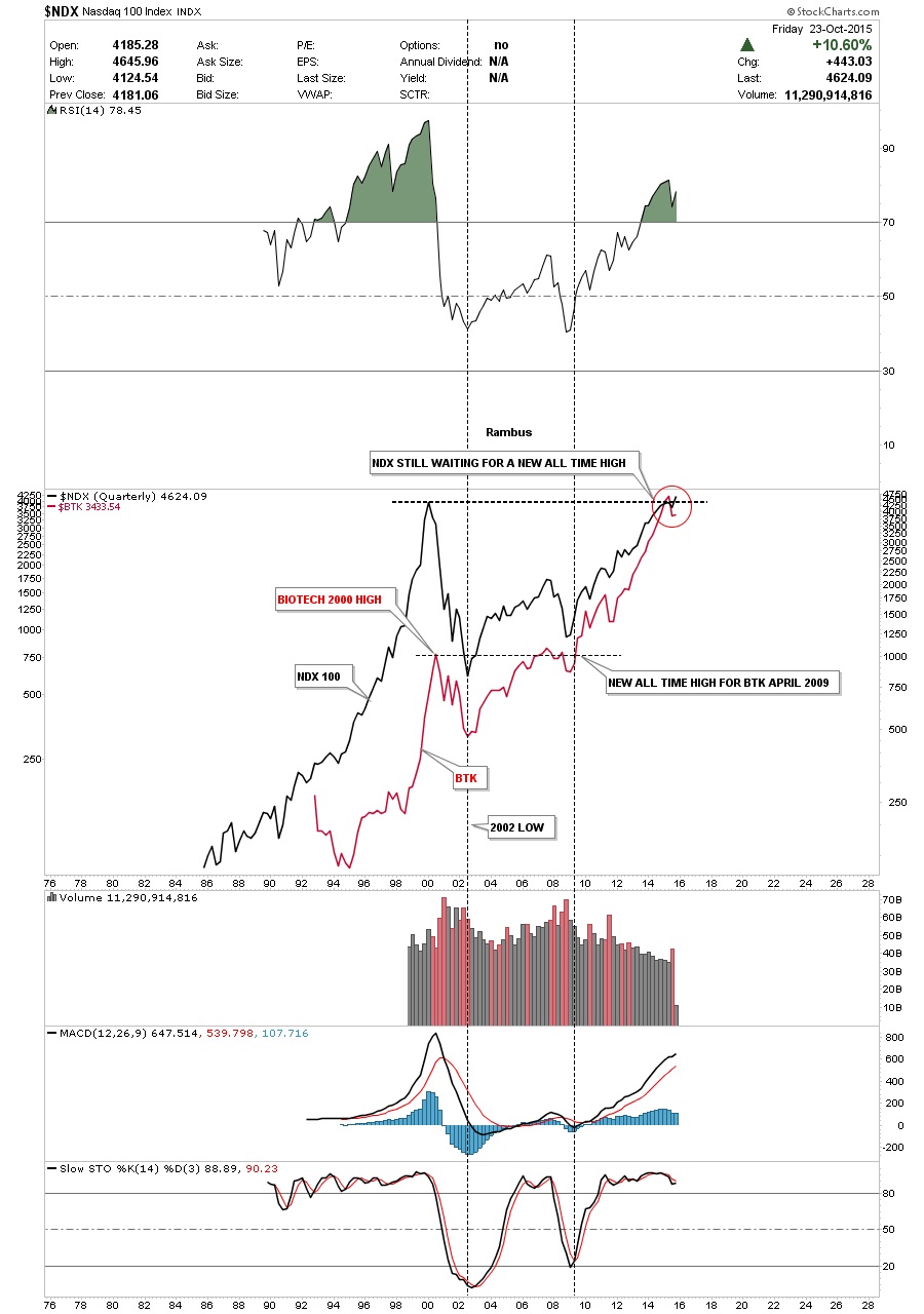
Below is a long term quarterly chart that compares the $NDX to the $BTK going back 30 years or so. They both topped out together in 2000 and bottomed together in 2002 which is what you would expect. Now let’s focus in on the rally out of the 2009 crash low. This is the point where the biotech stocks really started to outperform the big tech stocks. As you can see the $BTK broke to new all-time highs in 2009 while the $NDX was just bouncing off of its bottom. Since that point they both have been in a strong bull market but the big difference is that the $NDX is now just reaching its all-time highs. This is an old chart but the red circle now shows the $NDX is trading into new all-time highs using a quarterly line chart. Again I expect both of these sectors to rise but this time the $NDX, big cap tech stocks, will out-perform the biotech stocks on a relative basis. I believe the bull market will continue higher as capital rotates into the under-performing sectors like the semiconductors and networking stocks. Other under-performing sectors should also benefit from this move. This is how a bull market lives on. At some point the bull will die but not before most of the different sectors have their own individual bull market.
I’ve been showing you this monthly chart for Mr. Softy for several years now. It built out a beautiful 12 year blue bullish falling wedge. Note the two small red consolidation patterns that formed one below the top rail and one above the top rail of the bullish falling wedge. Last week MSFT broke out of a blue rectangle consolidation pattern to the upside.
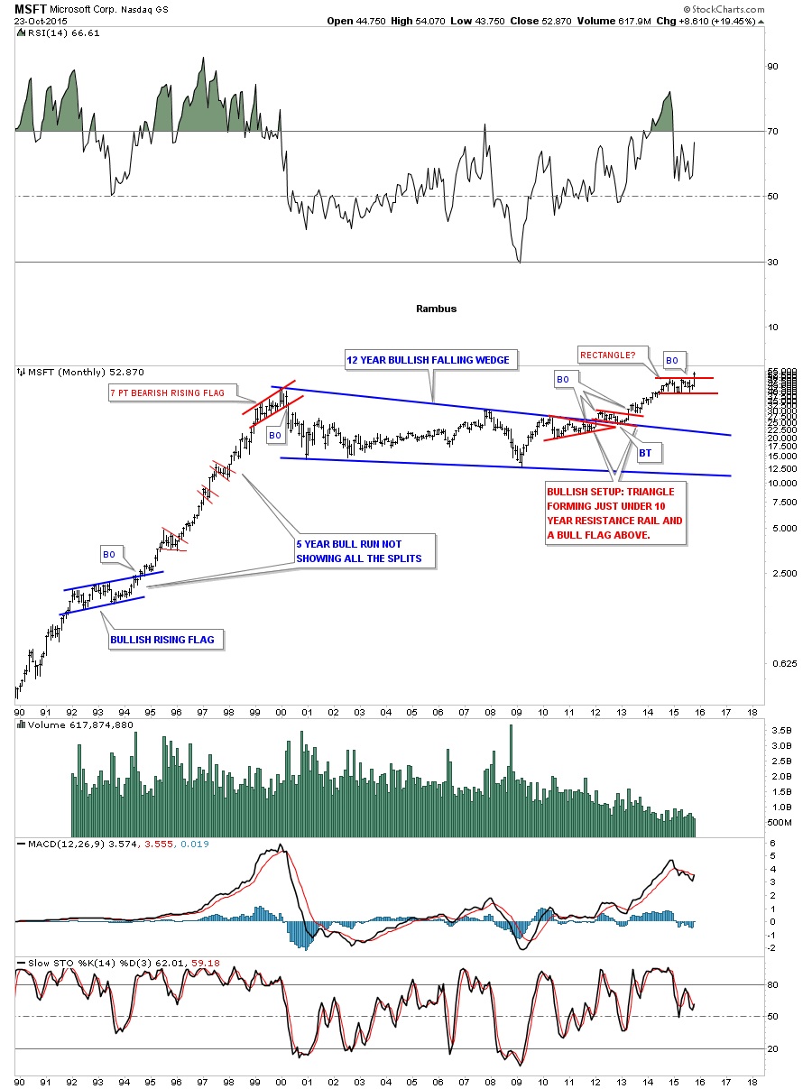
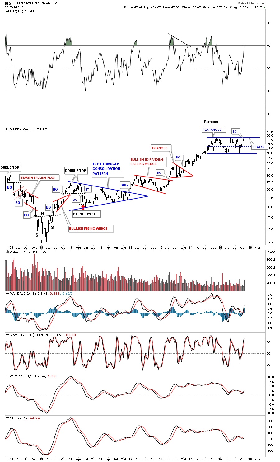
This weekly chart for MSFT shows all the consolidation patterns that have formed since its 2009 crash low including the breakout of the blue rectangle consolidation pattern last week.
I have many more charts to show you in regards to the massive consolidation patterns that have shown up on a lot of the old glory day tech stocks. Is history going to repeat again? Stay tuned. All the best…Rambus
********
Courtesy of www.rambus1.com
 Meet Rambus, a seasoned trader and technical analyst renowned for his unbiased and insightful chart work. Through his website, Rambus Chartology, and Substack newsletter, Rambus shares his expertise with a global community of subscribers, providing daily updates, commentaries, and hands-on training in the art and science of chartology. With his calm, humble, and down-to-earth approach, Rambus demystifies complex market trends, helping his followers navigate the challenges of today's volatile markets. Join the Rambus Chartology community today and discover a unique blend of technical analysis, trading expertise, and time-tested protocols. Subscribe now at www.rambus1.com or https://rambuschartology.substack.com/