Dow Jones Industrials And Its Earnings: 1929-2011 The NYSE Composite & Financial Indexes


Last week, Barron's reported record earnings for the Dow Jones: $850.91. But just 2.5 years ago in August 2008, Barron's reported record low earnings for the Dow: -$109.43. The question is, how can large blue-chip stocks report such excellent earnings so soon after the historic August 2007-09 earnings collapse? The last time the earnings for the Dow went negative was in 1932, at the bottom of the Great Depression Bear Market. However, the Dow's earnings didn't return to their 1930 highs until 1948: 18 years later.
This unprecedented surge in earnings from the 2009 bottom isn't necessarily a sign of "stability" or "growth". Considering how earnings growth is always a major topic of discussion in the contemporary financial media, I find it peculiar that this remarkable Dow's earnings performance hasn't been mentioned by the usual Wall Street, market "experts." This seems to suggest that the phenomenal rebound in the blue chips "profitability" doesn't signify stability to them either. One would have to assume that these mainstream Wall Street "experts" are aware of what the Dow's earnings have done: they've increased by $954 in only two and a half years! This should certainly be front page news for any competent financial journalist.
How was this surge in earnings even possible during a time when the economy had been struggling to come out of a recession, and why isn't Doctor Bernanke concerned about the economy "overheating"? Preventing inflation is supposed to be the Fed's primary mandate, but Bernanke's main concern seems to be getting the labor force back to work. And where is all this money coming from? Increased consumption by the unemployed workers in Europe and North America? The thirty companies that comprise the Dow are international companies. It might be that the earnings are coming from their foreign operations. Everyone knows that domestic sales aren't robust.
One nagging suspicion I have is that these post March 2009 earnings aren't a result of corporate operations, but changes in accounting standards. Could the Dow's companies reproduce these same earnings numbers using the accounting rules of the 1950s? How about the accounting rules of November 2007? Well, I'm not the guy to answer questions concerning accounting rules. So, let's assume that these earnings below are honest and accurate. Can you still look at this next chart, focusing on the 2007-11 period, and tell yourself that this is normal? "Strange" is the word that comes to my mind.

But it's not just the Dow's wild earnings' gyrations that are strange. The entire relationship the Dow has developed to its earnings since the early 1990s has become strange in a historical sense. Believe it or not, before Doctor Greenspan became Fed Chairman, the trends in the Dow and its earnings frequently fell out of line with each other. In the charts to follow, you'll see how in the past, following the Dow's earnings for signals when to buy or sell was never a sound market strategy. But that all changed after Doctor Greenspan took over "monetary policy." So let's take a look at the Dow and its earnings from 1929 to present. Note: the charts in this section use weekly closing values.
1929-1938
From 1929 to 1938, it wasn't that the relationship between the Dow and its earnings never tracked each other; they frequently did. The problem was that making investment decisions when to buy and sell based on earning trends, kept investors in the market when they should have gotten out, and caused investors to get out when they should have been stayed in during the most brutal decade in stock market history.
Look at the Dow's rising earnings from April 1929 to July 1930. They surged 53% as the stock market crashed! By the time the Dow's earnings began to decline in earnest (October 1930), the Dow itself had already declined by 45%. The predictive powers of earnings didn't improve at the bottom of the Great Depression bear market either. The Dow Jones saw its best year in its 126 year history from July 1932 to July 1933. But note how the Dow's earnings went negative, just as the Dow itself surged upward. The Dow saw no improvement in earnings until the Dow's best year ever was almost over!
So from 1929 to 1933, focusing on the times when the Dow and its earnings were trending together entirely misses the point. The point being that using earnings as a market timing system, was a sure way to a cardboard shack with no running water in Hooverville.

Take a minute and closely follow the Dow (Blue Plot) with its earnings (Red Plot) after 1933. For the next year the Dow stagnated as its earnings surged. When the Dow Peaked in 1937, its earnings continued rising, just as they had in 1929! From the March 1937 top to the lows seen in the chart (April 1938) the Dow declined 47% as earnings fell only 12% from October 1937 to April 1938.
1937-1947
The next 10 years were much the same. If someone was placed in a room, supplied only with information on the Dow's earnings from 1937-48, and instructed to buy and sell on key turns in the Dow's earnings, they would have walked out of that room poorer than they had walked into it. But, had they sold stocks on rising earnings, and returned to the stock market on falling earnings, they would have outperformed the market for these 11 years, which saw the Dow only breaking even from 1937-48.

I'm skipping the twenty year period from 1948 - 68. These 20 years, earnings on the Dow, as usual, proved to be a poor future indicator for the stock market.
1968-1978
Resuming my series of charts from 1968, we see a dramatic divergence between the Dow and its earnings! There aren't two consecutive years in the chart where the Dow and Its earnings agreed on anything! In January 1973- December 1974 we saw the first Dow Jones BEV -40% Bear Market since 1942, as the Dow's earnings surged the entire time. And then, the Dow regained most of its 73-74 bear market losses by early 1976, ON DECLINING EARNINGS! This chart looks crazy. But to anyone who has actually studied the data Barron's has published weekly since 1929, there is nothing surprising here.

1976-1986
There was more of the same from 1976 to 1986. Four years of solid gains in the Dow's earnings from 1976 to 1980, while the Dow itself did nothing. No mystery here: remember, capital gains are driven by monetary inflation flowing from the Federal Reserve, * not * earnings growth. From 1976 to 1980, monetary inflation was flowing into gold, silver and commodities. These four years saw double-digit CPI inflation, and double-digit negative returns on bonds. That the Dow oscillated between 800 and 1000 from 1976-81, is actually a remarkable achievement for the stock market.
In early 1982, Business Week had their "The Death of Equities" issue, predicting the end of Wall Street. Clearly Business Week wasn't looking at the Dow's excellent earnings for their clues of future trends in the stock market. But then by 1982, no one did for reasons that become obvious after studying my charts above. Then, as the Dow's earnings tumbled 93% in the next 16 months ($129.09 in November 1981 to $9.14 in March 1983), the Dow Jones began the longest Bull Market in its history in August 1982 (dashed vertical red line). How was this possible? I already told you: capital gains are driven by monetary inflation flowing from the Federal Reserve, * not * earnings growth!

1985-1997
Next chart down, you'll see that the Crash of 1987 occurred on excellent earnings. From 1929 to 1987, has the Dow ever begun a major decline on declining earnings? The answer to that question is a resounding NO! And as expected, when the Dow regained its losses from the October 87 crash (in 1989), right on cue the Dow's earnings plunged from $250 to $50. The Dow could have cared less.
It was just after the Crash-of-87 that the general public became interested in the stock market. At first their expectations were reasonable, but in the next 10 years the stock market became a debauched bacchanal, where everyone ran around in various stages of undress, intoxicated on the "liquidity" flowing from the Greenspan Fed. With the "Greenspan Put," covering everyone in the financial markets, even loin-cloths were eventually discarded. In the photo below, we see a typical day in the late 1990s for Wall Street's proprietary desk traders, going naked in the option markets.

One of the most ridiculous dog & pony shows ever to disgrace high finance was staged by CNBC and Wall Street promoters of high-tech stocks during earnings seasons of the 1990s. During "earnings season", CNBC hosted a day-time game show called "Beat-the-Street", where selected, hundred-billion-dollar high-tech companies (many which weren't even incorporated 10 years earlier) announced earnings that "beat the street's" earnings estimate by a penny. And it was always a penny that would drive the stock up 5% or even over 10% in just a few minutes. This would happen for selected companies every quarter for years.
The stock market had become the in place to be for quick capital gains. And bulls, as always, only cared about capital gains. Dividends, as always, counted for nothing to the high-tech bulls. But somehow, playing a rigged game of "Beat-the-Street" gave earnings a new, never before seen significance in picking entry and exit points to the stock market. And so, like magic, since 1992, when the Dow's earnings came out of the box in the chart below, earnings for the Dow fell in line, and stayed that way during the good times and bad, with the Dow's valuation trend for the first time since 1929.

1996-2011
The relationship between the Dow and its earnings for the past eighteen years has been unique. Picking buy and sell points using the earnings of the Dow Jones has proved a good market timing system for large blue-chip stocks since 1993. But why? I don't really know. This is a topic that would be better researched by someone with a Wall Street background. No doubt some "policy" is behind this. I'm only pointing out the peculiar nature of this eighteen year anomaly.
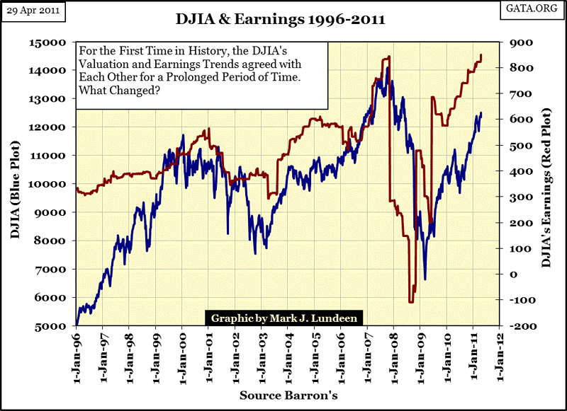
Currently the earnings of the Dow Jones are still in sync with the valuation trend of the Dow Jones itself. A couple of possibilities come to my mind as to what is ahead of us.
- The post 1993 model will continue to hold, with rising earnings leading to rising valuations in the Dow Jones. After eighteen years, this is a firmly established pattern. There is no obvious reason for us to suspect this pattern of the Dow and its earnings tracking each other will cease tomorrow. That isn't to say that the Dow won't go down tomorrow, only that if it does, it will go down on bad earnings news.
- But the stock market is a story of many surprises. Things change all the time on Wall Street with no notice provided to the investing public. There are many examples shown in my charts where Mr Bear took the bulls to the woodshed ON RISING EARNINGS. It can happen.
Since so many people in 2011 believe that the stock market's valuation is driven by its underlying earnings trend (possibility #1), totally unaware that possibility #2 was actually a common occurrence in the stock market from 1929-92 (63 years), I suspect that when Mr Bear decides to come back to work, he will take the Dow down on rising earnings just like in the good-old days when prices were set by buyers and sellers, not the "policy makers."

This table lists only the major market declines, not listed are the many minor declines in the Dow moving counter to its earnings too! And don't forget the many times the Dow began a significant move upward on declining earnings! But I can't imagine the "policy makers" doing anything so reckless as to manage the Dow's valuation up far above its highs of October 2007. So I expect the next big move in the Dow (+/- 20%) is down.
NYSE Composite and Financial Indexes
How likely is the Dow to break down into a major bear market on rising earnings? Well, you know my tea leaves are no more accurate than anyone else's: but I do drink a lot of tea! And at the bottom of one of my empty tea cups, I keep seeing a vision of the NYSE Composite and Financial indexes plotted together like the chart below.
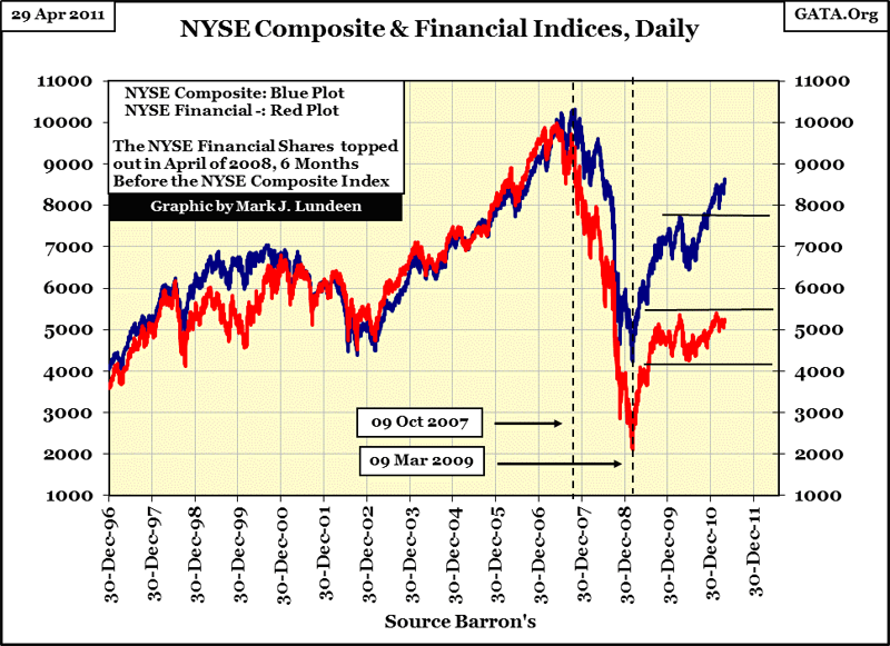
Now this is a scary chart, a regular slow-motion wreck of the financial system (red plot) supporting the stock market (blue plot). From 1996 to 2007, the NYSE composite & financial indexes almost laid on top of each other. Then came the mortgage meltdown, and nothing has been the same since.
Note how the financial index led the composite index down in 2007, beginning their crash in April, six months before the rest of the stock market. Both turned up together in March 2009. That's good. But what isn't good is that since August 2009, the financial shares have been in a confined trading range while the NYSE composite is trending back up towards its old highs of October 2007. Gee, for years these guys used to do everything together, but now they can't even agree about where they're going on Saturday night. And that's a problem; as the financials stocks (in our inflationary system of finance) are the guys who pay most of the bills for the good times the composite guys have come to expect.
Let's take a quick look at these indices' step sums in the chart below. The step sum is just a single-item A-D Line, using the daily (or weekly) advances and declines in the price of a stock or index. During bull markets, we expect to see more up than down days, and the step sum should trend upwards. During bear markets, we expect to see more down days than up, and the step sum should trend downwards. Note I say "should" as it doesn't always work out that way!
By the way, these step sums are derived from the same data shown in the chart above. The step sums plots are only the sum-totals of every up day (+1) and down day (-1) of these indexes as time passes by. So, it's important to note that even if the financial index itself was keeping up with the composite index from 2002-07, the financial index's step sum began breaking down in 2003, after closely following the composite's step sum since 1996. No doubt about it: something changed. Starting in 2003, the financial index was seeing more down days than the composite index.

The financial step sum diverged from the composite's in May 2003, anticipating coming problems in the US mortgage market. It then turned down in April 2007, just as the mortgage market began freezing up, and the NYSE financial index began declining well before the overall market. All in all, the NYSE financial step sum did an excellent job forecasting the pending difficulties of the financial companies, and signaled the 80% crash in the NYSE financial index in a timely manner. But note how the NYSE composite's step sum totally ignored the mortgage market fiasco. During second worse bear market in history, it trended sideways! There is nothing in the above blue plot (the NYSE Composite's step sum) to suggest that from October 2007 to March 2009, the second worst bear market since 1885 occurred: the NYSE composite index crashed by 60%!
What happened here? Most likely Doctor Bernanke, working with his Wall-Street minions, made sure that each down day at the NYSE was followed by an up day. This prevented a pattern of running-down days in the stock market that always provokes short sellers to jump on a market in decline. Why didn't he do the same with the financial stocks? He probably tried - and failed. This is why during the crash, the "policy makers" came up with a temporary prohibition on shorting financial stocks, as the big NY Banks were shorting their competition into oblivion faster than the Fed and US Treasury could bail them out! In a pinch, the big banks always eat their own. In a steep-bear-market decline during a credit panic, it's hard for them not to cannibalize each other since every bank on Wall Street knows that their competitors' assets are just as worthless as their own. Even with the official ban on short selling financial stocks, the NYSE financial index still fell 80%.
I see J.P. Morgan's earnings exceeded Wall Street's expectations this quarter. J.P. Morgan is one of thirty stocks comprising the Dow Jones Industrials Average. But is this boost in the Dow's earnings a buy or a sell signal? I think it's a "Get the Hell out of Dodge City" signal. Whether Mr Bear comes back to town by locomotive, horse, or by his own four paws is something I don't care to speculate on. I'm the first to admit that he's taking his sweet time too. But he's coming, and I expect him to arrive with a tin-star on his chest, determined to rid the financial markets of the riff-raff currently running rampant on Wall Street, and Washington. This bear market won't be over until the new Sheriff says it is!
Mark J. Lundeen
More from Gold-Eagle


