Some Ratio Charts : A Surprising New Paradigm in the PM Markets


How many times have we heard that the precious metals stocks are so oversold and cheap that they can't go any lower and have to rally. They just can't go any lower because the low in 2008 was the absolute low that will never be hit again as it was just an extraordinary event. A precious metal stock crash that was a once in a lifetime thing. So based on that low many PM investors bought their precious metals stocks thinking they were buying on the cheap. I'm wondering if they still think the precious metals stocks were a good buy at that 2008 crash low in the ratio charts?
Let’s look at the Gold to the XAU ratio line chart that shows the high in 2008 that was supposed to be the new benchmark for the pm stocks being oversold. As you can see on this weekly chart that the 2008 all-time high for this ratio was not the concrete ceiling that everyone thought it would be. It’s been making new all-time highs on almost a daily basis that doesn't show any signs of topping at the moment.

Below is a very long term monthly chart for the gold to XAU ratio. As you can see this ratio chart behaved very well trading between the blue and red horizontal trendlines for many years. The crash in 2008 for the ratio started a course of events that have significantly changed the landscape. The blue horizontal trendline was always a good place to buy precious metals stocks for years as it shows they became very oversold when the ratio got up to 5.10 or so. When the ratio got down to the 3.70 area, red trendline that was a good place to sell and take profits. When they say, this time is different, usually that means nothing has really changed except the perception of a change. In this case something really did change and its not just a perception of a change. The 2008 crash actually did change things. All the old highs at the blue horizontal trendline have now been acting as support once it was broken to the upside. Maybe the fundamentalist can figure out what has changed for the precious metals stocks compared to gold. We will know in time but for right now this ratio chart is telling to be wary of the precious metals stocks.

This next ratio chart compares DUST to the HUI. A rising price shows DUST outperforming the HUI and a declining price shows the HUI outperforming DUST. Which investment would you rather have been in since last October? The chart below needs no annotations.

Let’s compare the CDNX to gold to see if the juniors have fared any better than the large cap PM stocks. You can see the crash that occurred at the high in 2008 had a fairly decent recovery off the bottom but the CDNX fell way short of making it all the way back to the previous top. It instead built the blue bearish rising wedge that has taken the price action below the impregnable 2008 low. As you can see this ratio has gone nowhere for almost a year now trading below the 2008 low which had been holding resistance.

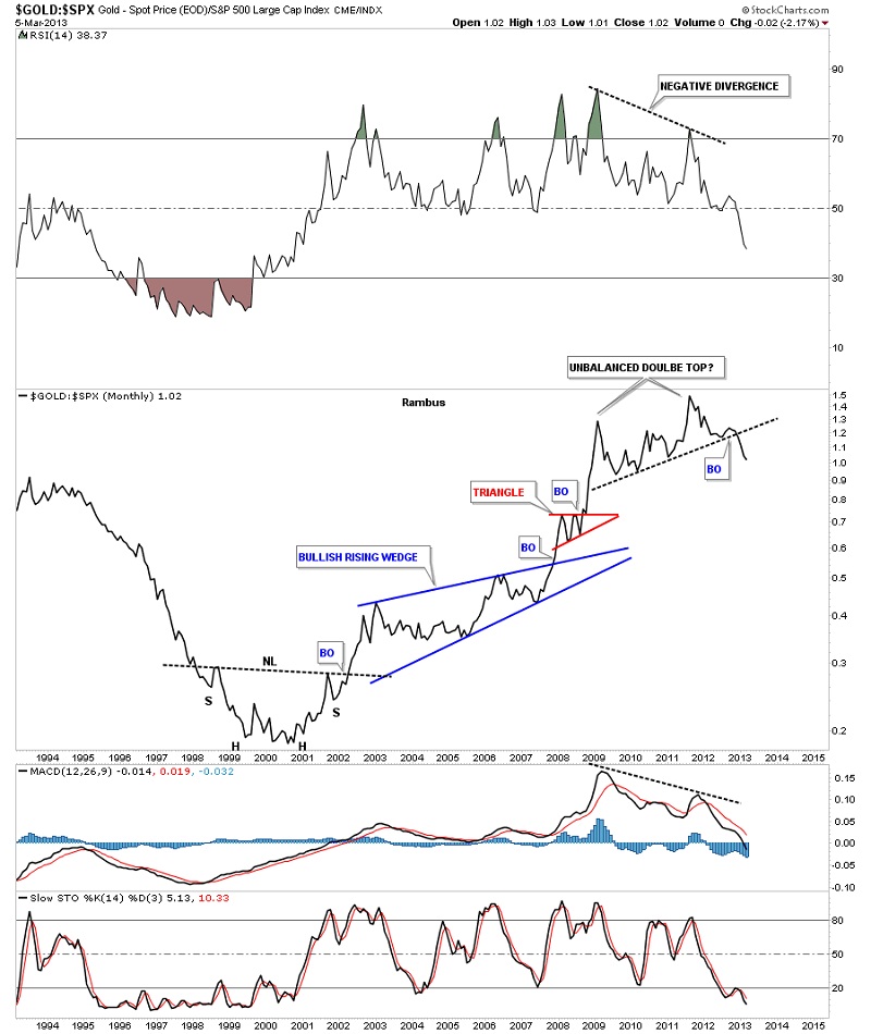
I think this next ratio chart is very telling and is strongly suggesting that the bull market that gold has enjoyed vs the S&P500 is over for now. You can see the very nice inverse Head&Shoulder base that launched the bull market for gold against the S&P500. That was a reversal pattern. Now note the unbalanced double top that has broken down. The double top is a reversal pattern that is reversing the 13 years bull market for gold to the S&P500. These charts talking are talking to us if we care to hear what they are saying.
More Rambus (including Free Trial) at www.rambus1.com
 Meet Rambus, a seasoned trader and technical analyst renowned for his unbiased and insightful chart work. Through his website, Rambus Chartology, and Substack newsletter, Rambus shares his expertise with a global community of subscribers, providing daily updates, commentaries, and hands-on training in the art and science of chartology. With his calm, humble, and down-to-earth approach, Rambus demystifies complex market trends, helping his followers navigate the challenges of today's volatile markets. Join the Rambus Chartology community today and discover a unique blend of technical analysis, trading expertise, and time-tested protocols. Subscribe now at www.rambus1.com or https://rambuschartology.substack.com/


