“Monetary Policy” And The Financial Markets


On Wednesday I watched Janet Yellen on CNBC, (as usual with the volume muted) as she discussed “monetary policy.” CNBC provided a running commentary at the bottom of the screen with the two key points for everyone to take away from her prepared comments:
- The Fed’s decision on raising interest rates was data driven;
- Increased transparency in “monetary policy” is a virtue.
The points I would take away from Ms. Yellen’s comments (even had I listened to them), are that the raw data the FOMC actually uses can’t be the same flawed data the Federal Government provides to the public; and if true transparency was actually imposed on the FOMC’s market activities the stock and bond markets would see their largest one day crash in history.
That’s not an outrageous claim on my part. Sure, since the market crash of 2007-09 the stock and bond markets have again been advancing just as they had since the early 1980s. But the FOMC was forced to “inject” massive monetary inflation into financial markets in order to make these market gains possible. See chart below. We should also note that in the past year since the FOMC has ceased quantitative easing, market valuations at the NYSE have been pretty much unchanged. “Economic growth” today has little to do with fundamental business conditions and everything to do with “monetary policy.”

Next we see another view of the stock market; indexing the Dow Jones with the always increasing number of dollars in circulation: 1.00 = January 1920. During the past one hundred years the only Dow Jones bull market that actually exceeded the increases in CinC was during the Roaring 1920s. The market tops of 1937 and 1966 were peaks that occurred when gains in the Dow Jones equaled the inflationary increases in CinC. But these market tops were from many decades ago.
Since 1966 the closest the Dow Jones has come to matching the increases in CinC occurred in January 2000 at the peak of the high-tech bubble. The table in the chart shows CinC increasing by a factor of 138 while the Dow Jones increased by a factor of only 105; leaving a gap of 31% between the inflation of dollars in circulation and the appreciation in the Dow Jones. Evident since January 2000 in the plots and table is the growing gap between monetary inflation flowing from the Federal Reserve and stock-market tops. Yellen and the FOMC have obviously been gradually losing their ability to goose stock-market valuations ever higher with monetary inflation. The chart also suggests that when the Dow Jones ultimately decouples from FOMC created inflation, its ultimate bottom will be far below the -53% decline of March 2009.
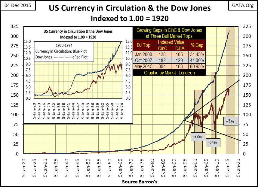
For your information here’s the table giving the indexed values plotted in the chart above for the Dow Jones’ market tops of 1929, 1937 & 1966, as well as this week’s close (Dec 2015). Though at the close of this week we are not at a market top, it’s interesting seeing that since the Dow Jones saw its last all-time high last May; CinC inflation has increased by a factor of 11 as the Dow Jones itself has declined by a factor of 4.

But one of these days Mr Bear will be deflating this bubble, and that will be something none of my readers will want to experience. No doubt there are people who expect to become rich beyond their wildest dreams by shorting or purchasing puts in the coming market collapse. However in this hyper-deflationary market environment, counterparty failure at the highest levels of finance is likely to spoil any anticipated payday from shorting the stock market. The safest survival strategy for the upcoming market collapse seems to be one that protects personal wealth from counterparty risk by holding a good portion of ones wealth in gold and silver bullion outside the banking system.
As the Federal Reserve manipulates markets and the economy by setting the Fed Funds rate above or below the US Treasury’s long bond yield, let’s take a look at what they’ve been doing with interest rates since 1954. I’ve divided the chart below into three historical periods:
- Policy Makers Fight Inflation (Post WW2 -1981)
- Policy Makers Fight Deflation (1981-2007)
- Policy Makers Fight for their Lives (2007 -2015)
Since first created in 1913 the Federal Reserve has been the engine-of-inflation as seen in my first two charts. Unfortunately the Federal Reserve has always been under management of leading academics, who have cleverly redefined what inflation is: from increases in the quantity of money in circulation to increases in consumer prices resulting from increases in the quantity of money. Rising consumer prices were what the “policy makers” were fighting from 1954 to 1981 as bond yields increased from single to double digits. Notice the frequent, and increasing extreme yield inversions in the chart below, periods when the FOMC increased the Fed Funds Rate (Blue Plot) above the US Treasury’s Long Bond Yield (Red Plot). These yield inversions forced the economy into recessions to stem rising consumer prices, or so the theory went.
Then in October 1981, as bond yields peaked, something remarkable happened; monetary inflation flowing from the Federal Reserve stopped flowing into consumer prices and began flowing into financial assets. The truth is that all bull markets since 1981 have been inflationary events. But unlike rising consumer prices everyone loves a bull market, until it goes bust. So from 1981 to 2007 the “policy makers” were fighting deflation; aka bear markets. Note that since 1981 all yield inversions have been greatly muted for fear of inducing a bear market somewhere in the inflated-financial world.

Janet Yellen and the FOMC’s current dilemma is fear that a pathetic twenty-five basis point (0.25%) increase in the Fed Funds Rate could implode global financial markets. Could it? Go back and look at the first two charts above. Ever since the US Treasury abandoned the Bretton Woods’ $35/ounce gold peg in August 1971 the inflation flowing from the Federal Reserve has been horrendous. The growing gap between levels of CinC and Dow Jones valuations is alarming. Anticipating the next bear market bottom to be similar in scope to the 1929-32 market collapse is certainly not unreasonable.
I plotted the yield spread between the Fed Funds rate (Blue Plot above) and the US Treasury’s Long Bond Yield (Red Plot) in the chart below. “Monetary policy’s” response to rising consumer prices (pre 1981) and rising market valuations (post 1981) differed greatly. To fight rising CPI inflation the “policy makers” would increase the Fed Funds rate well above bond yields. However after 1981 all yield inversions became increasing shallow, and every time the Fed Funds Rate was increased above the US Treasury’s Long Bond Yield a bubble popped somewhere in the financial markets.
The last yield inversion occurred at the top of the mortgage bubble (2006-07). Doctor Bernanke increased the Fed Funds Rate above long bond yields by only sixty basis points (0.60%) and the greatest financial panic since the Great Depression resulted. Janet Yellen now fears a puny twenty-five basis point increase in the Fed Funds Rate as the only thing she actually knows about the current credit system is how fragile it is.
I placed a red star over the 1989-90 yield inversion, the point in time when
Alan Greenspan decided to become the worst central banker in history. Wall Street was in trouble from providing bridge loans for hostile takeovers (Leveraged Buyouts / LBO) and Japanese real-estate deals. Had Greenspan been an honest central banker he would have continued tightening the money supply as was the practice prior to 1981. Instead he reversed “monetary policy” by lowering the Fed Funds a historic 5% below bond yields, rescuing Wall Street and igniting a bubble in high-tech shares. This pattern of bailing out Wall Street with easy money, and inflating bubbles in the economy is not a sustainable economic model, but it’s what the idiot savants formulating “policy” at the FOMC have been imposing on the world ever since 1990.
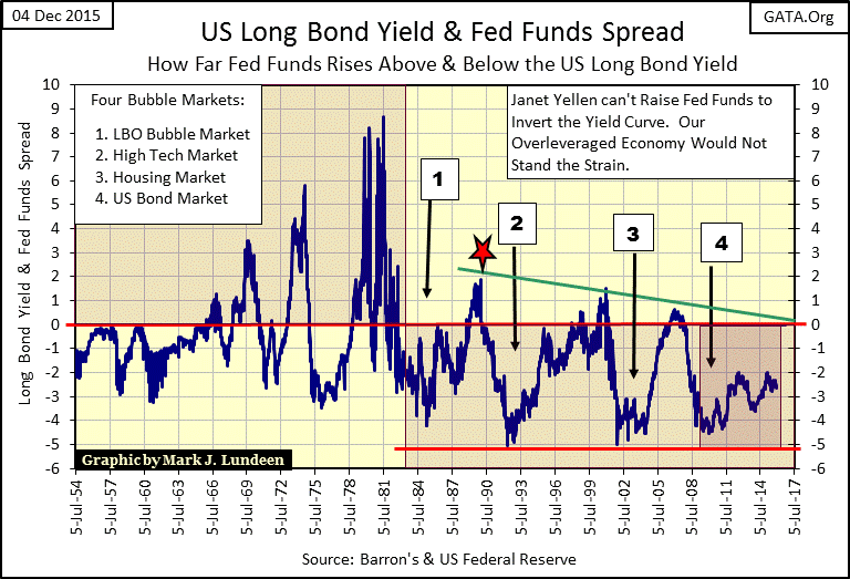
You can also see when Doctor Bernanke’s “Operation Twist” was implemented in 2011 in the charts above.
http://money.cnn.com/2011/09/21/news/economy/federal_reserve_operation_twist/
Operation Twist was intended to lower long-term bond yields, which it did. However it also had the unintended consequence of tightening the money supply by narrowing the gap between the Fed Funds Rate and bond yields by a full two percentage points. In effect Operation Twist tightened the money supply as much as a 2% increase in the Fed Funds rate but provided no benefit or incentive to savers. This was no accident as current “policy” demands that grandma do her bit in saving the banking system by purchasing junk bonds if she expects income from her life savings.
Janet Yellen could, (but I doubt she will) raise the Fed Funds Rate at some time in the near future. If she does and markets crash, waves of counterparty defaults and bankruptcies would ripple through the banking system and economy. She knows the financial media would blame her. As a veteran of many food fights at UC Berkeley’s Haas School of Business over “monetary policy” if she has learnt anything it’s that it’s better to be perceived to be responding to a calamity than to be blamed by the media for causing it.
As no one I know has predicted rising long-term bond yields as the coming thing in fixed income markets, let me be the first to do so. Keeping the Fed Funds at its current 0.12%, should long-term T- bond yields return to where they were in June 2007 (5.35%) would create the most accommodative monetary policy since 1954. The FOMC would then be forced to increase the Fed Funds Rate; it would then be irresponsible not to. Who then could blame these career bureaucrats for holding short term rates at zero for so many years for any market catastrophe rising long term rates then forced on the financial markets?
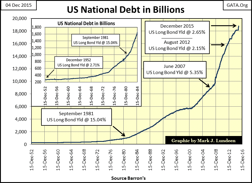
What’s the likelihood of rising bond yields happening? Looking at the chart of the national debt from 1952 below, it’s difficult explaining why it hasn’t already happened. US Treasury Long-Bond Yields were more than 15% when the national debt first broke above its one trillion dollar mark, but yields have since declined below where they were in 1952 (2.15% August 2012) as an additional seventeen trillion dollars of Treasury debt have been stacked on. Who in September 1981 would have predicted that?
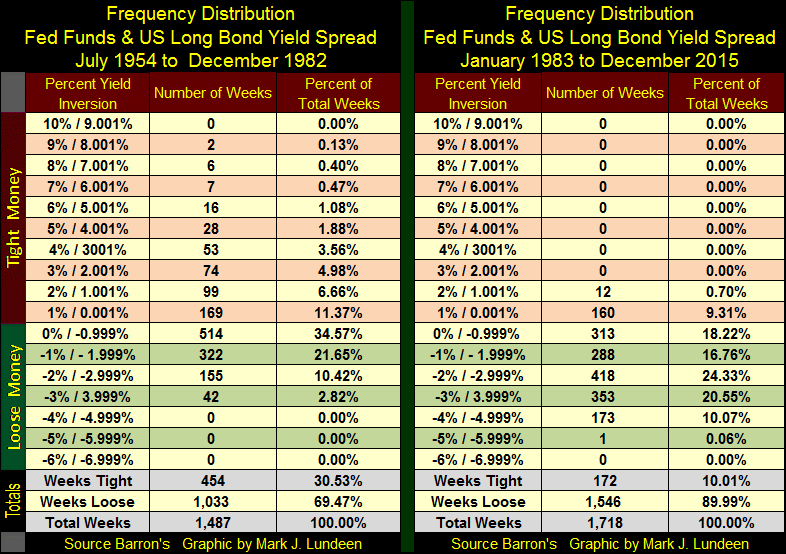
Here are the frequency distribution tables for the Fed Funds / US T-Bond Yield spread plotted two charts above. These tables are useful in comparing the extremes in “monetary policy” before and since December 1982. Before 1982 when concerns of rising CPI inflation dominated the FOMC, they inverted the yield curve for 186 weeks by 2% or more, with inversions of more than 5% not unknown. But all that changed after December 1982. In the past three decades “monetary policy” has never inverted the yield curve by a full 2% for fear of deflating an inflationary bubble somewhere in the financial markets. However the FOMC has frequently lowered the Fed Funds Rate 2% (and much more) below bond yields since 1982, something it had rarely done before.
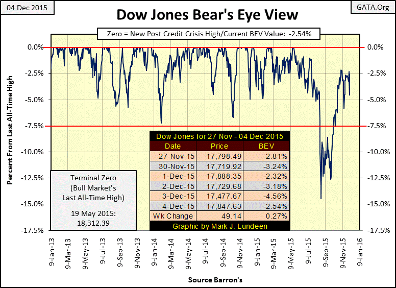
Market “experts” and economists can put on a brave face when discussing the current market and economy. But as Mr Bear sees things the inflationary excesses of the past three decades needs to be wrung out of market valuations and balance sheets throughout the economy swept clean of their unserviceable debt burden. Mr Bear does love a clean balance sheet! But currently he’s content just watching from the sidelines as we can see in the Dow Jones BEV plot below.
This week the Dow Jones closed just 2.54% away from making a new all-time high, something that has happened a few times in the past month. If this were truly a bull market, breaking above the highs of last May shouldn’t be a problem. But there is a problem because every time the Dow Jones approaches 18,000 the smart money is taking the opportunity to exit.
And making new 52Wk Highs isn’t just a problem for the Dow Jones. The NYSE 52Wk H-L Ratio hasn’t seen a +10% day since the summer of 2014, and since March 2015 the ratio has simply collapsed.

As with the NYSE 52Wk data, the Dow Jones Total Market Group’s 52Wk data has also seen an absence of new 52Wk Highs now for many months.
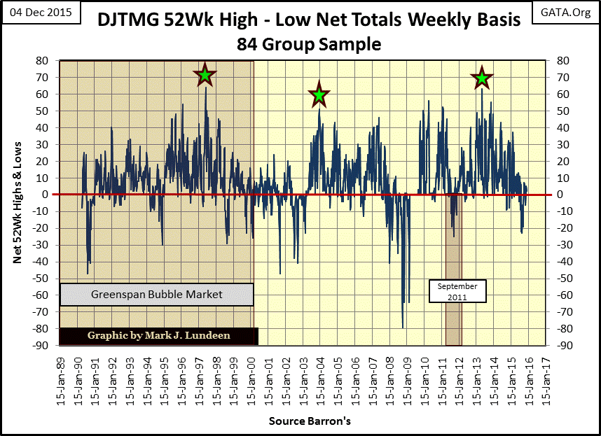
There is no mystery what the problem is; all bull markets since 1981 have been inflationary events. Since Janet Yellen’s Fed stopped its QE program about a year ago the stock market has stalled out. Here’s the DJTMG’s 52Wk table. Only seven groups made new 52Wk Highs this week. Distillers (#1) up 41.7% from its 52Wk Low, and Toys (#11) up 42.38% were the best performers. This week there were only six new 52Wk Lows.
Coal (#76) and Nonferrous Mining (#75) have declined to depression levels. The coal miners’ problem is the environmental movement, and the entire Federal Government has declared war against their industry. With each electrical utility switching from coal to natural gas the prospects of the industry diminishes. The nonferrous metal miners’ problems come from declining Chinese demand for their ore. That’s a big problem, but not as big as the coal miners face. Gold Mining (#70) is actually looking better than most of the DGTMG’s indexes. Yes it’s down 30% from its 52Wk High, but it’s also up 18% from its 52Wk Low. That’s something four of the seven groups making new 52Wk Highs this week can’t say.
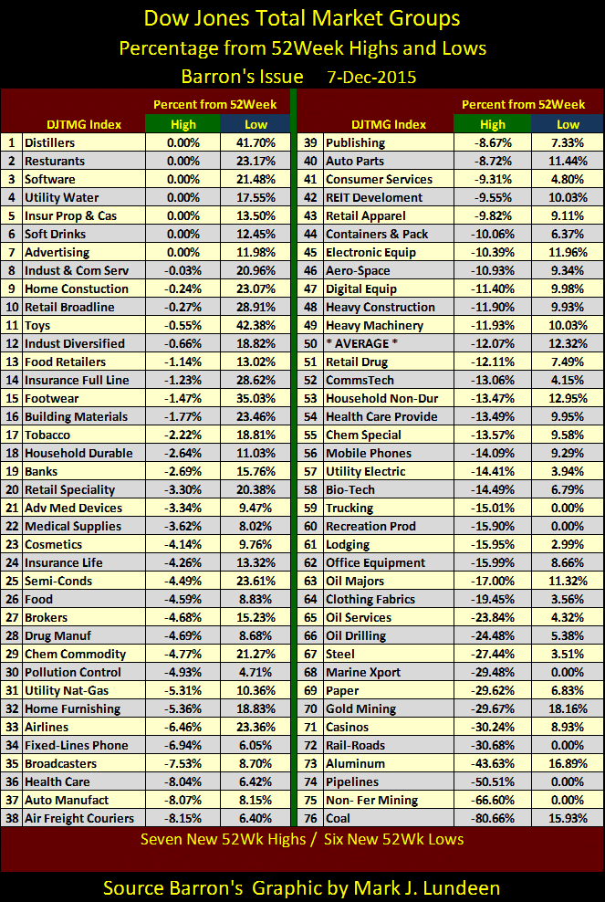
It’s not that the stock market is doing badly. Just look at all the groups less than 10% from making a new 52Wk High (#8 - #43). The problem is that this is how the market has been for months now. Look at the Average (#50 in Table). Both 52Wk Highs and Lows are at 12% which makes boredom the predominant feature of the current market. And so it will stay until the FOMC once again “injects” some go juice into Wall Street (unlikely), or Mr Bear comes back to feast on the market’s inflated valuations (quite possible) in the not too distant future. All in all, investors would be smart to avoid this sort of market, as there is much more to lose than to gain in the coming year. But the precious metal miner could very well be the exception to that rule.
Christmas is a slow time of the year for the markets, so I’ll be taking time off until after the New Year comes in. Merry Christmas to all and to my Jewish friends may you have a Happy Hanukkah. God willing, I pray 2016 will be a better year for everyone than 2015 was.
Mark J. Lundeen
More from Gold-Eagle


